<style>
.hidable
</style>
<script>
function showhide(section){
var ele=document.getElementById(section);
if(ele.style.display!="block") {
ele.style.display="block";
document.getElementById(section+"show").innerHTML = "Hide this design";
} else
</script>
GR2 - Designs
1. Scenario
A couple (Anne, Joe) with a kid (Andrew) are tourists in Boston. They decided to go to the Aquarium and they arrive at about 11am. The line for buying tickets has about 70 people waiting and the couple don't have too much time because they would like to visit other places in Boston during the weekend. While in the line, the staff informed that they can buy tickets on-line using their cellphones and in that case they can skip the line and go to the priority access line which is empty. Joe tried to buy the tickets on-line but he found he needs to register. He did try but the cellphone is a little bit uncomfortable for typing and selecting, so after dealing with the website he abandoned the idea and they stay on-line. After 45 minutes spent in buying tickets, they get into the Aquarium and Andrew saw an advertisement about the Blue Little Penguins. Andrew asked his parent to go there but they were confused because the Penguins are signaled to be in the main exhibition place but since the aquarium is currently in reconstruction they were moved. They tried to find the Penguins following the arrows marked in the floor but they got confused, in part because there is so many people in the place and there are arrows for different species, that they got to the wrong floor. They went back and Andrew started playing with a touchscreen system but the parents were unable to find the information in the interactive guide. Finally they saw a member of the staff who helped them to get to the penguins. After that they continued walking through the aquarium and they discovered an exhibit was running in a place hidden at the entrance but it was just about to finish.
Note: This is an adaptation of real situations observed in the aquarium.
Tasks involved in this scenario:
- (T1) Buying tickets on line. In this particular case, using a mobile device.
- (T2) Find the location of a specific specie and navigate the building to get there.
- (T3) Get information about interactive informative sessions held by staff (times-locations).
Other related tasks addressed in the following designs are:
- (T4) Find information about an interesting specie that is in a tank.
- (T5) Make a plan for the visit.
2. Individual design sketches
This section presents the individual designs:
Note: the following sections have been divided in parts that can be displayed by the reader for better organization. Please note that this is working in Firefox and Safari, but not in Chrome.
2.1 Claudia
1) For tiny screen:
This design pursues the goal of minimizing the amount of information displayed so it's compatible with tiny screen such as cellphones. The main screen of the UI will contain several icons representing the main tasks to be accomplished by users. Let's focus on (T1) buying tickets as first task. The user clicks on the "buy tickets" option, then a very simple screen is shown with two options: today or for other day. The idea is to present the "option" today because it's expected to be widely used and that way we reduce the time for the user to select the date in a calendar which is usually tedious in a tiny screen. Once the user clicks "today", the UI shows a form with the minimum amount of fields required to do the electronic transaction for payment. No registration is required. The user gets then a confirmation number that can be used to have direct access tot he Aquarium.
Once the visitors are inside the aquarium, they can look for the location of a specific species (T2) by selecting the icon "species". A list of animals is displayed using recognizable pictures and then clicking in one animals will produce a new screen with general information and the location.

The UI can handle alerts about sessions that are about to start as well as another main icon with this events (T3). After clicking in the events icon or the alert, the UI shows information about the session, the location and quick access to the schedule of other sessions in the same day.
Finally, the user also have access to information about a specific specie that is interesting by clicking in the species icon (T4). It's important to remark that sometimes is hard for non-expert to identify that an animal in a picture is the same that is being observed in the tank so it will be important to produce good images that facilitates this recognition.

2) Sea Metaphor:
This design is inspired in a metaphor of the underwater environment. The idea is to present an underwater picture in which animals are clustered according to their locations in the aquarium so that species that are together in the aquarium are in the same cluster in the UI as well. These clusters are drawn near some rock or little sub-environment in the picture and this represent the location. Finally, an underwater diver representing the expert staff is displayed near the species involved in an informative session.

It is possible to click on animals (T4), locations (T2) or divers (T3) an each one present the related information an also presents links to the other to options. For example, clicking over an animal shows information about the specie (T4) and also one button to related informative sessions and the location information.
This allows the user to have all the information linked to only one page. After clicking in one of the main options (an animal, diver or location), the new window is shown over the previous one and can be easily closed by clicking the x button so that the user can go back very easy if it was a mistake.

The tickets section (T1) can be handled by a bottom in a corner that replicates the previous design.
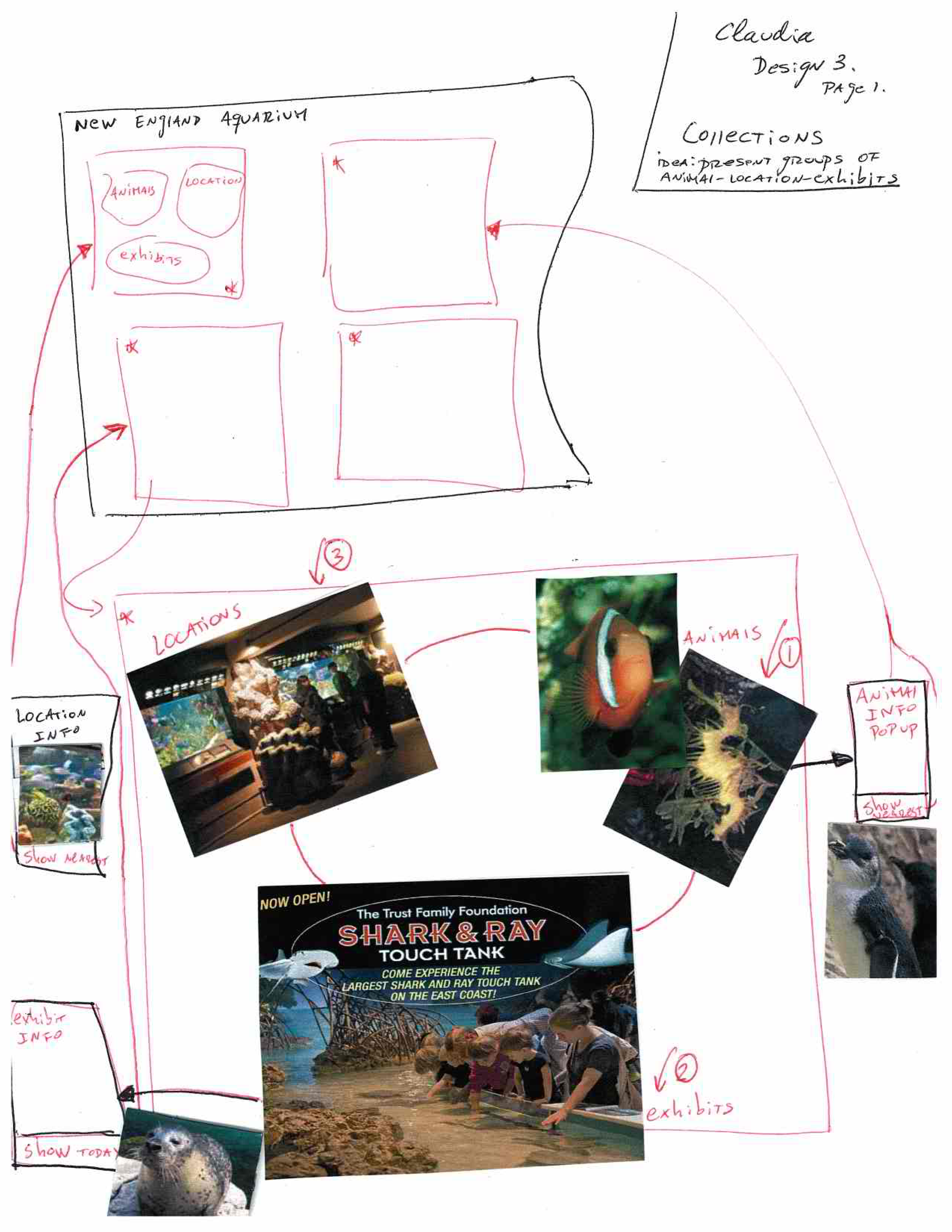
3) Thumbnail-styled groups of animals-locations-exhibitions:
This design is similar to the thumbnails that are used by some browsers to present the user the favorites or the most used links. The idea is to show groups of animals-locations-exhibitions that are related by location in the Aquarium. Each group is displayed in a thumbnail. The user can click in one of them an get a bigger window with all that information. Then it is possible to click in the location (T2), an animal(T4) or an event (T3) a get the information that was requested.
2.2 Alejandro
1) Time-budget centered design

Interface assumes that the user only knows how much time they have and which days they are able to use for a visit.
In an effort to shield the user from the daunting task of the astronomically large amount of possible time arrangements, the user only selects three things (a) which day to visit on (b) how much time they have for the visit (c) which things available that day they want to see.
The screen starts out with only 7 cells, one per day, with small icons inside. The icons are not meant to show specifically what is available that day, but to give the user an idea regarding how much is available that day. If the user wants to plan for a future date, or just buy tickets for it, he can. However, this design does not favor that, as we think that due to constant reconstruction, rescheduling, moving, etc. the staff only have a good idea of the upcoming week.
After a day is clicked, icons for all animals, sessions, and exhibitions appear. These don't have words; only pictures. If one is clicked, more information is shown, along with an option to 'checkmark' this item.
Once the user has marked the icons he is interested in visiting, a set of instructions similar to those obtained from Google Maps upon clicking 'Get Directions'. These specifically tell the user when to arrive, when to go where, how to move around the building using visible landmarks (turn right once you see the round shark tank).
Finally, icons for the following options are shown below: (a) Print the plan (b) Email yourself the plan (c) Buy tickets for this date.
Notes: Finding visual landmarks might be too difficult. The interface should let the user know if he choose too many items to see for his time-budget somehow. A very strong idea that came up while we presented these was that distance and estimated walking time should be incorporated into the schedules.
2) Exploration-centered design

This interface assumes that the user does not want to think about time, and simply wants to know where things are and how to get to them efficiently (i.e., not going back and forth)
The interface looks like the map found inside the aquarium. There are icons with images of animals on top of certain locations. If the user clicks them, information shows up along with an 'Add' option.
A schedule is kept below the screen and is constantly updated. This schedule does not specify times, simply the order in which events take place.
Arrows are drawn on the actual map connecting the locations selected by the user. These arrows have text displaying the estimated time it takes to walk from point A to B.
The interface takes care of avoiding redundant paths and tries to make everything a loop.
Buying tickets is automatically added to the schedule; if the user clicks the ticket logo, they can buy them online.
This interface assumes that the user is planning (and buying tickets) for the current day.
3) Explicit scheduling

This interface assumes the user wants to directly control every aspect of the timing. Instead of choosing a day of the week, the user inputs a date. Instead of selecting the time budget, the user explicitly inputs when he will arrive and leave.
After this information is entered, a list of available sessions, animals, and exhibitions are shown along with 'checkmark' boxes next to them.
The user then begins clicking on the ones he is interested in.
A schedule is maintained below. It is somewhat simple (ordered icons for each visiting event) but also has detailed timed information below it (e.g., buy tickets at 1pm, go to tank A at 1:30pm). The option to buy tickets online is added to the beginning of the schedule.
2.3 Yixin
1) Design for children
For the children, the interface provides the info about different animal species in a fun way. At a specific tank, there should be a touchscreen that provides info about the species in that tank. It shows the fish swimming/moving in the sea and children could click on the fish and a bubble will pop up to show information about that fish. The bubble should be big enough to display the text at appropriate font size.

2) Design 2
The design is task-based. There are 4 main tasks: see the aquarium map, explore exhibitions and species, plan and schedule their trips and buy tickets.


3) Design for non-computer interface
The visitors are given a paper brochure. It basically shows the map of aquarium, with dots on it. At the side of the map, there are description of each dot that represents one exhibition.

2.4 Yihua
1) Design for tiny screen

The main view presents the user with four options. After user clicks on one option, the view switches to help user complete that specific task. Since the screen is tiny, I use the scroll bar and also the pop up/slider coming from the left side of the screen.
2) A map-based design

The main view presents the map of the aquarium. The map not only shows the locations(other details shown after zooming in) of exhibitions during that day, but also the species info after user clicks on a specific tank. The interface also provides the “buy ticket” and “find animal” (Display all exhibitions on the map (same with animals))
3) Third design

Main screen: User could zoom/in out of the map. The map shows all the exhibitions on that day. Detailed information are presented below the map.
3. Designs and storyboards
Brainstorming:


3.1 Design 1: Time-based Approach

Usability Analysis:
Learnability
Pros:
- Few options on the main screen. At the beginning, the user is only presented with two options: “buy ticket” or “plan”.(We might add a “search” option for user to find a specific exhibition or specie).
- The interface guides the user step by step to complete the tasks. It asks the user to enter answers to questions like “what date do you want to visit aquarium”, “what time”,“do you want to see following exhibitions” and “what animals do you want to see”.
- After a day is clicked, icons for all animals, sessions, and exhibitions appear. These don't have words; only pictures.
Efficiency
Pros:
- The only necessary input from the user to generate a plan is time and exhibitions.
Cons:
- Once learnt, the interface is not very fast to use.
- There are hundreds of species in the aquarium, so asking the user to select which animal they want to see could be very inefficient if they want to see a large number of species.
During a given date and time, there might be multiple exhibitions, so it might also become cumbersome for user to view each available exhibition and check the checkbox if they want to visit this exhibition.
Safety
Pros:
- Only the exhibitions available during the time the user chooses will be presented for user to add to his/her plan.
- Always have a “back” button to go to previous step.
Cons:
- The interface should let the user know if he choose too many items to see for his time-budget somehow. When the user selects too many exhibitions to visit, he/she will not know until he/she hits the “Get Plan” button and then get the error prompt.Then they need to go back and redo the plan.
3.2 Design 2: Location-based Approach

Usability Analysis:
Learnability
Pros:
- A map is very visual and the users know that they could get location information from the map.
- Clicking on the exhibition dot or specie dot opens a pop-up window and presents the “add” option.
- The arrows drawn on the map is a very intuitive way to show direction and itinerary.
- Constantly updating the schedule gives user immediate feedback and shows the users the function of the interface.
Cons:
- Users might not realize that they could click on the exhibition/specie dot to get more info and add the exhibitions to the plan.
- Since the main area is a map, the users might not associate the task of buying ticket with it. They might not realize the use of the ticket icon at the side of the map and click on ticket icon to buy tickets.
- Difficulties in showing the aquarium structure on the map since it has a cylindrical tank in the center that spans three floors and also a outside surrounding cylindrical tank. The visitors actually spiral up through the space and come to the top. So we could not show such 3D-space onto 2D map and users might not understand and also not know how to interpret the map.
Efficiency
Pros:
- For visitors who have strong spatial visualization ability, showing the info on the map could be easier way of communicating location info then simply stating the location in text as “At floor x, beside Y”.
- The fact that this map shows the exhibits on it makes it easier to use for navigating the building. This is different form the current approach used in the Aquarium in which the map is shown only as a geometric draw. Including references the visitor can find allows more efficient navigation and use of the interface.
Cons:
- Could not get all information of the exhibitions or species off the map at one time.
- Users might need to click on several exhibition/specie dots before finally deciding on which ones to see.
- Could not get the time/schedule information, only an itinerary.
Safety
Pros:
- After clicking on an undesirable exhibition/specie dot, users could close the pop-up and go back to main map view.
- If the user already adds an undesirable exhibition/specie to the itinerary, they should click on one exhibition in the itinerary shown at the bottom to delete that particular exhibition from the itinerary.
- Users could drag and drop to change the order of the exhibitions/events instead of redoing the entire planning.
Cons
- After closing the pop-up for an undesirable exhibition/specie dot, the user might be lost in the map and don’t know where they were before clicking that undesirable dot.
3.3 Design 3: Metaphor-based Approach

Usability Analysis:
Learnability
Pros:
- The metaphor, if good enough, is easy to understand and shows the purpose of the interface. And it would be fun to play with, especially for children. For example, showing a human near a rock means there is a staff session going on.
- A treasure box is shown in the center of the screen at the beginning. For people who only want to buy the ticket, it is easy for them to find this buying ticket option.
The treasure maps generated at the end of the planning process making the visiting more rewardable and interesting.
Cons:
- The metaphor could be hard for older people and people with less imagination to understand.
- People needs time to understand the metaphor.
- It’s counter-intuitive that buying for the ticket is associated with clicking an underwater treasure box. Because it makes more sense to relate clicking on a treasure box to gaining some wealth.
Efficiency
Pros:
- Show the exhibition and species at the same location side by side. So it is relatively efficient to get info on a particular location.
Cons:
- For user who wants to search for the info for a particular exhibition or specie, it is hard to find a particular specie/ exhibition on the screen since only rocks and shawls of fish are shown. And there is no “search” option.
Safety
Pros:
- Errors are correctable. Could go back and redo the plan if necessary.
Cons:
- If a user accidentally adds a wrong exhibition/tank, could not realize the error until the final itinerary is shown. And it’s hard to re-select all components from the screen and re-generate the same plan.
4. Future work
From the TA and studio feedback, we are considering the following features for next designs:
- Search box (included in Design 2 so far).
- Integration of these ideas in one system for both planning in advance or in the fly.
- Find better approach to the location task in the time-based approach.
1 Comment
Unknown User (jks@mit.edu)
Great job overall. Your designs all hit on features that appear useful and usable, so some combination of your proposed ideas seem like a good fit to the problem.