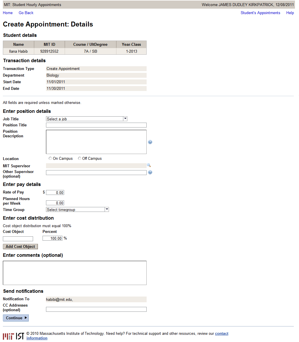
For form layouts applications like Hourly Student Appointment, fixed width values works best.
...
5. Because of the fact that you are using a CellDesign for the shaded TextViews, it seems that these will not line up with the rest of the UI elements since I assume the cell is always a couple of pixels bigger than the UI element – I made the cell widths for TextViews about 5 pixels narrower than the UI elements. Screenshot below shows three UI elements with equal width, but displaying differently:
The most important thing is that when using Matrix Layout, you can control a lot by using the width of the cell as well as the ui element. For example: If you make a cell's with 150px, and the ui element width (e.g label with wrapping switched on) 75px, the result is this:
Screen capture of Hourly Student Appointment:


