...
- The design's opening page has a simple login field as well as two buttons (represented by images) leading to both the QR QR code creator, and the event tracker. The event tracker will only be available to those who have logged in (a message warning non logged in users will alert them as such) However , however the QR code creator can be used by anyone to make one time codes.
...
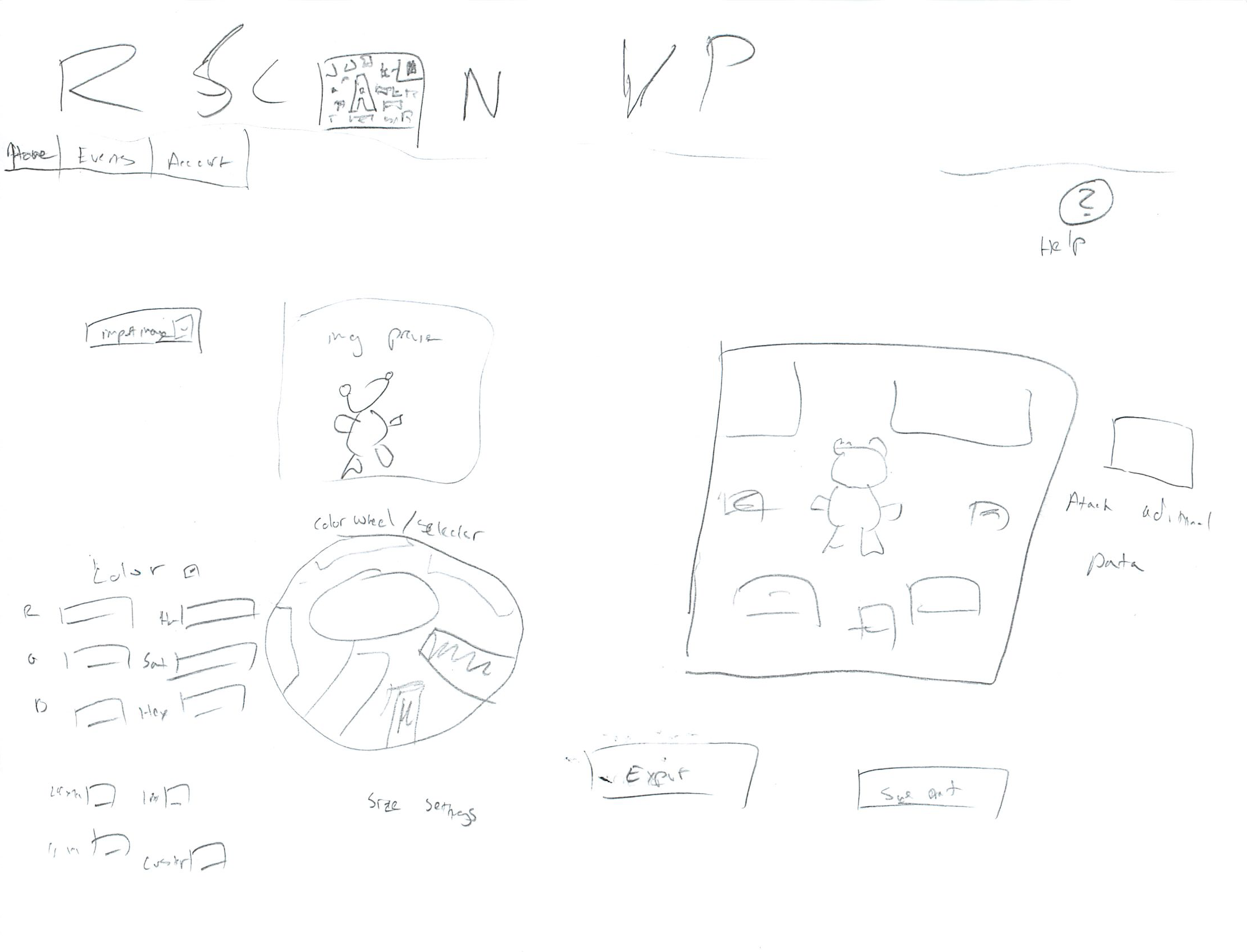
- In the case of our scenario, the user will begin by logging in and then clicking on the QR code creator icon. The following screen appears when the user enters QR code creator by clicking the button on the home screen. The left side of the screen has options to import an image to be used in the code as well as coloring options. Both numeric inputs for exact colors, as well as a color wheel for simplified color selection are available. Bellow that are check radio boxes for size settings with common sizes and a field for a custom size. The right side of the screen has a preview of what the QR code will look like that updates as the user imports an image or changes the color.. The button to the right of the poster when pressed brings up a dialog that consists of a simple form asking for event date, time, location etc, that will be displayed when the user scans the code. Below the preview are buttons to save the qr QR code for later (for logged in users) or Export export the image so that it can be placed on the poster. The user will receive the image files as well as a sample link to the site showing the description poster viewers would see.
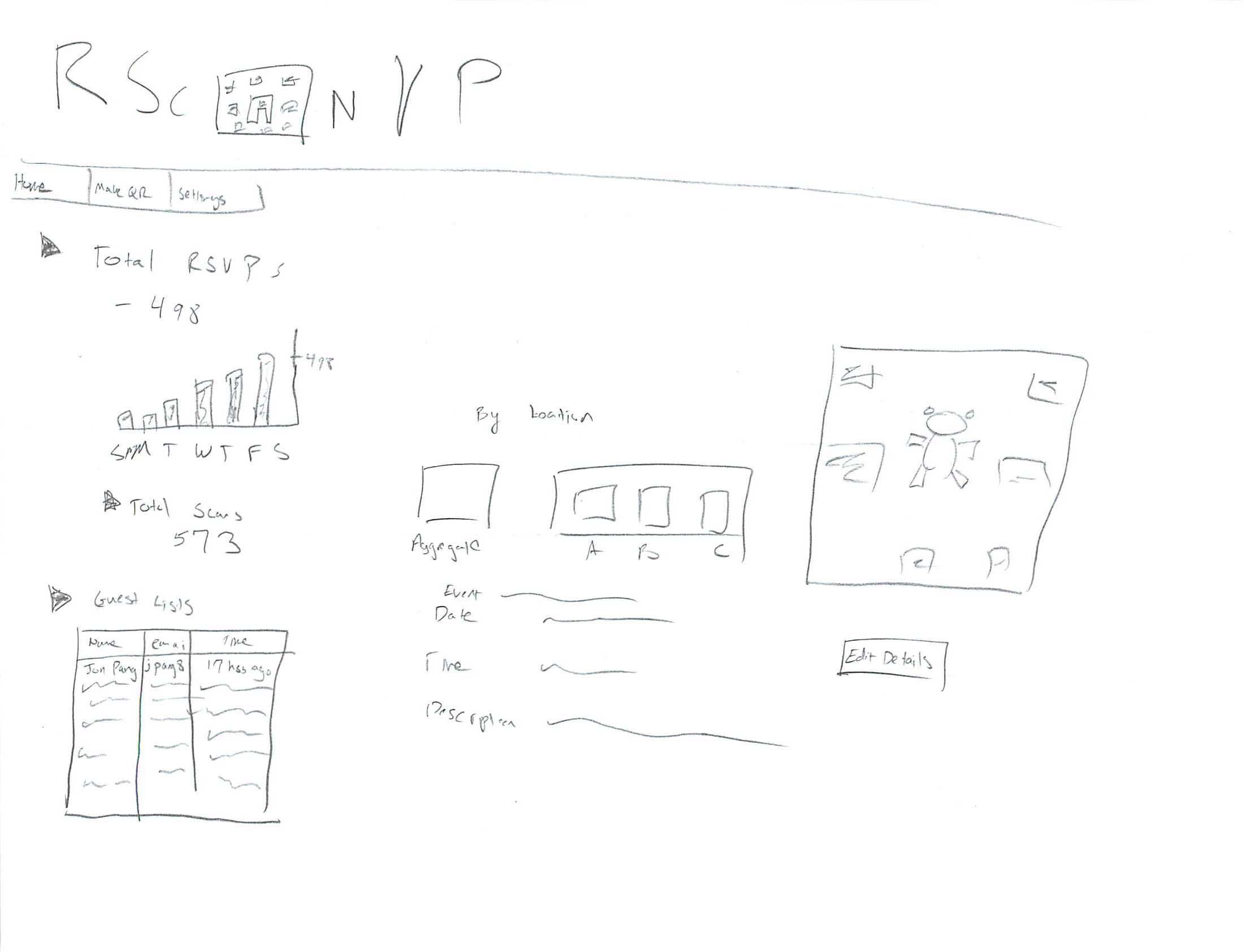
- On the My Events page (reachable from the home screen or from the tool bar on the QR creator screen) The user is first shown two horizontal rows of events. The top row is events that have not occurred and the bottom row are events that were previously made by the user who have already occurred. Arrows on either side of each row indicate that horizontal scrolling by row is possible if there are more off screen events. Clicking on an event icon brings up the page on RSVP statistics about said event.

- The statistics page allows users to see how many people have scanned the code, rsvp, and who has rsvp'd. The left side has a tree of collapsible categories. They display total RSVP count as well as graphs showing when these RSVP RSVPs occurred.
- The final tree node contains the guest list of people who have rsvpRSVP'd with their email, time of RSVP , and name if available. The middle of the screen has a summary of the event date, time, etc, the same information users who scanned the code would see. In addition if multiple QR codes had been made for posters in different locations, the widget in the middle would be able to click on a specific code by location, and the data displayed on the left hand side would update accordingly. The right hand side contains a picture of the QR code and a button below it with the option to open an edit the details screen. This screen would be the same as the screen used to make the QR code originally, however it would have the added option to email how to guests with a message of any changes (assuming the event has yet to occur).
...
- In terms of learnability users are most likely to feel lost or intimidated in creating the image of the code itself. By having a live preview of what the code will look like as the user adds custom images or changes color, the user can feel that he or she knows what the final outcome of the image will be. This design presents advanced numerical (hex for example) color selection options to the user, which the user may or may not be familiar with and could cause confusion. However by having a simple color wheel selector that the user could click on to select basic colors, novice users could bypass the complications of creating custom colors. The live preview could indicate to them that they chose colors correctly, and auto filling in the numerical value of their choice could help them use the more advanced option in the future. At the expense of possibly presenting something unfamiliar to novices, displaying both color input options increases efficiency as users who know exactly what color configuration they need to match their poster can quickly enter it.
- The live preview also helps with the safety of designing the QR code. The button to export the image is directly below the preview so the user will be looking at what the design will look like before they create it. *The *safety aspect of the event information can be helped by giving the user a sample link along with the image so that the creator can see exactly what the users will see upon scanning the code.
- The creation page itself doesn't do much to help the user in terms of the learnability of what a QR code is or why one should be used, but presumably the user would at least of a basic familiarity with the concept of what it was if they were attempting to make one. The creator does also does not overtly say a step by step process of what should be done. It assumes the user knows that after customizing the look of their code they should attach event information to it for it to be of any use. This lack of learnability in the creation interface can be mitigated by having a help section or dialog (reachable by clicking the ? on the creator screen) that explains the basic steps. Since the process is fairly short and simple, this design doesn't sacrifice efficiency to attempt to explicitly lead the user in a step by step process every time.
- If a user did not care about adding any images or changing the color, then they could simply accept the default black and white settings, and go straight into adding the event information by clicking on the button by the preview. The * efficiency* efficiency when it comes to quickly creating a code is therefore fairly high. At a minimum, from the home screen, only two button clicks are necessary to bring up the event information entry form. And only two more are necessary to submit send information and download the image.
- On the screen for viewing currently and previously created events, the efficiency his the efficiencyhis high assuming the user only cares about the few events that recently occurred and doesn't have an overwhelming large amount events currently ongoing. However if this was not the case then efficiency would be hurt by the fact that there is no view that presents a long list on the screen displaying dozens of previous and ongoing events.
- On the statistics page all of the information is displayed at once by default so learnabiity of where to find certain statistics isn't an issue. It could hurt efficiency if certain users never cared about certain statistics and were seeing extraneous information as a result, however by making the display nodes collapsible this issue can be mitigated.
- A tool bar at the top of the screen with links to each page (event viewer. qr creator, and account settings) should help efficiency and quickly navigating to the desired section of the app.
...