| Vincent pulls up the app and inputs his destination, Europe, how long
he is staying, 12 days, and the nature of his trip (vacation). He also
inputs his gender so the list generated by the app can be tailored more. | Pros - The layout is very simple, and it is clear
where the travel information should be
entered
Cons - There is no indication of how to move to
the next view | Pros
- All the fields for information to be entered
is located in one place, making it easy to
quickly enter all the information at once
Cons - Entering all the information via typing may
be a bit time consuming | Pros
- If a mistake is made in entering travel information,
it is easy to simply re-select the field and correct
the information
Cons - There is no indication of how to change travel
information once Vincent has moved to the next
view. |
 | Vincent sees a two paneled screen. He wants to check the weather in
Germany, his first destination, so he looks at the upper panel and sees
that the panel contains weather information. He wants to see the average
weather over the next several weeks, so after some exploring he sees a
little graph icon in the bottom of the weather panel, clicks that, and is
displayed with the temperature over time. After he has checked the
weather, he's now ready to start packing. He decides to start with toiletries,
as those are his most precious items. He looks at the bottom panel and
sees that there is a toiletries category. | Pros
- The suitcase on top of the scale is a clear
metaphor to the user that the suitcase is
'being weighed' and therefore the user can
see the estimated weight of their suitcase
on the scale
- Each icon is clearly labelled with a category,
and with their standard icon look the user is
prompted to select the icon to view it in
detail.
- The left and right arrows on the weather widget
along with the highlighted circles below it make
easy for the user to realize that they can switch
the widget by toggling left and right Cons - Since the view is evenly divided between the
weather widget and the scale/suitcase, it is not
immediately clear what the main purpose of the
view is
- Because the view is evenly divided, between two
different widgets, the user would have to take
time to explore all of them to figure out what each
does | Pros
- For each widget visible on this view, there is at
most one action to be done, making it fast to
complete actions
Cons - Because the widget can be toggled left and right,
in order to find out what each widget is the user
would have to toggle through all the widgets to
discover them. | Pros Cons
|
 | He clicks the toiletries category and it opens a checklist with entries that
were automatically generated for him. He packs conditioner and aspirin and
checks the checkboxes next to the items. They immediately move to the
bottom of the list. He realizes that the list hasn't autogenerated a toothbrush
for him, so he decides to add it. He sees a textfield at the top of his screen
called "Add another entry", so he taps it and enters "toothbrush" into textfield.
It adds the entry to the top of his list. He selects the entry and sees details
about the item appear at the bottom of his screen, such as weight and
category. He also sees the option to "don't bring" the item.
| Pros Cons
| Pros Cons
| Pros Cons
|
| Vincent finishes packing everything in the clothing section, and only some
things in the toiletries section. When he goes back to the main menu, he
realizes that the categories where he has packed everything have a green
icon in the corner. The categories where he has only packed some items
appear as a yellow yield icon. Categories where he has packed no items
have a red "x" in the corner. Now that he is midway through packing, he
wants to know how much his current stuff weighs, in case he goes over the
luggage weight limit. Conveniently, he realizes the weight is located at the
top bottom panel. He sees he is over the limit, so he wants to know which
category is taking up the most space. He searches around and notices that
the bottom of each category also has a weight for all items in that category.
| Pros Cons
| Pros Cons
| Pros Cons
|
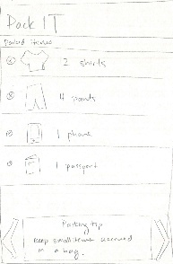
 | Vincent has finally finished packing but he realizes he's pretty bad at it
because his luggage is pretty much overflowing. He wants to check how
to pack more efficiently, so he goes to the main menu again and sees two
arrows on the left and right edges of the upper panel and 5 dots near that
bottom that indicate there are more panels to the left and right. He decides
to check those out, and swipes left. On the left is panel for packing tips!
He follows the instructions and now everything fits perfectly.
| Pros Cons
| Pros Cons
| Pros Cons
|