...
Sketch | Storyboard | Learnability | Efficiency | Safety |
|---|---|---|---|---|
|
| Pros - Easy to learn because there are simple icons that the user sees which immediately describe what the icon represents without unnecessary words (aka, picture of airplane = travel there by plane) Cons - Lack of text may be slightly longer for user to figure out whats going on | Pros - Autocomplete provides efficiency Cons | Pros - Allows the user to reselect icons if the wrong one is chosen Cons- After hit the "go" button, user cannot edit travel |
|
| Pros - Easy metaphor: items can be dragged into container, just like real packing Cons | Pros - Drag and drop provides efficiency Cons- Adding/deleting items may take longer than necessary | Pros - Adding/deleting items may take longer than necessary Cons- Not easy to delete/add item because you have to open backpack |
|
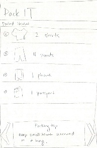
| Pros - User has most likely encountered a checklist before, so easy to use this one Cons- Doesn't allow user to add any items, so doesn't support some functionality of normal checklists | Pros - Simple checklist, user can find all items in this checklist Cons- If user is looking for a specific item, has to look through | Pros - User can delete items or uncheck items they don't want Cons- No way to recover an item if a user deletes it |
|
| Pros - Simple text page, nothing new to learn Cons- User doesn't know what to do if they want more information | Pros - All information in one location Cons- User may want too see only packing tips, must scroll to | Pros - User can easily navigate to and away from this page Cons |


...
Sketch | Storyboard | Learnability | Efficiency | Safety | |||
|---|---|---|---|---|---|---|---|
| Vincent starts by pulling up the app. He sees a preliminary screen prompting him to input information about his trip and himself. He types in Europe as his destination for the trip, inputs how long his trip is (12 days), and then select his mode of transportation (airplane) via icons. He also selects his gender, and then presses 'Start Packing' to continue in the app. | Pros- The input fields on the page make it very clear what information should be entered into which fields. Cons- When entering the length of the trip, it may not be as intuitive for the user to figure out how to change the unit of time (day, week, etc) | Pros- Many of the icons are simply buttons, making it quick for the user to select an option as they enter their trip information. Cons | Pros- * *If the destination is entered incorrectly, or the length of the trip entered correctly, it is easy to re-enter the destination information or toggle the length of the trip. Cons- Once the user has submitted their information, there is not really a way to fix their data if they have made a mistake and submitted it | |||
| The next screen displays shelves holding the different categories of items. Below shows a suitcase, representing the current items already packed. To the left of the suitcase is a box displaying the current estimated weight of the suitcase as Vincent packs. At the very bottom Vincent can also view packing tips, and to toggle them he can swipe left or right. To view the items in the clothes category, Vincent can select the clothes icon. | Pros- The metaphor of items, such as clothes and toiletries, on a shelf makes it clear to the user that the shelf contains items to pack. Cons- At first glance, it is not immediately clear what the user should do, other than toggle the packing tips and click on the icons; thus users might not realize they are able to select the suitcase to view what is inside | Pros-* *Because items are grouped into categories, it makes it faster for users to see what sorts of items they need to pack Cons- Users need to go one more view in to see the individual items that they need to pack | Pros- If a user accidentally selects a category they did not mean to pack, it would be a simple task to simple return back to the original view Cons- It is not clear how a user could change the categories that appear based on the initial information that inputted, since there is no way of changing the settings of their trip | |||
| In the clothes category view, Vincent can view exactly which items he should bring and how many of each one he should bring. He decides to pack his shirts first, and to indicate that he has packed them, he drags the shirts icon into the suitcase below. For each item packed and dragged into the suitcase, the weight counter increases. Vincent also decides to add glasses to his list of clothes item to bring, so he presses the add button to add them to the shelf. To view what items he has already packed, he can select the suitcase to see them. | Pros ConsPros- Icons match visual objects that the user is familiar with so they are instantly recognizable Cons- Users may not understand what a specific icon represents | Pros - Icons in corner telling how many of each item allows user to quickly view that information Cons- User may have difficult time locating items of shelves, because items could be scattered in random locations | Pros - User can add items or delete items easily Cons - User may have difficulty adding or deleting only one item in a particular category Pros Cons | |||
| Taken to a view of items packed in the suitcase, Vincent can see exactly which items he has packed. In addition to viewing the items he has packed, he can remove them if he decides not to take them with him in the suitcase. Once he has finished with packing he closes the app and gets on his way to Europe. | Pros Cons | Pros Cons | to Europe. | Pros - Is essentially just a list, so easy for user to understand what is going on Cons - Difficult to see options are available besides "delete" due to lack of visual cues | Pros - Delete next to icons is easy to spot, so deletions will be quick Cons - List is uncategorized so user may have difficulty locating a particular item | Pros - User can delete items they mistakenly inputted Cons - User cannot add back items immediately if they accidentally deleted them, must go back to main menu and add the item Pros Cons |