...
Index Card | Description |
|---|---|
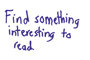
| This was our first task. There are two index cards because we updated the task part-way through our paper prototyping. This task is meant to prompt the user to explore our reading interface so we can see how easy/intuitive it is to read information. |
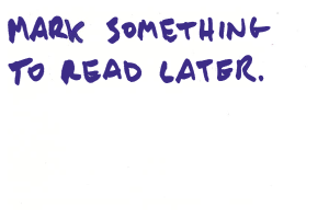
| This was (sometimes) our second task. This is a form of organizing/saving information (our third high-level task in GR1) that we wanted to test. We learned later on in our paper prototype testing that the behavior of this feature confused some users. It is not consistent with how users prepare items for reading later in emails/twitter/etc, and it was unclear what was supposed to happen when the users hit the "read later" button (does the item go away? etc.). |
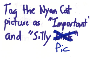
| This was our second/third task. It is also a form of organizing/saving information like the previous task. Our paper prototyping users told us that the tag menu/general functionality was more straightforward than the "read later" functionality. |
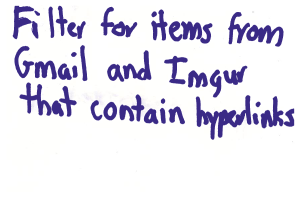
| This was our last task, testing our implementation of the filter task (second high-level task from GR1). It was our most complex task, and was changed the most in our iterations for our paper prototype. |
Analysis
Summary
Reading
- The first task description, "Read
...
- something interesting", initially confused some users who didn't realize they were being asked to try to scroll down or expand items.
...
- Changing the description
...
- to "Find something interesting to read" resolved this.
- Because it is a mobile app we tried to afford scrolling by displaying a partial line of content at the bottom edge, but some users did not realize that the page was meant to be scrollable
...
- .
- Users were able to notice the "Expand" button and click on it to expand items to see the full version. In some of the original tests, we didn't display a "Shrink" button on expanded items; users during these tests tried to touch the original menu to get back, similar to how you close a photo on Facebook. Some users did this even after we started showing the "Shrink" button - we could consider making clicking outside of an expanded item shrink it,
...
- though this could be
...
- another issue that comes up
...
- with a paper prototype.
- A couple of users hit the "Share" button
...
- . Ideally, this wouldn't require any additional effort, just make the post in the background using an API. (Tom: what?)
- Some users thought the interface was busy and suggested hiding buttons
...
- . When the interface is on a real screen we can better determine whether decreasing learnability by hiding the buttons makes sense.
- For the most part, users were familiar with interfaces that present a list of items to read, and did not have significant roadblocks navigating.
Saving
We experimented with two mechanisms to save content for later: the first is to hit a "Read Later" button that presumably shows you the content later; the second is a set of tags that users can apply to items, and later search for, similar to Gmail. One user mentioned that she would save emails often since she doesn't want to reply to them on the phone, and suggested that hitting "Read Later" on an email mark it as unread (this would be desirable by users who use both Hubbub and their email clients to read emails). When the user hit "Read Later", the feedback we used was to change the text on the button to "Saved". Some users thought that this term didn't fit their mental model (emails are already saved), and suggested making the item go off the screen. We could make it do this automatically, or have the user do a sideways swipe similar to dismissing notifications on Android.
...


