To make our paper prototypes, we grabbed a bunch of supplies and started drawing and cutting. Based on our tasks and our designs from GR2, we started drawing the different stages and all possible states that could appear. We had one main screen, and then on separate pieces of paper, we drew and cut out the buttons and other things that would appear on screen and placed it on our main screen. We organized all our prototypes using paper clips and envelopes keeping items that appeared on the screen at the same time together.
Supplies:
-Paper
-Sharpies
-Pen
-Scissors
-Tape
-Paper clips
-Envelopes
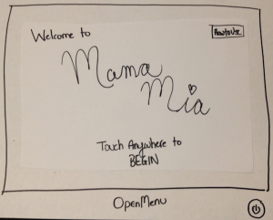
Main Screen
This is the first screen the user sees.
| 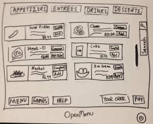
Main Menu
With nothing open, this is the menu.
| 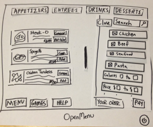
Menu Filtering
Clicking the search button, opens
up a filtering sidebar.
| 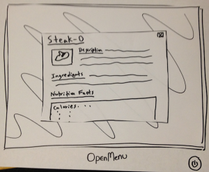
Item Description
Clicking on an Item open a pop-up
menu with data on it.
|
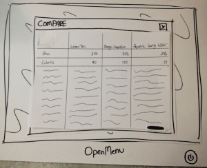
Compare Menu
After checking off items to compare,
the user can view its data and choose
something to eat.
| 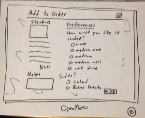
Adding Item to Order
The user adds an item by selecting
their preferences and pressing add. | 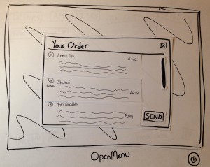
Your Order
The user can view their current
selections and send the order in if
satisfied. | 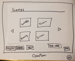
Games
The games page where the user
can select a game to play. |
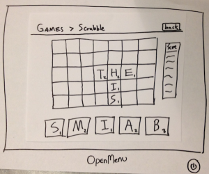
Games (Scrabble)
When playing a game, a user can go
back to the main menu by clicking
back. | 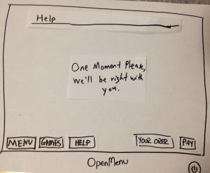
Help
The user can get help by pressing
help button on the bottom. | 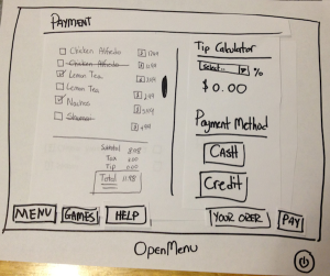
Payment Screen
The payment screens contains the
list of items, tip calculator, and
payment method. | 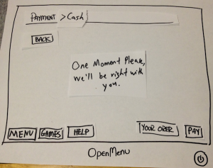
Payment Screen (Cash)
The cash option of the payment
screen. |
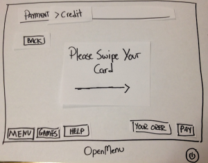
Payment Screen (Credit)
The credit option of the payment
screen with a quick tutorial on how to
use. | 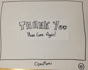
Thank You Screen
The thank you screen after the user
has paid. | | |
...
| Panel |
|---|
Hello and thank you for help us with our project, OpenMenu! This is _ _______, __ ______, and _______. Picture this: You are going out to a restaurant on a Friday night with a couple friends. When you are seated, you notice that instead of menus, your waiter has grabbed tablets instead. Your waiter informs you that the restaurant is trying out a new electronic ordering system. The purpose of this new ordering system is to make ordering and waiting at restaurants faster and more efficient and to entertain customers while waiting for their orders to arrive. To help us test the system, we're going to ask you to do some scenario tasks. |
...
# | Title of the Task and Statement to User | Steps of the Task (For our personal use) |
|---|
1 | Viewing and Ordering Foods| Panel |
|---|
You and your friends were just seated by a lovely waitress at Mama Mia's.
You are extremely hungry and want to look through choices to order something as
soon as possible. So:
- You go through the menu to order some food
- You proceed to send in your order |
| 1. Scroll through the menu
2. Move between tabs
-Drinks
-Appetizers
-Entrees
-Deserts
2. Click on each item for more information
3. Add and remove items from their order
4. View your order
5. Send in their order |
2 | Play Some Games | Panel |
|---|
You and your friends just ordered some delicious food from Mama Mia's. In the mean
time, you and your friends notice that there are games offered on the device. So:
- You go and browse through the games
- You choose to play Scrabble with your friends |
| 1. Navigate the game screen
2. Click on a game
3. Play a game
4. Go back to the main game screen
|
3 | Pay the Bill| Panel |
|---|
You and your friend just finished your delicious meals and everything was wonderful.
The only thing left to do is pay the bill. So:
- You pay the bill |
| 1. View the bill
2. Add tip
3. Choose to pay with cash or card
4. Pay the bill |
4 | Filtering and Comparing Foods| Panel |
|---|
You and your friends are ver impressed by the number of items on the menu, but some
want beef while others want seafood. So:
- You filter the items that appears to suit your preferences |
| 1. Filter the menu based on certain specifications
-Price
-Nutritional Facts
-Ingredients
2. Search for items
3. Compare items side-by-side
|
5 |
| Panel |
|---|
You and your friends have just spilled a drink accidentally and really need help from the
waiter/waitress. So:
- You get help from the waiter/waitress using the system |
| 1. Click on the help button
2. Search through the help on the device
3. Call your waiter over for help
|
6 |
| Panel |
|---|
You are slightly unsure of how the new device and system works and decide
to first go through the tutorial. So:
- You do the tutorial |
| 1. When the system starts, click on
the tutorial button
2. Complete the tutorial |
...
User | Description (Abridged) | Lessons Learned |
|---|
1 | Task: Viewing and Ordering Foods
1. User opened screen with ease by touching the center of the device.
2. User stares at the screen for a couple of seconds and says that he is very
confused with the split screen (Compare and Menu).
3. User clicks on the second item he sees on the sliding boxes of items.
4. User sees the item in the compare screen.
5. User is confused why it wasn't added to his order.
6. User clicked on another item (third) and sees it on the compare screen again.
7. User stares at the screen for a couple of seconds and notices the add to order
button in the compare screen.
8. User says that is very confusing and should be separated.
9. User finishes his order and thinks he's done.
10. User does not realize that he has to go to the order tab to send his actual order in.
Task: Play Some Games
1. User did well with opening the the main screen.
2. User paused on the main menu for a couple seconds.
3. User immediately notices that its a tab systems and shows signs that
it was not his preferred way for navigating.
4. After a couple seconds he opens the entertainment tab.
5. He states that he likes the big buttons for the games because its easy
to find and open.
6. He finds scrabble and opens it. He says its a good multiplayer game.
7. We simulate him playing with a computer by manually drawing in data.
8. We play through a couple rounds for approximately 5 minutes.
9. He tells us he is wondering about the status of his meal. Which he doesn't
see in the game view.
10. The tell him the waiter came and gave him his order.
11. He finishes.
Task: Paying the Bill
1. User found it easy that he needed to click on the Payment tab.
2. User is surprised by the tip calculator and found it helpful. He says its "…easy
to use and doesn't require to much effort."
3. We forgot to prompt the user of how he should pay (oops), so he independently
chooses to pay by credit.
4. User sees the "Swipe Credit Card" screen and starts looking for the slot on the
right hand sign of the tablet (where the arrow is pointing to).
5. User swipes and signs the receipt.
6. User says, "Ha, that was pretty easy." | Learnabilitiy
1. When opening the menu, there's a lot going on on screen
2. Browsing through the menu was slightly confusing to learn
3. Adding items to an order takes a little bit of time to learn
4. Actually sending in the order is not very learnable
5. Easy to figure out how to select games
6. The tab system is easy to figure out
7. Paying by card is pretty easy to learn by following the on-screen instructions
Efficiency
1. Adding items is inefficient; user has to add to compare, and then add to order
2. Browsing through the games if very fast
3. The user was able to add tip and pay very quickly
|
2 | Task: Viewing and Ordering Foods
1. User opened screen by double tapping the screen.
2. User stares at the screen and goes, "What the…".
3. User tells us that he has no idea whats going on in this screen.
4. User spends about a minute trying to figure out what everything does by clicking
random buttons.
5. User realized that he added a couple items to the compare button and goes, "OH,
this is like a table to compare nutrition facts or something."
4. User tells us he doesn't know how to add it to the order.
5. User finally realized the add to order button is in the compare section of the screen.
6. User asks if he sent in the order yet.
7. User notices the order tab and clicks on it. He asks, "Why is it a tab?"
8. User clicks "Send Order" and completes the task.
Task: Filtering and Comparing Foods
1. User realized that he did this when he was doing the previous task.
2. User open to the menu tab quickly.
3. User struggles to figure out how to use the filtering system.
4. It takes the user a couple second to realize the drop menu filters the offerings.
5. User selects seafood and chicken.
3. User clicks on a chicken dish and a salmon dish.
4. User looks at the dishes on the bottom half of the screen and tells us, "…hmm…I want to compare calories."
5. We write in the calories in the table.
6. User chooses the chicken dish (less calories).
7. User clicks on the order tab, and sends in the order to complete the task.
Task: Pay the Bill
1. User clicked on the Payment tab relatively quickly.
2. Told us, "Tip's pretty easy to calculate but I can see this being useful."
3. Manually wrote in his tip (We forgot to implement this, but we did so on the spot).
4. User chose to pay by cash, but was confused on what to do when paying with cash.
5. We prompted that the waiter/waitress is coming to accept the cash and give change.
6. Suggested that we somehow make the cash process faster (pre-calculate the change).
7. Finished payment and completed the task.
8. We forgot to put a Thank You page, and he noted that. | Learnability
1. There is too much going on screen in the Menu tab.
2. The prompts (buttons and fields) do not afford their function.
3. It is not evident how to send an order.
4. Filter options have little visual clues of their existence and function.
Efficiency
1. It is not efficient that the user needs to add items to compare before they can send their order.
|
3 | Task: Viewing and Comparing Foods
1. User open the screen by tapping the screen.
2. User takes a minute to figure out what he is looking at.
3. He states that it looks like a gallery, with some Compare thing at the bottom, but he doesn't know how to use it.
4. He attempts to click on the drinks button, and we switch the items with drinks.
5. He clicks on "Lemon Tea", "Coke", and "Sprite" as he notices the information pops up in the bottom compare screen.
6. He states that it's weird how clicking on the item doesn't immediately add it to the order.
7. He decides to pick his option based on price which we have displayed in the table already.
8. He clicks on adding the Lemon Tea to the order form the compare menu.
9. He attempts to figure out how to send the order to the waiter and at first assumes that it is already sent when he clicked on add to order button.
10. He realizes that there is an order tab and clicks on it.
11. He's confused about why we used a tab system.
12. He proceeds to click on the sender order button, and complete the task.
Task: Play Some Games
1. User found it early to locate that Games is under the "Entertainment" Tab.
5. He immediately recognizes the Scrabble button from the set of four big game buttons.
7. We simulate him playing with another guest by manually drawing in data that is supposed to be his "friend's".
8. We play through a couple rounds for approximately 2 minutes (due to time constraints).
9. He tells us that this can be really entertaining while waiting for food at a restaurant.
10. The waiter comes and gives him his order.
11. He finishes his task.
Task: Ask for Help
1. User could not figure out how to Ask for Help (the button was very hidden) or how to call the waiter/waitress using the system. .
8. We play through a couple rounds for approximately 2 minutes (due to time constraints).
9. He tells us that this can be really entertaining while waiting for food at a restaurant.
10. The waiter comes and gives him his order.
11. He finishes his task.
Task: Ask for Help
1. User could not figure out how to Ask for Help (the button was very hidden) or how to call the waiter/waitress using the system. | Learnability
1. There's a lot going on initially, makes it difficult for the user to figure out how the menu works and where to get started.
2. It takes a second to figure out how to add an item to the order.
3. It takes the user a while to figure how to send the order; he assumes it automatically sends when he adds it to the order.
4. The help button is not very discoverable or intuitive.
Efficiency
1. Adding items to an order is very slow; the user has to add the item to compare before adding it to order Learnability
Efficiency
Safety
|
...