...
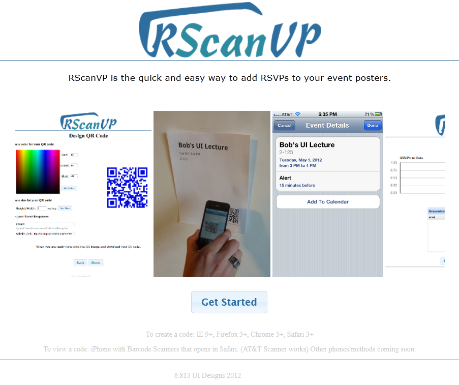
- The home screen has been changed in response to heuristic evaluation comments, as it was originally to wide to be seen on many modern devices. We changed the format of the home screen to include a marquee instead of a ribbon of images so that the view will not be as wide. This was much cleaner and allowed to page to be displayed cleanly on all devices that we tested.
- After clicking the get started button on the home page the user is presented with an initial form to fill in the event information that the attendees will see after scanning the QR code they are creating. Unlike in earlier prototypes where all input fields were identical in size, the event description input has been expanded into a multi row text area to be more consistent with the fact that event descriptions can often be several sentences. In response to heuristic evaluations that showed our time entry field had usability issues, this area was redesigned to include a drop down to allow users to select times without having to manually type them in. Error checking was also implemented to alert users if their date or time entries were invalid.
...
