...
Screenshot | Explanation | ||
|---|---|---|---|
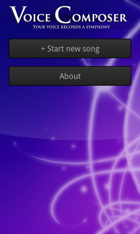
| Originally, the main screen looked like the extended song list below. Our final design adopts a splash-screen-like design in order to highlight the name of the app and reassure users that they're in the right place, while remaining functional with a prominent "new song" button. The background is intended to be aesthetically pleasing but unobtrusive. | ||
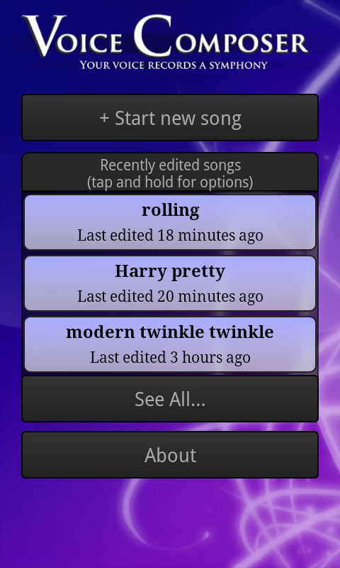
| We limited the main screen to three saved songs to avoid overwhelming users. The "new song" and "about" buttons remain prominent. Tapping on a song launches the compose screen, shown below. Our original design included small "rename", "duplicate", "export", and "delete" buttons on each song, but our paper and heuristic evaluations noted that such nested buttons were confusing and difficult to use on a small screen. We therefore replaced them with a menu accessed by tapping and holding for a second or so; this method is nonobvious, so we also included an instructional note. | ||
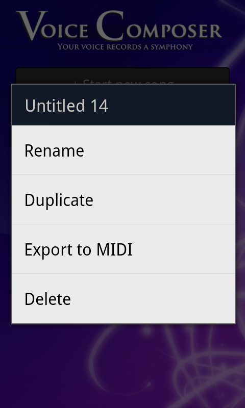
| Renaming a song works by replacing the name in the song button with an editable text box; when the user submits (presses enter) the song is saved. Duplicating a song creates a new song named "Copy of NAME" and enters rename mode on that song. Deleting a song asks for confirmation, then slides the song button rightward off the screen. (It would perhaps be clearer for the button to shrink to nothing vertically with the buttons below sliding up, but technical properties of the Android API make implementing this animation difficult.) | ||
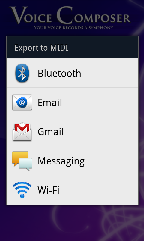
| Exporting uses native Android sharing functionality , which displays to display a list of possible transfer methods for the user to pick from. A MIDI file containing the song is sent via the specified method. | ||
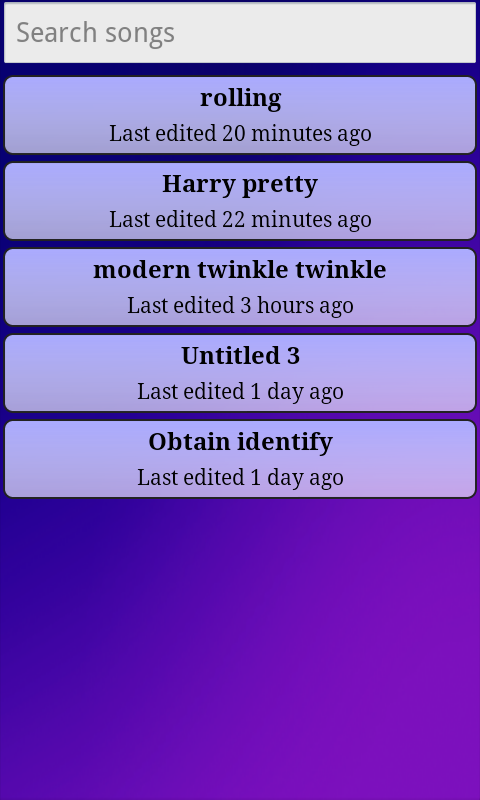
| If the user clicks the "see all" button, this screen is shown. It lists all saved songs, allowing scrolling and searching (the list updates as a user types in the search box). | ||
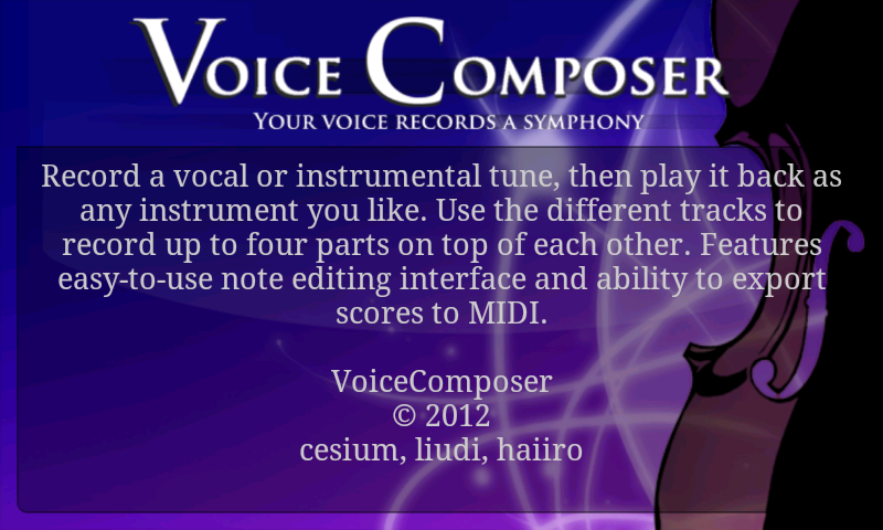
| The "about" button takes users to this screen, which is just a static message. | ||
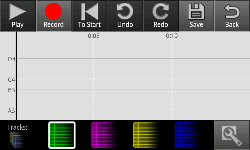
| This is the compose screen for a song with no notes in it (e.g. a newly created song). | ||
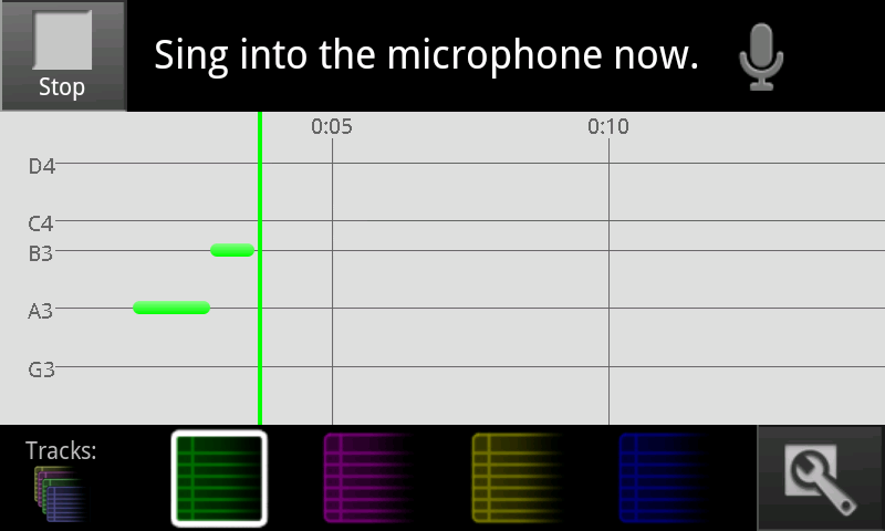
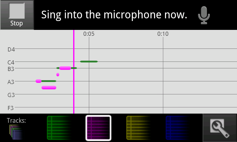
| A click track plays while the user is recording. The cursor turns the color of the current track, and moves rightward across the screen (the display scrolls so that the bar is never more than 3/4 of the way across). Notes are created at the cursor position when the app detects singing, and lengthen until they change pitch or stop; notes are deleted if the cursor hits them while recording into the same track. All buttons are disabled here, but "Stop" is available to stop recording. | ||
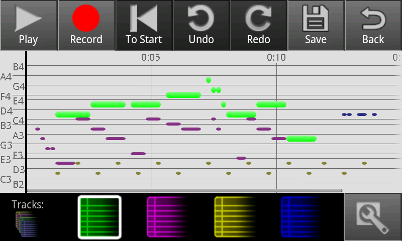
| Here the user has stopped recording on the green track, and started recording on the purple track. All four tracks are drawn on top of each other; notes on the same track can't overlap, but notes on separate tracks can. | ||
| Here notes have been recorded into all four tracks. Notes from the currently selected track are bright and large; other notes are dim and small. | ||
| A screenshot of one of our editing interfaces. Tap a note to start editing mode on it. Tap another not to switch to it, or tap off to stop. Dragging the note moves it, pulling the ends changes its length. | ||
|
| ||
|
| ||
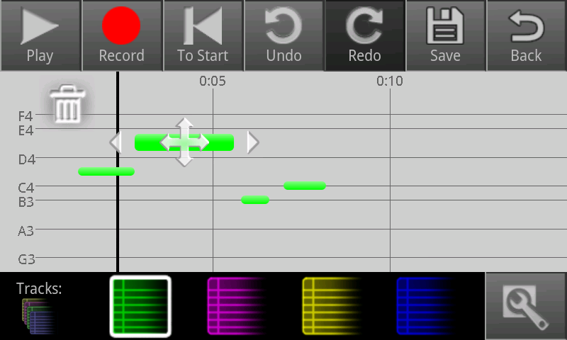
The 'new' editing interface. Tapping on a note causes these icons to appear. Tapping the trash can deletes the note. Dragging the side arrows left or right changes the start and end points. Dragging the middle icon vertically changes the pitch of the note, and dragging it horizontally moves the whole note without changing its length. As notes in the same track can't overlap, the note stops when it hits something, and a red glowy thing appears to signal that it can't move or extend anymore. | |||
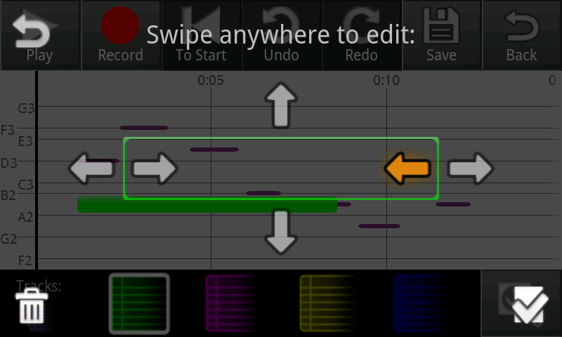
| The 'old' editing interface. Tapping on a note causes this overlay to appear. Tapping the trash can deletes the note. Swiping left or right on the left side of the screen moves the start of the note backward and forward in time; swiping horizontally on the right side does the same for the end of the note. Swiping up or down in the middle of the screen changes the pitch. There's no way to move the note without changing its length. If the note tries to expand but hits something, it stops and a red glowy thing appears; also, the arrows that don't do anything are crossed out. | ||
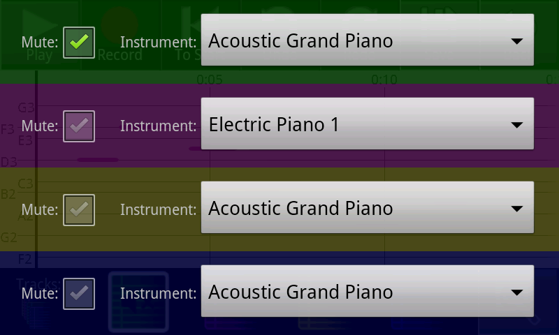
| Tapping on the track tools button brings the user to this screen, which has color-coded controls for each track. A muted track doesn't appear in the compose screen and produces no sound during playback. | ||
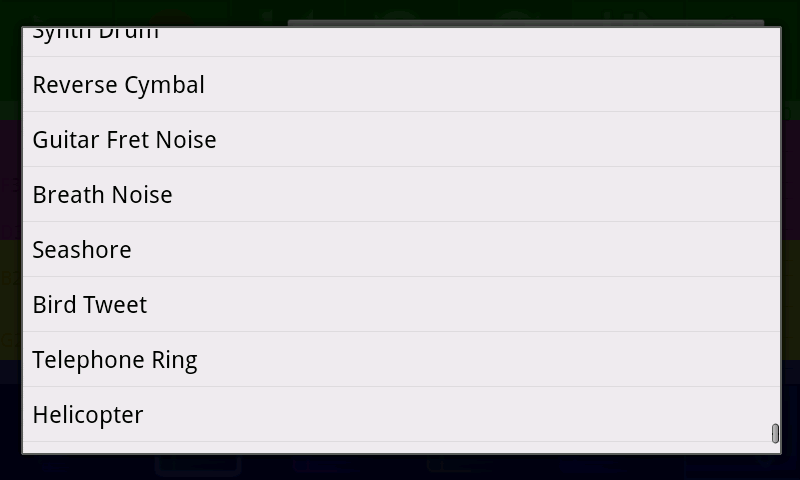
| The instrument menu allows the user to choose what musical instrument the track will be played as. | |
|
|
| ||
|
|
Implementation
"Describe the internals of your implementation, but keep the discussion on a high level. Discuss important design decisions you made in the implementation. Also discuss how implementation problems may have affected the usability of your interface."
...