...
Step 2 -* *User is not sure on exact specifics of picture, but has an idea of a picture, so they browse.
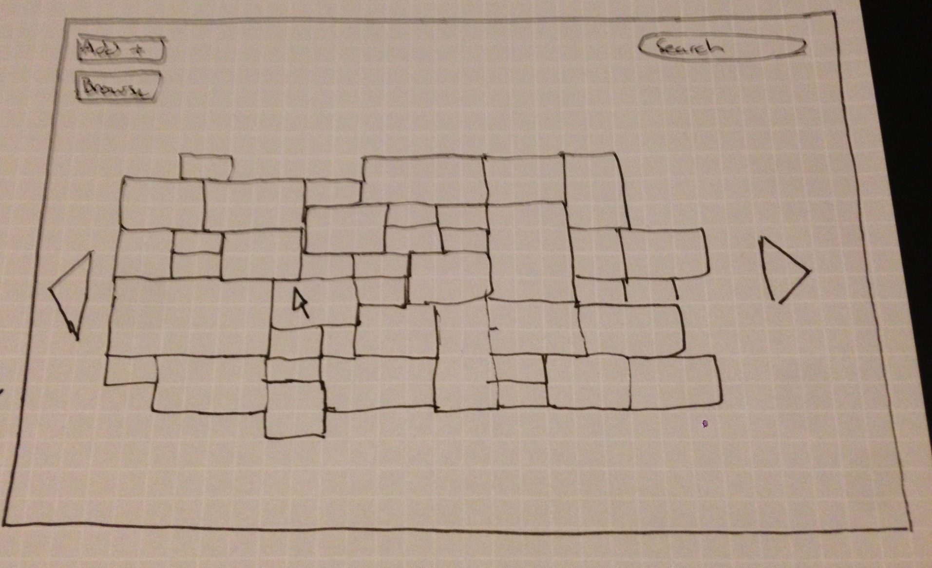
- Mosaic displays random pictures, which is fast for sorting and fun to view.
Step 2 -* *User is not sure on exact specifics of picture, but has an idea of a picture, so they browse. - Mosaic displays random pictures, which is fast for sorting and fun to view.
Design Highlights
- Grandparent carries out all actions through the interface of an “address book,” which contains clickable buttons corresponding to each contact. All mode of communication options (including adding a contact) appear as overlays on top of the address book, so that the address book is always in sight.
- Mode of communication is purposefully asymmetric to meet different needs. When grandparent sends voicemail, it is voice recorded on the grandparent’s side but sent as text/email to the grandchild’s side, to accommodate grandchild’s busy schedule.
Usability Analysis
- Design's overall theme is for someone who either has an idea for the content they want, but not a specific picture in mind, or they just want to browse for personal enjoyment.
- Home screen is designated for the
- Still allows for functionality of searching for specific content and adding new content (not pictured).
Usability Analysis
- Learnability
- Pros
- Simple interface in terms of few buttons on home screen. This allows the users to know precisely what they can do.
- Mosaic is catchy for the user. They are likely to hover over it with mouse, and learn more about its functionality.
- We need to use this opportunity to inform them in some way.
- Cons
- Some users might not understand the mosaic can move adding new pictures. Arrows try to convey this information.
- Pros
- Efficiency
- Pros
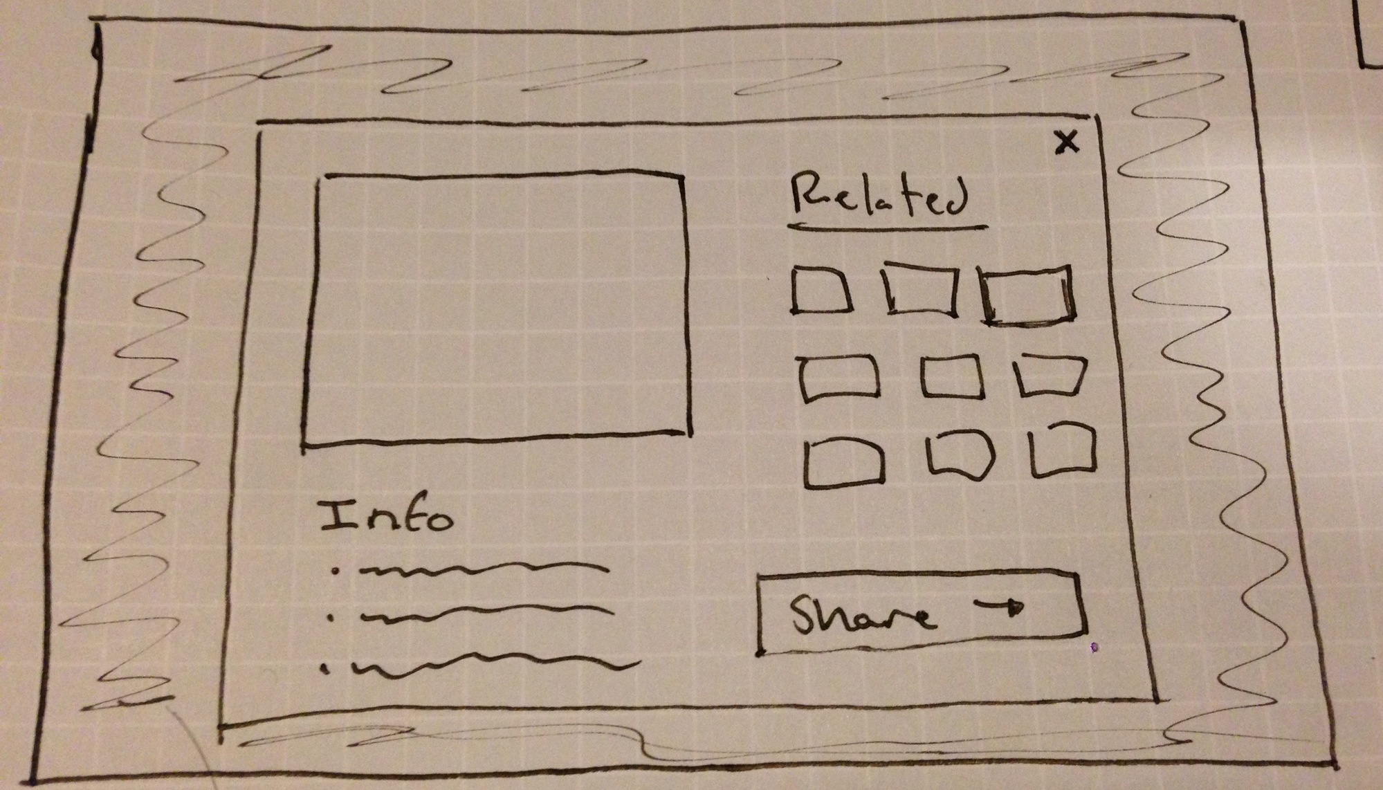
- Showing random pictures at varying sizes allows users to process a lot of data at once. Clicking on picture can get them to related pictures.
- Cons
- Overall process is geared towards browsing, which is inefficient if the user has a specific photo in mind.
- Pros
- Safety
- Pros
- Users are processing a lot of data at once, but it takes a click to actually learn more, not just a simple hover.
- Pressing escape or clicking outside scope of sharing/larger view window goes back to mosaic (easy to undo mistake)
- Cons
- Pictures are close together for the mosaic and user could potentially click on wrong photo
- Pros
- Learnability
- Pros
- Address book metaphor and mailbox metaphor together maintain some external consistency with grandparent’s existing method of keeping contacts, and thus lowers the learning curve.
- Cons
- Address book metaphor combined with dialing the desired contact may confuse a new user. In real life, one does not add to a paper address book by dialing the person’s number.
- Pros
- Efficiency
- Pros
- Grandparent never needs to type on the keyboard.
- Recording a voicemail is less time intensive than typing an email (provided the speech interface is easy to use).
- Younger family member receives voicemail as text, so can check message while doing other activities.
- Cons
- Grandparent must always go through a two-step process of selecting the desired contact before selecting the mode of communication (call vs. send voicemail).
- Pros
- Safety
- Pros
- Because the main page is never out of sight (all other functionality appear as overlays), cancelling an unwanted action is more visually intuitive; the “default” mode is always visible.
- Pros