...
Michael returns from his lunch break and logs on to `appname` to check up on his active repair jobs. He sees that he’s received a notification from Jenks informing him that Jenks needs fluorescent light bulbs for him to replace the lighting in the McCormick Date Room. Michael uses `appname`’s address book feature to find Home Depot’s phone number and then place a bulk order for replacement light bulbs. He then updates the light bulb task on `appname` to indicate he’s placed an order for the needed light bulbs and that the task should be ready to proceed tomorrow morning. While he’s on `appname`, Michael also goes ahead and processes the new repair jobs that have come in since the morning.
Storyboards:
Storyboard #1 (Gmail-esque):
Sketch | Design Description |
|---|---|
| House manager Michael McIntyre logs on to ‘appName’ and sees all of his repair jobs in the center pane of the main dashboard. Michael decides the “broken printer” job should have a higher priority than where it is currently listed (at the end of the ‘New’ section), so he clicks and drags the event to the top of the ‘New’ section using the drag-and-drop affordance at the left of the repair job listing. (This prioritization is key not only for house managers so that they can more easily find important information about repair jobs but also for mechanics so that they know which jobs they should attend to first. The key here is that house manager prioritization affects the prioritization in the mechanics' view.) Next, Michael decides to assign the “broken lightbulbs in the penthouse” job to his mechanic, Jenks. He clicks on the job, which is then highlighted, and more details about the job appear in the right pane of the dashboard. |
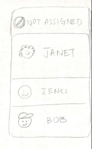
| Michael can use the ‘Assignment’ area at the bottom of the right pane of the dashboard to assign the job to a worker. At first the worker picture is blank, and the drop down list says “Job not assigned”. Michael clicks on the drop down list arrow, sees a list of all his workers, and chooses “Jenks J”. The blank picture is now replaced by a photo of Jenks, and an “Assign” button appears which Michael can push once he is ready to assign the job. |
| Jenks J. the McCormick Hall mechanic gets to work that morning. He logs on to ‘appName’ and notices on his dashboard (very similar to the house manager’s dashboard) that he has some new repair jobs assigned to him. (In essence, a mechanic’s dashboard focuses on presenting to the mechanic the new, active, and recently completed repair jobs assigned to that particular mechanic as opposed to presenting all repair jobs.) He notes down the jobs assigned to him in a notebook and heads out to complete the jobs. (Note: Same screenshot is used as Michael M.'s dashboard since UIs are very similar.) |
| Jenks realizes that he needs more light bulbs in order to repair the lights in the McCormick penthouse. Each repair job has an update log that Jenks uses to record a new update; specifically, Jenks uses it to note that the job’s progress is being blocked because he needs more light bulbs. He submits this update by filling in a text description of the update, specifying the type of update via a dropdown menu, and then clicking ‘Add Update’. |
| When House Manager Michael McIntyre returns from his lunch break, he logs back into ‘appName’ and notices (in the top-left corner of his dashboard) that he’s received a notification. He clicks on the notification alert to bring up a dropdown menu of notification summaries. He sees from these summaries that Jenks needs more light bulbs to proceed with the McCormick penthouse repair job. |
| So Michael McIntyre uses ‘appname’’s Address Book feature to bring up a searchable, filterable list of contacts and their contact information. He filters through the contacts by clicking the ‘Electrical’ Tab, finds Home Depot’s phone number, and then places a bulk order for light bulbs. |


Usability Evaluation
Learnability
+ The dashboard is externally consistent. It is similarly designed to Gmail and other task management systems.
+ The dashboard has a natural mapping. The newer jobs are at the top of the screen, ones in progress are in the middle of the screen, and ones that are completed are at the end of the screen. This layout follows the progress of a request job from start to finish; it moves down the screen as it gets closer to completion.
+ ‘appName’ has many affordances: scrollbars for seeing more jobs than currently on the screen, texture dots for dragging/dropping, button that says “Assign” next to a specific mechanic’s name to assign him to the job.
+ ‘appName’ offers feedback. Low-level feedback includes: when a cursor moves over a job or when the user selects a job, the job line is highlighted; when a user selects a particular filtering tab, that tab becomes highlighted. High-level feedback includes: when the manager assigns a job to a mechanic in the right-side pane, the mechanic’s name appears in the “assignment” area of the lists in the center pane.
+ In terms of interaction styles, ‘appName’ uses direct manipulation (drag/drop) and menus/forms (checkboxes, notes). These interaction styles are preferable to command language.
- The drag and drop feature for moving jobs around to change their priority may not be easily apparent. Since the interface is similar to Gmail and Gmail does not have the feature of physically moving emails around on the screen, the user may not look for this feature in ‘appName’. Also, the texture dots are small and we don’t currently have a way of making this feature obvious when the user sees the dashboard for the first time.
- There is currently no way for the user to seek help (no manual, no search bar for typing in problems and searching for solutions).
Efficiency
+ Search bar and filter tabs allow users to quickly find the specific repair job details they need at any given moment.
+ The dashboard chunks repair jobs into 2-3 groups (‘New’, ‘Active’, ‘Recently Closed’) of 4-7 jobs each. This makes it easier for users to parse and mentally manage the repair job listings on their dashboards.
+ The update log for each repair job also only presents at most 2-3 messages at once so that the updates are easily mentally manageable.
+ The design mostly (if not completely) features pointing tasks to the exclusion of steering tasks, which are far less convenient than pointing tasks (by Fitts’s law).
+ Frequently-clicked widgets (search bar, search button, address book button, sign out button, job completion button, etc.) are large for easier pointing and thus enhanced clickability.
+ Text areas for adding updates to a job’s update log use fragile defaults/pending deletes.
+ Application supports aggregation of multiple job listings for more efficiently executing operations over multiple job listings.
- Targets for selecting a job listing (via checkbox) and/or declaring a job listing as important are small, which detracts from easier pointing/clickability.
- There are a considerable number of pointing tasks in this user interface, but the targets for these pointing tasks can be quite far apart. This detracts from interface efficiency.
- We haven’t discussed adding command-based shortcuts to our application just yet. This detracts from efficient application use as well as detracts from making the application accessible to hard-of-seeing users.
- Search bar may not implement autocomplete for more efficiently searching through repair job listings.
- Defaults (e.g., automatically prioritizing repair jobs for users or automatically assigning certain jobs to certain mechanics) may not be provided to users, which hinders efficiency for commonly repeated tasks.
Safety
+ User interface will provide low-level feedback as to where in the dashboard, at any given moment, a dragged job listing will be dropped if a user lets go of the mouse at that moment. This helps users drag-and-drop job listings to the appropriate locations.
+ User interface provides low-level feedback when a House Manager user assigns a job to a given mechanic (e.g., by displaying the picture of the mechanic chosen) so that the House Manager can quickly realize if s/he is about to assign a repair job to the correct mechanic.
+/- Job assignments have to be undone by manually selecting a new mechanic (or None) to the job. This is not as efficient, however, as a command-based undo functionality.
- We haven’t discussed whether quick undo functionality (even one-level undo) will be implemented for undoing dragging-and-dropping of certain repair jobs to a new ordering/location. In general, we haven’t thoroughly discussed most undo functionality.
- Since we haven’t discussed whether this application will be mobile-friendly, it is possible that mechanics may not remember all the jobs they have to complete. (There’s no way for them to portably carry their dashboard wherever they go.)
- We haven't discussed yet whether a comment that the user is writing will somehow be saved in the case that the user mistakenly selects another repair job before he presses the “Update” button to add the comment to the update log.
Storyboard #2 (Drag and Drop):
Sketch | Design Description |
|---|---|
| Michael is able to log into the app and see all of the new and unassigned jobs right away. They are ordered by time at which they came into the system. He is able to take basic action on them such as combine duplicates, resolve or close already completed job, and assign them to a particular worker. In order to combine duplicates, jobs may be dropped into each other or there may be check boxes for group processing. Not shown in the image, there will be a quick and easy way to close a job which may have already been done by the time the job was seen by Michael. Finally, jobs can be dragged and placed into a particular worker’s list. Michael can also see the jobs assigned to that worker that have not been closed. |
| When Jenks, the house mechanic, logs into the app he is able to see the jobs assigned to him. Instead of being ordered by timestamp, his jobs are ordered by priority which is editable by Michael, the house master. Jenks can quickly take action by resolving the task. For many reasons he wishes to see more info on a job. He can do this by clicking more info. |
| The view for more information shows all details for a given job. This includes information such as the reporter, time reported, location, full description, etc. Additionally, there is a way to comment on the specific tasks. When Jenks realizes that there are no more light bulbs, he writes a note which automatically notifies anyone following the task (in this case, it would be Jenks and Michael). |


Usability Evaluation
Learnability
+ ‘appName’ has many affordances: scrollbars for seeing more jobs than currently on the screen, texture dots for dragging/dropping.
+ In terms of interaction styles, ‘appName’ uses direct manipulation (drag/drop) and menus/forms (checkboxes, notes). These interaction styles are preferable to command language.
+ In terms of interaction styles, ‘appName’ uses direct manipulation (drag/drop) and menus/forms (checkboxes, notes). These interaction styles are preferable to command language.
- The drag and drop feature for assigning jobs and changing their priority may not be easily apparent.
- There is currently no way for the user to seek help (no manual, no search bar for typing in problems and searching for solutions).
Efficiency
+ Ability to quickly assign jobs to specific workers.
+ Grouping assigning possible
- It is hard to search for a given task. While there is no evidence from needfinding that Michael needs to search new/existing tasks, he may wish to be able to search through resolved tasks.
Safety
+ User interface will provide low-level feedback as to where in the dashboard, at any given moment, a dragged job listing will be dropped if a user lets go of the mouse at that moment. This helps users drag-and-drop job listings to the appropriate locations.
- The user may accidentally assign job to worker that was not intended. It may be possible to offer an undo feature to allow a user to quickly assign the most recent task (undo the most recent action).
- The user may accidentally close or resolve a job. In this case, the undo feature would be most useful. Otherwise, the user would have to manually go into resolved jobs and reopen it.
Storyboard #3 (Illiterate/Graphically intensive):
Sketch | Design Description |
|---|---|
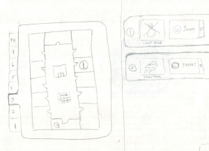
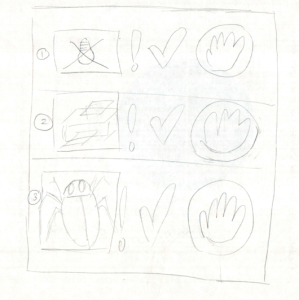
| Sketch 1: Home Page |
| Sketch 2: Drop down Menu |
| Sketch 3: Address Book |
| Sketch 4: Mechanic’s View |

Usability Evaluation
Learnability
+ Easy to view problems associated with one particular floor since all of the jobs associated with one floor will show on the same task list.
+ Icons should be relatively distinct so that the users for the most part have an understanding. For example, the plumber can be described with a faucet symbol.
- Difficult to navigate to the jobs that are on various floors. For example, if there is a problem on the 4th floor, the user would have to navigate to the fourth floor tab and click on it to find the particular floor.
- Difficult for House Manager and Mechanic to initially understand what the symbols mean despite the fact that they should be graphical. Some symbols/icons sometimes have multiple meanings so the individual might be confused initially.
Efficiency
+ Great for the mechanic if he/she needs to scan every floor and determine which tasks are crucial before actually going to that particular floor.
+ The mechanic usually in charge of a particular building will be the default mechanic who the House manager can assigned which will make it easier for the house manager. He will not have to select to a different House Manager.
- Time consuming to have to navigate to every single floor and decide what tasks need to be addressed.
Safety
+ It will be easy for the house manager to correctly change the mechanic if he/she has assigned the task to the wrong person since Mike will just have to select a different person to do the task.
+ The profile pictures of the mechanics and outsider contractors will be useful for the House Manager because he/she will be able to confirm that the name selected is the one that he/she has reached out to before.
Individual Designs:
Anurag
...