Note: We created two separate designs for user testing, one which took a more user-friendly approach and another which focused exclusively on efficiency. After the first round of testing (which consisted of three music directors and an "elf" from the radio station) we dropped the design which focused on efficiency and merged the best design concepts from both into a single design. Because we ran each user in the first round on both designs (we counterbalanced so that an equal number of users started with either design) there was a significant learning and preference bias (the tasks remained the same across the two designs, therefore users were more comfortable by the time they tried the second design). This may have been an influence on the users' unanimous preference for the second design they were presented with. Nonetheless, we found it a useful exercise to use multiple designs in our first round of testing, since many details from both designs are found in the present design.
Prototype Photos

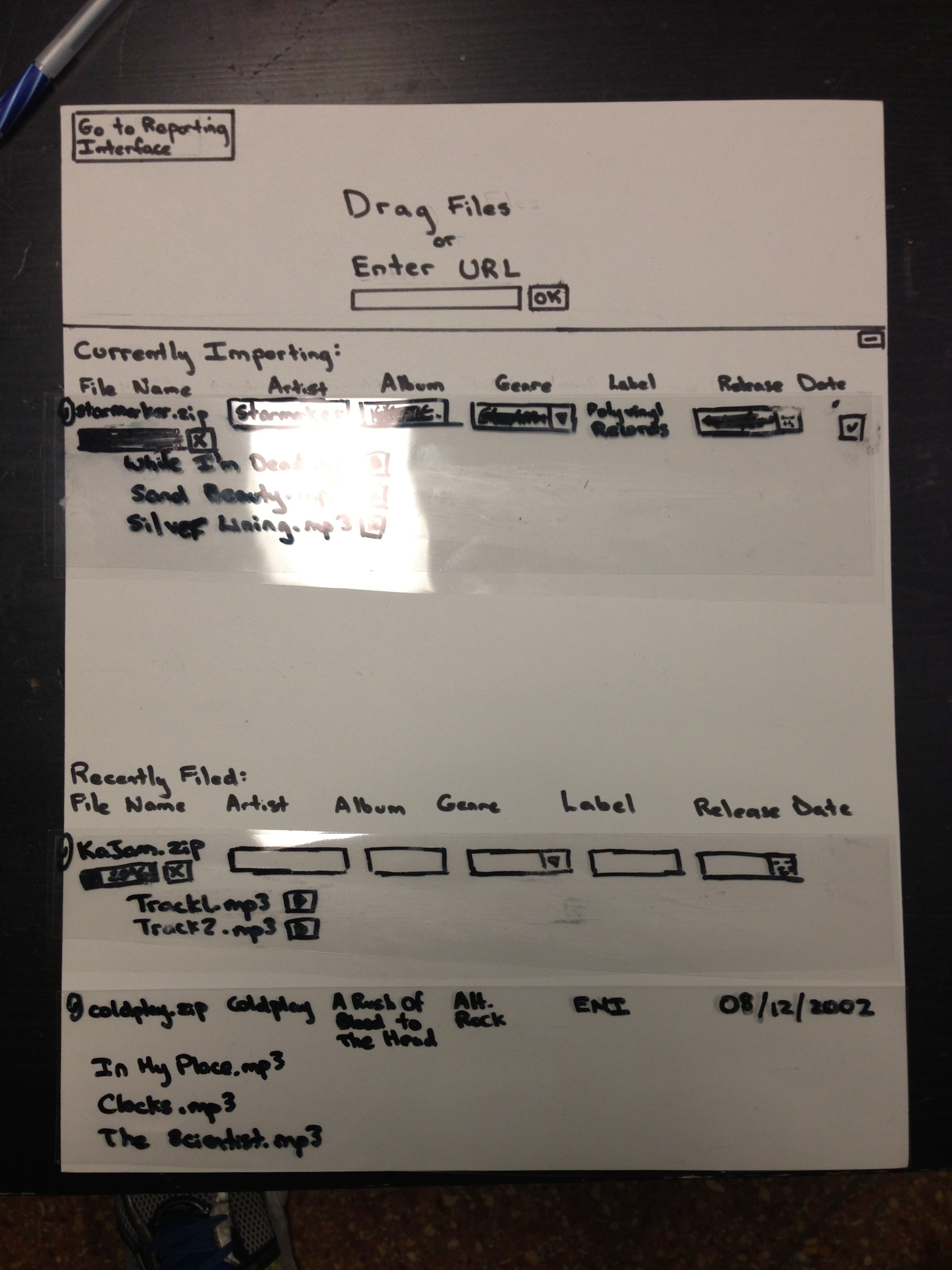
| v1.0 of user-friendly implementation
The user has drag/dropped two files from the desktop onto the interface and the files have begun uploading to the system.
|

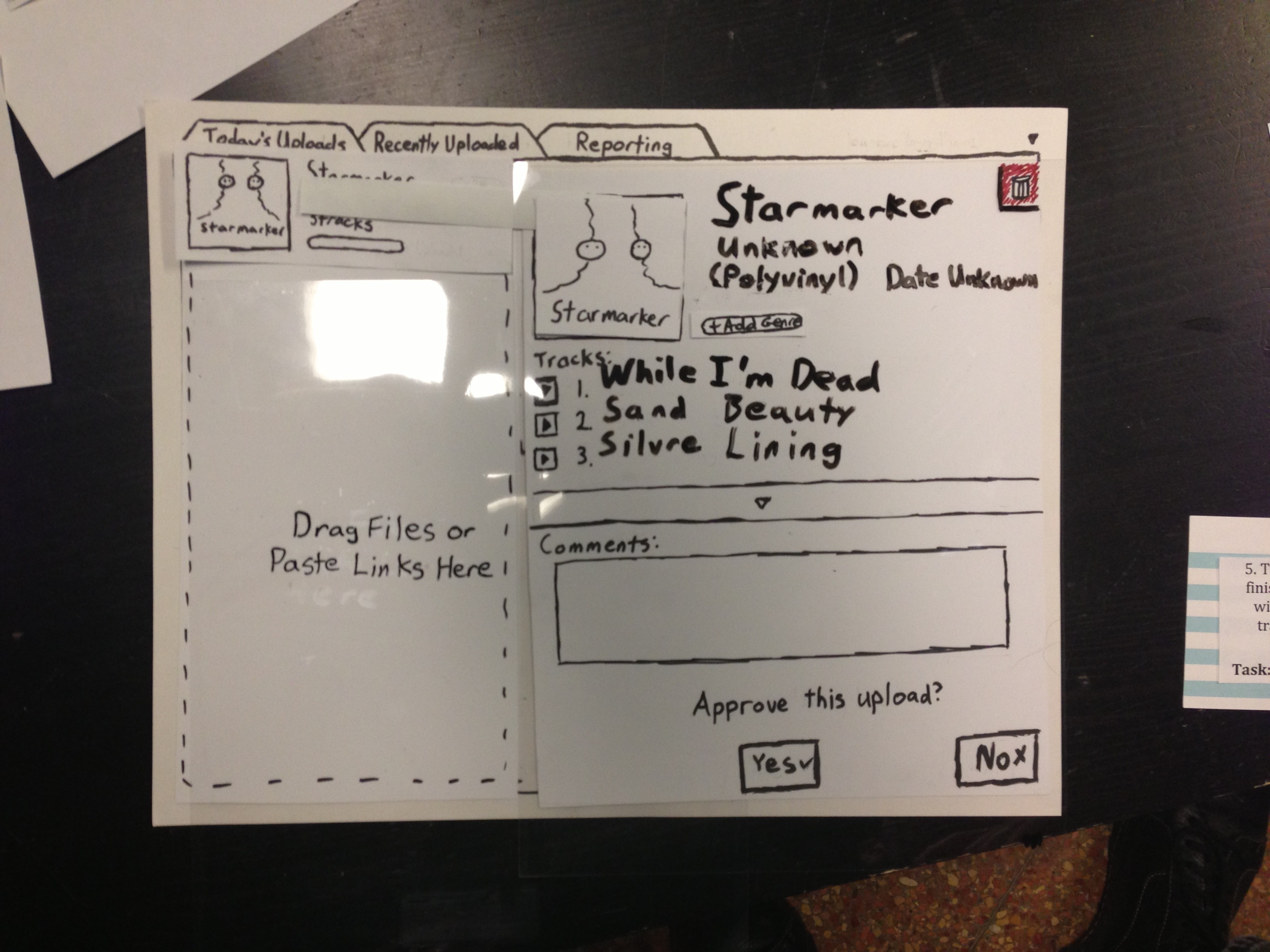
| v1.0 of user-friendly implementation
The user has clicked on one of the uploading albums and sees the detailed album view with cover-art. Each field on this page is editable (the field highlights on a mouse hover and turns into a text-box on click).
|

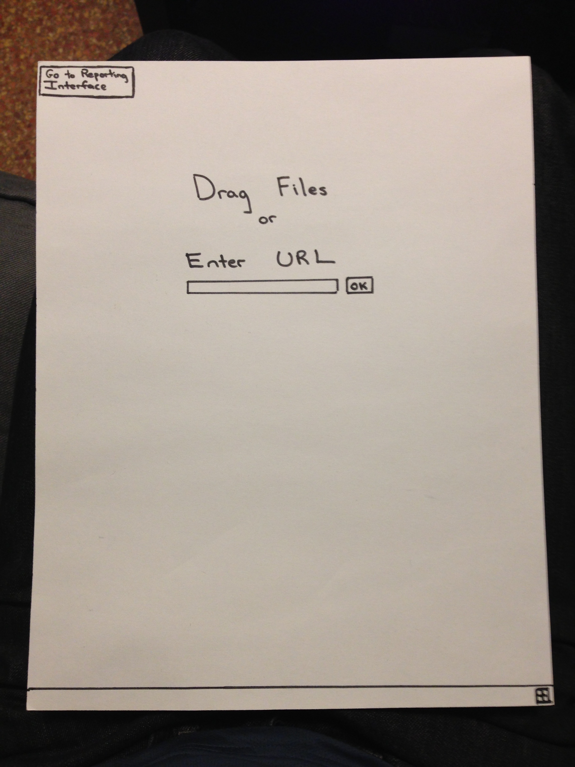
| v1.0 of high-efficiency implementation
The main screen that shows up on loading. The "+" button at the bottom manually brings up the list of uploading albums and previously uploaded.
|

| v1.0 of high-efficiency implementation
An album (starmarker.zip) has completed uploading and is ready to be approved (and filed) into the playback system.
|

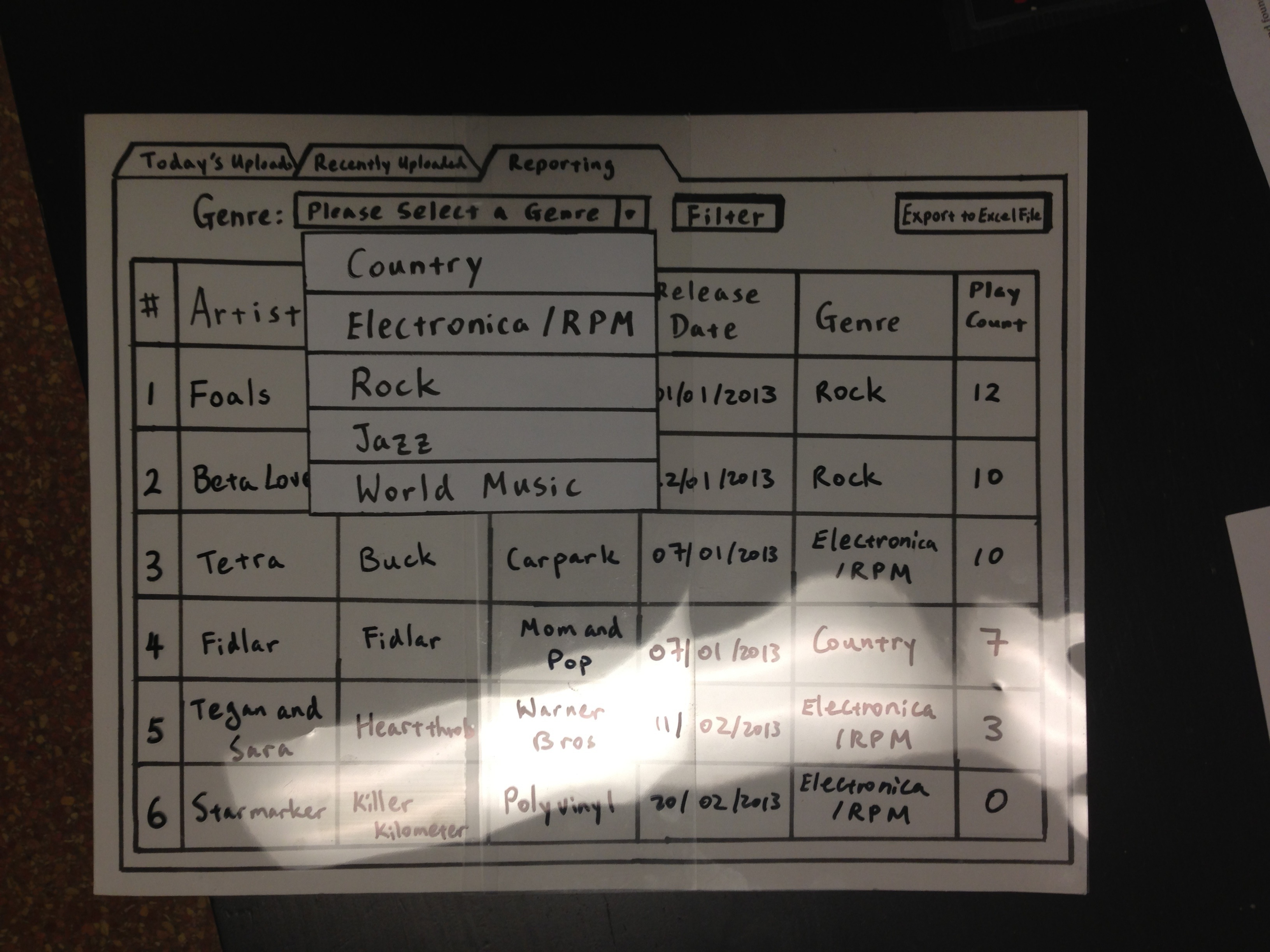
| v1.0 of reporting interface (both aforementioned v1.0 implementations use the same reporting interface)
Currently with no filtering selected, all albums are being shown.
|

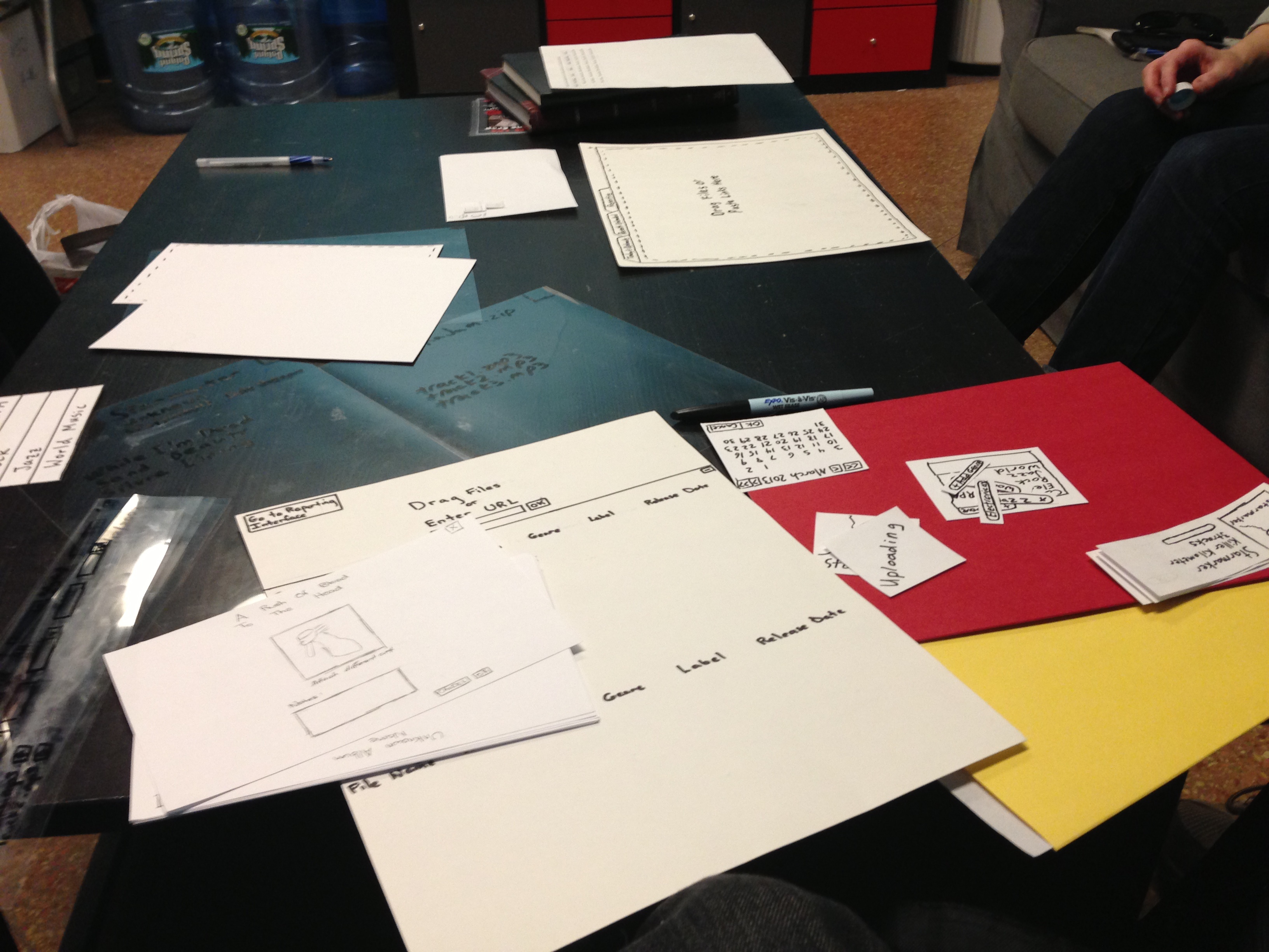
| One of the user testing sessions at the WMBR studio.
|

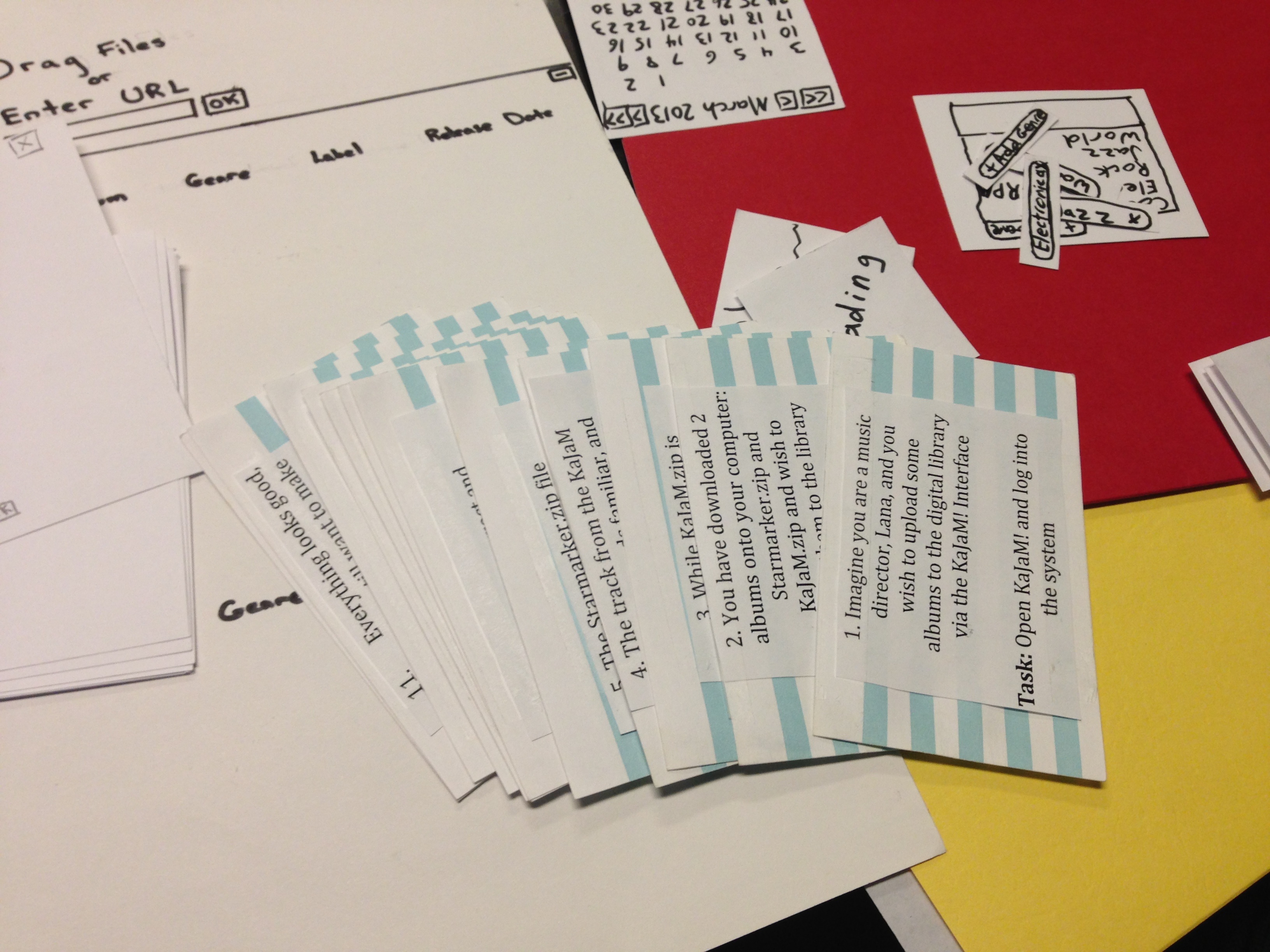
| Some of the interface widgets and task cards used.
|

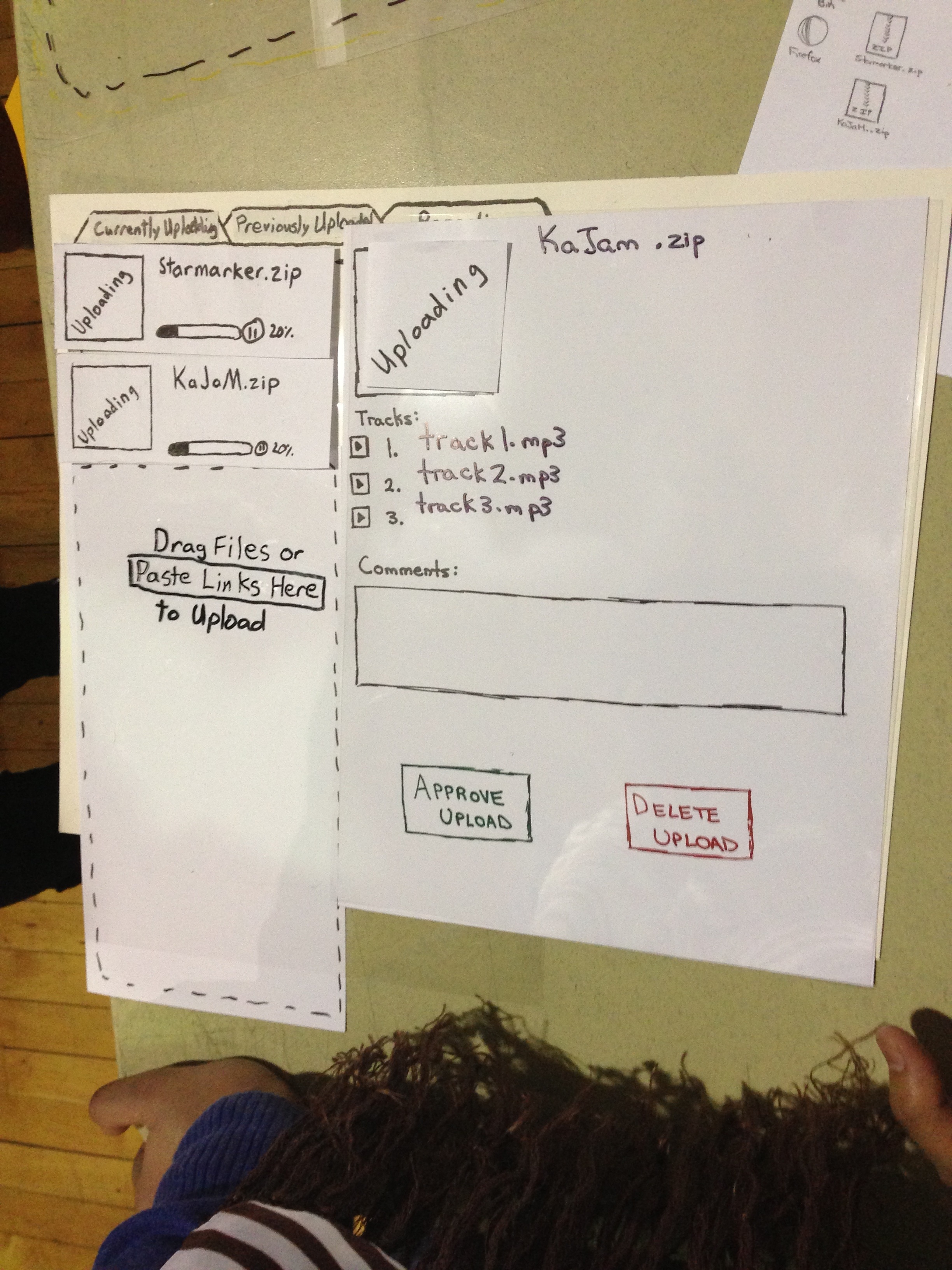
| v2.0 of our merged implementation
Notice the pause button by each upload progress bar, the clear approve/delete buttons for the album (and the removal of the trash bin icon previously in the top right corner), and the re-wording on the upper left tabs for clarity. Changes not seen include a screen hover on dragging files over the interface (an entire gray-out screen blankets the screen and says "upload"), a highlight on hovering over any editable fields (including the tracks, which then allow editing of artists on individual tracks), and other minor changes. Other forthcoming changes include being able to delete single tracks (also using a hover over track affordance) and a clear visual cue that uploading albums can be clicked on to see specific album information.
|

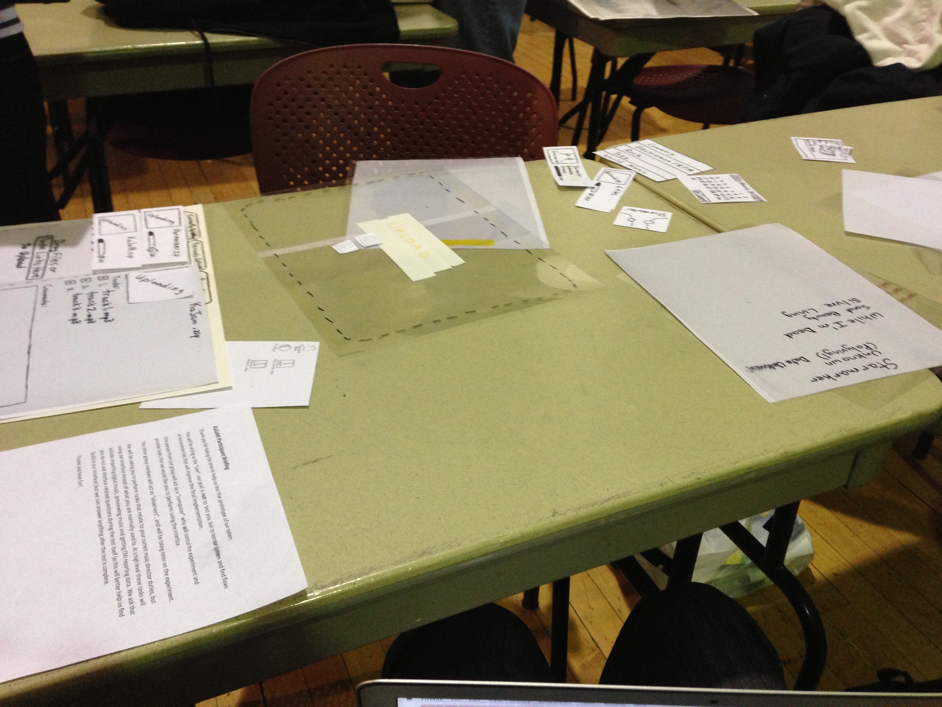
| A view of the testing session on Monday March 18th.
|

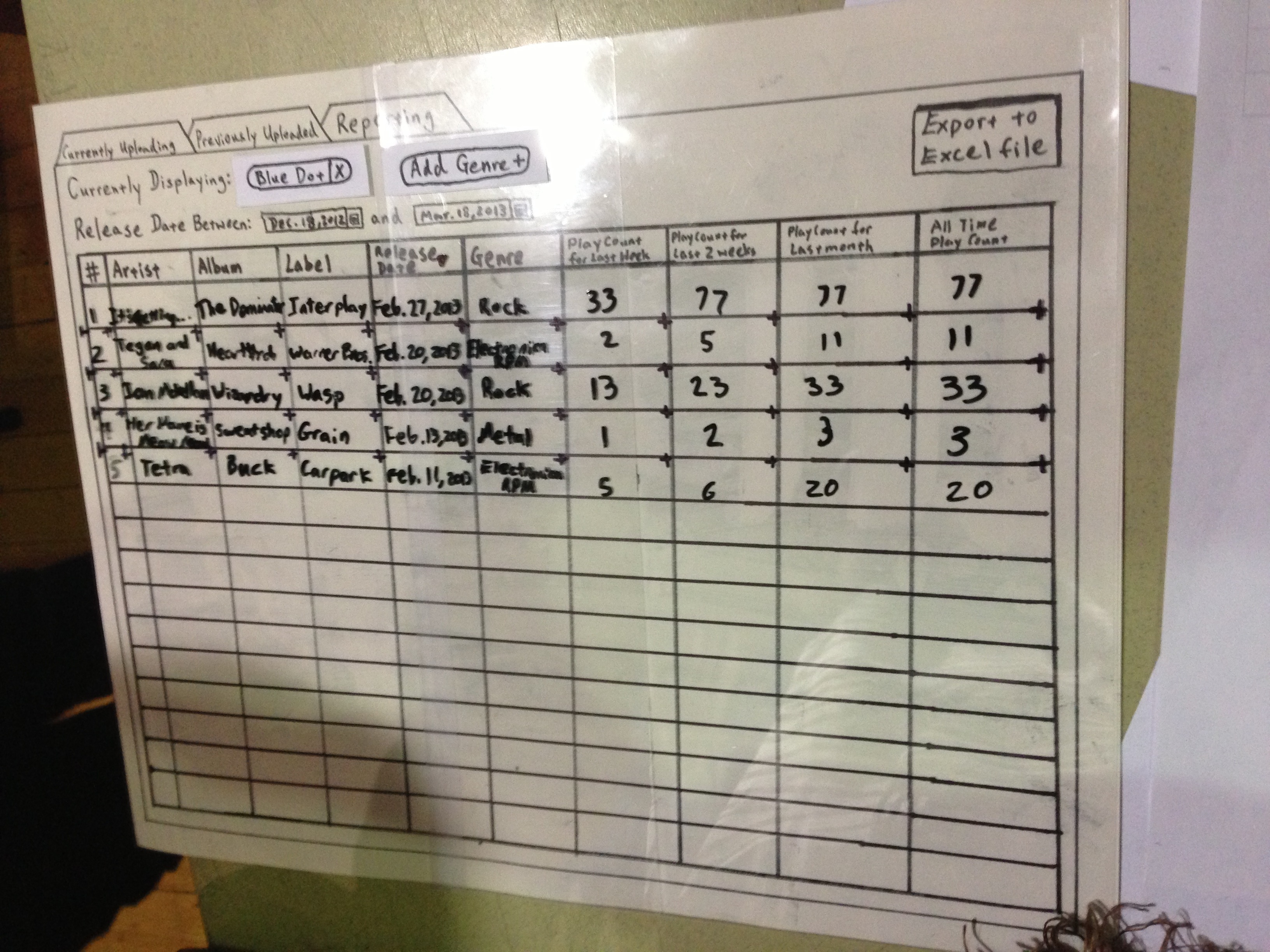
| v2.0 of reporting interface
Notice the Piazza-like tagging for genre filtering (allowing flexible genre additions as well as multi-selection filtering), release date range filter, and additional playback count columns (for easy sorting between commonly used date ranges). Note that there were several transparencies made for both versions of the reporting interface to reflect changes in filtering and when clicking on one of the playback count headers (which sorts by play count in descending order).
|
...

