...
| Anchor |
|---|
| Second Iteration |
|---|
| Second Iteration |
|---|
|
Second Iteration
| Anchor |
|---|
| Prototype Photos II |
|---|
| Prototype Photos II |
|---|
|
Prototype Photos
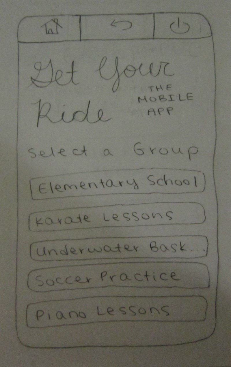
Our revised interface consists of five tabs: "Join a Carpool," "Pending Groups," "My Carpools," "Next Date," and "Swap Dates."
...
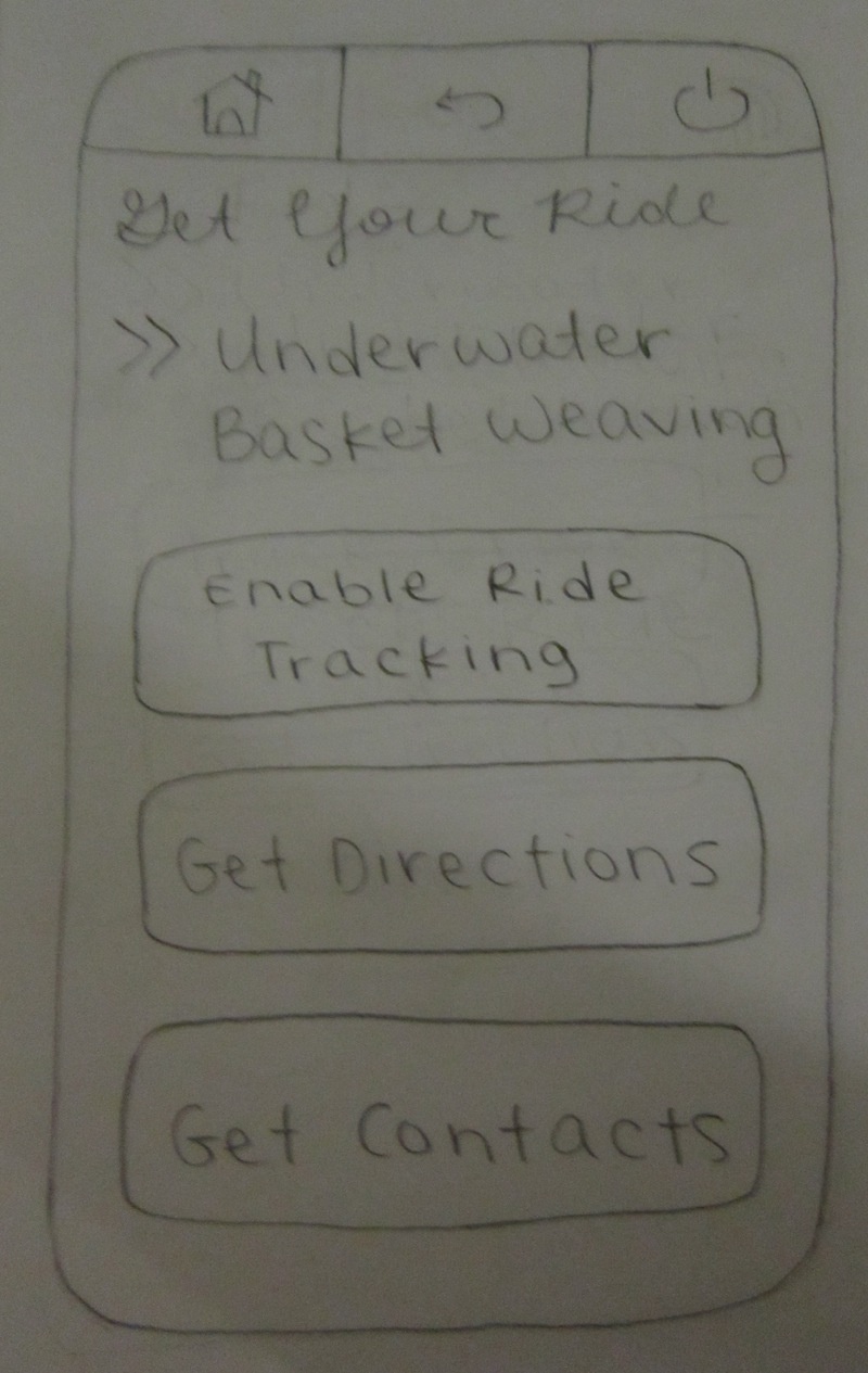
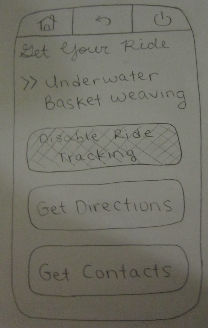
For Task 5, the workflow is exactly the same as that of the first iteration prototype. The only change was the labels on the buttons.
| Anchor |
|---|
| Observations from User Tests II |
|---|
| Observations from User Tests II |
|---|
|
Observations from User Tests
To protect anonymity, we will refer to our three testers for this round as User D, User E, and User F.
User D
Task 1
Task 2
- The user selected the "My Carpools" tab instead of the "Next Date" tab because he was reading from left to right and saw "My Carpools" first.
- He then viewed his full schedule and realized that he needed to check his next date, so he navigated to the "Next Date" tab.
- He thought that something like the next date feature should also have been included in the "My Carpools" tab as well.
- He remarked that the "Next Date" tab seemed very intuitive to him.
...
- The user found the interface very intuitive but had questions about how we would implement it. He was simply asking out of curiosity, rather than offering criticism.
User E
Task 1
Task 2
- The user did not notice that the task had mentioned confirming the date, so it took him a significant amount of time in order to locate the confirm button. However, the user thought the interface was very intuitive otherwise.
...
- The user found the interface intuitive, and did not have much to say about what could be improved here.
- He thought that there could be more information displayed at all times. Although we wanted to keep the interface simple in order to communicate the information well, we may choose to add more navigable activities.
User F
Task 1
Task 2
- The user liked the highlighting done to the tabs they thought they would be frequenting, such as "Next Date" and "Swap Date." The user would have liked to see more information in the full schedule, such as which parent was driving which day.
- He also mentioned that the tab for next date should have some small indication of when that next date is.
- He asked about the “+” buttons on the map after the fact, and liked the idea, but stated that there should be an intuitive way to display all of the driving directions at once, like Google Maps would, but for multiple destinations.
...
- Like other testers, the user completed the task easily and did not much to say here. He just asked if there would be more functional activities for the mobile app.
| Anchor |
|---|
| Round 2 Analysis - Additional Usability Problems |
|---|
| Round 2 Analysis - Additional Usability Problems |
|---|
|
Round 2 Analysis: Additional Usability Problems
| Anchor |
|---|
| Learnability II |
|---|
| Learnability II |
|---|
|
Learnability
- For some users, highlighting "Next Date" might not be enough; perhaps it should be the default tab.
- One user noted that the driving directions interface should more closely resemble Google Maps.
| Anchor |
|---|
| Efficiency II |
|---|
| Efficiency II |
|---|
|
Efficiency
- There should be a shortcut to "Next Date" from "My Carpools."
- One user noted that we could display the next date without necessarily requiring the user to visit the tab. We could implement a tool tip here.
- The date swapping interface for agreeing to swaps should not be divided between an acceptance step and a date selection step. It should all be in one place.
- As in Round 1, users in this round also wanted more information to be shown on the calendar. Perhaps syncing with Google Calendar would solve this problem.
Safety
- We originally decided not to include the names of the people responsible for the swap dates in the swapping interface because we thought it would be irrelevant and we wanted to maximize efficiency. However, most users wanted that information to be revealed.