...
These tasks all relate together so he can put them altogether under one task in DormMate. Joseph is able to quickly get through the first two tasks but now the room has to be cleaned by a janitor on his staff. Joseph send sends an email to Ahmed alerting him to the current situation. He tells the staff to notify him when the room has been cleaned. The next day the room is cleaned and Joseph is able to send a confirmation to the student saying that he is now able to move in on his own time. Card access is given to Ahmed, and the desk workers are also notified that Ahmed is allowed to move in. Ahmed takes a full week before finally packing his stuff and moving in. It's a good thing the desk workers have DormMate because during the week they had forgotten that Ahmed was allowed to move in, but the information was easy to look up. The student picks up his new room key and is on his way. Through DormMate, the desk worker checks off the subtask so that Joseph and the rest of the desk workers know that the task is completed.
...
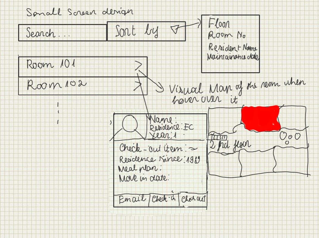
View Room: This view show the alternative view of the floor plan of all of the above design. When the user over over each room, it will display the small section of the floor plan where the room located with some useful information. If the user clicks on the room, it will display the detail information of the room such as dimension, current residence, check-out item, etc.
Daniel Martelly
Sketch | Comments |
|---|---|
| The idea behind this design was to have all information and tasks focused around the room number. A user can see the history of a room in the hopes that the user may notice a pattern behind repairs indicating a more serious problem. In addition, when the user wants to initiate a new task, the user can click one of the new task buttons which will take them to a form which will be partially completed with default information based on the room. |
| This design splits the screen into 3 columns. The first column is mostly static. Depending on the selection made in the first column, the second column populates with the appropriate information. The same thing happens between the second and third column. |
| This is meant to be a small screen stretch. On this single drawing, there are 3 columns for 3 different pages that a user would use. There would be some sort of dashboard/home page which summarizes the most important information. Possibly, users may want to track particular tasks, and these tasks would always be present on the dashboard for quick access. Users can then go to a page dedicated for a particular category of task. These pages contain a list of all the tasks which can be selected to see the details. In order to add a new task, users would scroll down to the bottom of the page and begin filling out a form that is already there (no need to click an additional link). |
...


