...
Storyboard and Designs
Design 1
Sketch | Comments |
|---|---|
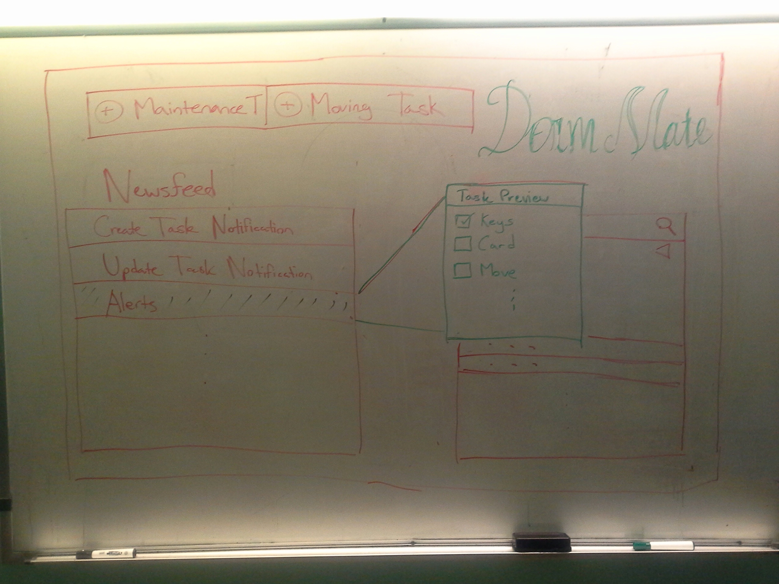
| Home PageOn this page, users can see recent activity in the form of a news feed and a complete list of tasks which is searchable and can use filters. When users click on tasks from either box, a preview pop up comes up. This pop up contains a small preview of the task with the greatest focus being on a checklist of subtasks to be completed. |
| Creating a TaskWhen creating a new task, users fill out a form on the left side of the screen. Although not shown here, the form should include a checklist at the bottom which can be expanded to add new subtasks as necessary. The right hand side of the screen is meant to contain easy access to information that is typically relevant to the given task. |
| Floor PlanThe floor plan is used to give a general overview of each floor. Using color coding, users will be able to efficiently see which rooms are vacant and occupied and which rooms have pending maintenance or moving in/out tasks. |
|
|


Design 2
Sketch | Comments |
|---|---|
| Main screen: This the design incorporate the idea of having a compact web page where the user can find most of their information on this page. The page is divided into three layer with the left most contains all of the notifications of the new update/alert and the tasks that still left to be done. It also have the option of the user to start a new task which will be displayed in the second layer.The second layer will contains the form to let the user fill out the important information quickly and send it to all of the party involve.The third layer will contain the relevant information where the user can refer to in order to get his tasks done easily such as looking up the list of vacant room, schedule a clean up date for a room, view the floor plan, etc. |
| Floor plan: This floor plan is more compact and also display different information in each room than the previous floor plan. There is also list view of the room on the right hand side for searching. The room matches the search criteria will be highlighted for visual effect. |


Design 3
Sketch | Comments |
|---|---|
| This design is for viewing on the mobile phone which is very common for busy person like house manager. This applies the idea of CRUD learning in the lecture. There are three separate screens:
|
