R3 - Paper Prototyping
We did 2 1.5 round user-testing on Monday. The original design is based off the dual panel concept. We took the feedback on Monday and designed and tested an additional UI over the break.
...
Here is the briefing we gave to users: Purpose of application: To explore the food options safely using our menu.
- You are a "chicken vegetarian", someone who is a vegetarian, except that you eat chicken.You are also allergic to peanuts
...
3. You realize today is a special day(permitted by your religion) so you want to eat burgers.
...
In last iteration, we feel confident enough to drop task 1, and only ask the user to find an item that he can safely eat.
Design and Photos for Prototype 1
The original prototype is based on the dual panel concept. It consists of two main windowstabs, one to manipulate restriction, and one to manipulate the dishes.
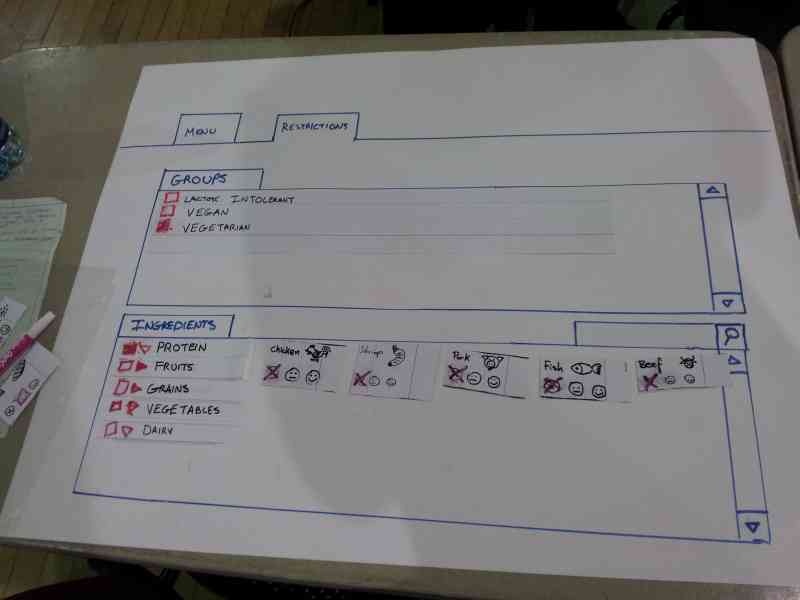
The idea behind this prototype is have the user select his restrictions and preferences first in the ingredient tab, then move onto the menu tab where the items will be filtered by his ingredient choices.
The photo above shows the user restricting all the meat by selecting the group "vegetarian" from the groups.
After the user made his ingredient choices, he will navigate to the menu tab and select the menu items:
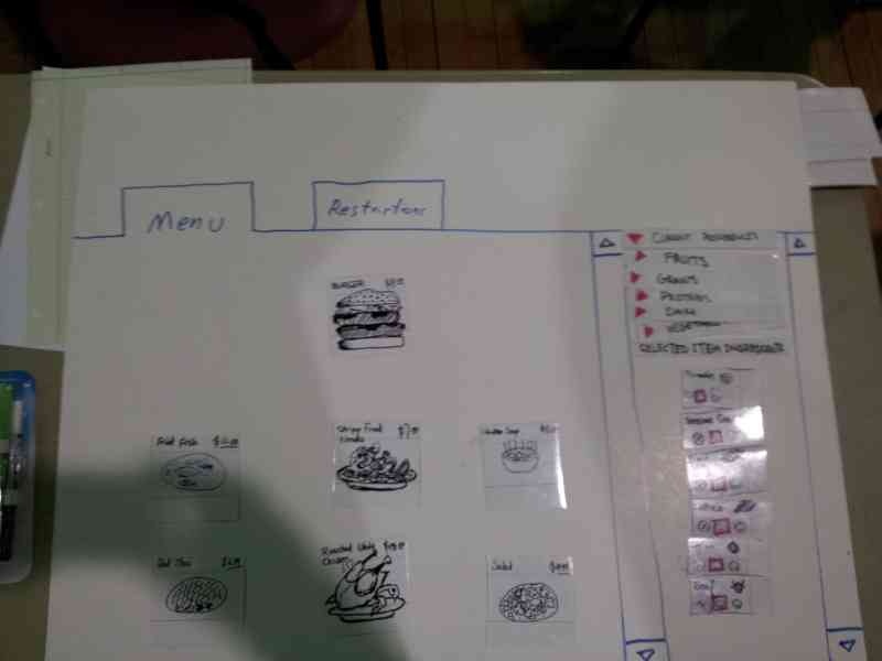
Here the user is selecting burger as the menu item. All the ingredients of the burger is shown in the right panel to inform the user what's in the burger. We kept a list of current restrictions on the right also, as a safety reminder what is currently restricted.
Feedback for Prototype 1
- Restrictions
- Unclear whether checking item 'includes' or 'excludes' it
- Item preference selection inconsistent between 'restrictions' menu
- 'Partial checkbox' for partially-restricted item groups is unclear
- Some food categories were obvious (chicken is obviously under 'protein'), some were not (is 'peanuts' under grains?)
- Users appeared to understand that checking an 'item group' meant checking everything beneath it
- Right-pointing arrow to indicate 'folded accordion' was well-understood
- Does not know how to proceed to menu items after completing the restriction
- Groups
- Not clear if checking 'vegetarian' is reversible
- Some users simply selected 'vegetarian' and did not attempt to 'de-select' chicken
- Item browsing
- Not clear at first that this is *not* an ordering system, just a menu system
- Not immediately clear what selecting 'happy face' did (reordered preference list, moved preferred items towards the front)
- One user wanted to be able to 'dislike' food; not sure if that would cause even more confusion
- Use of 'neutral' face to indicate lack of restriction/preference is confusing; suggest happy face (and excited face for preference)
- Some users thought X/neutral face/happy face meant 'amount of ingredient in food'
- User are not sure how to deselect an item.
In conclusion, the users are seriously confused by what ingredients are restricted and what ingredients are preferred.
Prototype photos - Round 2
Design Sketch -

PaperPaper-prototype - (Evan add your photos)
...
- Ignore the "preference" option and focus on the restriction - to avoid confusion.
- Put the restriction and the menu on the same page - improve visibility, enable direct manipulation
- Add switch language Button - to overcome language barrier issue.
- Add registration option / Save button, in case the user wants to build a profile - Improve efficiency .** If the user click the save button, she sees a sign-up/login page, which enable her to save the restrictions to her account .
- Strike through the ingredient when it's checked/clicked, also change the color of the chosen ingredient to red - add visual cue to the chosen restriction ingredients.
- Use small user-friendly pop-out window, while darkening the rest of the page - To let the user to check the ingredients more thoroughly. ** small window contains: ** with list of full ingredient ** input field for possible special instructions *** a big green "Add item" button,
- Add " Your Order" column. - Let user review what has been saved**
- When user add an item, it will show up on the "Your order" column.
- Show price for each item, and also show subtotal,tax and total price.
- Remove option (a red cross icon) shows up when an item is clicked.
- Add a green button for pick-up option.
- Add a deliver button for deliver option.
- Order will be temporally saved to profile.