...
Here the user is selecting burger as the menu item. All the ingredients of the burger is shown in the right panel to inform the user what's in the burger. We kept a list of current restrictions on the right also, as a safety reminder what is currently restricted.
Feedback for Prototype 1
We tested this interface on 4 users, and kept a detailed list of all problems, retyped below.
- Restrictions
- Unclear whether checking item 'includes' or 'excludes' it
- Item preference selection inconsistent between 'restrictions' menu'Partial checkbox' for partially-restricted item groups is unclearSome food categories were obvious (chicken is obviously under 'protein'), some were not (is 'peanuts' under grains?)
- Users appeared to understand that checking an 'item group' meant checking everything beneath it
- Right-pointing arrow to indicate 'folded accordion' was well-understood
- Does not know how to proceed to menu items after completing the restriction
- Groups
- Not clear if checking 'vegetarian' is reversible
- Some users simply selected 'vegetarian' and did not attempt to 'de-select' chicken
- Item browsing
- Not clear at first that this is *not* an ordering system, just a menu system
- Not immediately clear what selecting 'happy face' did (reordered preference list, moved preferred items towards the front)
- One user wanted to be able to 'dislike' food; not sure if that would cause even more confusion
- Use of 'neutral' face to indicate lack of restriction/preference is confusing; suggest happy face (and excited face for preference)
- Some users thought X/neutral face/happy face meant 'amount of ingredient in food'
- User are not sure how to deselect an item.
...
Of all the issues, these issues seem to be the most severe:
- Users are seriously confused by what ingredients are restricted and what ingredients are preferred
...
- Many user are hungry, and started by selecting many items that he prefers, only accidentally restricting them all due to the confusion between restriction and preference
- Users are confused how to proceed from ingredient tab to the menu tab
Designs and Photos for Prototype 1.5
Taking the feedback for prototype 1, we quickly added in a few changes to the original design, and try to address some of the severe issues 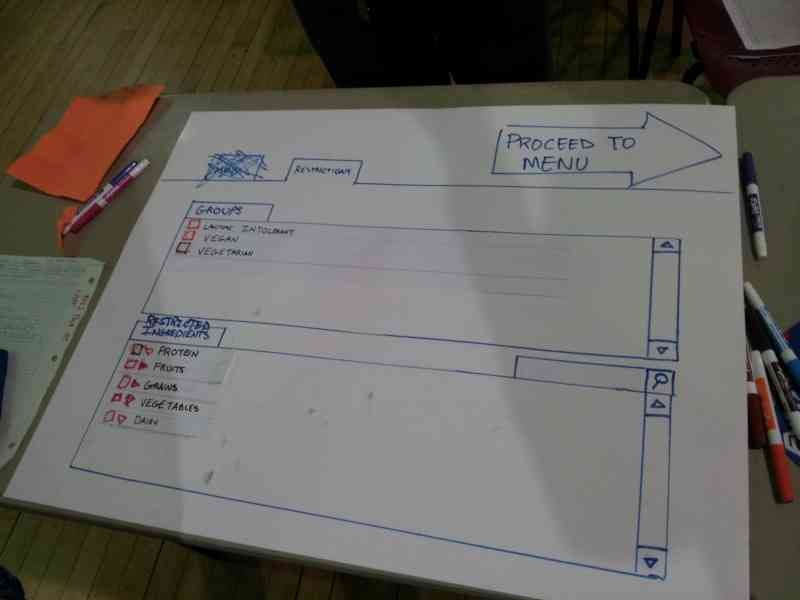
We first removed the tabs for "menu" and "ingredients" for more linearity of the user's progression. Instead, we put a large arrow on the upper right corner that states "Proceed to Menu", to give the user a clear sense of progress. 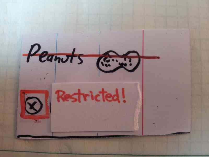
We then modified the restriction selection to emphasize that a certain item is restricted. By showing the word "restricted" and striking through the item. 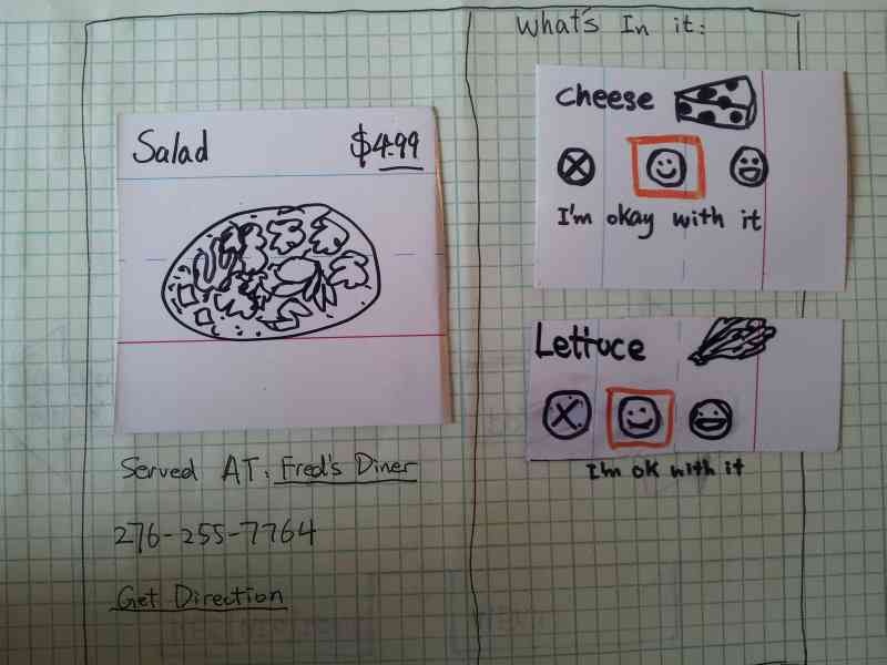
We improved the menu item by adding in the resturant's name and phone number, and also an address so the user have a sense of when to stop. Notice we also moved the ingredients for the menu item from the right panel to directly next to the menu item, so it is clear that these ingredients are in the dish, providing extra safety. We also tried to address the "don't care" face by adding the text "i'm okay with it"
Feedback for Prototype 1.5
- Restrictions
Prototype photos - Round 2
Design Sketch -
Paper-prototype - (Evan add your photos)
Observations from Monday's User-Testing
Total number of users tested: 6
User testing observations (1st Round)
- Restrictions
- Unclear whether checking item 'includes' or 'excludes' it
- Item preference selection inconsistent between 'restrictions' menu 'Partial checkbox' for partially-restricted item groups is unclear
- Some food categories were obvious (chicken is obviously under 'protein'), some were not (is 'peanuts' under grains?)
- Users appeared to understand that checking an 'item group' meant checking everything beneath it
- Right-pointing arrow to indicate 'folded accordion' was well-understood
- Groups
- Not clear if checking 'vegetarian' is reversible
- Some users simply selected 'vegetarian' and did not attempt to 'de-select' chicken
- Even in the ingredient section, user seems to have trouble keeping track of what is currently restricted and preferred
- User still has some issues understanding the effects of "vegetarian".
- Item browsing
- The restricted items in the browsing section is not shown prominently, the user does not know why a certain menu items don't appear
- the user has trouble de-selecting a restriction, having to go back and forth between the ingredient page and the menu page
- Not clear at first that this is *not* an ordering system, just a menu system
- Not immediately clear what selecting 'happy face' did (reordered preference list, moved preferred items towards the front)
- One user wanted to be able to 'dislike' food; not sure if that would cause even more confusion
- Use of 'neutral' face to indicate lack of restriction/preference is confusing; suggest happy face (and excited face for preference)
- Some users thought X/neutral face/happy face meant 'amount of ingredient in food'
- User are not sure how to deselect an item.
Paper-Prototype Iteration (2nd Round) - Revisions
- Unify preference/restriction editing menu
- Instead of X/neutral face/happy face, use 'disgusted' face/happy face/excited face
- Use clearer categories than 'grains/fat/protein' (where are peanuts?)
- Drop check-box interface entirely
- Perhaps preserve 'restrict all' button?
- Use same interface for 'edit
- Clarify how to switch between menu and restrictions
- Big, eye-catching arrow
- 'Directional' for consistency; the menu is to the 'right' of the preference restrictions
- Remove ability to edit 'generic' preferences from menu viewing; only list selected items. Decrease UI clutter
- Using 'leading' phrases to indicate what to do: "what can't you eat?", etc.
- Add 'undo' button to indicate actions are reversible; grayed out when no actions are possible
...