...
- Restrictions
- Some food categories were obvious (chicken is obviously under 'protein'), some were not (is 'peanuts' under grains?)
- Even in the ingredient section, user seems to have trouble keeping track of what is currently restricted and preferred
- User still has some issues understanding the effects of "vegetarian".
- Item browsing
- The restricted items in the browsing section is not shown prominently, the user does not know why a certain menu items don't appear
- the user has trouble de-selecting a restriction, having to go back and forth between the ingredient page and the menu page
...
Some Brainstorm Ideas for Prototype 2
- Unify preference/restriction editing menu
- Instead of X/neutral face/happy face, use 'disgusted' face/happy face/excited face
- Use clearer categories than 'grains/fat/protein' (where are peanuts?)
- Drop check-box interface entirely, as vegetarian and different other diet groups confused the user during testing.
- Perhaps preserve 'restrict all' button?
- Use same interface for ' edit
- Clarify how to switch between menu and restrictions
- Big, eye-catching arrow
- 'Directional' for consistency; the menu is to the 'right' of the preference restrictions
- Remove ability to edit 'generic' preferences from menu viewing; only list selected items. Decrease UI clutter
- Using 'leading' phrases to indicate what to do: "what can't you eat?", etc.
- Add 'undo' button to indicate actions are reversible; grayed out when no actions are possible
Prototype 1.6
We came up with a quick sketch trying to address some of the ideas we discussed 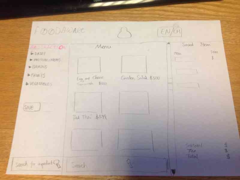 Modified Revisions - (Wei added / feel free to edit)
- Ignore the "preference" option and focus on the restriction - to avoid confusion.
- Put the restriction and the menu on the same page - improve visibility, enable direct manipulation
- Add switch language Button - to overcome language barrier issue.
- Add registration option / Save button, in case the user wants to build a profile - Improve efficiency .** If the user click the save button, she sees a sign-up/login page, which enable her to save the restrictions to her account . Strike through the ingredient when it's checked/clicked, also change the color of the chosen ingredient to red - add visual cue to the chosen restriction ingredients.
- Use small user-friendly pop-out window, while darkening the rest of the page - To let the user to check the ingredients more thoroughly. ** small window contains: ** with list of full ingredient ** input field for possible special instructions *** a big green "Add item" button,
- Add " Your Order" column. - Let user review what has been saved**
- When user add an item, it will show up on the "Your order" column.
- Show price for each item, and also show subtotal,tax and total price.
- Remove option (a red cross icon) shows up when an item is clicked.
- Add a green button for pick-up option.
- Add a deliver button for deliver option.
- Order will be temporally saved to profile
Designs and Photos for Prototype 2
After more thoughts and discussions, mainly on whether the system should handle ordering and deliveries (we decided against it to have a tighter focus), we come up with prototype 2.