Rocket Science - GR3
| Table of Contents |
|---|
...
First Iteration: Pictures
This is the picture of our first prototype:
...
- In the Artist Search mode, two out of three users did not use the drop-down filter for artist selection. We realize that the drop-down menu looks small, so we increase its prominence and position.
- In the splash screen help message, all three users did not seem to notice or click the ‘Lets Go’ button. We fix this by animating the help sequence, and changing the ‘Lets Go’ button to ‘Click here to Begin!’.
- We have a ‘Smart-resize’ function which automatically resizes the gallery images based on their preference when users select images they like (these fly into their inkBox). However, two out of three users were initially bewildered as to what was going on, but they actually soon realized that the images were being resized. We believe this can be solved by animating the resize in-place. In order to make this less bewildering, we improved our initial help message, and we add a “Turn off Smart Resize” checkbox.
- All three users seemed to be slightly confused about the different modes of our application in the top right buttons. For example, there was confusion with “Browse Gallery” and “Find My Preference” - two users said aloud that they did not know immediately which to click and simply clicked to find out what each button leads to. In order to make it explicitly clear that each button uses a different mode, we changed these buttons into tabs instead and this will make the modes much clearer and further cleans up the interface. Lastly, the Login/User Profile page was also confusing (two out of three users were not sure if it was a popup or not), so we incorporated it as our third tab.
- All three users commented that they wanted more details in the Artist Profile, such as contact information. One of them tried to click the address with the hope of getting a map. We improve this by adding more contact information in the artist’s profile.
- Two out of three users were not sure what to do with the Analysis results. We therefore change the wording of the results given in the analysis, to explicitly say that the results are based on the selections of the user in his inBox and are just meant as a suggestion.
- Only one out of three people used the ‘inkBox’ button. We think that this will be less of a problem in real life by making it animated. Also, we make it more noticeable by adding an obvious floating rectangle around it to separate it from the rest of the page, and improve the visibility of our welcome splash help message.
Wiki Markup All three users think that the *front page (login page)* which had 3 options was confusing. We therefore simplify it into two options: \[Login\] and \[Browse as Guest\]. We use one button “Begin Exploring” in the Browse as Guest part. This leads the user directly to the Gallery mode of our interface, along with the splash help screen to guide them along.
Second Iteration: Pictures
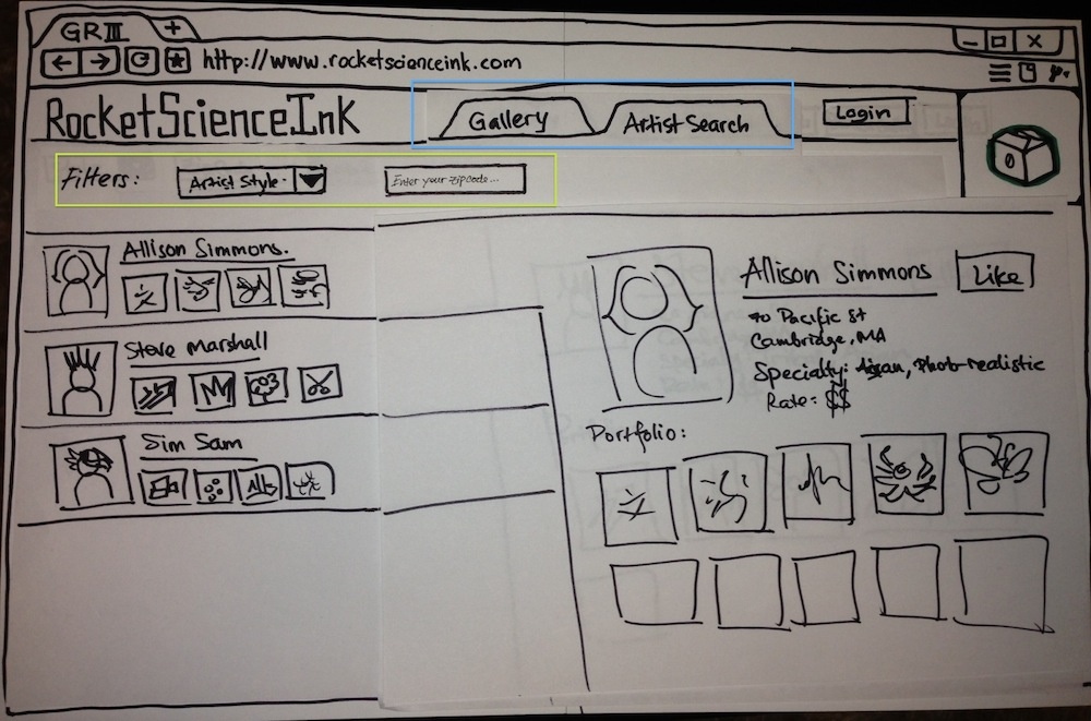
The new Artist Search interface. Notice the tab interface (blue box) to prevent mode errors and the more visible filters (yellow box).
...
...
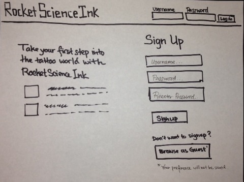
The improved SignIn or SignUp page. The user is now presented with a more conventional login page. The user can choose to either login, register, or browse as guest on this page.
...
User Testing Result in the Second Iteration:
...