| This is an overview of the homepage of the patient app. It shows the user (patient) the pills events he is yet to
take to take today, with the ones in red indicating that he has passed the time to take the drug, and the ones in yellow
indicating yellow indicating that the drug is yet to be taken in the future. The navagitation bar on the top can lead you to other
sections of the patient app, such as "Manage Pill" (editing pills), "See History" (see the list of medicines the
patient has already taken or missed), and "contact doctor" (allows the user to communicate directly with the
doctordoctor. By default, the homepage only shows the drugs the user needs to take today. If the user wants to see
more, he/she can click on "See next day's pill" to see future medicines. User can repeatedly click on this button to see more into the future.
From
Design Decision:
From the beginning we know that the major sections we need to have (edit pills, contact doctor, we want both functionalities of taking drugs and editing drugs, but we were not sure what's the most intuitive way to separate them. After several iterations we decided that the best way is to separate them entirely and having a "Manage pill" section for all the add, delete and edit. It still causes some confusion for the users, but in general patient can tell the difference between taking a drug and editing a drug. Also in order to enable multi-select, we used the checkbox for the user to select which drug/s to take or miss. It is not shown here, but when user click on the checkbox, a pop up box where show up giving user the option to take the drug or miss the drug. |
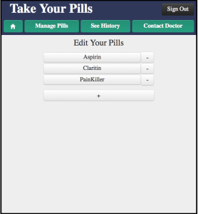
| This is the "manage pills" main page. From here the user can delete a medicine, add a medicine or click on a medicine to edit it.
| | This part is mostly unchanged from the start.
|
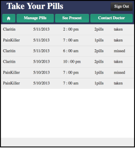
looks like the main page, but with not checkbox and colors.
Design Decision:
Initially we have red and green color on the history page showing the user whether he/she has missed or taken the drug, but we realized that the history page looked too similar to the main page, which caused confusion for the user. We then changed everything on the history page to gray.
|
 Image Added Image Added | This is the page will user edit the information of the drug. It is the same page the user needs to fill in to edit the drug.
Design decision:
We have three different type of drugs: those that are taken at certain hours a day; those that are taken every several hours, and those that are taken several times a day, with no restriction on specific time. We initially designed to have three separate pages, then we thought that having one page that switches among those three choices would be a better idea. The challenge is how to chose the wording for those three type of drugs that are clear and not redundant. After several user iterations, we decided on "set cycle", "set specific time", and "set number of times a day" and most user can understand it. | | |