...
Final Design | Description |
|---|---|
|
|
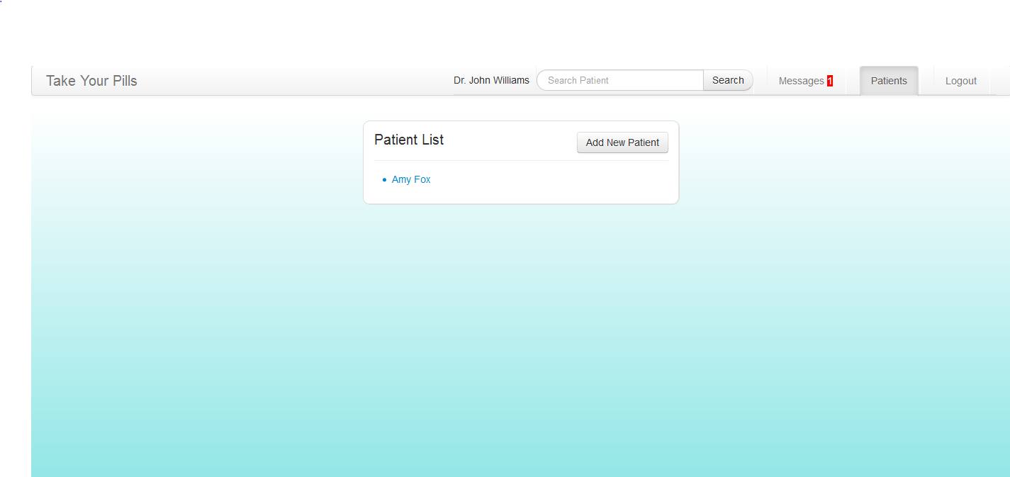
| This is the doctor's patients page that lists out all the connected patients. This page can be accessed through the navigation bar at top of the page. |
|
|
|
|
|
|

Implementation
Our interface frontend was implemented using HTML, Javascript, JQuery, and CSS. The patient app is especially unique in that most of it is dynamically generated which makes it very flexible in responding in real time to user actions (ie manage pills list, and drug events list). Only the top navigation bar is hard-coded. The doctor website also makes great use of twitter bootstrap so it looks a lot nicer and simple yet professional.
For the patient app, we worked really hard on the backend and I believe that our functionality is pretty solid. We used .json files to store patient, pill, drug events, and messages data. JQuery had a very easy read .json function and was really fast. Unfortunately, writing to .json files required some php work, and we quickly discovered that writing to .json is a lot slower than reading from .json. This especially was a problem when we wanted to write updated data to .json files and immediately read from .json to update visibly for the user. Because writing was a lot slower, reading would pull the old data before PHP had a chance to update the file.
We solved this problem by creating a JS object which would be synced with the data in the .json files on document.ready. Saving any data involves updating the JS object as well as the corresponding .json file. Thus, we can read from the JS object (since adding to the JS object is comparably fast), while our data still generally persists across multiple sessions (ie you can close the browser and re-login to our application) since it is written to the .json file as well.
The .json files also function as a shared database for both the patient and doctor app, so both patient and doctor can share messages as well as see the pills recorded by our synced 2-app system.
Evaluation
Briefing
Patient:
...
- The user started on the home page of the patient app. When asked to add a new pill, she was confused by and did not immediately understand that the rows on the home page were drug events. She saw "Manage Pills" but did not feel like it was something to go to to add a new pill. She thought maybe she was not on the home page so clicked on the top home button a few times (which did nothing since she was indeed on the home page..). She said she clicked on the home page hoping that the home page would give her a more high-level idea of how to use the app.** CATASTROPHIC: she did not know what page she was on. The app did not give her feedback at all.** MAJOR: "Manage Pills" did not convey what we wanted to convey. This naming issue has persisted since the first user prototypes where we tried "My Pills" and "Edit Pills" but always had some feedback with user confusion on what that encompasses.
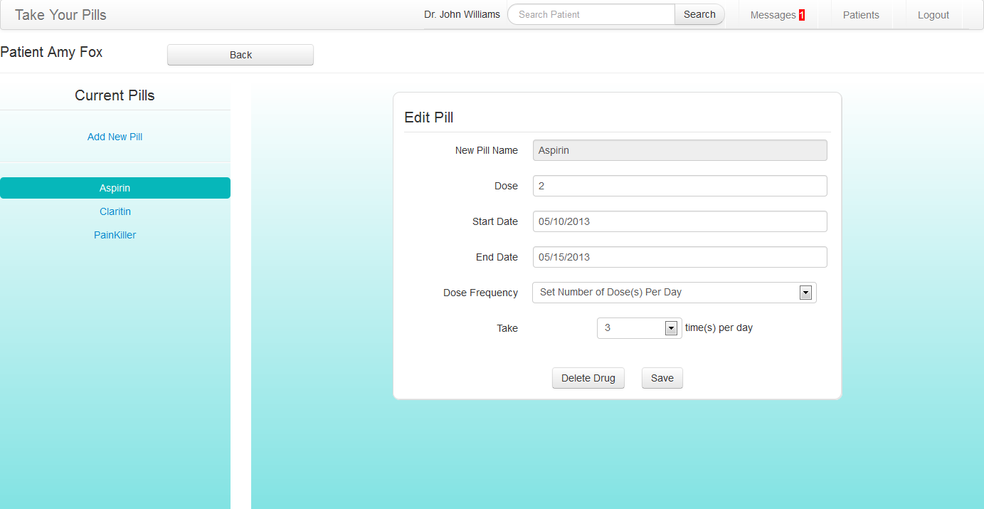
- When trying to remove a pill from the manage pills page, she clicked on the pill's button only to realize that it was to edit that pill. When she returned to the manage pills page, then she discovered the "-" button next to that pill and deleted it correctly.** MINOR: Maybe we should color the button (say bright red) so that the delete button is more intuitive and stand-out.
...
- When updating an existing pill, the user feedback that says "pill updated" was in color red, so user was at first alarmed thinking that she might have accidentally deleted it, because previously when deleting a pill, a red user feedback said "pill deleted."** MINOR: Color "pill updated" differently, not red. Maybe green? or blue?
- User would have liked the send button on the messages page to be able to work via pressing "enter."** MINOR: Consistent functionality with other standard UI's.
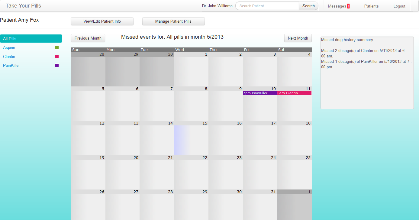
- User was confused why when adding a new pill, the info did not show up in the calendar. User did not realize that the calendar only showed missed drug events.** MAJOR: Our interface does not clearly or intuitively indicate the functionality we wanted to share with users.
- User would have liked to see some info of each drug on the calendar page.** (just a suggestion for additional features)
Reflection
Our group spent a lot of time and effort designing the look of the user interface and really went into the details of the app. How should a user take a drug? How should the user design a drug? How many messages should the user be allowed to send to the doctor everyday? These are the questions we spend a long time discussing but I think it's worth the time to do it, because those are the key decisions to make for a good user interface.
...