...
Doctor
Final Design
| Description |
|---|
 | | 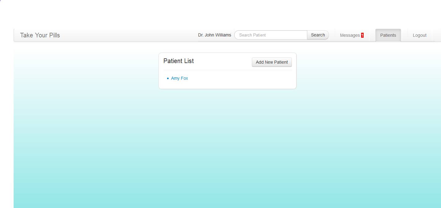 Image Removed Image Removed
| This is the doctor's patients page that lists out all the connected patients. This page can be accessed through the navigation bar at top of the page.
|
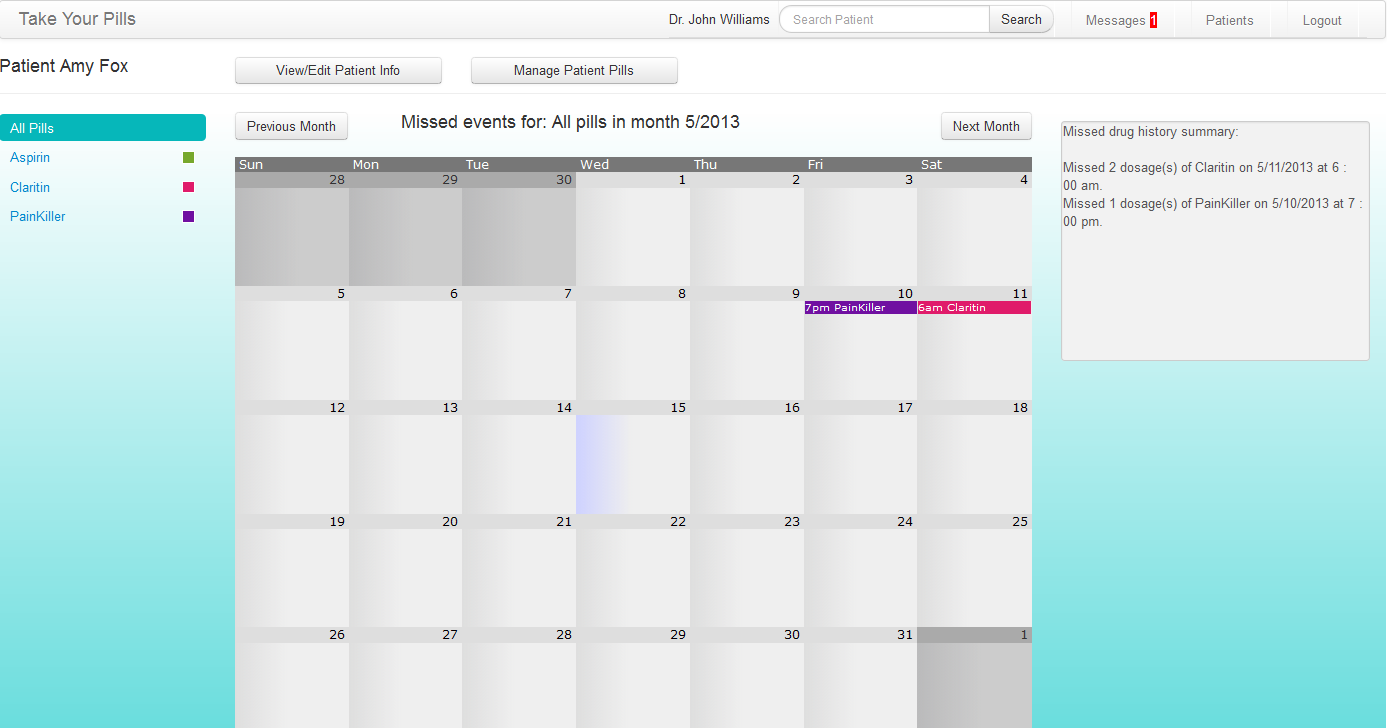 Image Removed Image Removed
| |
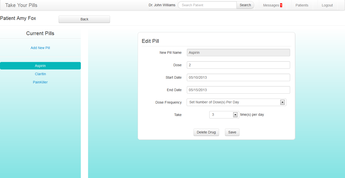 Image Removed Image Removed
| |
page that will first show up after the doctor logged in. This page displays all the message history from patients and allows doctors to send messages back to patients. Doctor can read messages from different patients by switching the tabs on the left. Unread messages will be shaded in a darker gray than rest of the messages.
Design decision:
The design for this page has not changed much since our original design. Because our main purpose for this website is to allow doctors to receive immediate feedback from patients, we decided it’s most important to show the messages first after doctors log in. In our final implementation, we added in the new shading for unread messages and also the new message counter in the navigation bar to provide more feedback to the users. |
Image Added
| This is the doctor's page that lists out all the connected patients. This page can be accessed through the navigation bar at top of the page. Users can add new patient on this page or click a patient’s name to access the patient’s personal pill history page.
Design decision:
In our original design, there is no page that showed a list of patients. Instead, the navigation bar presents an “Add patient” tab that leads directly to adding a new patient. The only way that doctors can access a patient’s personal pill history page is by searching the patient’s name in the search bar. In our user testing, many users found this to be very unintuitive and had trouble finding patients’ pages. Therefore, we decided to create this page to list out all the patients. |
Image Added
| This is a patient’s pill history page that shows all the missed pill events in a dynamic calendar. Doctors can look at a particular pill or all the pills at once. A summary of the missed events is also listed on the right of the calendar in text format to provide more details. Doctors can also go to pages where they can edit patient info and manage patient pill through this page.
Design decision:
This page originally only shows information related to missed pills. In our user testing, some users suggested that they should also be allowed to go to patient editing and pill managing pills from this page for easier navigation. This page almost became the patient’s personal page where every functionality related to that patient can be accessed through this page. |
Image Added
| This is the page where doctors can manage a patient’s pills. Doctors can add, edit or delete a pill on this page and all pill information is synchronized between the patient’s mobile app and the doctor’s website.
Design decision:
The design for this page has not changed since the original design. It’s important for the doctors to be able to access and manage the patients’ pill information. This also allows doctors to help patients who are not very familiar with technology to enter their pill information. |
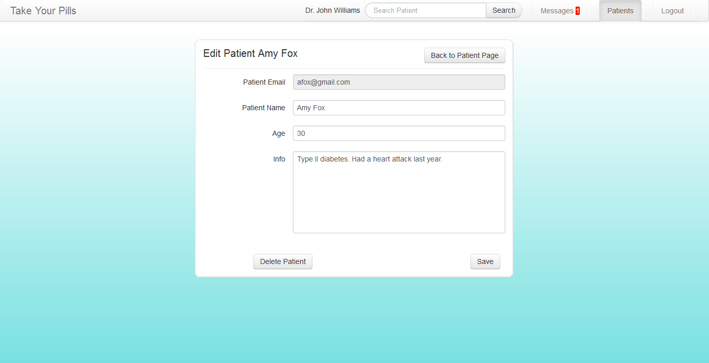 Image Added Image Added
| This is the page where doctors can edit and disconnect from a patient.
Design decision:
We wanted the doctor to be able to record a patient’s medication and health history somewhere. The only field that the doctor cannot change is the email which serves as the account name or ID for the mobile app. | Image Removed
| |
Implementation
Our interface frontend was implemented using HTML, Javascript, JQuery, and CSS. The patient app is especially unique in that most of it is dynamically generated which makes it very flexible in responding in real time to user actions (ie manage pills list, and drug events list). Only the top navigation bar is hard-coded. The doctor website also makes great use of twitter bootstrap so it looks a lot nicer and simple yet professional.
...