Next Ride GR3: paper prototyping
Prototype Photos
landing page, main scheduling page blank, main scheduling page with scheduled rides, request page, reserve page, M
| This is the landing page of the application. It shows the users their next ride (offer, reservation or request) as well as the upcoming rides to and from the house. This page is designed to provide an efficient way for users to find the next ride to their intended destination. In order to make it easier for users to quickly see how much time they have until the next ride the times are give in time until ride, not absolute time. |
| This is the primary scheduling page, in this case blank (no rides or requests). There are three tabs, one for rides to the house, one for rides to campus, and a final tab (called ME) that contains your personal settings and your rides. |
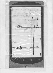
| This is the same schedule with rides and requests on the schedule page. The request are on the right side of the page and are shown by line segments that signify the time range that they are looking for rides. Rides are horizontals lines with an icon and a number on it. The icon will signify the type of vehicle it is: van, car and taxi. The number signifies how many spots are still available on the vehicle. |
| To create a request, you drag and pull and let go to create a bar this will then open up this request page. Which has clickable arrows that defaults to 1 for how many people you are requesting a ride. Again the date is purposely not changeable. Requests have time ranges, so you can define the time range that you can change. It defaults more where you clicked and dragged to |
| To reserve a ride you click on one of the icons, this brings you to this page. Again has a consistent format for how to choose the number of seats your booking (it also shows how many are available and does not let you choose more than are available). It shoes who the driver is, what vehicle he is driving and the time. It also displays the drivers phone number ( not written in here) and any notes the driver might have written. The Submit and cancel page are in the same spot on each of these pages. |
| has clickable arrows that defaults to 4, to show how many spots you are willing to offer. Then the day cannot be changed. Then the time defaults to roughly where you clicked with your fingers. There is also a section to leave any notes for the riders. |
| On the top shoes your information like name and phone number in case you would like to change it. Then it shows all your pending offers reservations and request. The arrow on the right lets your expand and collapse the sections. Collapsed sections display a number of things in that category. Expanded sections show time, direction, people , and icon. And there is an arrow with an extra icon. |
Briefing
NextRide is a mobile phone application to allow brothers and friends of a fraternity (more specifically our fraternity ZBT) to schedule, request and find rides between campus and the house. The application includes the ability to schedule the house's 15 passenger van, cars, and cabs.
Scenario Tasks
- Charles woke up at the house at 11am and is planning on driving to campus today. He needs to be there by 3pm but doesn’t really care when he goes so he is willing to give people a ride and leave whenever it is more convenient for others. He is going to check to see when people have requested a ride. He is then going to schedule a ride for the time with the most requests.
- Alexis is on campus at 3am and he wants to get to the house by 5am. He is flexible on when he is leaving but he knows he can’t leave in the next 30 min. MIT Saferide and the T have both stopped running for the night and it is too cold to walk all the way to the house so he wants someone to give him a ride but he would also not mind getting a cab. He wants to use NextRide to request a ride and also offer a cab.
- It’s 11am right now. Jorge is at the house and needs to get to campus before 1pm. He doesn’t care when he goes as long as he gets a ride before one. Jorge wants to look at the available rides and reserves himself a spot on a ride at 12:30pm.
Observations
Task 1 | Task 2 | Task 3 |
|---|---|---|
|
|
|
|
|
|
Task 1 | Task 2 | Task 3 |
|---|---|---|
|
|
|
|
|
|
|
|
|
Prototype Iterations
Changes that occurred between the first ans second iterations are:
- Added icons to the times to make it more obviously clickable
- Added ride and request headers on the top of the schedule page, to signify what the different things were.
- Your rides/request/offers have a slightly different look
- Added the notes section to allow for input of additional information when offering or requesting a ride
- Previously had the user input name and phone number on each reserve/offer/request page. Changed it to have them input it after the splash page
- changed view from list/find to schedule view
- combined request and offer view into one view
- changed request from different type to just one type
- add a my offers/request/reservations page
- added an option to change your default name and phonenumber
- added my rides to the splash page


