...
R3 - Paper Prototyping
Although we created three different prototypes and tested them all in Round 1, the photographs below show the Address Book prototype specifically, which we chose to focus on for Round 2 after the feedback received from Round 1.
Prototype photos
We completed several rounds during user-testing on Monday. The original design is based off the dual panel concept. From the feedback on Monday, we designed and tested an additional UI over the break.
Objective
The objective of this UI is to help people with dietary restrictions safely explore the menu items offered by restuarants
...
...
...
...
...
...
...
...
...
...
...
...
...
...
Briefing
Here is the briefing we gave to users:Purpose of application: To connect the elderly with their younger family members
- You are a
...
- "chicken vegetarian." A "chicken vegetarian" is a vegetarian, with the all its normal diet restrictions with the exception of chicken being an acceptable food choice. You also have an allergy to peanuts.
Scenario Tasks
...
Here are the tasks we gave to users, one after another.Task 1: Lily calls you and asks you to add her as a contact by dialing the number 721-4146.
Task 2: One day later, you want to send Lily a message.
Task 3: A few days later, you go on ElderConnect again. You want to call Lily.
Observations from Wednesday's Testing (Round 1)
Total number of users tested: 5 (Address Book: 3, Phone Metaphor: 1, Action wheel: 1)
We built and tested all three prototypes to get a more holistic comparison between the three designs.
User testing descriptions
Address Book Metaphor Prototype
- Phone
- During the add-contact task, users were uncomfortable with the fact that the phone call actually went through to the granddaughter. Some expressed that “Add contact” should feel different from a normal phone call, and should allow them to hit an “OK”-like button to confirm before the request is sent.
- Lacks a “send” button. old dial-tone phones with no numerical feedback do automatically start dialing, but since our display looks like a cell phone that displays numbers, it should be consistent with cell phones having a “Send” button.
- No way to delete one digit at a time. This is poor safety for the elderly who may make errors while entering digits. Having no digit-backspace also threatens efficiency; the user would need to completely start over if he/she makes any mistake.
- Lacks an “end call” button. This was simply an oversight on our part.
- Not a real cell-phone number (only 6-digits long).
- User not sure if * and # keys are necessary since they are never used when dialing a phone number.
- Mail
- Yellow mail icon misconstrued to be a “compose mail” button.
- “You’ve got mail” icon being inside the address book seemed to be inconsistent with the address book metaphor; normal address books don’t have mail-receiving functionality inside. User suggested to put the inbox in a corner of the browser instead rather than associating each mail icon with a particular contact.
- Can’t hear message playback or see previously sent/received messages again.
- Options/Widgets
- No way for grandparent to write an email, yet receives emails from grandchild. Makes user feel somewhat mistreated.
- Doesn’t make sense for “call” and “send voicemail” to be two diverging options. Normally the caller would call and, if the recipient doesn’t answer, the caller would leave a voicemail.
- Call/Send Voicemail screen: user wondered why both options were shown even though the contact was not online.
- Need video vs. audio option
- No way to send a video message.
- User said that it may feel more like an address book if the user can fill in the details right on the book instead of on a popup. So maybe clicking on Add Contact will turn that entry into some text fields.
Phone Metaphor Prototype
- Phone:
- There is no end call button.
- No way to confirm that the phone number is correct because it automatically dials.
- Mail:
- User did not associate “leave a message” with “send a voicemail.” Strong association between “leave a message” and textual message.
- No way to review a previously received message again.
- “Call” and “Message” are currently either-or options. Would like the option to both call or send message even when the recipient is online.
- Immediate start of message recording was a bit startling.
Voice Search / Action Wheel
- Circular action wheel:
- Circular selection momentarily confused user because it does not look like normal button options. However, user understood that they were probably buttons after thinking for a brief moment.
- User did not know what what voicemail icon stood for.
- User thought the X over the phone meant “end call” instead of “calling is not an option.”
- No functionality to delete a contact.
Feedback summary
Inconsistency with Expectations:
- Having a phone actually dial the recipient during the “add contact” task was disorienting to users.
- The reason for having “call” vs. “send voicemail” options is not intuitive. Used to leaving voicemail as a failed call attempt, rather than an upfront option.
- Many users were so caught up in recording their voice messages that they forgot to click “Done” until they realized they needed to do something.
- Users wanted the option to send a text message, not only voice messages.
- Letter icon was ambiguous to users (compose mail vs. receive mail).
- (Phone metaphor prototype) No user attempted to punch numbers into the phone to dial the recipient.
Consistency with Expectations:
- All users correctly clicked on the phone digits to dial the phone - understood that the interface was mimicking a phone.
- All users clicked on the recipient to initiate communication with the recipient. Some noted that they did so because it was the only thing to click on.
- Users used the X’s in the upper right corner of layovers to exit out of the layover or to undo the selection. This was as we had hoped/expected.
- Users clicked the “Cancel” and “End call” buttons correctly.
- When mailbox icon was in upper right corner of the browser, all users knew to click there for mail.
- Users noticed the address book metaphor.
Positive and Meta-feedback:
- Users remarked liking the simplicity of the interface (aside from the call vs. messaging options confusion)
- Users expressed some degree of amusement/excitement over recording a voice message and talking over webcam. The excitement may be partly a result of feeling nervous, but users seemed on the whole happy and played along with the voice-recording/webcam components of the study.
- One user (playing the Grandparent) remarked over webcam: “It’s nice to see your face!” This remark suggests that college-aged students assume and are aware of the notion that their grandparents would like to see them more often.
Changes for Round 2
We decided to continue with only the Address Book Metaphor design.
Flow:
- To address all the communication-option confusion, change to the following flow hierarchy.
- If online: see call vs. send message →
- If click into messages: see 3 options (voice message, email, video message)
- If offline: goes directly to the 3 message options (voice message, email, video message)
- If online: see call vs. send message →
Phone changes:
- Make “Add” button so that user has control over when phone starts connecting during Add Contact task.
- Show “End call” button once user and recipient have connected live, during Call task.
- Add back-arrow icon to allow deletion of 1 digit at a time.
- Make sure phone number is 7 digits long.
Receiving Mail:
- Change mail icon to mailbox icon. May want to try mailbox on yellow paper.
- Place mail icon in upper right of browser, representing mail from all contacts rather than from individual contacts.
Voice Mail:
- change wording from “voice mail” to “voice message” so that it is not confused with real-world voice-mail recording when the recipient does not pick up
- perhaps change icon from a tape to a person speaking
Observations from Friday's Testing (Round 2)
Four users tested against the updated Address Book Metaphor prototype.
User testing descriptions
User 1
Observations:
- User expressed discomfort with the name “ElderConnect”; feels the name points out his old age
- Yellow mailbox with mail flying out was effective in signaling to user to that something has changed. User was highly tempted to click on the mailbox once it changed.
- User thought contact buttons led to profiles rather than actionables; user attributed this thought to the “Address Book” metaphor which usually does not contain actionable items
- User had trouble recording a video message because there was no way to initiate the recording.
Feedback:
- User remarked that the interface makes it “easy to recover” from errors.
- User suggested that the blank slots should be made transparent so that the user does not mistake them for buttons to click on.
User 2
Observations:
- User attempts to click "Call" even when it is disabled.
- User asked "What kind of message?" during the second task after seeing the message type choices.
- Mailbox was effective for signifying that the user has a message. User discovered the change from closed to open mailbox.
- Regarding the voice message controls:
- User speaks “Good Job” without clicking on Record.
- User tries again, but clicks Play, and “Good Job” and Send.
- Third time, clicks Record, “Good job” and Send.
- There's a serious mode error in this interface.
- Video call interface operated correctly.
Feedback:
- The voice message interface is very confusing. User interpreted "Play" as "Start".
- User suggests "Repeat" instead of "Play" button.
- User thinks that the disabled "Call" button is not a problem and that he simply made a mistake.
User 3
Observations:
- “Big plus sign” for adding a contact was effective, user clicked appropriately.
- Options available after choosing to “Leave Message” confused user. Needs to be more intuitive.
- Video message interface should provide more feedback and/or control. User looked for a “Ready” button to start leaving his/her message.
- Video call interface was operated correctly.
- Once again, user experienced a mode error with the voice recording interface. User wasn't sure whether the interface was already recording.
- The user thought the Record button was a Stop button.
Feedback:
- When asked "Do you think you prefer it starts recording right away or press a button?" (regarding voice message), user prefers pressing a button.
- When asked "Do you want to hear your own message?", the user says yes.
- Maybe make "Add Contact" be in the upper left corner.
- Change the name of the app.
- Change "Address Book" to a different name so the user feels like clicking the contact can yield some options.
User 4
Observations:
- User offended by the name ElderConnect.
- User says "So many options!" after seeing the three message types.
- During the third task, user sees the mail icon, but was not sure whether it was the same icon was before. Nevertheless he tapped it.
- When replying to a message, the user expected that simply calling the sender would be a clearly available action, given that the sender is online.
- User wonders whether he can send a message either by clicking the user or clicking the mail icon.
- Voice message interface operated correctly.
- Video call interface operated correctly.
Feedback:
- User: "What happens if I tapped mail?"
- We haven't implemented this but we might say No Mail.
- User suggests maybe we should put text on the mailbox such as the number of mails or "No Mail".
- User: "You have two separate loci on the starting point. One is the user - people centric, and the other is the mail icon - task centric."
- We used to put mail beside person. But people got confused.
- We also used envelope, but that turned out confusing, so we changed to a mailbox.
- User: "I guess there'll be arrows for flipping pages?"
- Yes we will.
- User likes the fact there is no history, so there are only two things to do in the main interface.
Issues to consider/resolve moving forward
1. Enter the dietary restrictions to the interface.
- Reason for this task was to demonstrate the ability of the interface to filter unwanted menu restrictions (e.g. All meat products save for chicken and peanuts)
2. Browse the menu for an item that you can safely eat.
- This task was the main focus of our design we wished to test.
3. You realize today is a special day(permitted by your religion) so you want to eat burgers.
- Reason for this task was to demonstrate the ability of the interface to remove a restriction previously entered (e.g. Beef)
In our last iteration we decided to drop task 1 based on user feedback. The task was then posed to find an item that the user can safely eat.
Design and Photos for Prototype 1
The original prototype is based on the dual panel concept. It consists of two main tabs, one to manipulate restriction, and one to manipulate the dishes.
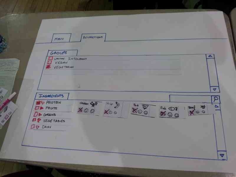
The idea behind this prototype is have the user select his restrictions and preferences first in the ingredient tab, then move onto the menu tab where the items will be filtered by his ingredient choices.
The photo above shows the user restricting all the meat by selecting the group "vegetarian" from the groups.
After the user made his ingredient choices, he will navigate to the menu tab and select the menu items:
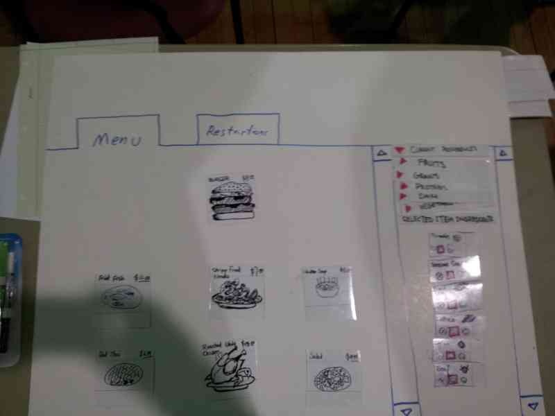
In the above view, The user has selected burger as the menu item. All the ingredients of the burger are shown in the right panel to inform the user of the content of the burger. We kept a list of current restrictions on the right as well, as a safe reminder what is currently restricted.
Feedback for Prototype 1
We tested this interface on four users. The summary of the user findings are listed below.
- Restrictions
- Confusion of whether checking item 'includes' or 'excludes' it
- 'Partial checkbox' for partially-restricted item groups is unclear
- Users appeared to understand that checking an 'item group' meant checking everything beneath it
- Right-pointing arrow to indicate 'folded accordion' was well-understood
- Indication for how to proceed to menu items after completing the restriction was inadequate and confusing.
- Groups
- Reversibility of checking 'vegetarian' was ambiguous to some users.
- Some users simply selected 'vegetarian' and did not attempt to 'de-select' chicken.
- Item browsing
- Not clear at first that the interface is *not* an ordering system, just a menu system
- Not immediately clear what selecting 'happy face' did (reordered preference list, moved preferred items towards the front)
- One user wanted to be able to 'dislike' food; not sure if that would cause even more confusion.
- Users were not sure how to deselect an item.
Of all the issues, the following issues seemed to be the most severe for the user interface:
- Users are seriously confused by what ingredients are restricted and what ingredients are preferred.
- A typical user is hungry when using the interface. We saw many users start by selecting many items that he/she prefers. This results in accidentally restricting all menu choices due to the confusion between restriction and preference
- Users are confused how to proceed from ingredient tab to the menu tab
Some of the issues described above were a result of an inadequate briefing to the individual. Such as the user not realizing chicken was an acceptable ingredient choice and informing the user that the interface intent was not to place menu orders.
Designs and Photos for Prototype 1.5
Taking the feedback for prototype 1, we quickly added in a few changes to the original design, and tried to address some of the severe issues 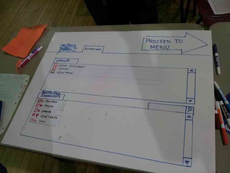
We first removed the tabs for "menu" and "ingredients" for more linearity of the user's progression. Instead, we put a large arrow on the upper right corner that states "Proceed to Menu", to give the user a clear sense of progress.
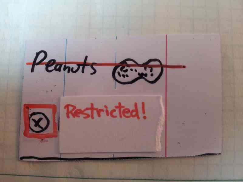
We then modified the restriction selection to emphasize that a certain item is restricted. By showing the word "restricted" and striking through the item, here, the user is restricting peanut.
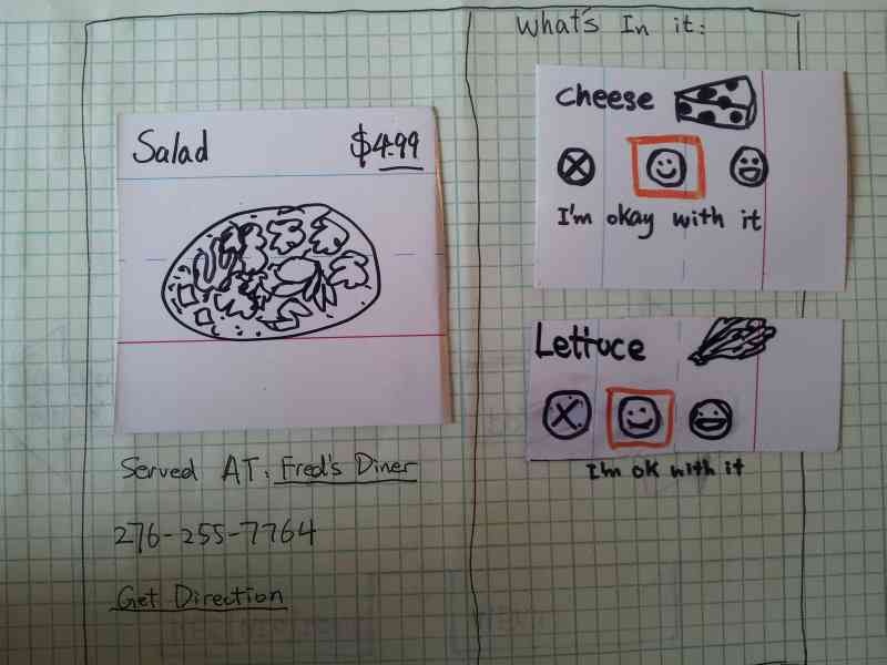
We improved the menu item by adding in the restaurant's name and phone number, and also an address so the user has a sense of when to stop. We also moved the ingredients for the menu item from the right panel to directly next to the menu item, so it is clear that these ingredients are in the dish which we believe added extra safety to menu browsing. We also tried to address the "don't care" face by adding the text "I'm okay with it" for a second visual cue as to the effect of the three radio buttons.
Feedback for Prototype 1.5
- Restrictions
- Some food categories were obvious (chicken is obviously under 'protein'), some were not (is 'peanuts' under grains?)
- Even in the ingredient section, user seems to have trouble keeping track of what is currently restricted and preferred
- User still has some issues understanding the effects of "vegetarian".
- Item browsing
- The restricted items in the browsing section is not shown prominently, the user does not know why a certain menu items don't appear
- the user has trouble de-selecting a restriction, having to go back and forth between the ingredient page and the menu page
Some Brainstorm Ideas for Prototype 2
- Unify preference/restriction editing menu
- Instead of X/neutral face/happy face, use 'disgusted' face/happy face/excited face
- Use clearer categories than 'grains/fat/protein' (where are peanuts?)
- Drop check-box interface entirely, as vegetarian and different other diet groups confused the user during testing.
- Perhaps preserve 'restrict all' button?
- Use same interface for editing preferences and restrictions
- Clarify how to switch between menu and restrictions
- Big, eye-catching arrow
- 'Directional' for consistency; the menu is to the 'right' of the preference restrictions
- Remove ability to edit 'generic' preferences from menu viewing; only list selected items. Decrease UI clutter
- Using 'leading' phrases to indicate what to do: "what can't you eat?", etc.
- Add 'undo' button to indicate actions are reversible; grayed out when no actions are possible
Prototype 1.6
We came up with a quick sketch trying to address some of the ideas we discussed:
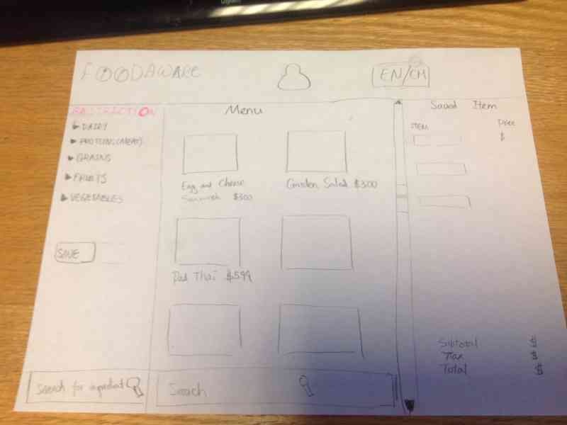
- Ignore the "preference" option and focus on the restriction - to avoid confusion.
- Put the restriction and the menu on the same page - improve visibility, enable direct manipulation
- Add switch language Button - to overcome language barrier issue.
- Add registration option / Save button, in case the user wants to build a profile - Improve efficiency .** If the user click the save button, she sees a sign-up/login page, which enable her to save the restrictions to her account .
- Use small user-friendly pop-out window, while darkening the rest of the page - To let the user to check the ingredients more thoroughly. ** small window contains: ** with list of full ingredient ** input field for possible special instructions *** a big green "Add item" button,
- Add " Your Order" column. - Let user review what has been saved**
- When user add an item, it will show up on the "Your order" column.
- Show price for each item, and also show subtotal,tax and total price.
- Remove option (a red cross icon) shows up when an item is clicked.
- Add a green button for pick-up option.
- Add a deliver button for deliver option.
- Order will be temporally saved to profile
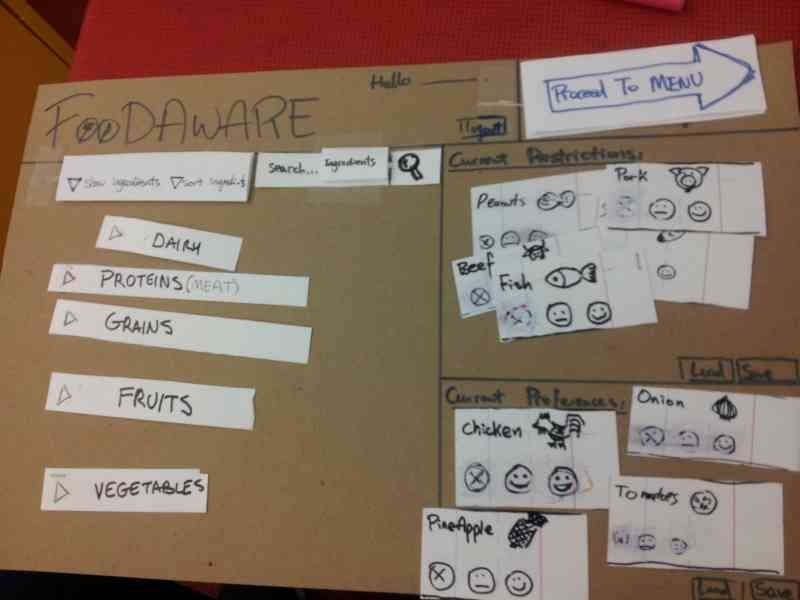
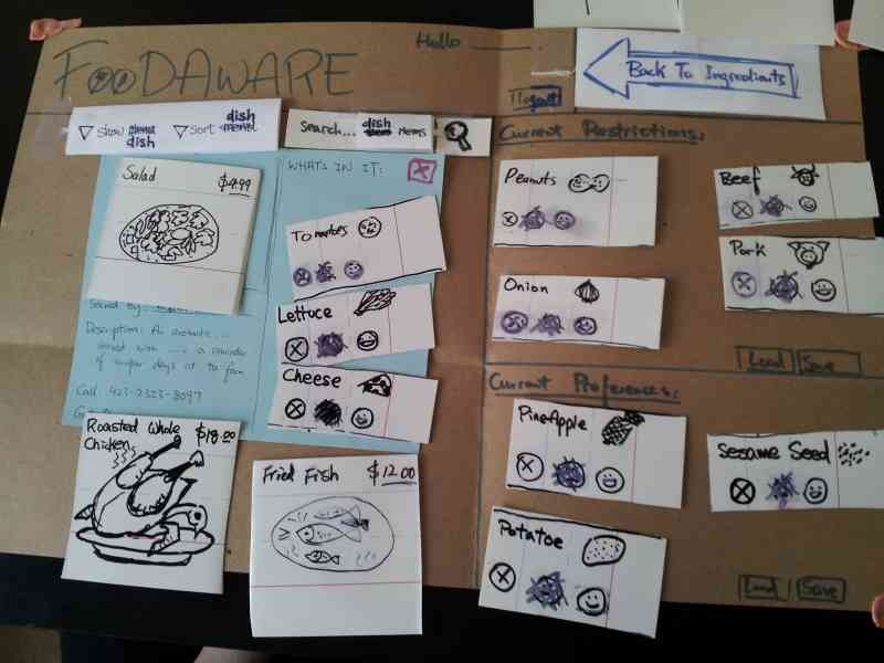
Designs and Photos for Prototype 2
After more thought and discussion, mainly on whether the system should handle ordering and deliveries. We decided that an order system was not to be a focus area in order to be unobtrusive to participating restaurants and to more focused on the overall goal of browsing a menu safely. Shown below is the second full prototype of our design:
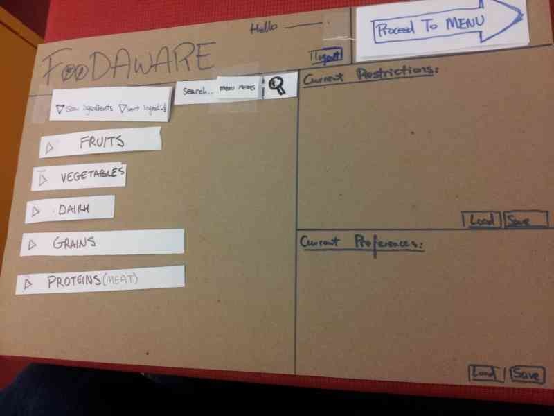
- In this design, we kept the profile for fast access of past restrictions and preferences. This way, restriction and preferences can only be entered once.
- We kept two frames for restriction and preference always on the right of the window. All the preferred and restricted items can be viewed directly in those two frames.
- We allowed the user to remove the restriction and the preference frames.
- During the case of modifying a restriction, we would show a warning of a potentially dangerous action.
- We decided to make the saving/loading explicit so the user can be aware of the option improved efficiency.
- We removed the groups for vegetarian/different diet groups because the users were confused on the their use. Each person with a dietary restriction is unlikely to be identical to the one we've listed, and extra tweaking might be required from the user.
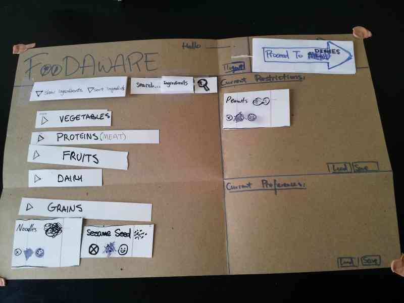
Shown below is a picture of a user using our interface who is hungry. The user only selected the preferred items without thinking about restrictions at all.
Notice how preferred items showed up instantly in the preference frame, giving instant feedback that these items from now on will be preferred.
When this picture is taken he is in the process of selecting chicken as his preference
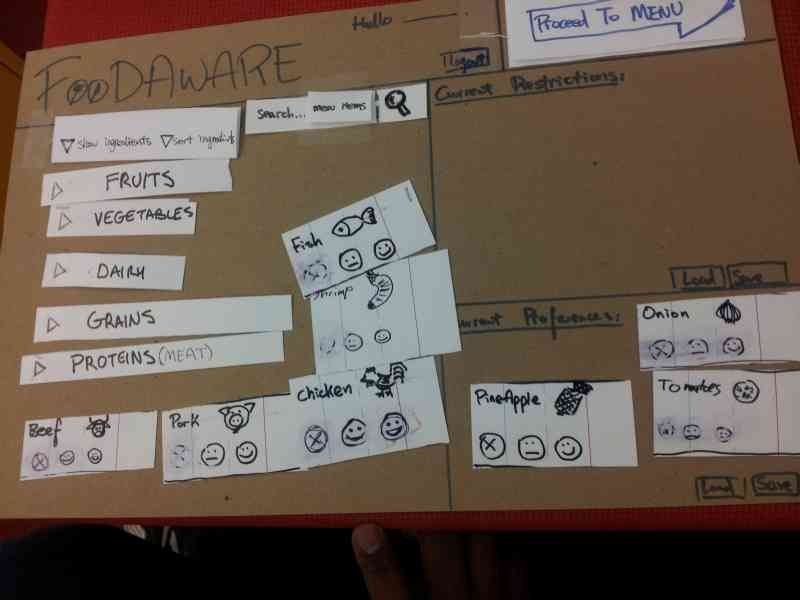
He then realized that the restriction frame is empty as he has not actually restricted any ingredients, he adds more items to the restriction section.
At this point, the user has a brief confusion on how to proceed. The reason being the word "menu" is ambiguous with a software menu. After I explained menu actually means dishes, he was able to proceed.
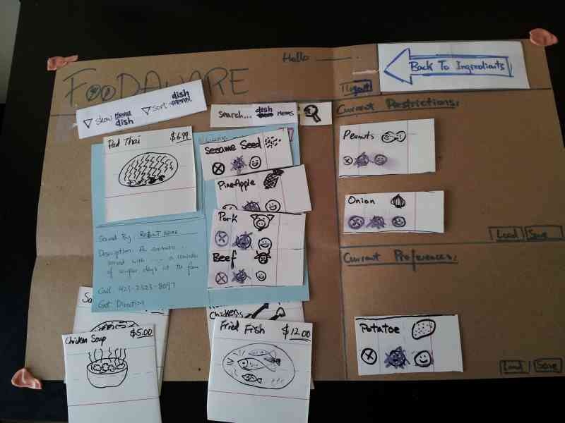
Here is a picture of the user selecting chicken soup from the menu. A suggestion was made to sort the ingredients of the dish, showing preferred ingredients first, then show the other ingredients
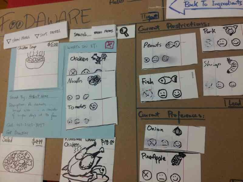
When remarked that he can eat a burger, the user was able to quickly remove beef from the current restriction without having to leave the menu browsing. 
After this testing, we made a few tweaks and tested it on another user:
Notice we changed the word "menu" to "dishes" to avoid the confusion.
We also removed the "agnostic" smiley face from the ingredient buttons. It was discussed that that should be the "default" option for an ingredients, and should not be included to avoid confusion.
Here we see the user only remembered to restrict peanuts from the ingredients and moved to the dishes section.
She clicks on pad thai, and discover that it contained ingredients that she could not safely eat.
However, she was able to add the ingredients in Pad Thai directly to the restriction frame on the fly, this way, she did not have to go back to the ingredient page.
With the refined restriction, she selected a salad for her dish.
Some extra features that are not explored by the user:
- The dishes page can be sorted, filtered by restaurant and food genre such as Chinese or Mexican.
- The ability to save a dish to a meal selection to be printed and taken to the restaurant, and also to recall later
- Different ways of displaying the ingredients such as sorting them by common allergens, or alphabetically
- Different ways of displaying the dishes such as showing only items that are below a price, or only offered at a nearby restaurant
Conclusion
In conclusion, the paper prototype exposed many issues with our original design which severely hampered usability. To name a few:
- Bad linearity of progress
- Confusion between restriction/preference
- Users might select preferred items and restricted items in arbitrary order
- User can make mistakes on restriction entry, only to discover it too late once on the dishes page and have to return to edit restrictions.
Although some of these issues have been resolved, more brainstorming and discussion is needed. The depth of the menu may also have been a factor in what we observed. Our interface shown only eight total dishes and sixteen ingredients. Our results could have been much different with 100s of dishes and ingredients. We may need better ways of displaying information to reduce cluttering.
...