R3 - Paper Prototyping
We completed several rounds during user-testing on Monday. The original design is based off the dual panel concept. From the feedback on Monday, we designed and tested an additional UI over the break.
Objective
The objective of this UI is to help people with dietary restrictions safely explore the menu items offered by restuarants
...
Here is the briefing we gave to users:
- You are a "chicken vegetarian." A "chicken vegetarian" is a vegetarian, with the all its normal diet restrictions with the exception of chicken being an acceptable food choice. You also have an allergy to peanuts.
Scenario Tasks
Here are the tasks we gave to users, one after another.
...
In our last iteration we decided to drop task 1 based on user feedback. The task was then posed to find an item that the user can safely eat.
Design and Photos for Prototype 1
The original prototype is based on the dual panel concept. It consists of two main tabs, one to manipulate restriction, and one to manipulate the dishes.
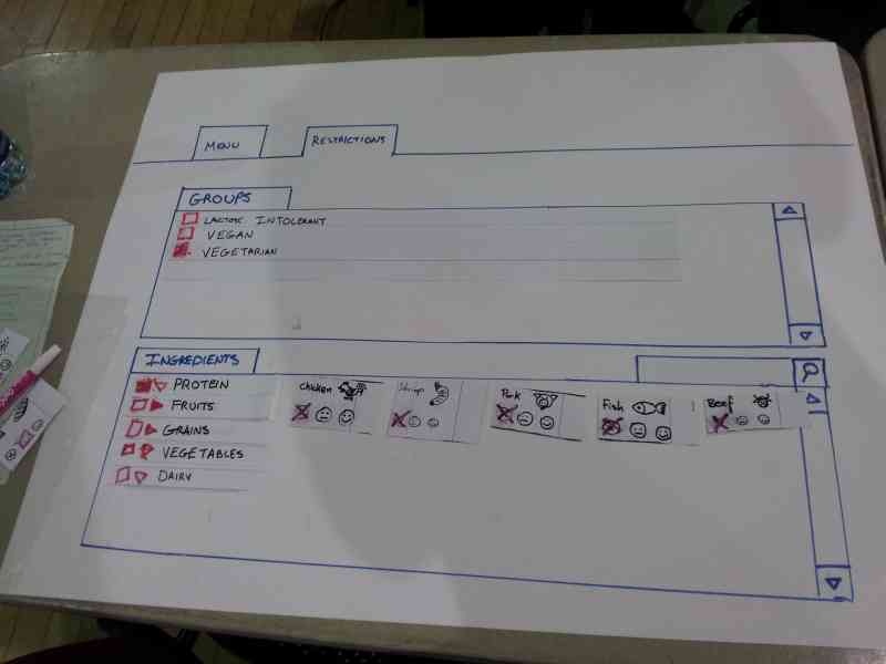
The idea behind this prototype is have the user select his restrictions and preferences first in the ingredient tab, then move onto the menu tab where the items will be filtered by his ingredient choices.
The photo above shows the user restricting all the meat by selecting the group "vegetarian" from the groups.
After the user made his ingredient choices, he will navigate to the menu tab and select the menu items:
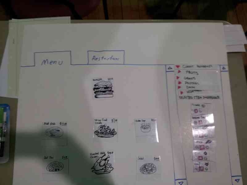
In the above view, The user has selected burger as the menu item. All the ingredients of the burger are shown in the right panel to inform the user of the content of the burger. We kept a list of current restrictions on the right as well, as a safe reminder what is currently restricted.
Feedback for Prototype 1
We tested this interface on four users. The summary of the user findings are listed below.
- Restrictions
- Confusion of whether checking item 'includes' or 'excludes' it
- 'Partial checkbox' for partially-restricted item groups is unclear
- Users appeared to understand that checking an 'item group' meant checking everything beneath it
- Right-pointing arrow to indicate 'folded accordion' was well-understood
- Indication for how to proceed to menu items after completing the restriction was inadequate and confusing.
- Groups
- Reversibility of checking 'vegetarian' was ambiguous to some users.
- Some users simply selected 'vegetarian' and did not attempt to 'de-select' chicken.
- Item browsing
- Not clear at first that the interface is *not* an ordering system, just a menu system
- Not immediately clear what selecting 'happy face' did (reordered preference list, moved preferred items towards the front)
- One user wanted to be able to 'dislike' food; not sure if that would cause even more confusion.
- Users were not sure how to deselect an item.
Of all the issues, the following issues seemed to be the most severe for the user interface:
...
Some of the issues described above were a result of an inadequate briefing to the individual. Such as the user not realizing chicken was an acceptable ingredient choice and informing the user that the interface intent was not to place menu orders.
Designs and Photos for Prototype 1.5
Taking the feedback for prototype 1, we quickly added in a few changes to the original design, and tried to address some of the severe issues 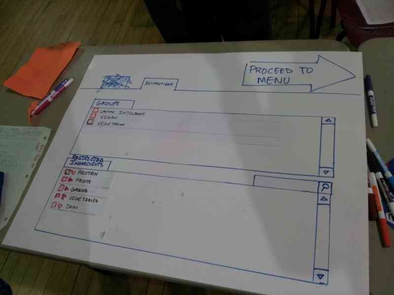
We first removed the tabs for "menu" and "ingredients" for more linearity of the user's progression. Instead, we put a large arrow on the upper right corner that states "Proceed to Menu", to give the user a clear sense of progress.
...
Feedback for Prototype 1.5
- Restrictions
- Some food categories were obvious (chicken is obviously under 'protein'), some were not (is 'peanuts' under grains?)
- Even in the ingredient section, user seems to have trouble keeping track of what is currently restricted and preferred
- User still has some issues understanding the effects of "vegetarian".
- Item browsing
- The restricted items in the browsing section is not shown prominently, the user does not know why a certain menu items don't appear
- the user has trouble de-selecting a restriction, having to go back and forth between the ingredient page and the menu page
Some Brainstorm Ideas for Prototype 2
...
We came up with a quick sketch trying to address some of the ideas we discussed:
- Ignore the "preference" option and focus on the restriction - to avoid confusion.
- Put the restriction and the menu on the same page - improve visibility, enable direct manipulation
- Add switch language Button - to overcome language barrier issue.
- Add registration option / Save button, in case the user wants to build a profile - Improve efficiency .** If the user click the save button, she sees a sign-up/login page, which enable her to save the restrictions to her account .
- Use small user-friendly pop-out window, while darkening the rest of the page - To let the user to check the ingredients more thoroughly. ** small window contains: ** with list of full ingredient ** input field for possible special instructions *** a big green "Add item" button,
- Add " Your Order" column. - Let user review what has been saved**
- When user add an item, it will show up on the "Your order" column.
- Show price for each item, and also show subtotal,tax and total price.
- Remove option (a red cross icon) shows up when an item is clicked.
- Add a green button for pick-up option.
- Add a deliver button for deliver option.
- Order will be temporally saved to profile
Designs and Photos for Prototype 2
After more thought and discussion, mainly on whether the system should handle ordering and deliveries. We decided that an order system was not to be a focus area in order to be unobtrusive to participating restaurants and to more focused on the overall goal of browsing a menu safely. Shown below is the second full prototype of our design:
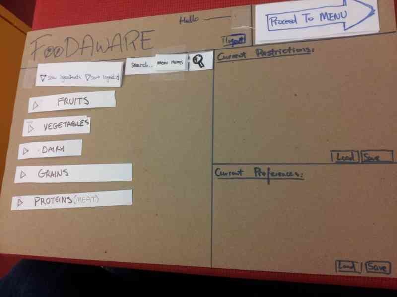
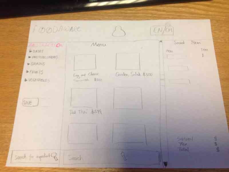
- In this design, we kept the profile for fast access of past restrictions and preferences. This way, restriction and preferences can only be entered once.
- We kept two frames for restriction and preference always on the right of the window. All the preferred and restricted items can be viewed directly in those two frames.
- We allowed the user to remove the restriction and the preference frames.
- During the case of modifying a restriction, we would show a warning of a potentially dangerous action.
- We decided to make the saving/loading explicit so the user can be aware of the option improved efficiency.
- We removed the groups for vegetarian/different diet groups because the users were confused on the their use. Each person with a dietary restriction is unlikely to be identical to the one we've listed, and extra tweaking might be required from the user.
...