...
Refer to GR2 for an explanation of what each screen is for. Refer to the end of this document for a summary of design choices from GR2 incorporated into this prototype.
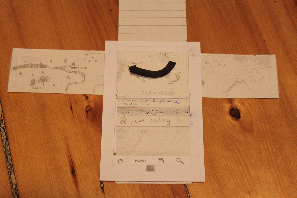
These photos are of Version 2 of our prototype.
Timeline
Two elements of the UI: a chronological list of journal entries, with the "new entry" button always positioned as the most recent entry, and a map that automatically re-sizes and moves to include all posts currently visible in the entry list. A prominent arrow is loosely fit to the entry points on the map to indicate a rough direction of travel. The arrow is animated as the user scrolls the entry list. Entries in the list accept right clicks (click & hold) to share, edit, or delete the entry.
The prototype is limited to horizontal scrolling only for the map (of made-up Siberia or something like that), and is limited to about 20 journal entries. The arrow is fixed, not animated, and only roughly corresponds to the users' direction of travel through the made-up landscape. The prototype is otherwise accurate.
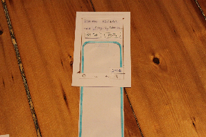
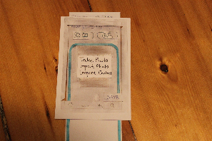
Edit Mode
More or less identical to the View mode, except for added affordances for editing consistent with other Android apps (outlined white background for editable text, cursor, and buttons for editable fields such as time and location). A save button is also present in the lower right corner. Scrollable and accepts right clicks (click&hold) for inserting data such as photographs or contact info. Photographs or contact info accept right clicks (click & hold) allowing them to be deleted.
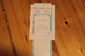
View Mode
More or less identical to the Edit mode, but omits all affordances for data entry. Scrollable and accepts right clicks (click&hold) to share, edit, or delete the post. To inform the user that the post can be edited, deleted, or shared, buttons for this content (also accessible via click&hold) appear at the lower edge of the screen initially, and whenever the screen is scrolled. The buttons fade out of view when the user is idle.
Briefing
This paper prototype represents a design for our mobile application, The Travel Book. The Travel Book can be used to maintain a timeline, or a timed journal, of all your traveling experiences. Every journal entry can contain textual descriptions, photos, and/or contact information.
A few things a user should know before testing:
...
- For all text inputs, assume that a virtual keyboard will pop up. In the actual testing, however, you will be using a pen, and write by hand over the "editable" transparency.
- For all inputs, the cursor is, by default, located at the end of the last piece of the box's current contentsinput provided by the user.
Scenario Tasks
Task 1 - View a previous entry on your timeline.
Task 2 - You are traveling in Siberia. You see a beautiful view of some snow-capped mountains. Create a new entry that includes 1) a small textual description, and 2) a photo (that you will be taking).
Task 3 - You realize that your photo is blurry. Edit the post to replace the photo with a new one.
Task 4 - Share your entry online.
...
- One user recommended that we toggle the share/edit/delete buttons by tapping on the screen. After they disappear, the user can tap once on the screen to get them back, and again to make them disappear. This seemed more useful than having them appear when the user scrolls, since the user may want to view the entire post cleanly while they are scrolling.
Prototype Iteration
Testing Version 1
Our first prototype was the Timeline screen of the second design mixed with the View/Edit screen of the first design. After the first round of testing, we made a few big changes to improve the visibility of some features and to improve the learnability of our UI:
...
- We added a set of buttons at the bottom of the screen (share/edit/delete) to allow users to interact with the post they are looking at. So as not to clutter the view screen, we decided to make these buttons disappear after a few seconds. They would reappear for a few seconds when the user scrolls then disappear again. We decided to make them temporary because if the user wanted to perform any of those tasks, they likely came to the view screen with that task in mind, so would press the button for that task right when they enter the view screen.
Testing Version 2
After testing with the second prototype, we decided to make a few more changes to our UI:
...