...
These photos were taken after we made the improvements described in the Iterations section.
Briefing
Transcript: Hubbub is a mobile application for managing incoming information from Twitter, Facebook, Ee-mail, and so on, and reading what's important to you as efficiently as possible.
...
Index Card | Description |
|---|---|
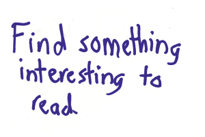
| This was our first task. There are two index cards because we updated the task part-way through our paper prototyping. This task is meant to prompt the user to explore our reading interface so we can see how easy/intuitive it is to read information. |
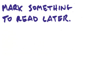
| This was ( sometimes ) our second task (the order varied because it didn't matter too much). This is a form of organizing/saving information (our third high-level task in GR1) that we wanted to test. We learned later on in our paper prototype testing that the behavior of this feature confused some users. It is not consistent with how users prepare items for reading later in emails/twitter/etc, and it was unclear what was supposed to happen when the users hit the "read later" button (does some expected the item go away? , etc.). |
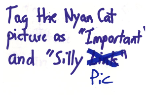
| This was our second/third task. It is also a form of organizing/saving information like the previous task. Our paper prototyping users told us that the tag menu/general functionality was more straightforward than the "read later" functionality. |
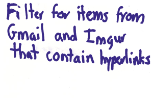
| This was our last final task, testing our implementation of the filter task screen (second high-level task from GR1). It was our most complex task, and was changed the most in our iterations for evolved more than any other part of our paper prototype. |
Analysis
...
Observations
Reading
- The first task description, "Read something interesting" , task initially confused some users who . some users didn't realize they were being asked the first task was asking them to try to scroll down or expand items. Changing the description to "Find something interesting to read" resolved this.
- Because it is a mobile app we Some users did not realize that the page was meant to be scrollable. We tried to afford scrolling by displaying a partial line of content at the bottom edge of the paper, but some users did not realize that the page was meant to be scrollable.didn't recognize the mobile app functionality we were trying to describe.
- Originally, we didn't display a "Shrink" button on expandable content, and users tried to touch outside the content to get back. Users noticed Users were able to notice the "Expand" button and click successfully clicked on it to expand items to see the full version. In However, in some of the original tests , we didn't display draw a "Shrink" button on expanded items; during these tests users tried to touch outside the image shrink button and users tried clicking outside expanded items to get back, similar to how you close a photo on Facebook. Some users did this even after we started showing the "Shrink" button - we could consider making clicking outside of an expanded item shrink it, though this could be another issue that comes up with a paper prototype.
- One user wanted to share items across services. A couple of users hit the "Share" button, which took them to the canonical URL of the item (its imgur page, the e-mail in the Gmail interface, the post on Facebook, etc). Ideally, we could choose a reasonable default mode of sharing so that the user wouldn't have to take further action. There is always However, one user wanted to share several items, and expressed interest in being able to share these items outside of their "default" modes. This reminded us that there is definitely the possibility that the user wants to share between services or out-of-band, though.
- Some users thought the interface was busy, and they suggested hiding buttons. When the interface is on a real screen we can better determine whether the blow to learnability makes sense.
- For the most part, users did not encounter significant roadblocks. Users were familiar with interfaces that present a list of items to read, and did not encounter significant roadblocksso use of our reading interface was generally straightforward.
Saving/Organizing
- One user suggested that hitting "Read Later" on an email should mark it as unread. We have two mechanisms to save content for later. The first is to hit a "Read Later" button that causes items to show up again in a later session. The second is a set of tags that users can apply to items, and later search for, similar to Gmail. One user mentioned that she would save emails often since she doesn't want to reply to them on the phone, and suggested that hitting "Read Later" on an email mark it as unreadrecommended making items unread when they are set to read later, which would be desirable to users who use both Hubbub and their email clients to read emails.
- Seeing "Saved" after hitting "read later" didn't fit users' mental models. When the user users hit "Read Later" we changed that button's caption to "Saved". Some users thought that "Savedsaved" didn't fit their mental modelmake sense (emails are already "saved"), and suggested removing the item from the list. We might go a step further and make the gesture for reading later be swiping the item off the screen, similar to dismissing notifications on Android.
- Tagging went smoothly for most users. They realized that they should check the tags they want and then hit "Save" to save or "Cancel" to abort.
- One user did not realize that they had to press the "New Tag" button to save a new tag. We didn't ask users to create new tags, but they did recognize that there was a textbox at the top and one user created a tag anyway. That user did not realize that they had to press didn't realize the "New Tag" button needed to be hit in order for their tag to be created.
- One user noted that it It wasn't clear how to rename a tag. It is, One user noted this during testing. We realized then that it is in fact, impossible to rename a tag with the current interface, . This is something we may need to fix.
Filtering
- Several users took more time
...
- on the filtering task than
...
- the other tasks, partly because the task itself is more complex.
- Most users took longer than we expected to find the "Filter" tab. The filtering interface
...
- went through the most changes in the iteration step. In the initial design, users
...
- accessed the filtering interface by switching tabs at the top, but most users
...
- had trouble finding the tab in the first place. When we replaced it with a button,
...
- users learned the interface much more quickly.
- Our "Advanced Filter" options button looked more like a header than a button. Some users didn't immediately understand what the advanced filter options referred to
...
- . On paper the "Advanced Filter"
...
- text surrounded by what were supposed to be disclosure arrows looked more like a header than a button. Since our task required using an advanced filtering option, users were slow to complete it. One user who couldn't find the "has a hyperlink" advanced option added "http" as a keyword search instead, which was creative and may have been as effective.
- Some users wanted to preview the results of their filter, showing filter options alongside the items in the reading interface.
...
- Initially, users were
...
- unsure how to
...
- apply or save
...
- their filter. After we made the buttons more prominent
...
- in the updated prototype, users figured it out quickly.
Design
Observations
User | Tom's Notes | Rahul's Notes | Leilani's Notes |
|---|---|---|---|
User 1 | computer |
| --user wants email marked unread when hit “read later” |
User 2 |
| computer? | --User was unsure what “read something interesting” meant (didn’t try to expand any of the information in the list, just tried to read them as is) |
User 3 |
|
| computer |
User 4 |
| computer | --clicked on gmail “icon” directly, rather than the email content |
User 5 | computer |
| --I only have half the notes for this test because I was working on RS2 testing for a bit |
User 6 | computer |
| --user’s first comment was that our interface is very busy |
Iteration
We performed half of our paper prototype tests before making any considerable changes to the interface. We made Our major iteration included the following changes:
- Eliminated the “tabs” formatSwitched from a tab metaphor to a popup for changing the current filter. Users now applied the filter by pressing "Execute" instead of switching back to the "Read" tab
- Modified the first index card to “find something interesting to read”, rather than “read something interesting”
- Changed access to the filter menu as a button at the top of the screen
- Added an execute button to the filter menu that automatically brings the user back to the original reading interface (with filtered content)
- Changed the description of the button that reveals more options in the filter from “advanced options” to “more options”
- added Added “shrink” buttons to expanded content Specified to users that the buttons for sources in the filter menu “toggle”that was accidentally missing them
We noticed these changes had the following general effects on our subsequent users:
- Users more quickly and confidently navigated through our filtering task
- Users were somewhat less confused about how to access the hidden filter options in the filter menu
- Users interacted more with the reading interface (the first task was clearer)
