Prototype Photos
Prototype 1
...
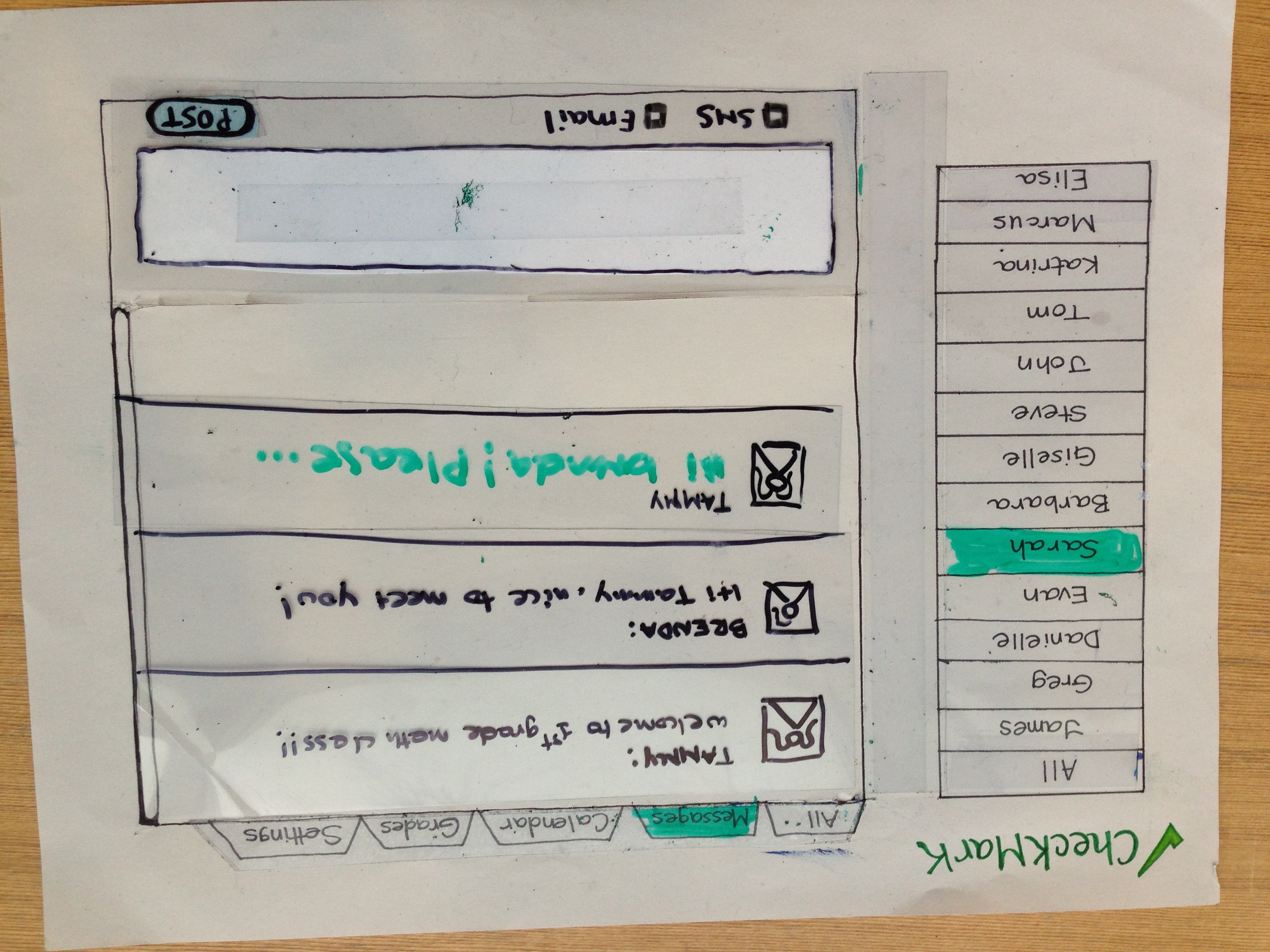
| Messages page
|
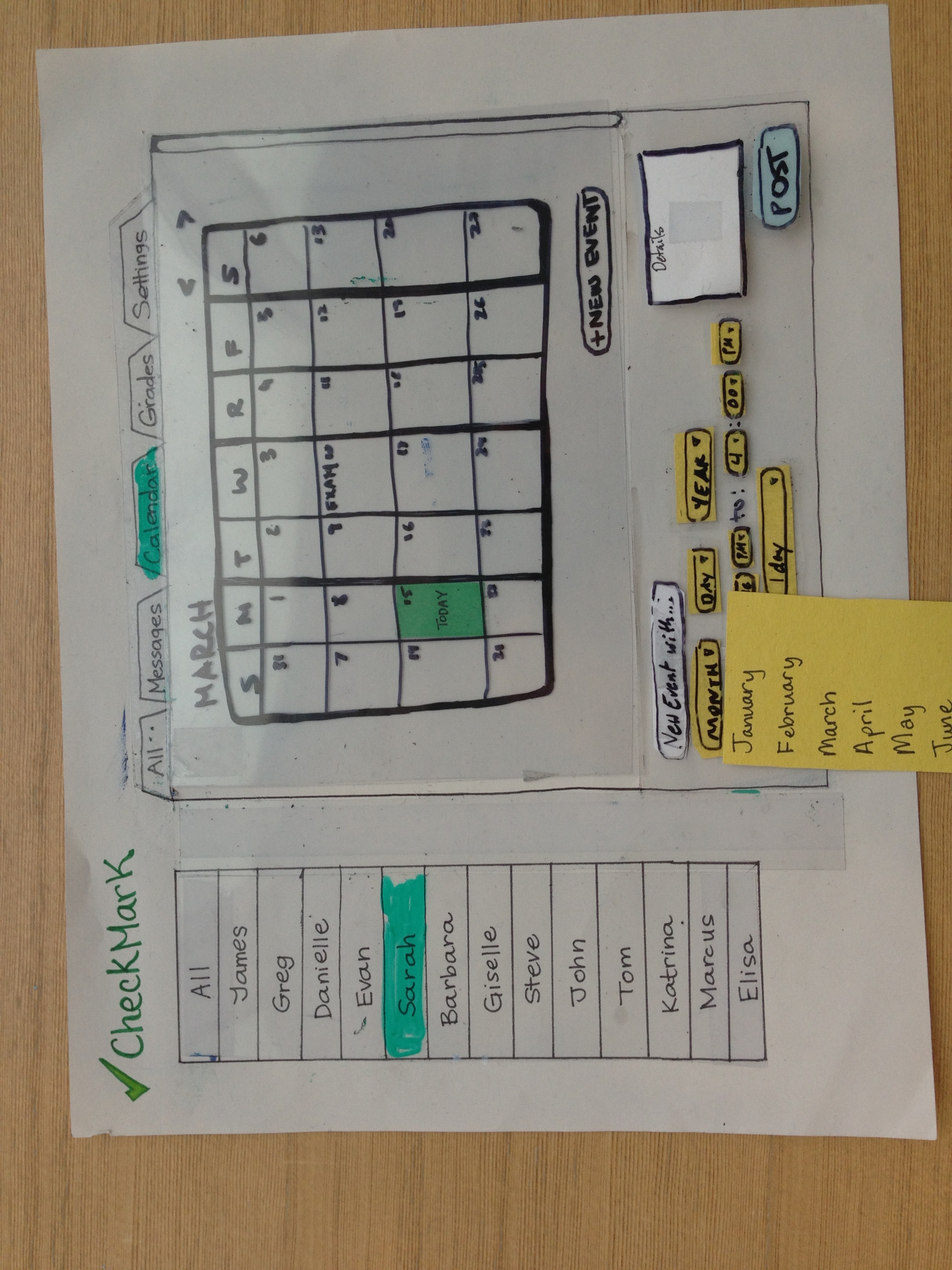
| Calendar page
|
Prototype 2
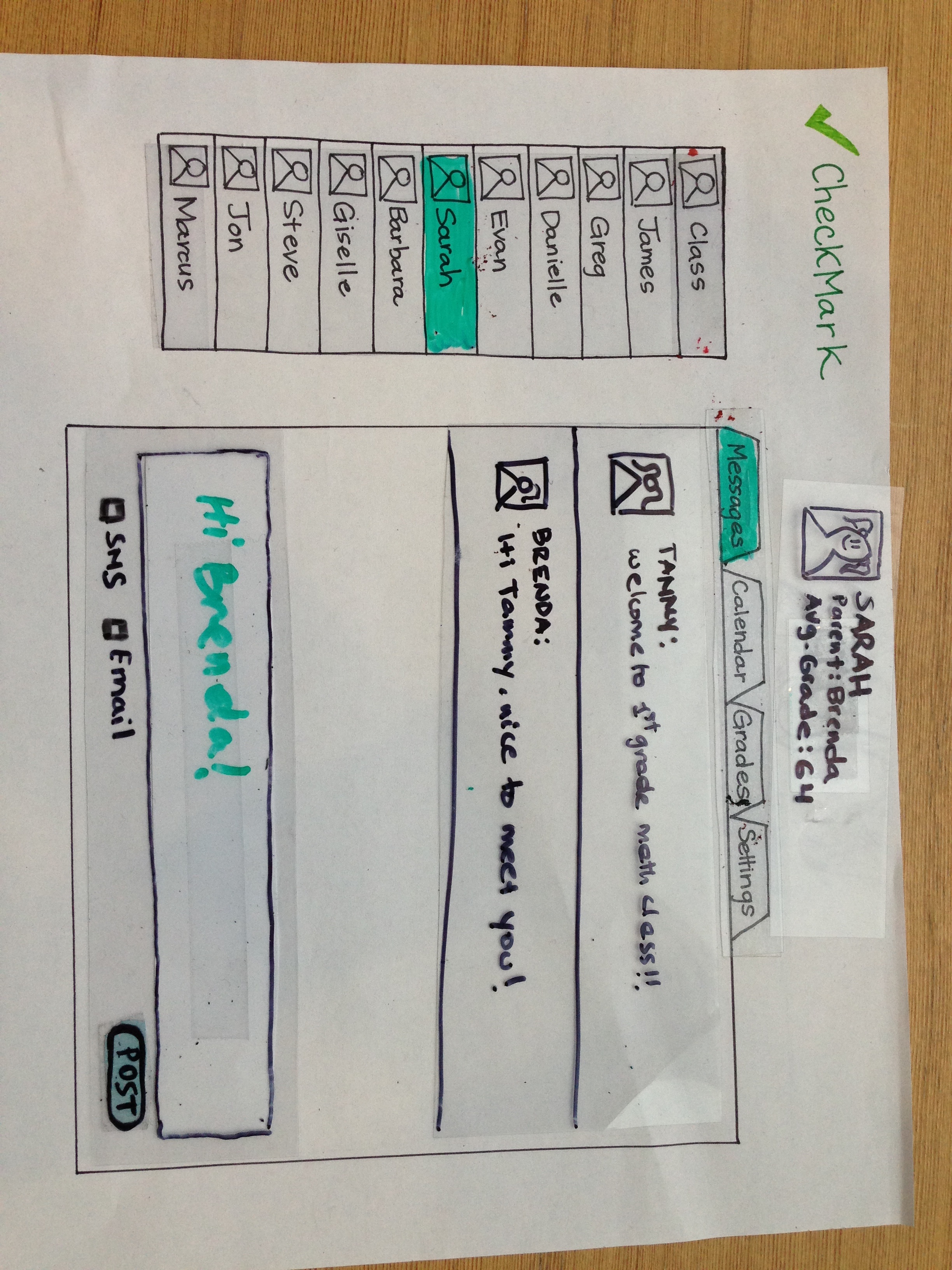
| Messages Page |
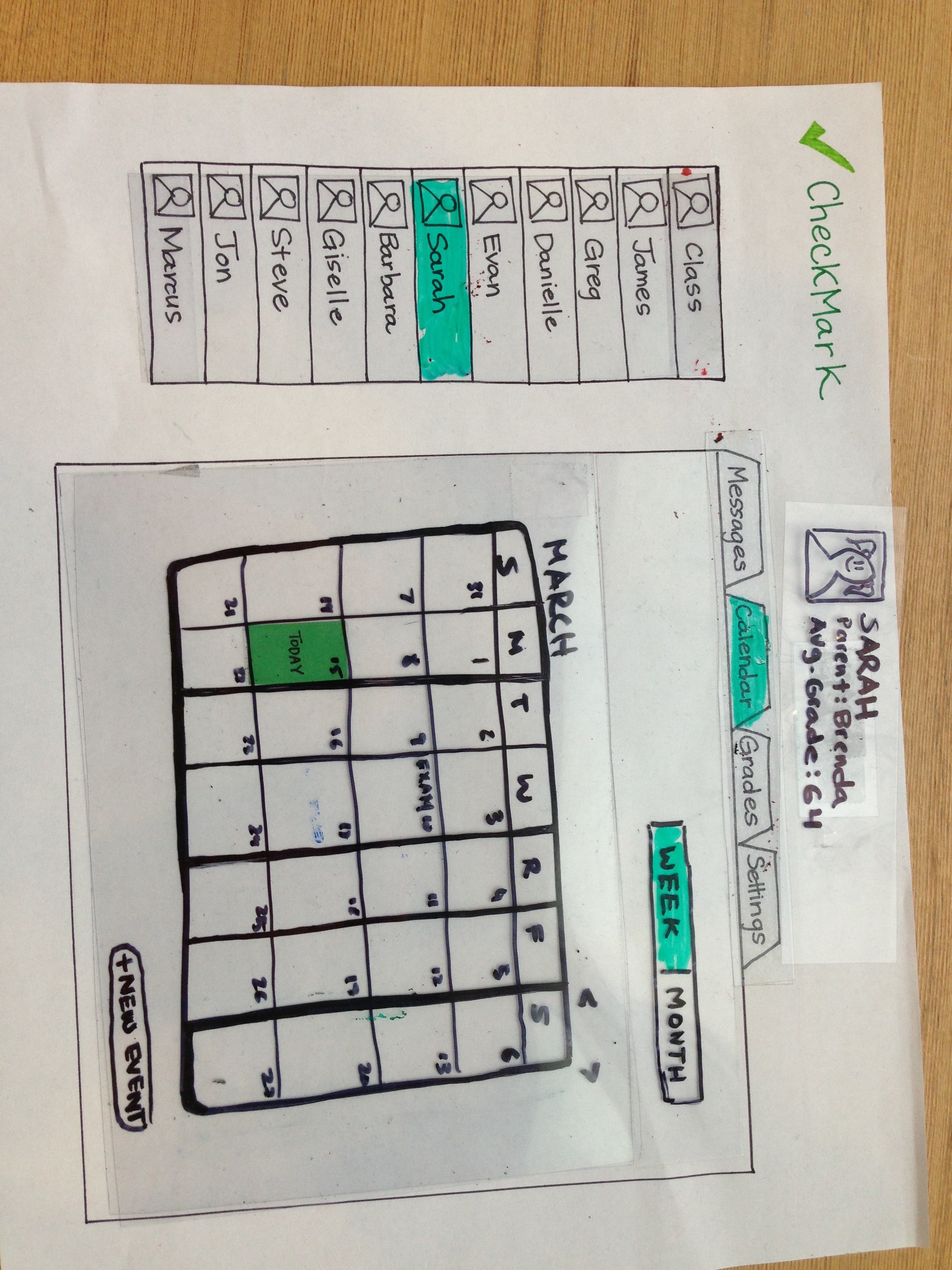
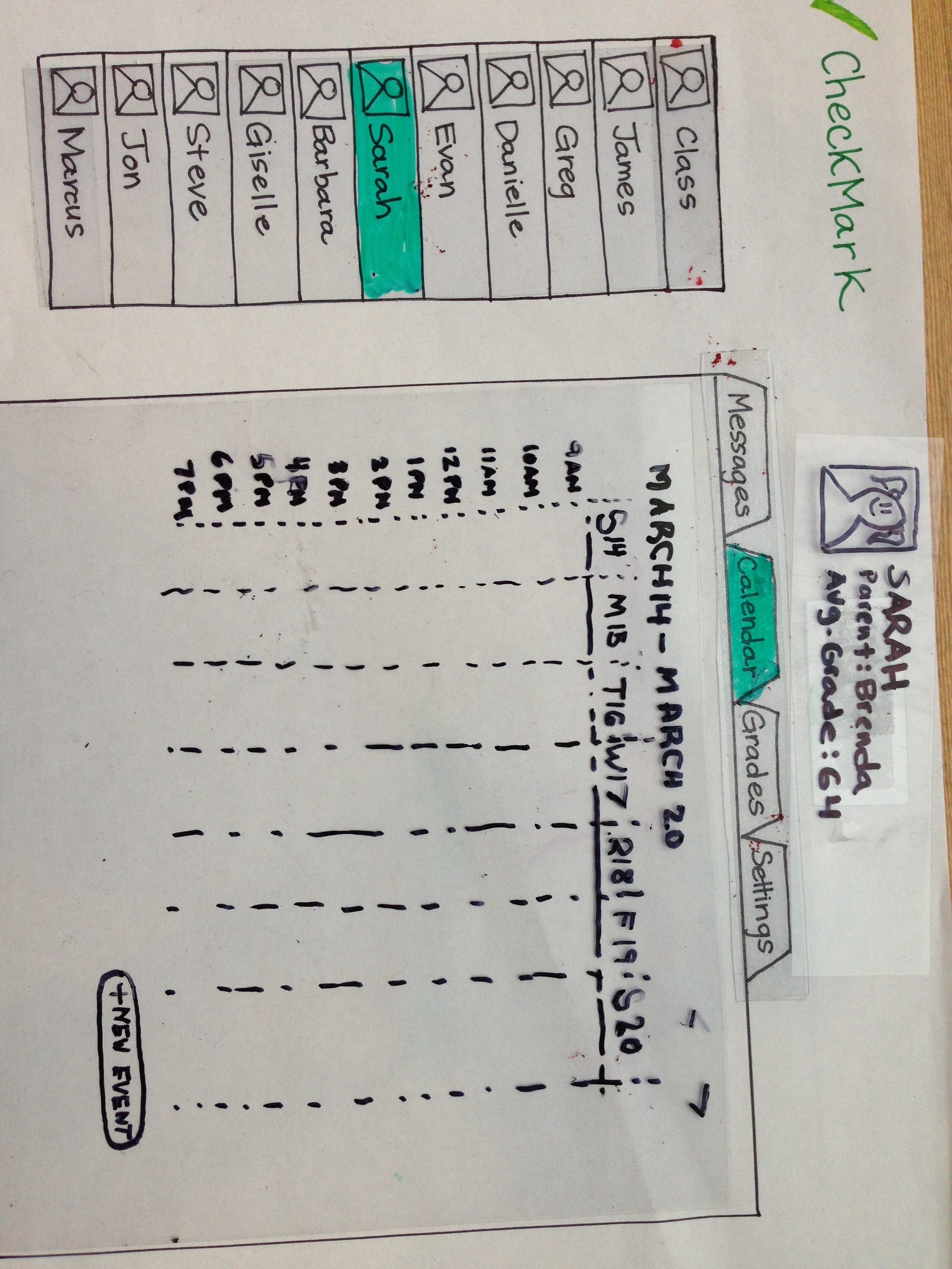
| Calendar Page
|
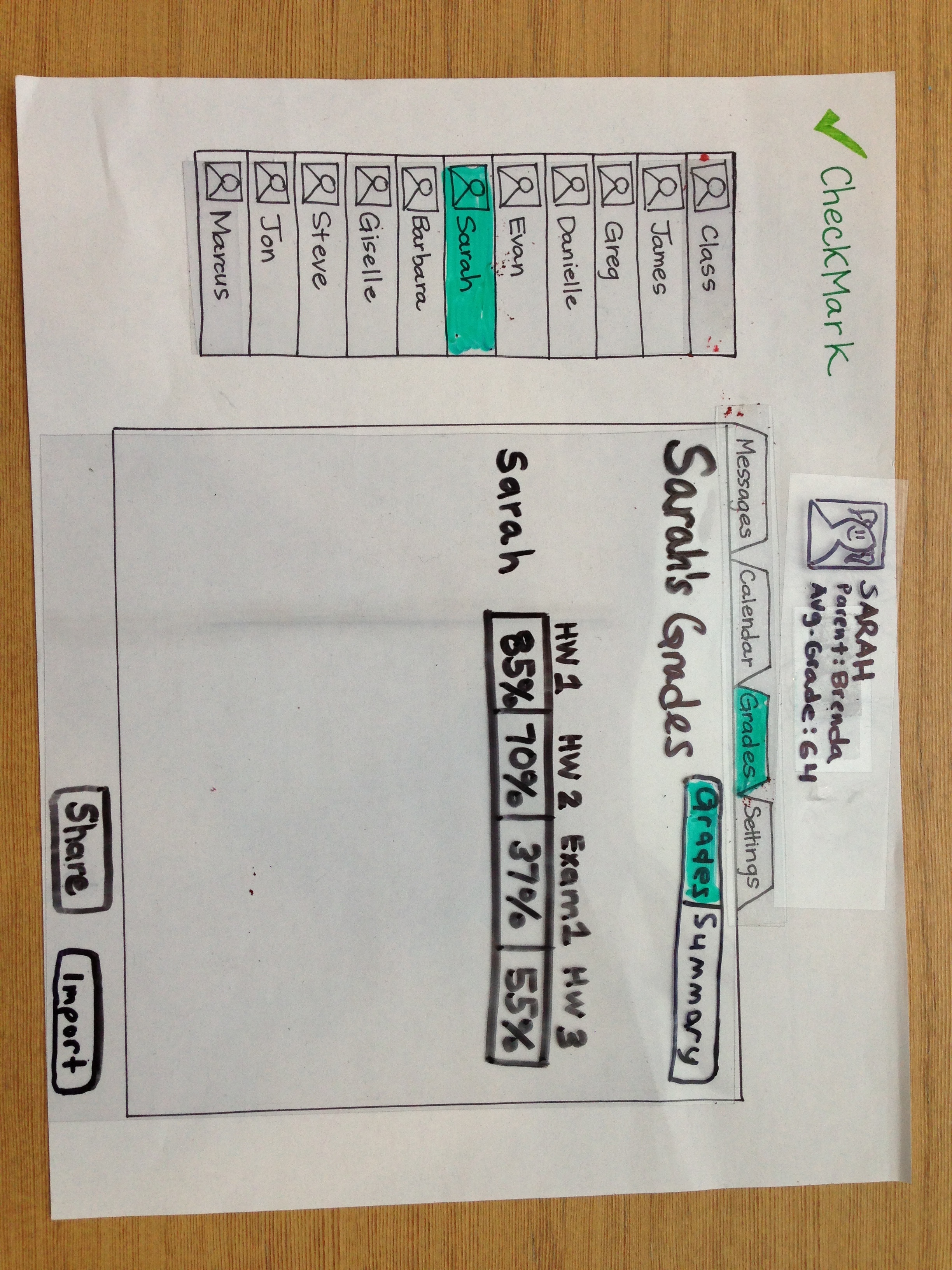
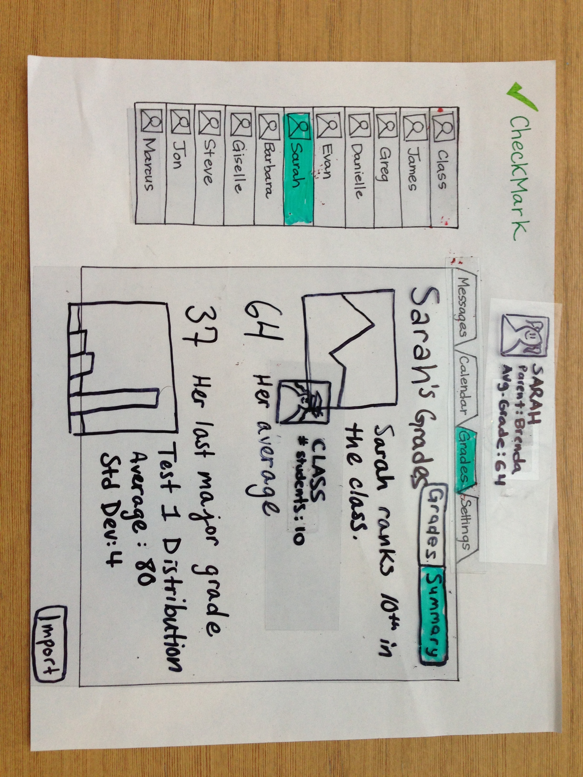
| Grades Page
|
Briefing
Users were shown the following video prior to completing their tasks:
...
3. Remind your entire class' families they have a math test again this Friday and that they should review multiplication.
Observations
Phase 1:
Aftering After testing our initial paper prototype with three users, we learned a lot about how new users approach using our system with little to zero knowledge of how it works. Our testing provided valuable insight, making many usability issues clear as well as confirm some of our assumptions about how users think and feel about CheckMark.
...
Users accomplish the messaging task without trouble: All three users despite usability issues in other tasks, managed to complete the messaging task easily and efficiency. We learned that using models from existing and popular applications allows us to significantly reduce the learning curve.
Phase 2:
After incorporating the user feedback we received during testing with our initial prototype, we tried to simplify our design by reevaluating what problems our interface really aimed to address and eliminate what got in the way from users accomplishing their goals with ease. Our feedback from users on our second design revolved around three major areas for improvement.
Displaying contacts needs to be clearly and logically organized: Most of our users caught onto how we organized and displayed contacts by the end of completing their scenario tasks. However, because CheckMark revolves around improving communication, being able to identify and select contacts for a task needs to be extremely clear for users, especially because many correspondences involve sensitive and/or personal information. In one case, a user sent an email saying that their student failed their exam to the entire class when it should have been sent to only that student's parent. Although our prototype indicated the selected contact by highlighting it on a left sidebar and displaying their contact "bio" above the content pane, we observed that these choices of indicating which contacts were selected were not clearly verifiable by users. One user commented that he thought that "Class" was simply the name of another contact and not group of contacts because it was spaced and formatted exactly the same as the other contacts in the sidebar -- the only difference was that it was at the top of the list. Additionally, another user commented that his eyes were not drawn to pay any attention to outside of the content pane, which was were we were displaying contact selection in our prototype. Therefore, we realized that we should place important information such as this inside of the content pane and we need to focus on visually differentiating between individual contacts and groups.
Users need feedback on their actions throughout the experience: Many users went through additional steps to verify that the messages and grade reports were in fact shared after sending them to parents, which cut down on their efficiency. For example, one user went back to the content stream a total of three times to verify that each of his correspondences showed up. Additionally, many verbally indicated that they were unsure of whether or not their intended action had been accomplished. One user explicitly said in his commentary that he wanted more feedback, which we observed to be an opportunity to solve other issues we observed (i.e.:
...
sending information to the wrong parent/entire class). Providing feedback throughout the process in addition to confirmations is an area that our next design will incorporate to hopefully alleviate some of these issues.
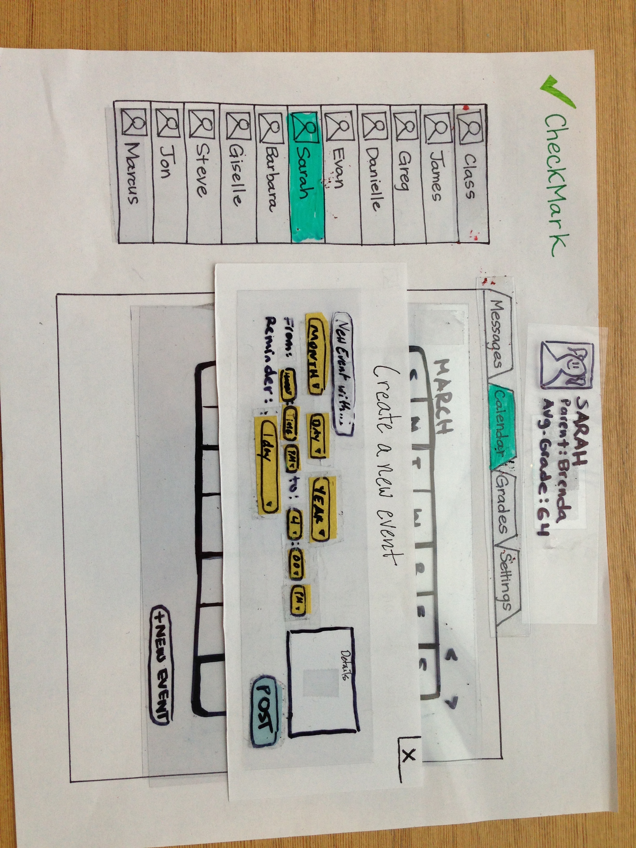
Grade sharing should provide information for both the parents & teachers: Although we originally thought that grade sharing would provide a one-way communication mechanism for teachers to give parents information about their students' performance, we received some feedback that our interface for grade sharing was ambiguous. More specifically, a user commented that although for a student, we provided a neat table displaying each assignment name and their score on it as a percentage, they had no idea what those percentages meant because they were not in relation to anything. For example, if a student scores an 80%, it would be valuable to know if the class average was 90% vs. 70%. Additionally, it would be valuable to know the trends of a student's grades over time and be able to share this kind of data with parents. Therefore, we were enlightened by these observations to expand the way we approached grade sharing: We want to provide useful, personalized information to both parents and teachers and not just support the flow of data from teacher to parent without context.l
Prototype Iteration
Changes between prototypes
...