...
Change | Iteration #1 | Iteration #2 |
|---|
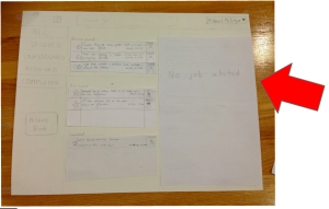
In Iteration #1, users felt bombarded with text/information when they first looked at the application.
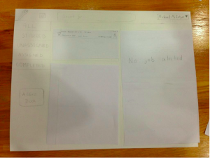
So when the application is first opened in Iteration #2, no repair job entry in the middle panel is selected and so the right panel (which provides details of a selected job) is empty (with just the text "No job selected" showing in the right panel). This approach not only spares the user from the initial text/information overload, but it also emphasizes the connection between the middle/right panels by conveying to the user that nothing is displayed in the right panel since "No job selected". | 
| 
|
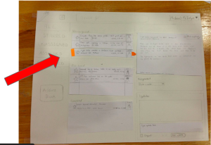
In Iteration #1, users did not understand the connection between the middle and right panels.
In addition to the aforementioned fix, Iteration #2 features new UI components that better indicate that the content in the right panel are details of the job selected in the middle panel. In particular, we added a vertical rectangle at the left of a selected job entry to indicate which job has been selected and an arrow at the right of a selected job entry to indicate where more information about the job can be found. |
| 
|
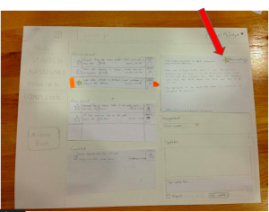
Users had difficulties finding how to mark a task as important.
Users attempted to find the "Star" widget in the right panel to no avail. We realized this was because there was a "Mark Completed" button in the right panel and so users may have thought a "Mark Important"/star button was also located in the right panel. To fix this, in Iteration #2, we added a "Star" button/widget to the right panel. |
| 
|
Users wanted to use the tabs on the left.
During the first round of user testing, users would often click through the tabs in the left panel when searching for a particular job's details. However, we had not implemented this functionality for Iteration #1's Paper Prototype. So for Iteration #2, users were able to search through jobs via clicking through the tabs in the left panel. |
| 
|
Studio Feedback
It seemed like prioritization of tasks was one of your main need that you found in GR1
...
It sounds like the second prototyping went well, maybe a third round can be done before you start implementing your product.
Appendix (raw user test observations):
Iteration #1:
User Test A
- Didn’t realize the entries in the middle panel were job listings at first.
- Unsure about the link between middle panel and right panel.
- To assign a job to a mechanic, attempted to click the “Unassigned” icon on the job listing.
- Was confused why details about the lightbulb job were still open on the screen after the job was assigned to a work
...