Aged to PerfectionBriefingOur website is aimed at the elderly population as a way to connect with each other, foster community, and find information about hobbies and interests. You have the following scenarios you'd like to perform on our site. Scenario TasksThe following scenario tasks were given to our user testers. - Look through a list of health related questions and choose to answer one.
- Find a person you don't know and try to connect with him or her with video.
- After talking with an user through video, you decided to add him or her as a friend.
Specific Questions/FeedbackWe included a guided questions list in addition to collecting feedback on the fly as well as if we noticed any critical moments during the evaluation. How hard was it complete the given tasks? Did you find any of the tasks unintuitive?
Is there anything annoying on the site and do you find it fast enough to perform the things you wanted? User TestingTalk about critical incidents (positive and negative), notes you took, feedback and quotes (Brian) User 1User 2User 3For user testing, we interviewed three users: - User1: A 65-year-old male professor at MIT; he is a regular internet user.
- User2: A 67-year-old male retired stock trader in Cambridge, who is also proficient at use of internet.
- User3: A third user is a 79-year-old female retired elementary school teacher without much computer experience. The testing was guided by a 30-year-old grandson who took notes and relayed info.
Usability Problems- "How do I go back to home page?"
- Description: Even though we have a grid to the top-left corner, it is not clear to the users that it brings them back to the home page.
- Severity: Medium
- Heuristic: Learnability; efficiency
- Solution: Animate the home page grid zooming into the top-left corner.
- Post question was hard to use
- Description: Posting new question was not intuitive. They didn't know they had to first click in the textbox to start typing and click on the button "Post" to post the question
- Severity: Minor
- Heuristic: Visibility; Help and Documentation
- Solution: Fill the textbox with a grey "click here to type your question" background text.
- "Did I post something?"/"Where is my post?"
- Description: After the user clicks on the "Post" button, the page refreshes with the user's answer buried somewhere in the middle of the page. He/she can't tell immediately if the post was successful.
- Severity: Medium
- Heuristic: Feedback
- Solution: Instead of refreshing the page with new content, the button should dynamically insert content into the page and highlight the post that fades out gradually.
- "How do I delete my post?"
- Description: After seeing that he/she can edit his/her own posts, the user asks if it's possible to delete or take away the post.
- Severity: Major
- Heuristic: Safety; CRUD; User Control & Freedom
- Solution: Add an "X" button, which will confirm the user's intent of deleting his/her post upon click.
- "Who are these people?"
- Description: It is not clear to the users how the "Meet new people" section is formed. By age? By geography?
- Severity:Medium
- Heuristic: Visibility
- "I don't want to show them my camera; turn it off."
- Description: Users are concerned with revealing themselves to strangers over the internet without knowing more about their identities.
- Severity: Major
- Heuristic: Safety; User Control & Freedom
- Solution: Prompt the user for consent of turning on the web camera.
- Fonts are too small
- Description: Depending on the apparatus, the font appeared to be too small for a particular user.
- Severity: Medium
- Heuristic: Readability
- Solution: Use bigger font size in general and make sure the font family is easy to read.
Presentation and DemoPresentation Slide: 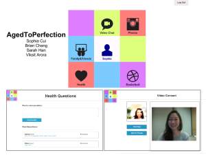
| 


