...
| "Filing Metaphor": This design has categorization based on which users sent the message. The categorization or "filing" is externally consistent with tabbed browsing. All functionality appears on the same screen and creating a message brings up a box within this window so people cannot get lost in navigation. Pictures and names are associated with each message. | ||
| "Hey Kids!": This adorable design also categorizes according to which users sent the message, but has little click-able sprites with pictures on the heads. Clicking on a person will bring up the messages they wrote (this categorization may not be relevant, however). You can also read the messages from all users. Functionality including search is not included by could easily be. | ||
| " | | "Old School": This computer-free design has a segmented whiteboard where different people post in different parts of the whiteboard. No notes are thrown away by student workers; instead, completed tasks are signed and dated by the worker that completed the task and removed it from the whiteboard and placed in a bin where they are reviewed and discarded by the desk captain. |


...
Several of the icons are consistent with other programs. For example, the envelope logo for sending e-mails is externally consistent with other programs. The “x” icon is a very well known icon for closing or deleting items. The “Add Event” box is also very self-explanatory. However, the dragging of tasks is non-intuitive until a user plays with the system for a long time. A user can drag a task from the main pane into the section under a user's name. This is a method that a user can use to assign the task to a specific portion. The user interface also supports "ctrl+f" which makes it easier for users to learn. "ctrl+f" is a standard functionality for browsers and several applications.
...
"ctrl+f" is a standard functionality for browsers and several applications.
Storyboard 2 - Folder Metaphor
...
UPDATED (reflecting suggestions from Jeremy, Studio)
...
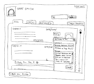
| The message can now be either a "Task" or a "Note." Tasks can be resolved; notes cannot be. The categories (tabs) reflect this. Also, a picture (supposed to be an unchecked box, note, and checked box) in the upper left hand corner of each message provides affordances towards what it is (unresolved message, note, resolved message).
|

...
Original Storyboard
...
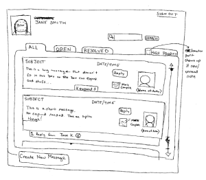
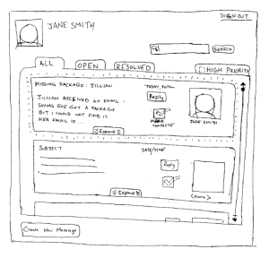
| Log In: Upon login, Jane sees her desktop screen. The tabbed browsing allows for Jane to review all OPEN messages, ALL messages, or RESOLVED messages, as well as HIGH PRIORITY messages if they exist (an icon would appear to signify that). She can search messages or create new messages. She can see all the functionality without scrolling or going to another page. |
| Write New Entries: After Jane cannot find Jillian’s package, Jane clicks CREATE NEW MESSAGE and an in-window dialogue box appears. Jane wills out the subject, decides this is not a “High Priority” message, and writes the message and clicks CREATE to add the note, which is now visible on the ALL and OPEN tabs. |
| Read Old Entries: Ben signs in the next day and notices the note from Jane. Later in the shift he discovers the missing package, gives himself a high-five, and sends Jillian an email saying that he found the package. Ben clicks the MARK COMPLETE button to signify that the task has been completed and the message is now resolved. |
| Search/Scrollling Through Old Entries: A search bar always exists in the same location (top right corner) and the tabs allow for users to go between different categories of messages |
...
There is an emphasis on external consistencies and metaphors to promote learnability. The “filing” metaphor is familiar and has the external consistency of tabs (web browsers). The universal search bar is familiar and well-labeled with a “search” button and a magnifying glass for an added affordance to the functionality of the search bar. There is only one window so users cannot get lost with navigation, and all functionality is always shown.
Efficiency
Efficiency may be lackingBecoming an expert may not improve usability with this design, as the goal of this design is to have a very easily learned interface so student workers do not need a training course. Shortcut Hot keys and perhaps simple customizability (changing tab order) would improve could improve efficiency. Categorization and search with autocomplete will help efficiency.
Safety
Errors related to message posting/editing should be recoverable. Messages are “resolved,” never deleted. Marking a message as “resolved” can be undone by clicking on the checkbox (may need to improve affordance). There are no buttons placed next to each other to deter description slips (REPLY is a button, whereas “Mark Complete” is a checkbox). Autcomplete for searches and tagging should decrease errors.
Storyboard 3 - Streamlined Preview
...
- Stronger classification of messages: 1) a message can either be an 'issue' (meaning that it is something that needs to be resolved) or a 'note' (meaning there is nothing to be resolved); 2) a message may fall into any of the following categories: lost/found (lost phone), desk supplies (ran out of red paper), repairs (elevator broken), requests (many residents requesting fans during spring), miscellaneous.
- Integrated resident database. When creating a new message, you can include a link to a resident's information by using the '@' symbol preceding their name. This will also enable autocomplete on that name. For example, if Susan brought something to desk, the desk worker could type "@Sus" and it would suggest "Susan Sample"; using this suggestion turns her name into a link that, when clicked, will open a dialog window with more dorm-specific information about Susan, like her class year, her room number, and her telephone number.
- Autocomplete for message headings that will also fill in an appropriate skeleton for the message. For example, selecting "Missing Phone" will fill this in as the title and will fill in a skeleton message like "__ lost her phone on ___ and reported it today. It was last seen _ __. Phone description: _ ___".
- Priority on a low/medium/high scale indicated by a colored flag and corresponding text (to replace the priority stars).
...