...
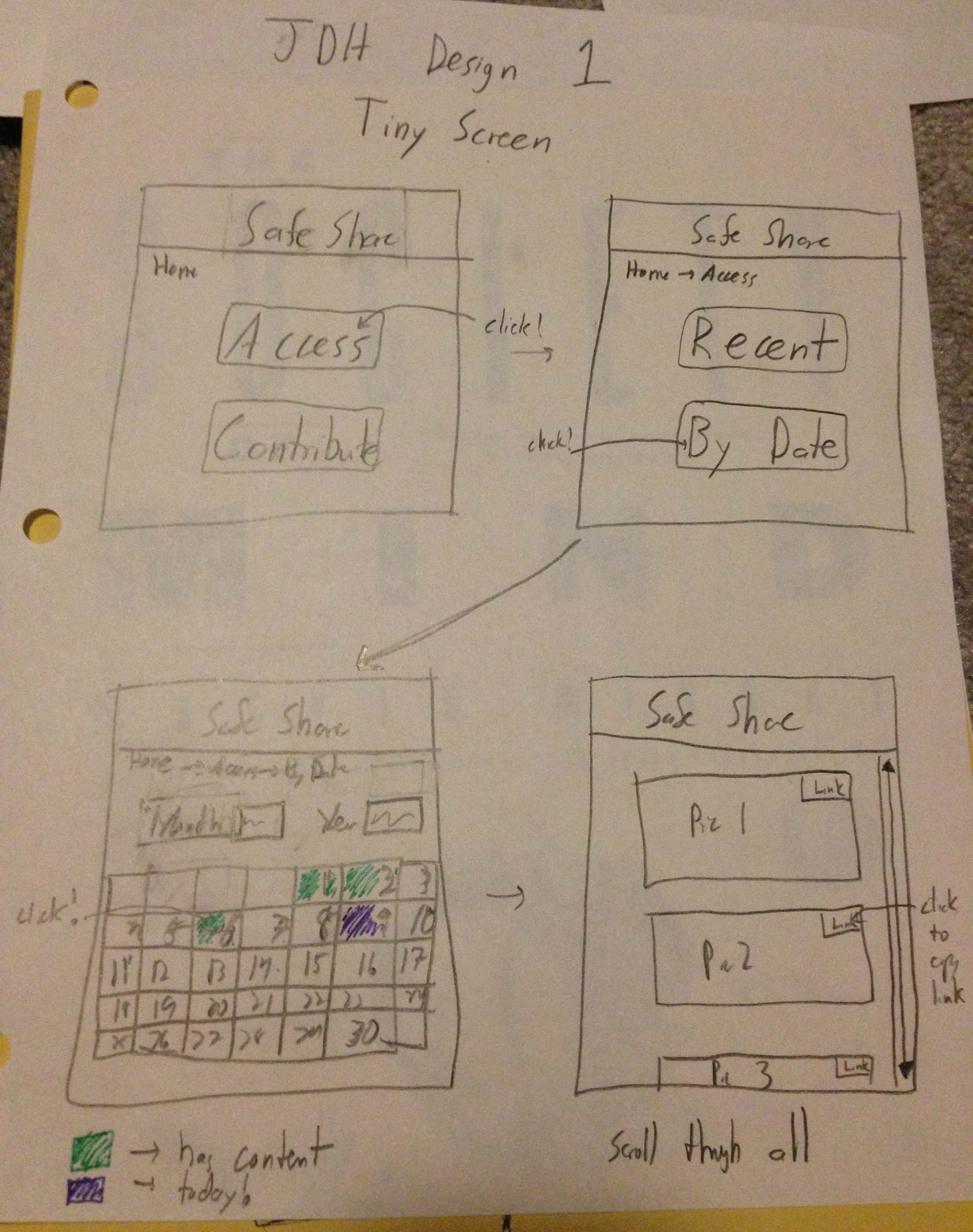
Sharing is accomplished by using the link provided for each picture. It is left to the user to share as they please.
Illiterate Users
Tried to illustrate flow of site without text, so primarily with images. Visual breadcrumbs help understand where they are in the process.
Used pictures of children to illustration aggregation by person.
...
The command bar shows the current search query. A matching contents bar shows different hotkeys to copy links to images, allowing them to be shared through links.
Design 3
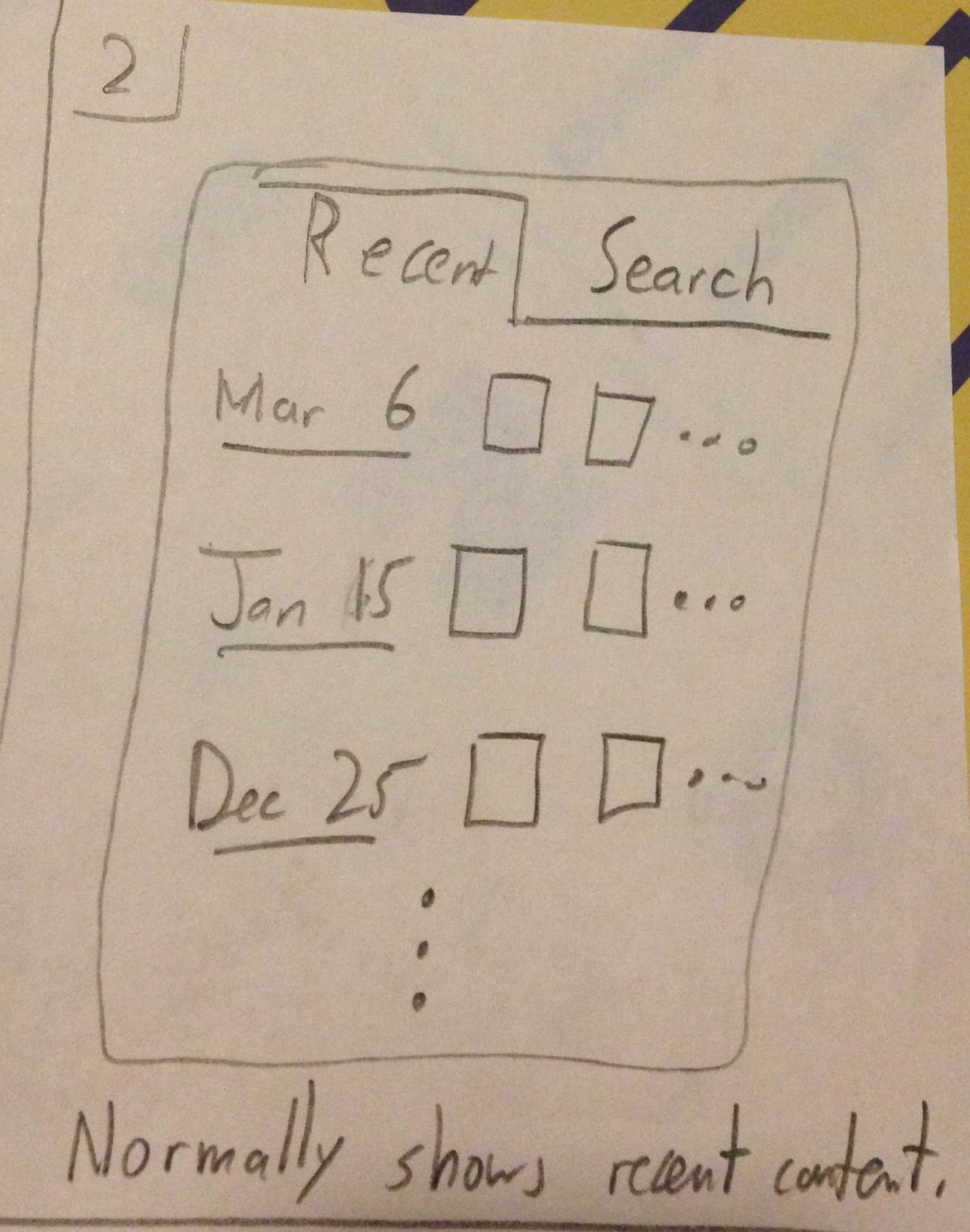
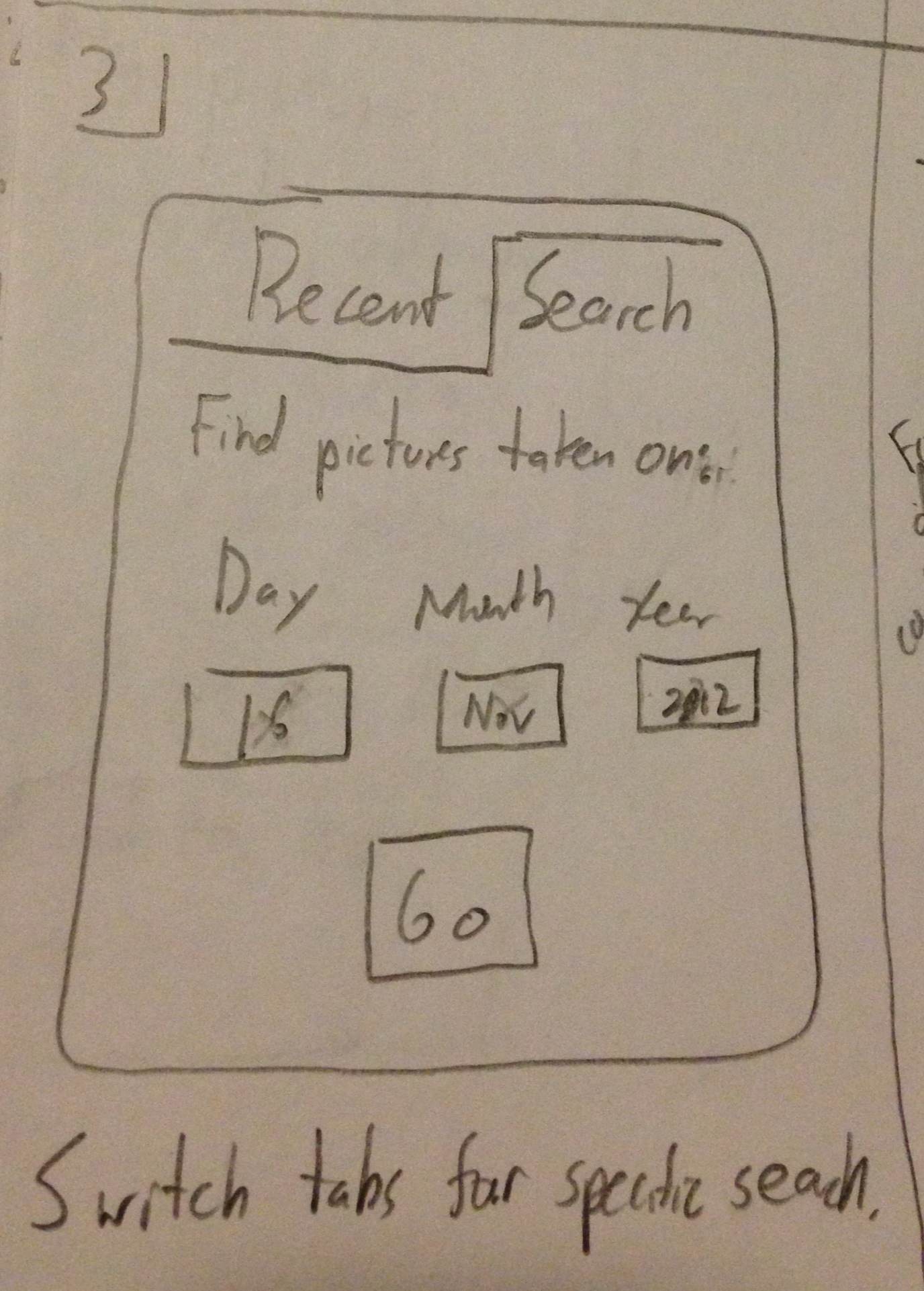
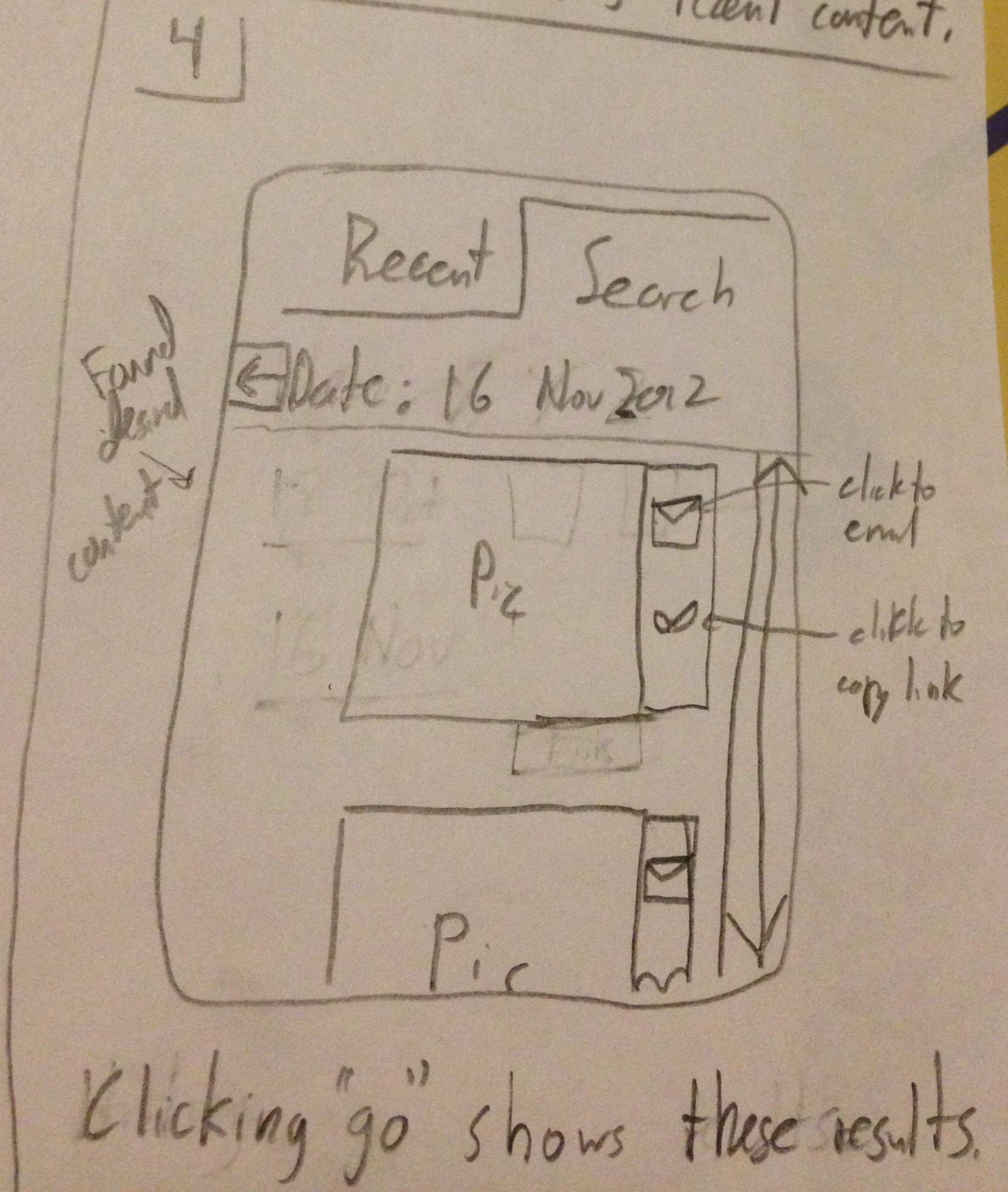
This was designed for a smart phone screen. It makes heavy use of dates. The default screen shows recently captured content. To find the specific picture from the birthday, knowing the day of the birthday, the User can search for a specific date, scroll through the pictures and see if they are there. Clicking on a picture will copy the link. This can be shared through text or email.
Learnability
The intended affordances were to have dates be clear
Efficiency
Step 1
- User wants to share pictures and has phone to do so.
Step 2
- This version defaults to showing the most recent content.
Step 3
- User can switch to selecting a particular date on which the content was captured.
Step 4
- Once a specific date is set, the User can now see that in fact there are pictures and can choose which one to share.
- Sharing is possible through email or a link to the picture
Design Themes:
- Judicious use of screen space due to smaller size
- This lead to less and simpler features i.e. primarily focusing on dates only
Learnability
- Pros
- Text boxes are labeled indiciating their function.
- Links and buttons should have the proper affordances to indicate their uses
- Cons
Efficiency
- Pros
- The efficiency of this interface stems mostly from the anticipation of user needs. The "Recent" tab provides immediate access to more current content which is presumably used more. Also
...
- , the buttons to email or copy or the pictures link are located next to the picture themselves as tasks commonly following viewing a picture or video.
- Cons
- Unfortunately, if many pictures occur on the same day, the user would potentially have to scroll through all of them if searching for something in particular. While this is better than simply searching through all pictures, it is something to improve in future iterations.
Safety
- Pros
- The different modes for simply viewing recent pictures versus those from a specific date are clearly demarcated using the visible tabs at the top, hopefully minimizing mode errors.
- Cons
...


