 Image Removed Image Removed
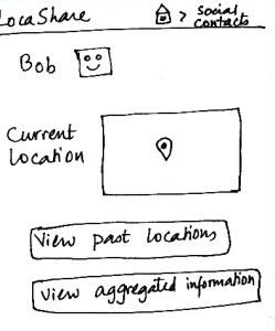 Image Removed Image Removed
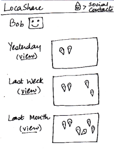 Image Removed Image Removed
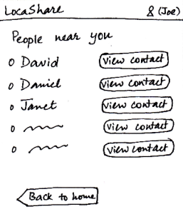
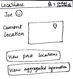
| Once Bob adds Joe as a contact, Joe can
now search for Bob in his social contacts.
He sees the screen shown here that
indicates Bob’s current location (depending
on what Bob allowed him to view). Joe can
also choose to view historical locations
visited by Bob or Bob’s aggregated information.
On the similar screen on Bob’s application,
where Bob would be viewing Joe’s profile,
Bob would see that the button “View
Aggregated Information” would be disabled since
Joe did not allow Bob to view his aggregated
information.
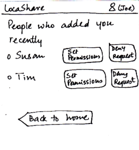
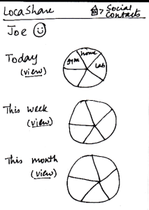
Suppose that a month has passed since Joe
added Bob to his contact list. Joe can view Bob’s
historical data by clicking on the button called
“View Past Locations”. He would then see this
screen that shows Bob’s locations using markers
on three different maps. These three maps
correspond to a daily, weekly and monthly summary
of Bob’s locations (based on the permissions
that Bob set for Joe).
| Pros:
Cons:
Pros:
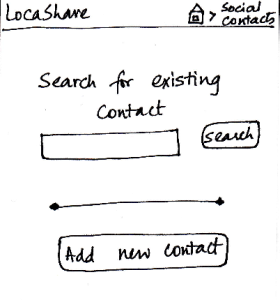
Have to explicitly search for the
contact to be able to view location.
Would be better if there was an
alphabetical list of contacts that the user could scroll through.
Cons:
Pros:
Cannot edit the contact's
information, so nothing irreversible can happen.
Cons:
Pros:
The most important
detail (current location) is
visible in an understandable
manner in a quick glance.
Cons:
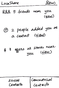
Task 3: View offers and opt-in to create commercial contacts:
| Storyboard | Learnability | Efficiency | Safety | Visibility
|
|---|
Image Added 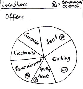 Image Removed Image Removed
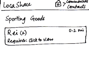 Image Removed Image Added Image Removed Image Added
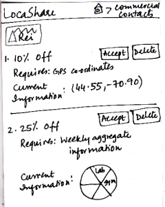 Image Removed Image Removed
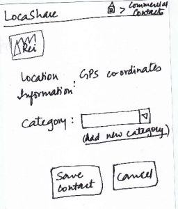 Image Removed Image Added Image Removed Image Added
Joe starts from the home screen and clicks
on the tab “Commercial Contacts”. He is
then taken to | Once Bob adds Joe as a contact, Joe can
now search for Bob in his social contacts.
He sees the screen shown here that can
be considered the “Home Screen” to handle
his commercial contacts. Here, he can view
various categories of products on a wheel.
Since Joe is at
a ski resort and wants to buy some gear,
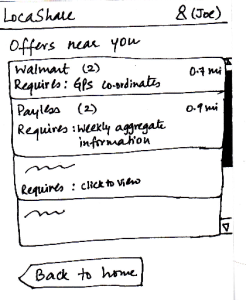
he selects the wedge titled “Sporting Goods” and is taken to the next screen that shows
him the list of stores selling sporting goods
and having offers.
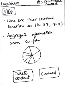
He can then click on the company providing the offers and see the details of the offers. To help Joe understand the exact information he would be sharing, LocaShare displays his
current information as an example.
Joe can choose to accept or delete the offer by pressing
the “Accept” or “Delete” buttons respectively.
Once he accepts an offer, he
would see a summary of the information he is about to share with Rei on the screen. He can choose to create a category in which to save Rei as a
contact. He finishes the process by pressing the “Save Contact” button or cancel
the offer by clicking “Cancel”.
Pros:
Before confirming the relationship, the design gives
feedback to the user about the
location that will be shared.
Cons:
The numbers in circles could be misleading. Are they based on the number of offers in that
category? What about offers that
can span multiple categories?
Pros:
The wheel analogy of categorization of offers
seems to be useful because users can quickly navigate to the type of
offer they are looking for.
Cons:
Have to go through four
screens to establish the commercial contact relationship.
Having a search mechanism will be helpful since search is
quicker than trying to locate a type of offer that does not neatly fit into any
pre-defined category.
Pros:
If you over-share
information, the only way
to cancel that is by deleting
the contact relationship. Not very efficient in that respect.
Cons:
Pros:
Options and controls are clearly visible.
Cons:
indicates Bob’s current location (depending
on what Bob allowed him to view). Joe can
also choose to view historical locations
visited by Bob or Bob’s aggregated information.
On the similar screen on Bob’s application,
where Bob would be viewing Joe’s profile,
Bob would see that the button “View
Aggregated Information” would be disabled since Joe
did not allow Bob to view his aggregated information.
Suppose that a month has passed since Joe
added Bob to his contact list. Joe can view Bob’s historical
data by clicking on the button called “View Past Locations”.
He would then see this screen that shows Bob’s locations
using markers on three different maps. These three maps
correspond to a daily, weekly and monthly summary
of Bob’s locations (based on the permissions
that Bob set for Joe).
The breadcrumb trail helps the user
navigate back to home screen of the
app or home screen of the social contacts.
| Pros:
- The map is a good affordance for
location.Also, the map widget is also externally consistent
with other location based apps.
Cons:
- The interface does not speak
users' language. Users might
not know the meaning of
"aggregated information."
.
- The data presented may be
confusing to some users.
What is the difference between
history and aggregation?
-* *The interface should provide a
list of friends to be more consistent
with other social apps. | Pros:
- View others location can be done in a single click.
- Auto-complete in the search bar
makes it more efficient for users
to find friends since they don't need to
provide the full name of the contact.
Cons:
- The user has to explicitly
search for the contact to be able
to view location. Would be better
if there was an alphabetical list of
contacts that the user could
scroll through.
| The possible mistake
here would be viewing
at a undesired friend's
profile. However, this
mistake can be solved
by clicking on the "Back"
button on the browser.
| Pros:
The most important
detail (current location) is
salient in an understandable
manner in a quick glance.
|