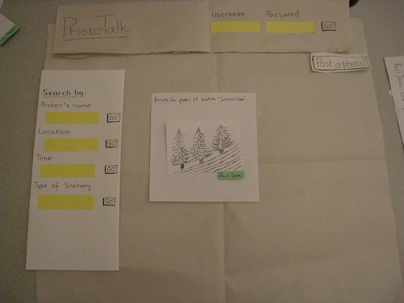
Prototype Photos
Main Page

Search Results:

View Photo + Make Comments
...
Thank you for your participation.
We are making building PhotoTalk, a photo-sharing website, in which each user posts a few meaningful photographs that spark conversations among the users. The users will be able to search and view photos, post their own photos, and make comments on photos.
The test will help us generate a better user interface for our website. Please think out loud so that we can identify problems easiermore easily.
We are not testing you, so please relax. If something goes wrong, it is the interface's fault, not yours.
This test will be confidential. And if If you feel uncomfortable, you can quit at any time.
...
OK. Let's begin. (Give the first task card to the user.)
...
Scenario Tasks
(Scenarios here)
Observations
Prototype 1
(Observations here)
Prototype 2
(Observations here)
Prototype Iteration
...
Each of the three task cards corresponds to a main task identified in GR1.
- (Searching) You are Jan Michaels. Your friend Paul Jones told you that he just posted an interesting photo that he took on his trip to Joshua Tree. You want to search for his photo.
- (Commenting) You are looking at Paul's photo. You want to make a comment that the photo is very cool.
- (Posting) You just took a picture of a beautiful sunset in Boston yesterday (March 15, 2011) while going on the duck tour. You want to post the photo.
...
Prototype Iterations
We performed two iterations in parallel in order to test two distinct interface designs. The first iteration is based on the first and the second designs from GR2, while the second iteration takes most elements from the third design. The major differences include:
- Search Box - The first iteration clearly shows the search bar for 4 different types of keyword at all time, while the second iteration puts a smaller search box in the page header. The first iteration also emphasizes the fact that photos can be searched using 4 different keyword categories, while the second iteration introduces only a single search box on the front page.
- Search Mode - In the first iteration, searching by photographer's name and location give two different search result pages, while the second iteration treats all keywords in the same way.
- Mode - The second iteration has a tab interface mode for user's control panel and a normal viewing mode, while the first iteration integrates them together.
- Posting Photos - The first iteration has a single page for selecting a photo and supplying photo information, while the second iteration has two separated pages, which was originally designed for batch uploading.
...
Observations
(Usability problems you discovered from the testing. Describe what the users did.)
Iteration 1
User A
- Searching
- The user said that he was in the "browsing mood" and chose to click on the thumbnail pictures.
- After he searched by name "Paul Jones", he mentioned that he would have expected to see photo thumbnails alongside the results.
- In that page, the user clicked on the number of search results instead of the photographer's name.
- The user suggested that pictures should have different border to indicate different photographers.
- The user tried to post a comment immediately, even before receiving the next task.
- Since the user is not logged in, he asked if he could post a comment anonymously.
- Upon completing all three tasks, he went back and suggested that the search field "Name" be re-titled as "Photographer".
- Commenting
- The user suggested that commenters should be able to reply with pictures?
- Posting
- The user pressed "Post a Photo" button without logging in.
- The user tried to drag an image file (from Windows Explorer / Finder) to the empty picture frame on the webpage.
- The user expected the "Browse" button to be on the right of the filename textbox.
- He also felt confused / irritated by the gap between the picture and the submit button.
User B
- Searching
- The user pointed to the four-category search box and said "Are these all required for each photo?"
- He made several attempts to search for the photo.
- He put "Joshua Tree" in the "Poster's Name" box. (=> Maybe we should change the wording.)
- He put "tree" in the "Type of Scenery" box.
- He clicked on a thumbnail with label "Nature".
- He made a comment on the top page's thumbnails: "Oh! This is just a random list of photos."
- He asked: if a user has many posted photos, will the photos be organized in categories.
- He wanted to see all information (as opposed to only 1 word) under each thumbnail.
- Commenting
- He asked if the comment text-box will have scrollbars when a lot of text has been typed in.
- He looked for a "cancel" button for the comment box.
- He wondered how to go to other pages of the sites.
- Posting
- He tried to post a photo without logging in first.
- He clicked the filename textbox instead of the "Browse" button
- He saw two buttons, "Browse" and "Upload". He got confused and asked why there are two buttons.
User C
- Searching
- The user searched by location, "Joshua Tree."
- She asked about how to search for her own photos
- She quickly got to the desired photo
- Commenting
- The user typed her comment in the text-box and pressed "Post!"
- She said that the process is "intuitive"
- Posting
- The user asked whether logging in is required in order to post photos
- She correctly went back to the main page by clicking on the top left icon
- She understood that the asterisks indicate required fields
- She left the non-required "Event" and "Type" fields blank
- She mentioned that there are a few possibilities for what goes into "Type", and she wasn't sure which one she should use
Iteration 2
User D
- Searching
- The user asked whether he could search for photos without logging in
- He searched by location, "Joshua Tree"
- He quickly got to the desired photo
- Commenting
- The user typed his comment in the textbox and pressed "Post!"
- Posting
- The user correctly went back to the main page by clicking on the top left icon
- He was familiar with the browse button.
- He filled in all the detail boxes, using "sunset" as the type and "duck tour" as the event.
- He said that the website mechanics is "pretty natural"
User E
- Searching
- The user was confused about why there were two search boxes
- He decided to go with the bigger box
- He searched "Paul Jones"
- He used the "Refine results" tab on the left to specify the location, "Joshua Tree"
- Commenting
- The user suggested that it might be a good idea to have breadcrumbs so that he can easily keep track of the state
- He was familiar with the way the commenting works
- Posting
- The user was fast with browsing for his photo and clicking "next"
- He mentioned that the photographer field should have been preloaded with the username
- He said he didn't want to specify the location (but it was a required field)
- He didn't understand what he should put in the "Time" field, and in what format.
User F
- Searching
- The user wanted to log in immediately
- He searched "Paul Jones"
- He didn't use the "Refine results" feature, and instead searched for the desired picture by himself
- Commenting
- The user asked whether he could press the Enter key in commenting
- Posting
- The user hesitates on what to do next, but eventually goes back to the main page, where he sees the "Post photo" button
- He was familiar with the browsing method
- He put "sunset" for the "Time", "Event", and "Type" fields
- He asked why there were two search boxes
- He would like to be able to set a default value for the photographer name.