...
Screenshot | Explanation |
|---|---|
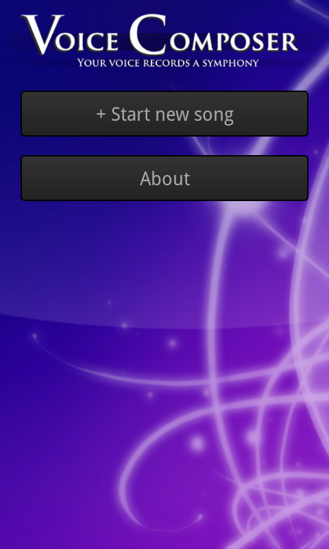
| Originally, the main screen looked like the extended song list below. Our final design adopts a splash-screen-like design in order to highlight the name of the app and reassure users that they're in the right place, while remaining functional with a prominent "new song" button. The background is intended to be aesthetically pleasing but unobtrusive. |
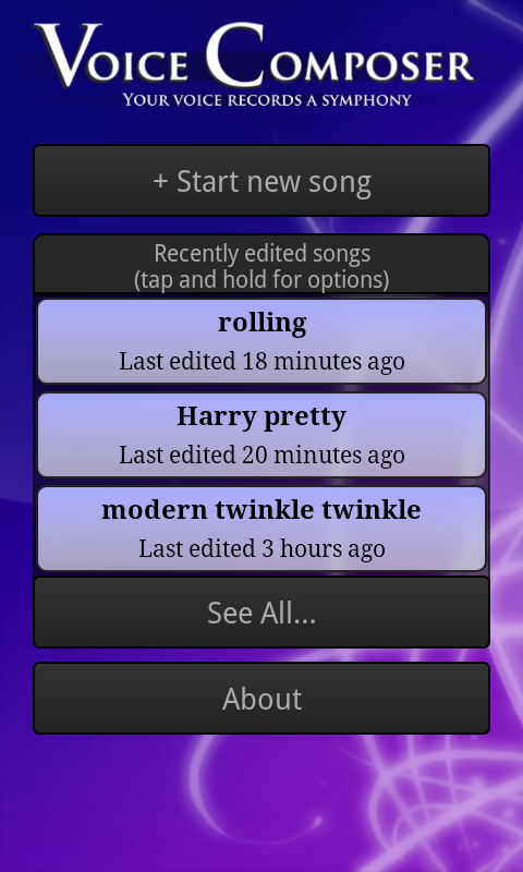
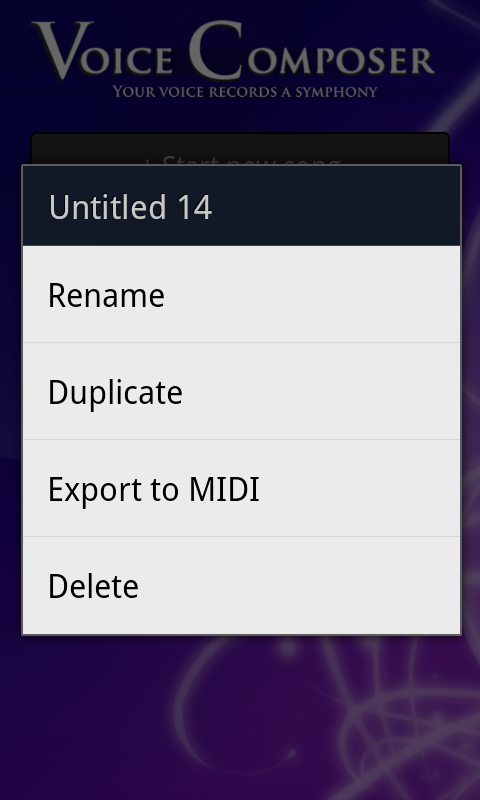
| We limited the main screen to three saved songs to avoid overwhelming users. The "new song" and "about" buttons remain prominent. Tapping on a song launches the compose screen, shown below. Our original design included small "rename", "duplicate", "export", and "delete" buttons on each song, but our paper and heuristic evaluations noted that such nested buttons were confusing and difficult to use on a small screen. We therefore replaced them with a menu accessed by tapping and holding for a second or so; this method is nonobvious, so we also included an instructional note. |
|
|
|
|
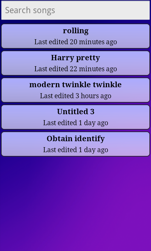
| If the user clicks the "see all" button, this screen is shown. It lists all saved songs, allowing scrolling and searching (the list updates as a user types in the search box). |
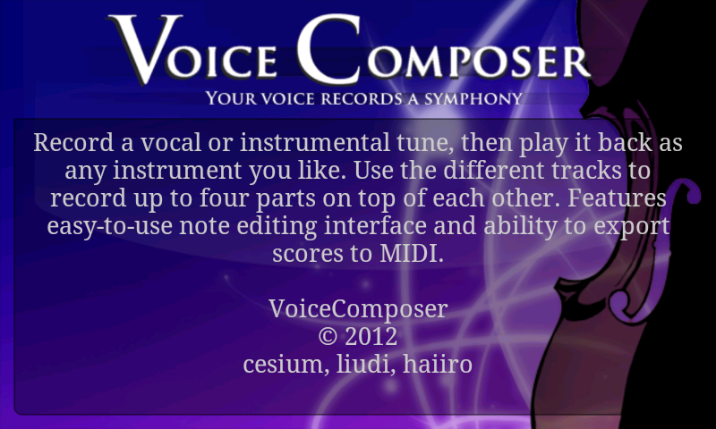
| The "about" button takes users to this screen, which is just a static message. |
| Clickthrough for start new song. |
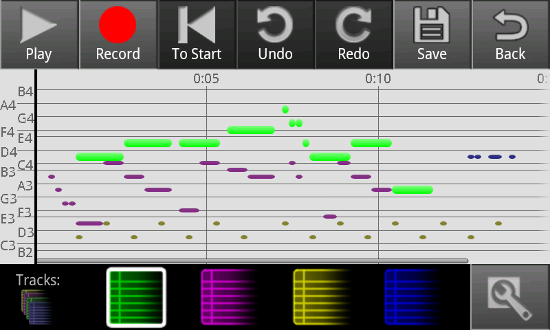
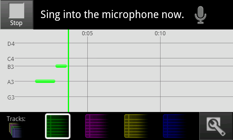
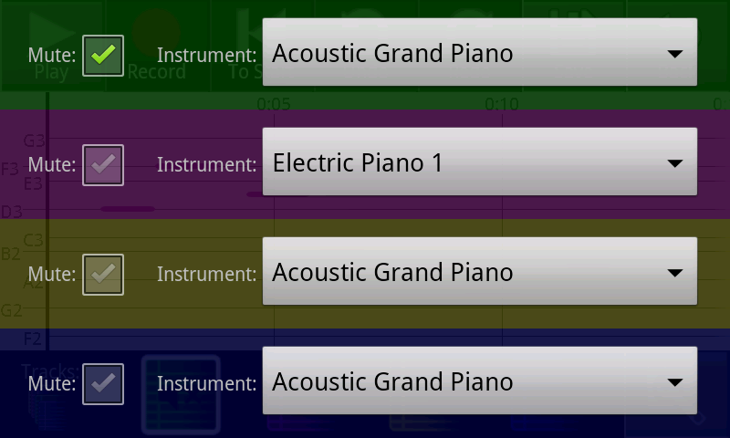
| Record some notes. Here various tracks have been used to layer notes. |
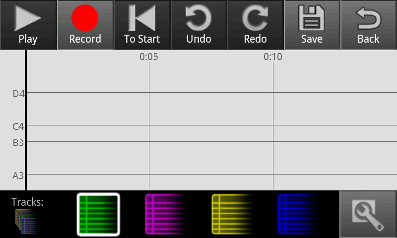
This is the compose screen for a song with no notes in it (e.g. a newly created song). | |
|
|
|
|
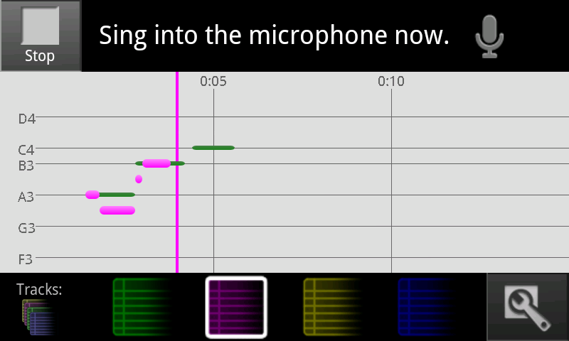
| Record some notes. Here various tracks have been used to layer notes. |
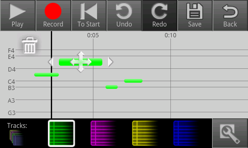
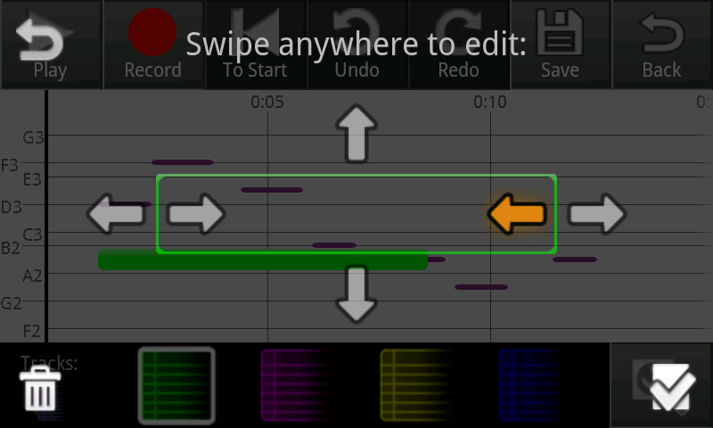
| A screenshot of one of our editing interfaces. Tap a note to start editing mode on it. Tap another not to switch to it, or tap off to stop. Dragging the note moves it, pulling the ends changes its length. |
|
|
|
|
|
|
|
|
|
|
Implementation
"Describe the internals of your implementation, but keep the discussion on a high level. Discuss important design decisions you made in the implementation. Also discuss how implementation problems may have affected the usability of your interface."
...