You are viewing an old version of this page. View the current version.
Compare with Current
View Page History
« Previous
Version 5
Next »
| # | Image | Specifications and Behaviors | Laura Comments |
|---|
| Top Nav |  | - Logo is clickable — goes to Home Page (revised)
- Learn goes to Learn Lander (new page)
- None of the nav items has a rollover dropdown
- Connect goes to Member page (revised)
- Search bar goes to Search Results (new page)
- Utility Icons click to:
- Notifications page (no changes)
- Messages page (no changes)
- My Profile page (no changes)
- MIT logo goes to web.mit.edu
We will keep the black CTA banner for non-logged in state. Ning - We need a version for non-logged in state.
| |
| Home Page |  | - Hero image is cropped smaller
- Tagline is the same; Button copy should be "Browse all posts"
- Unless Laura wants different...
- Object Card (see design below)
- Member preview
- Member count still clicks to Member page (revised)
- Can we show most active members (minus ClimateX team members)?
- Recent activities
- Make title clickable
- Should link to Recent Activities page (orphan page)
- Recent Activities page uses Notifications feed template, but simply lists all activities – comments, new posts, new videos, new podcasts
- Footer links are:
- Terms and conditions
- About
- Get involved
- Feedback link
- We're moving from a button to a link.
- Copy as shown
| |
| | | | |
| Compact Card | | Like style 2 best. The green label ribbon at top should not be colored green – it competes with other calls to action The "video" and "podcast" icons in style 1 should be applied to 2. We imagine using these cards on our topic pages. | |
| People | 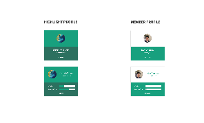 | We like the member profile square. It should be a smaller box – and the image should be larger in proportion to the box. We can replace the progress bar with a number for posts and comments. | |
| Pagination | 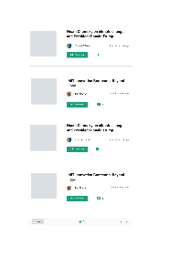 | This pagination is great. We'd like to see it say "Page 1 of __" | |