You are viewing an old version of this page. View the current version.
Compare with Current
View Page History
« Previous
Version 14
Next »
User Testing
Design
- The final design of our interface keeps all of the functionality from our previous prototypes but aims to simplify the workflow to make the entire process as quick and smooth as possible.
- The home screen has been changed in response to heuristic evaluation comments, as it was originally to wide to be seen on many modern devices. We changed the format of the home screen to include a marquee instead of a ribbon of images so that the view will not be as wide. This was much cleaner and allowed to page to be displayed cleanly on all devices that we tested.
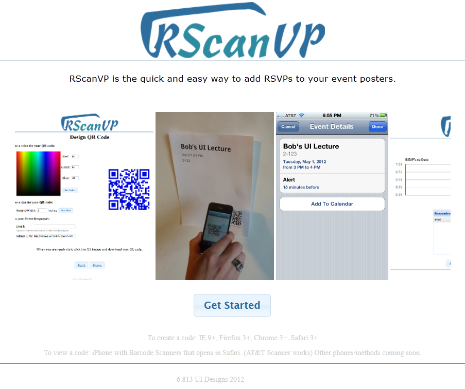
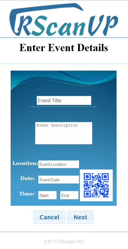
- After clicking the get started button on the home page the user is presented with an initial form to fill in the event information that the attendees will see after scanning the QR code they are creating. Unlike in earlier prototypes where all input fields were identical in size, the event description input has been expanded into a multi row text area to be more consistent with the fact that event descriptions can often be several sentences. In response to heuristic evaluations that showed our time entry field had usability issues, this area was redesigned to include a drop down to allow users to select times without having to manually type them in. Error checking was also implemented to alert users if their date or time entries were invalid.
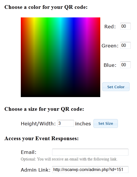
- After inputting event details users are brought to a page where they can customize the color and size of the QR code and then download it. Previous prototypes had divided QR customization and QR download into two separate pages. Feedback during heuristic evaluation indicated that the download page, which previously showed as sequence of instructions about downloading the code and how to use it, was overly complicated for the task. We therefore decided to streamline the process. We added text field for the user to enter their email address as well as a text field containing the user’s link to the admin page, to the QR code design page, and removed the additional page altogether.
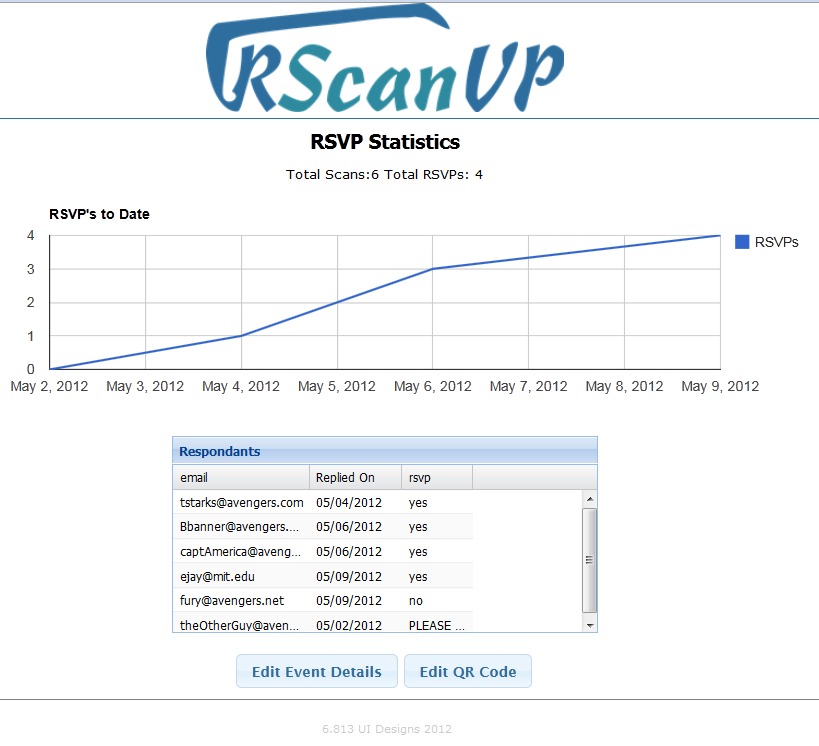
- The admin page where users can view RSVP statistics remained the same functionality wise throughout the iterations into our final design. It allows users to view a table of all those responded as well as a chart showing response numbers versus time. However, the layout of the elements on the page was updated to be internally consistent with the rest of the site. The main elements were centered, with the navigation buttons to the other parts of the site moved to the bottom.
- The heuristic evaluation noted a lack of feedback for sending RSVP responses. Therefore, we updated the view page to indicate to the user when a response message had been sent to the system.
Implementation
- We use our own server to host the website. We use PHP, JavaScript, AJAX, JQuery, and HTML to implement the site.
- The back end of the site provides a MySql database that stores data provided when users use the site. Whenever a user creates a QR code for a particular event. All of the details for that event are stored in the database along with enough information to generate the QR code. The user is allowed to re-edit QR codes and update their values in the database.
- The front end of our website features a simple and usable design that allows users to enter information pertaining to a particular event. Our website creates a QR code that gives potential attendees a simple way to RSVP to these events by scanning the QR code (hence the name RScanVP). The user is presented with another page of development that allows them to recolor the QR code and also re-size it within visible constraints.
- We decided to take away the "Download" button altogether. This makes it a little harder for users to acquire the QR code that has been generated. We made this decision so that the user was not redirected away from the site at any time because we could not figure out any other way to do it.
- We decided to add red text indicating an error in text fields so that users would not why their submissions were being rejected. Our user testing indicated that this was a good idea but would be more helpful if it were more visible and possibly located next to the field that had the error.
- QR codes are regenerated each time a new size or color is set. This was simpler than recoloring the image in JavaScript and thus we chose this way of doing it. However, based on user testing, this was a bad idea because users get confused when the QR code keeps changing.
Evaluation
Getting the users
- We decided to use pairs of users to test our project. As the project involves someone creating a QR code and then another person accessing that QR code and responding to an RSVP, we figured it made more sense to use separate users and give them focused tasks instead of making them perform tasks as multiple people. We gathered three pairs of people where each pair consisted of an MIT poster maker (dorm, school, and sport) and an random MIT student. By getting three different types of poster makers and a small group of random MIT students we feel that this represents our target user population very well. The poster makers are exactly the types of users we were hoping to build out website for and the MIT students fit the role of event attendees very well.
Briefing the Users and User Tasks
- After getting the users who would participate in the test, we told them that we created a website to help with the tracking of results for advertised events.
- Poster Maker - You are in charge of publicizing for an event. Your first task is to use our site to create a QR code that prospective attendees can scan to send an RSVP for the event. Later on, you will be tasked with viewing the statistics for your event.
- Prospective Attendee - Your task is simply to scan a QR code, RSVP 'yes', and choose to get an email reminder/add it to your calender.
Usability Problems and Solutions
- Download Obscurity - Catastrophic- Users were unsure of how to actually download the QR code. There was a note saying to right-click and download the image, but users got stuck because the term "download" was not consistent with the supplied option of "Save Image As...". In order to fix this, we could simply change the line of text telling the user how to download and make the syntax consistent. Further, we could simply email the image to the user when we email them the Admin link so that they do not have to worry about downloading it. However, this means that supplying an email would not longer be optional.
- Size Restriction - Minor - The user is restricted to certain sizes when re-sizing the QR image. We limit the size of the image to be between 1 and 5 inches; however, we never alert the user of this until they made the mistake of supplying an out or range size. We can fix this by putting an indicator that we only accept certain sizes. Further, we could fix this be having the size be a slide rule. Thus, the user can slide to the exact allowed size that they want but will have no way of getting outside those bounds. This would also supply them with sufficient feedback as to what sizes are allowed.
- Recolor Confusion - Major - Users were a little confused that every time they clicked "Set Color" a new QR code appeared. As mentioned in the Implementation Section, we did this on purpose. To avoid this, we could made re-size and re-color happen on the QR images themselves rather than trying to create a new QR image each time the button was clicked. As a simpler, but not desired, solution we could have written a note to the user explaining that the codes would continually change but still work, so they should not worry that the images keep changing.
Reflection