You are viewing an old version of this page. View the current version.
Compare with Current
View Page History
« Previous
Version 10
Next »
Design 1
This design is unique in that users do little to no typing when using the site (depending on how the exchange / request message system is set-up). Thus the all mouse based interface makes navigation and site actions very efficient. Additionally, it's minimalistic design makes it good for the non-tech savvy users, such as the elderly.
|
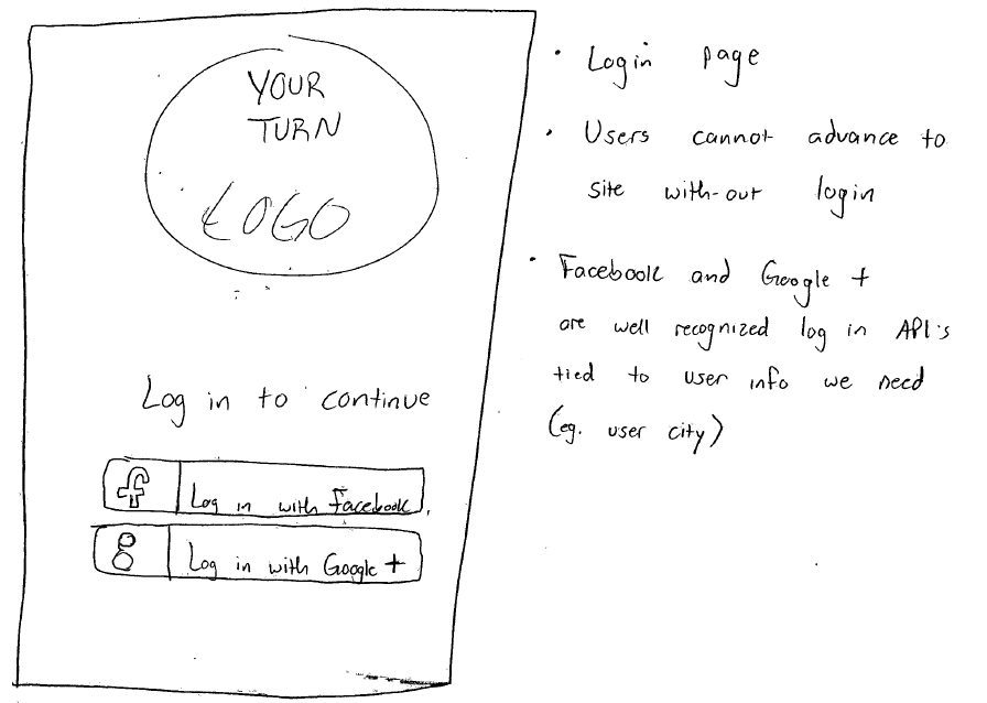
HOME PAGE
Pros
Users do not have to enter their information into a long form, so registration is faster and easier
Cons
Users may not be comfortable with connecting their social network profile to the site
Requires users to have a Facebook or Google+ account
Users cannot browse website without logging in |
 |
DONATE PAGE
Pros
Choosing items to donate is very simple -- users perform a batch photo upload of each item they would like to donate
Categorizing items is easy -- users drag and drop items from their donations list into pre-determined categories
Cons
The only information associated with any item is a picture and a category. This is severely limiting for search capabilities
and would not allow for common features such as search by name. |
|
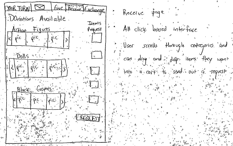
RECEIVE PAGE
Pros
Users can easily select items by dragging them from categories into their cart.
Cons
Finding items can be a chore. The only filtering of items is predetermined categories.
Users forced to do a side scroll through items in a category in the hopes that they find what they want. |