1 Design
The most important design principles that guided TravelTech's final design are: user control/freedom, consistency, learnability, and feedback.
1.1 Design Decisions
Paper Prototyping
During paper prototyping, several important design decisions were made.
- Discard TravelGroups
- Include two calendars
- Develop the new map / data representation interface
- Place the calendars and map on the same page
TravelGroups
TravelGroups, lists of people going to the same area as the user, were cut from the final design because we realized that users' travel plans were dynamic and frequently subject to change. Instead of TravelGroups, we focused on saving trips and providing easy means for the user to change details about their trips. We also decided to generate a list of emails for users to contact rather than relying on TravelGroups.
Two Calendars
Many users were confused about selecting a start date and an end date on the same calendar. To adapt to user demand, we decided to use two calendars, one labeled "start date" and one labeled "end date" in order to reduce user confusion. The calendar also grays out dates before the start date in the "end date" calendar after a start date is selected. This prevents errors and gives the user basic feedback.
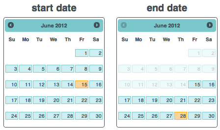
Figure 1. Two calendars are used to represent a start date and an end date to reduce user confusion that arose when using only one calendar.
New Map and Data Representation Interface
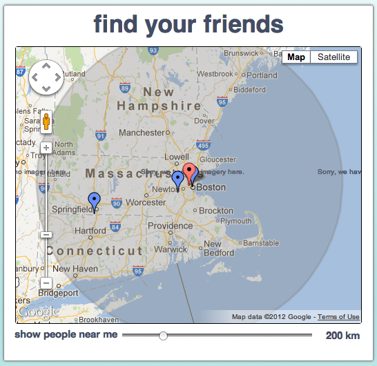
Figure 2. The final map interface combined the initial map page where users entered their destinations with the map page that displayed data about other people in the area. This was more consistent with the real world and across the TRavelTech site.
Calendars and Map on the Same Page
We also decided to place the calendar and map on the same page for the sake of simplicity and consistency. The user was also able to have more direct feedback; as he adjusted the dates on the calendar, he would see people pop up or disappear on the map if they fell in or out of his selected date range. This decision gives the user maximum control and information scent.
Figure 3. The calendars and map placed on the same page to reduce complications, give users direct feedback, and increase consistency.
Heuristic Evaluation
Feedback from heuristic evaluations and TA meetings made us realize that we should give the user even more feedback and information scent. In response, we did the following:
- More interactive feedback on the map in response to changes on the calendars
- A chart to tell the user how many people are near him on each of the days he is traveling, as well as several days before and after his range.
More Map Feedback
After heuristic evaluations and feedback from our TA, we linked selection events on the calendar to more direct feedback on the map. After entering a location selecting a start and end date, the map immediately centered and zoomed-in on the user's destination. Then, people within a user-settable radius of the destination and within the user's given date range are displayed as clickable blue markers. Clicking on the blue markers displays a pop-up containing the name, email, and travel information of the person at that location. See Figure 4.1.
Chart to Display Other People During Similar Time Range
What if people have adjustable start and end dates to their trips? They might extend their trip by one day if they know that a certain friend is also traveling on that day. We decided to include a histogram of the number of people traveling for each day within the users's date range, as well as five day before the start date and five days after the end date. The chart is redrawn each time the user changes his date range. By mousing over the bars in the histogram, the user can see how many people are traveling on a certain date, as well as how many more/fewer people will be traveling on the extra five days at either end of his range. In the future, we want to make the bars clickable: a pop-up will display a list of people and their emails if the user clicks on a bar.
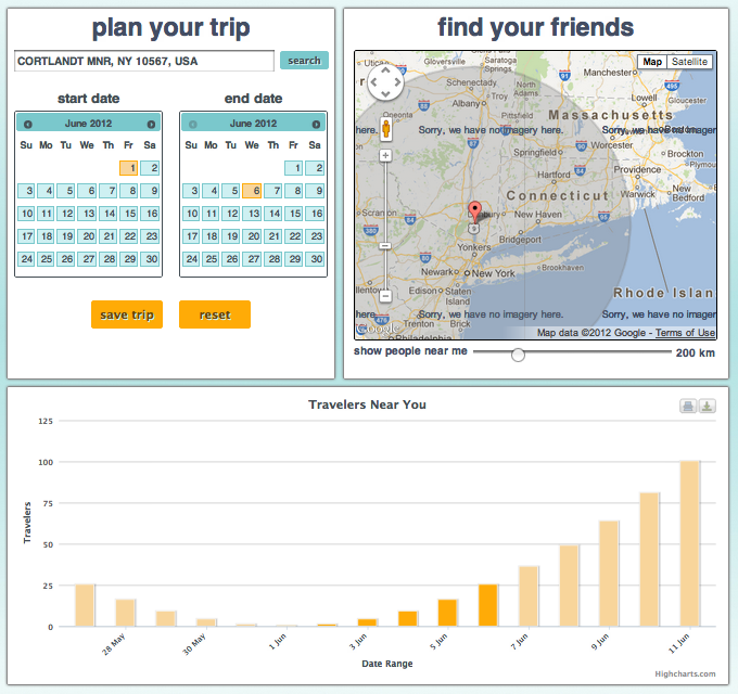
Figure 4.1. Selection of a destination, start date, and end date gives the user immediate feedback in both the map and the chart. The chart displays to the user the number of other people who will be traveling to his destination during his date range. The chart also shows the user the number of other people who will be traveling 5 days before his start date and after his end date, giving the user feedback about how many more people he could be traveling with if he were to extend his stay by a few days.
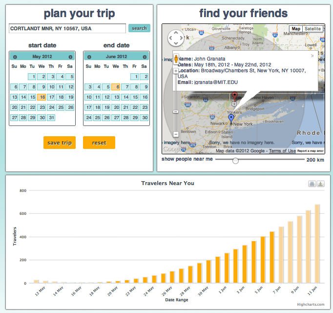
Figure 4.2. This is a date range with people who are near your destination. The people are clickable.
User Testing
Because user testing occurred after our final implementation, we could not incorporate their changes. Below are some proposed changes and/or solutions:
- The link to enter the home page from the landing page should change colors when scrolled over to show it is a link.
- The text color/button color combinations should be changed to make them easier to read
- The buttons that perform different actions within the website (reset, save trip) should have different colors so the user can more easily differentiate them.
- Clicking a location from the autocomplete menu should perform the same action as if the user had also clicked search with that value in the text field.
- The graph should be visible once there is a valid location and date range on the home page.
- All of the markers shouldn't disappear once the user selects a date range even if he/she has selected a location. This confuses the user and makes them believe they've done something wrong.
- Some indication should be added (potentially a picture on the landing page) that shows that the markers are clickable.
- The list of trips on the my trips page should be listed in chronological order.
- There should be a button in the contact list pane that copies the list to your clipboard.
- The names in the contact list should be clickable like the list of trips.
Other Design Decisions
Other design decisions include:
- Autocomplete on destination textbox
- Navigation bar on top
- Reset button
Autocomplete
Autocomplete was included for the destination textbox to make the user's experience simple.
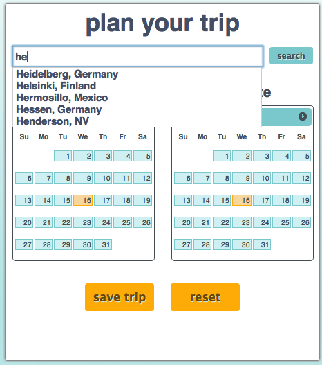
Figure 5. Autocomplete box for better user experience.
Navigation Bar
We included a navigation bar on the top for the user to easily navigate between the map page and the trips page.

Figure 6. Navigation bar for easily flipping between pages.
Reset Button
We included a reset button (which can be seen in Figure 5) in case the user messes up his trip planning and wants an immediate reset.
1.2 Alternatives
There were several alternatives that we considered:
- Line-graph data representation of travelers near the user and then two map pages
- TravelGroups
- Facebook integration
- Forum
Line Graph and Two Maps Representation
Initially during paper prototyping, we had a sequence of three pages: an initial map page to enter a destination, a calendar page to select a date range, and a data/summary page to display other people traveling to a close destination within a similar time range. Originally, we represented our data in the form of Figure 2.1. Several users had trouble deciphering this graph. In order to make our design more simplistic and consistent with the real world, we decided to change the data representation page to a map, seen in Figure 2.2. Finally we combined this map page with the first map page where users enter their destination information. This made the design more simplistic and reconciled inconsistency issues with the first and second map pages. The summary page's map was slightly different from the map on the first page because it had adjustable bars to change the date range and change the radius. For many users, they were confused by the two really similar but slightly different maps. They also could not see direct feedback as they were setting their traveling dates and destinations. Moreover, we decided to discard the adjustable bar for dates and instead allow users to adjust their date range directly on the calendar. The radius adjuster was kept.
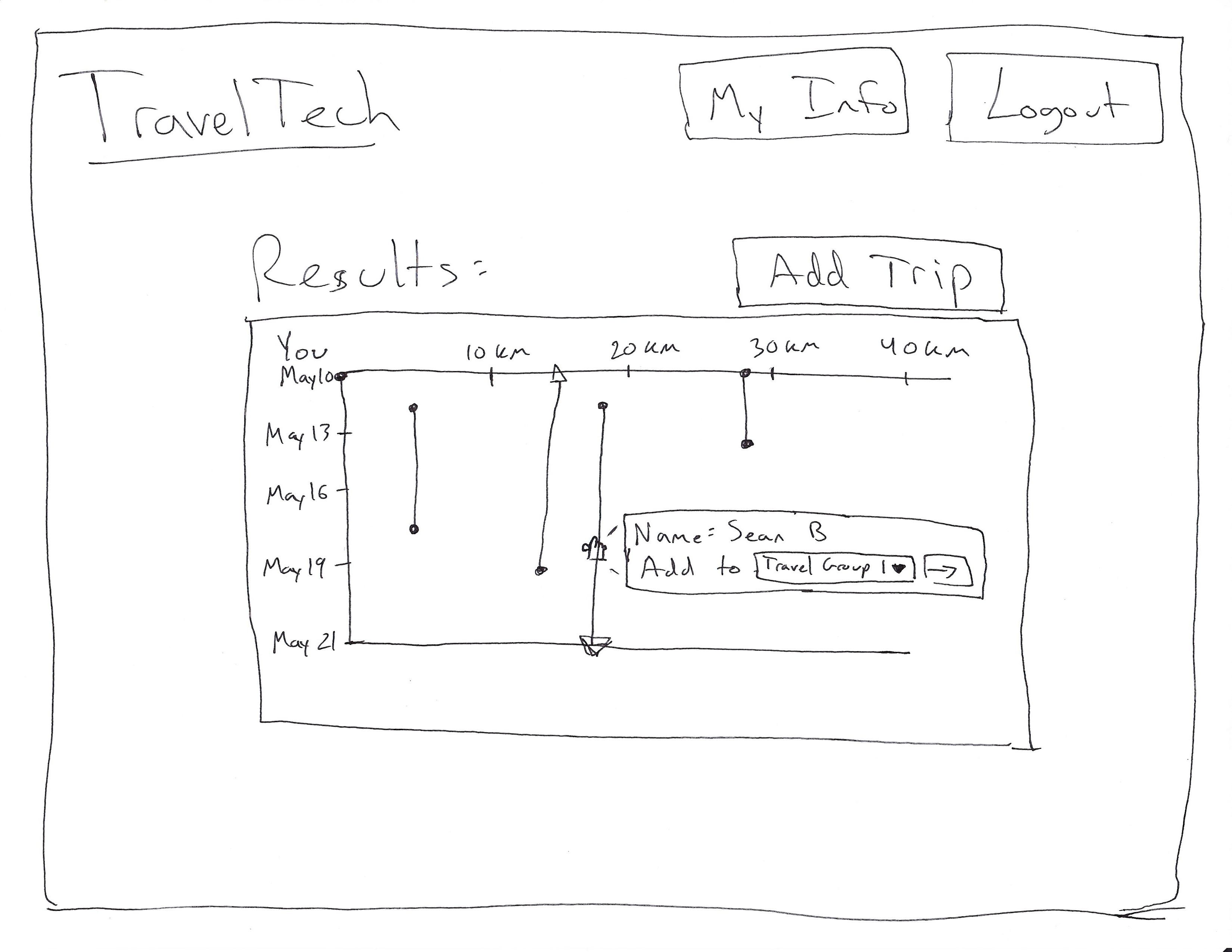
Figure 7.1. Users found this interface difficult because people are not typically represented as line graphs in the real world.
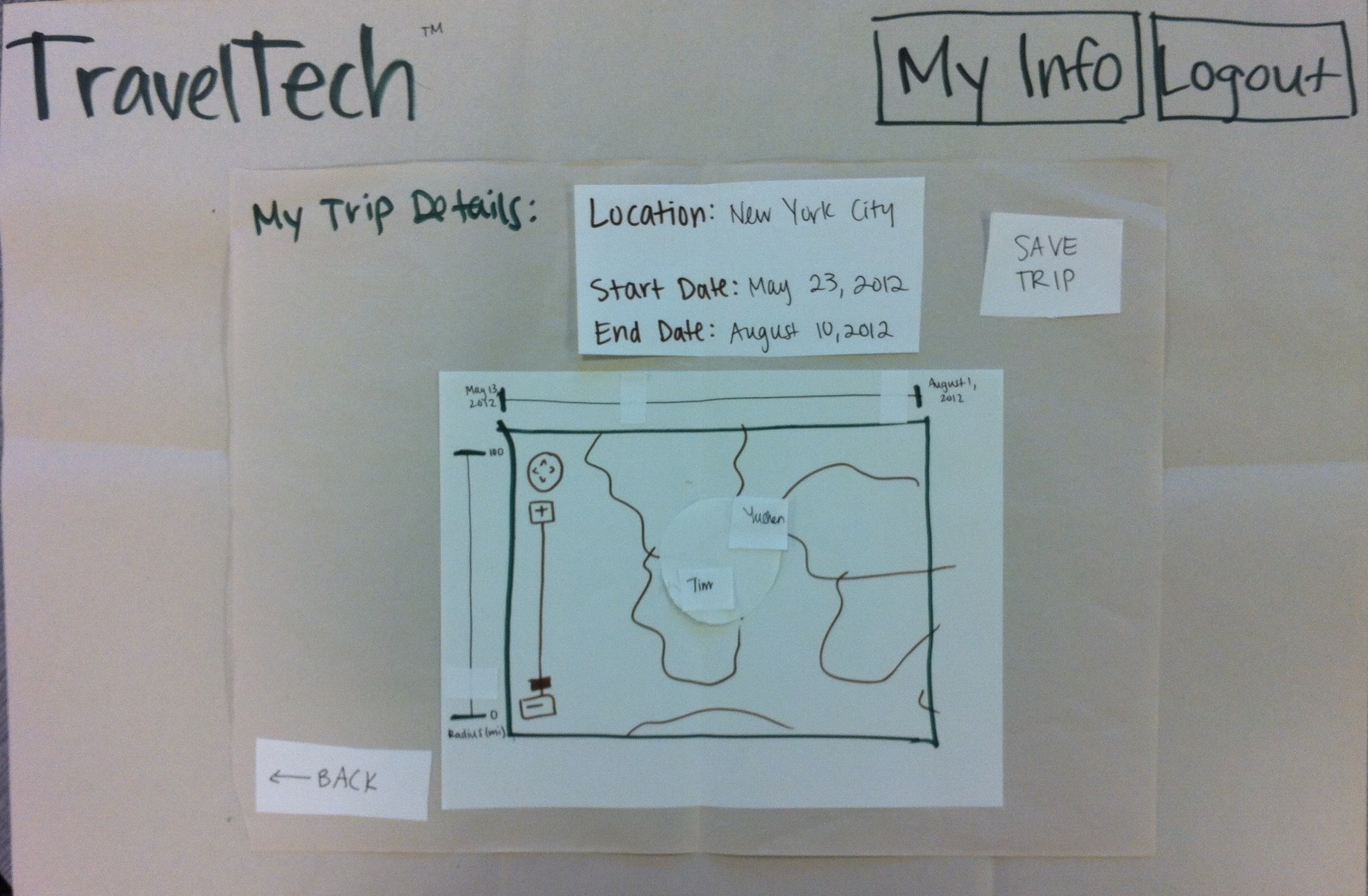
Figure 7.2. The new interface allowed users to adjust the radius from their destination as well as the date range.
TravelGroups
As discussed earlier in Design Decisions, we decided not to include TravelGroups. They were, however, originally an important part of our design. As can be seen in Figure 8, TravelGroups were essentially a collection of people traveling near the user during a similar date range. They can be saved on and then accessed on the trips page. We decided that this was unnecessary because users can easily change small trip details that may result in a slightly different travel group.
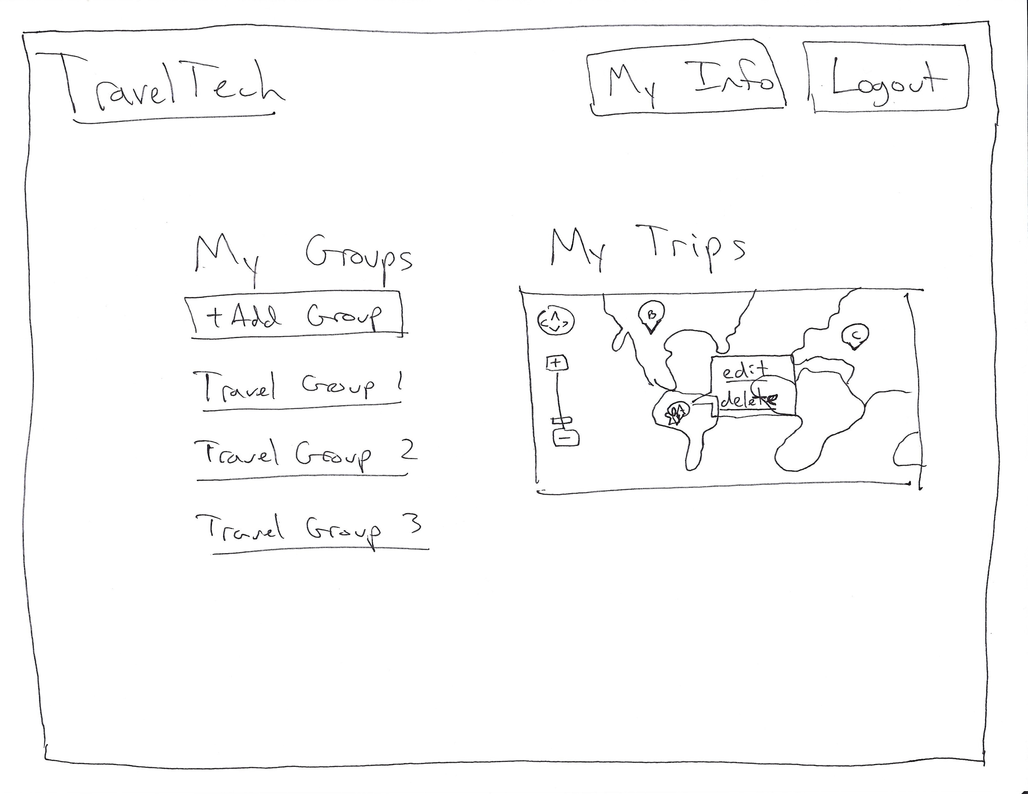
Figure 8. TravelGroups of people traveling near you during a similar date range. Deprecated.
2 Implementation
2.1 High Level Discussion
We decided to implement a web application using HTML, JavaScript, CSS, JQuery, with a PHP/MySQL backend and we use MIT's scripts server for hosting. User authentication is implemented with MIT certificates, which are also utilized to pull user information (name and email address) from. This may be confusing that users aren't required specifically to log in, but we expect that most users with certificates understand their purpose. There are two sql tables: one for user information and one for all of the trips. The site collects any information that the user is inputting and when the user does an action that requires table lookup/modification, the site passes the information via URL to the other page (home -> my_trips, my_trips -> home), which executes the relevant query. The main usability problem with this implementation is that any action that requires a table lookup/modification requires a page reload, which as it stands resets any of the user's current partial input. Most of our fields and buttons are controlled via javascript, and we utilize the Google Maps API for our maps. We chose Google Maps for both its ease of use in implementation but also in hope that the users will be familiar with the interface and controls.
Our graph that shows nearby travelers on a day range greater than yours is only visible once the user has inputted a location and selected a start and end date. While this was implemented this way because otherwise the information could be misleading, the fact that the graph is at times not showing and then being displayed may cause potential usability problems. We also decided to implement the graph with dummy data to show off its functionality, as there would need to be a large amount of data entered into the system for the graph's output to be relevant.
2.2 Potential Problems
Several aspects of the interface design proved to be much more difficult than anticipated, and some of these struggles may have negatively affected the overall usability.
- Calendar: Our original intent was to use one single calendar for the sake of simplicity; however, this created the issue of determining whether a certain date was supposed to be the start date rather than the end date in addition to figuring out how to interpret a date change. As aforementioned, we settled on displaying two separate calendars rather than one – this resulted in greater ease of implementation but reduced simplicity. Additionally, we ran into some difficulties when highlighting/selecting the current date as the initial selection and this behavior could also cause problems for the user.
- Map: The map updates dynamically when the user selects either a start or end date in order to display the users traveling in the given date range; however, if the user has not entered a desired destination then all markers will disappear from the map, potentially causing confusion for the user.
- Graph: Like the map, the graph updates immediately when the user inputs a start and end date. However, the graph is only displayed when the user changes both the start and end date from its original (current date) selection. If the user is planning a one-day trip on the current date, he/she may not ever see the graph.
- Layout: We faced many difficulties when making design decisions regarding the layout of the application. On the home page, we decided to place the graph immediately below the input and map boxes; if the user is working on a relatively small screen, this requires him/her to scroll down in order to view the full graph. This could potentially cause decreased efficiency.
3 Evaluation
3.1 User Test Setup
Users were asked to sit down in front one of our laptops displaying our briefing page, located here. They were then told that they would be given three tasks and observed as they navigate through each of the three tasks. During each task, users were asked questions (included in 3.3 User Briefing and Tasks) to make sure that they were progressing through the tasks. If users became stuck, they were prompted. We made sure users knew that some of our data was dummy data. At the end, users were asked to say one thing they liked, and one thing they disliked or found confusing.
3.2 User Backgrounds
We found users by emailing out to our respective dorms. Those who responded participated in our user test. Because we did not get a response from an MIT faculty/staff member, we approached one in person and was able to elicit the person's participation. From our user tests, we identified three representative users:
- An undergraduate student
- A graduate student
- An MIT staff member
Users were of the age range 18 to 50 and were of both genders. Our initial target population were students, faculty, and staff. In retrospect, anyone computer-literate can use TravelTech if he/she wants to plan a trip. We specifically identified students and faculty/staff because they would be traveling more often and be more likely to look for other people with similar travel plans.
3.3 User Briefing and Tasks
Users were briefed with a simple description of TravelTech's goals, located here. We felt that a demo was unnecessary because TravelTech is easily learnable and provides enough cues to the user. Then users were given the same tasks they received during paper prototyping. They were given the following tasks:
- Input a trip and save it
- View all trips and find a list of contacts
- Edit then delete a trip
Task 1: Input and Save a Trip
A user was read the following in stages: "You are planning a trip to Newton, Massachusetts from May 17, 2012 to June 12, 2012. Please enter this information. How many people will be within 200 km of you during the date range you just specified? What are their names? How many people are within 360 kilometers? Who is/are the new person/people given this new specification? If you changed your trip's end date to June 13, 2012, how many more people will be near you? Change your trip's start date to July 13, 2012 and end date to August 11, 2012. How many people are within 360 km of you? Finally, change your location to Indianapolis, Indiana, but keep the dates July 13 and August 12. Who is the only person within 200 km of you? Add your new trip."
Task 2: View Trips and Generate Contacts List
A user was read the following in stages: "Please tell me all the trips that you currently have. Click on the trip you just made and tell me how many people are near you. Get me this person's email."
Task 3: Edit and Delete a Trip
A user was read the following in stages: "You are no longer traveling to Indianapolis, Indiana. Instead, you want to go back to Newton, MA. Make this change in your trip. You decide you don't have enough money to make a trip at all. Delete it."
3.4 Usability Problems and Proposed Solutions
Task 1: Input and Save a Trip
- The MIT staff member:
- Save trip button (minor): She hit the save trip button on the first page immediate after inputting a destination and start date. She proceeded to finish the rest of the task on the my trips page rather than the home page. Thus, she never saw the information displayed in the chart and did not use the first page at all. The placement of the save trip button could have been misleading; instead, moving it to the bottom of the page may alleviate confusion so that the user stays on the first page longer.
- Markers on map (minor): Since the user never used the home page and almost exclusively relied on the my trips page, she did not realize that the markers were clickable and depended completely on the contacts list for getting a user's name and email. Had she been asked for the user's traveling date range, she would not have been able to tell from the contact information. The fact that the markers were clickable is an extension of Google maps and had the user stayed on the home page, she would have had to click on the markers to find information about other travelers. Fixing the location of the save trips button should fix this too.
- Undergraduate student:
- Autocomplete / search (major): This user had trouble searching for a specific location because he chose to click on the appropriate entry in the autocomplete drop-down menu and then refrained from clicking the "search" button. This issue could easily be avoided by changing the functionality of the autocomplete.
- Map radius and zoom (minor): He commented that he did not like how the radius was reset to 200km each time the search button was pressed. He also would have liked that the map zoom in/out as the radius is changed. Both of these issues could be solved by changing the default behavior of the search button and radius slider.
- Graduate student
- Markers (minor): John didn't know that the markers on the home page were clickable and therefore had trouble acquiring the proper information for the first task using the home page. He also didn't know the markers were clickable on the my trips page. A possible solution to this is to have a marker already selected when the user loads the page.
- Calendar (major): John had a few issues with the calendar on the home page. After a location is entered and the user hasn't changed any of the dates, the graph isn't generated. Only when the user has selected a new start and end date is the graph generated. Also the calendar allows you to set an end date before the start date if the user hasn't changed the initial start date. A possible fix for this is to treat the initial selected dates as if the user had input them.
- Circle radius/zoom (minor): John didn't like the default radius of 200km as he thought it was unreasonable and also didn't like that it was always reset to 200km. He thought that zoom of the map should scale with the radius of the circle. This could be fixed by fixing the zoom of the map with the radius of the circle.
Task 2: View Trips and Generate Contacts List
- MIT staff member: had no troubles with this part.
- Undergraduate student: had no troubles with this part of the testing.
- Graduate student
- Trip list (minor): John was able to perform the task but commented on the trips not being listed chronologically. This could be fixed by sorting by date.
- Contact list (major): While the formatting of the contact list allows direct copy/paste into gmail, John had a hard time with the uneven formatting and suggested a button that copied the selection to the user's clipboard. He also thought that names on the names on the contact list would be links that highlighted trips like the trip list. A possible solution to this is to make the names in the list links, that when clicked, perform the same action has if the associated marker had been clicked.
Task 3: Edit and Delete a Trip
- MIT staff member: had no troubles with this part.
- Undergraduate student: accidentally clicked the "delete" button when the intention was for the user to click the "edit" button. This confusion could be avoided by changing the colors and/or layout of the buttons in such a way to distinguish them from each other. Another solution would be to implement an undo button.
- Graduate student:
- Button color/font (cosmetic/minor): John had a hard time reading the text on the button due to bad color choice and with all of the text being lowercase with a bulky font. This could be fixed by changed the color of the button or the text or by adding an outline. Also, a thinner font would help the issue of letters running together or appearing the same.
4 Reflection
4.1 Lessons Learned
- UI design requires both detail-oriented and big-picture vision: Over the course of the semester, each of us came to learn that the UI design process is a delicate one. Every detail matters, but it is also important to establish a goal and direction early on in the design process – and also make sure to remain goal-oriented throughout.
- User/usability testing is an involved process: Standardization is important and necessary in order to obtain valid and accurate responses from potential users. A key skill is knowing how to interact (and remain silent) with users during the testing process; there is a fine line between too little and too much when explaining the interface to the user. Additionally, it is important to test a variety of users, as some may be more experienced or knowledgable about a certain topic than others.
- Less is more: Throughout this process, we came to understand the importance of simplicity and minimalistic design. When an interface is crowded with several features, each of them loses significance – we decided to focus on a few important aspects that eventually created what we believe to be a successful product.
- Heuristic evaluation is a powerful tool: Having individuals who know the elements of user interface design analyze and provide feedback is an extremely powerful method on improving a user interface.
- The user is always right and it's hard to think like a user: It is hard to distance oneself from the role of the developer and forget the things you know and the attachment you have to what one has created. It is important to get objective opinions about a user interface, and usually the ones who designed the interface will be some of the last to determine certain problems.
- Not everyone interprets things the same way: Sometimes we would get feedback or would observe the same user action during testing but when we came together, we each thought we had seen something different or that the cause of the behavior were different factors. It is always important to have someone recording the results and user actions as they happen and also to ask the user questions questions about their behavior/choices when using the user interface.
4.2 What Would We Do Differently? (Meta-Level)
- More users for each of our tests: Though the amount of usability testing that we conducted was sufficient enough to provide us with valuable feedback, we feel that testing both the paper prototype and initial design on a wider variety of users would have given us more insight into our target user population. Additional paper prototypes would have saved us a great deal of time and provided more user feedback during additional iterations.
- More rounds of testing: We also believe that we should have done more iterations of testing after coming up with new designs after GR4. We were too focused on creating a final product that was what we wanted instead of ensuring that from the beginning that we were focused on something that that our user population would want and could use.
- More stretch: We think we should have zeroed in on the fundamentals of our user interface earlier so that we could have spent more time adding stretch. Stretch was the challenging part of the UI that allowed us face difficult decisions and utilize user feedback.
- More detailed computer prototype: While we had a computer prototype that enabled testers to get some sense of our user interface/project, we would have had a much easier time creating a more cohesive and better UI for our final implementation if our computer prototype had been further implemented before being heuristically evaluated.
- Focus the idea: We spent too much time initially trying to make a site that did too many things (and much of them were repeat functionality of already existing web applications). We should have more immediately focused on the elements of an idea that proposes unique and challenging UI problems.
1 Comment
Sacha Zyto
on GR5:
Presentation: good briefing !
Usability: lots of great improvements: chart, information scent, homapage, user discovery process, engaging UI, safety
Answers to our questions: very good: reflection on efficiency (i.e. avoid many clicks problem)
Overall: The project has improved a lot since GR4. Congratulations !
on GR6:
Overall Wiki presentation
: nicely structured and up to date
Design description: very good discussion of design decisions. Excellent to remind us of which design were not kept and why
Evaluation: good, as long as John hopefully isn't your user's real first name (privacy).
Reflection: good and thoughtful