GR3 - Paper Prototyping
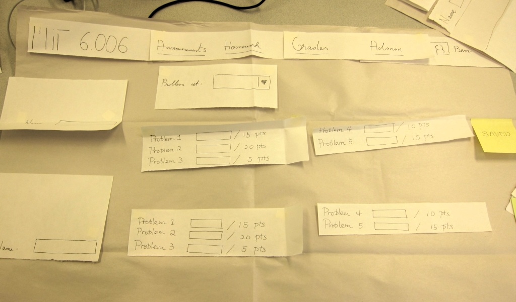
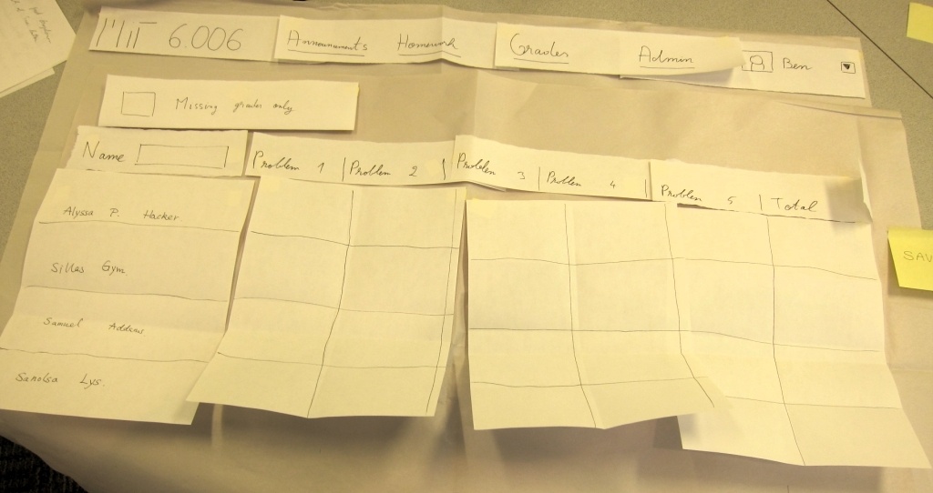
Prototype photos
First iteration:

Second iteration:

Briefing
We gave our users the following verbal briefing: “We are working on a course management site, something along the lines of Stellar. Students submit psets, TAs get them, grade them, enter the grades, and then students see their grades. Today, we want to test the UI for entering grades. You are Ben Bitdiddle, a TA, and your tasks will all revolve around entering grades for psets.”
Scenario Tasks
- Task 1: Enter grades for one student, Samuel Adams, for problem set 1
- Sam got the following grades:
- Problem 1: 10
- Problem 2: 15
- Problem 3: 5
- Problem 4: 8
- Problem 5: 12
- Task 2: You have many students (30+) whose grades you need to enter into the system. Don't use the mouse – tell us what keys you press. Please note that ordinarily, when faced with this quantity of grades, the user would naturally discover that he or she can use the keyboard to increase efficiency. We can make this assumption since we have data confirmation of this behavior based on the system prior to the UI improvements that we're working on now.
- The header labels are: Name, Problem 1, Problem 2, Problem 3, Problem 4, Problem 5
- Samuel Adams: 15, 20, 5, 8, 12
- Alyssa P. Hacker: 5, 5, 5, 8, 5
- Task 3: Get a list of students without a grade for problem set 1, so that you could grade any late submissions
Observations
The following details some of the users' more informative behaviors, and the usability problems and our response in the second prototype (and beyond) are described in more detail in the next section.
- First iteration:
- User 1: Noticed the name search before the pset drop-down, so he probably would never constrain grades to PS 1. Would use Tab or Enter to move to next student, so we should make both work.
- User 2: Tried posting grades through Grades > PS 1. Spoke to himself about the point totals, wondering if they could be clicked and changed. Did not know what to do after entering grades for one student, in task 1 (was thinking of using mouse). In task 2, the user selected a student name successfully from the combo box, but the computer forgot to switch focus to the first grade field. The user would press Tab, but questioned his decision (this might be irrelevant, since a real UI would get this right). We should probably have Save buttons, and have some UI for switching to fast entry mode (checkmark + label + question mark that shows pop-up with instructions)
- User 3: Tried posting grades through Admin > Post Grades. Combobox interaction went well. Also looked for a Save button after entering grades for one student. When focused on the pset selection drop-down, the user tried typing 1 to get to PS 1.
- Second iteration:
- User 1: We didn’t populate the table with student names, and the user was confused. The user was also confused about whether they needed to enter a percentage, or raw points. This shows that, if we do populate the table, users might try to find student names there, instead of using the search box. Name search was confusing, the user tried to move focus back to the search box after entering grades for one student. We should figure out an interaction model that works better for this. Finished task 3 very quickly.
- User 2: Tried posting grades through Grades > PS 1. For task 2, tried tabbing through entire table until the right student name popped up. Computer had a hard time managing the input focus, which might have bugged the task. For the third task, went to the Admin menu, then gave up. Did not notice checkbox at first, but later found it.
- User 3: Wondered whether should head for Grades or Admin, eventually went for Grades > PS 1. For task 2, tabbed through the UI until the focus sets on the first name field, entered student name via combo box, pressed Enter to select the student, then pressed Enter after each grade. So Enter should work in the same was as Tab. Used arrow keys to select names in combo box. Finished task 3 instantly.
Prototype iteration
Users didn’t realize the fact that problem sets and students need to be chosen sequentially, and that performing the steps in the wrong order can lead to errors -- specifically, entering a grade for the wrong problem set for a student. In the second iteration, we made an improvement on the name search box. Instead of just having a name search box, we added a placeholder for all of the students on the page. This was still confusing to users, so we pre-populated all of the user names. This last change dramatically improved the usability of the grades interface. Some users still referred to scrolling through the page to look for a student, so the change was not good enough to improve the discoverability of the filter box. One way to add information scent to it is to add inactive text -- text that appears when the search box is empty -- that labels it as a filter control. We think that this last step, combined with the UI improvement that we made for the second round of testing, will enable all users to use the interface in the most efficient manner. We can test this in the computer prototype stage.
Our original idea for task 3 was to have a “Missing Grades” for a problem set in the admin panel. However, our user testing of the first prototype showed that none of the users tried to open the admin menu to perform task 3. In fact, none of our users were able to complete task 3. This lead us to add a large checkbox to each problem set to apply a filter against graded problem sets. After some thought, this makes a lot more sense – after adding a list of users beneath the name filter box, we were able to add other filters to that list. A natural place appeared to show users who don’t have grades for a problem set, and that place was alongside the name filter box.
Please note that our second prototype does not have maximum point counts. These upper bounds were very helpful, and we later realized that we should have kept them in the header row of the table. The reason we removed them in the second prototype is because several users asked about them, and tried to interact with them (when in reality they were static text). Also, in the second prototype, we accepted the return key as a substitute for tab, based on our observations of the first prototype. Also, users don't seem to accept the concept of auto-saving fields, so we decided to add a notification (as can be seen in the pictures) or a save button. We decided that a save pop-up would be best based on user reactions. We decided to do something about the admin menu -- most likely remove it due to the confusion it caused with the users.