GR3 - Paper Prototyping
Index
- Prototype Photos
- Briefing
- Scenario Tasks
- Observations
- Prototype Iteration

1. Prototype Photos
The following photos show the second iteration of our design. (The first iteration consisted of the Home Page and Analytics of our Design #2, and the Food History page of Design #1, as seen in GR2.)

Log-In
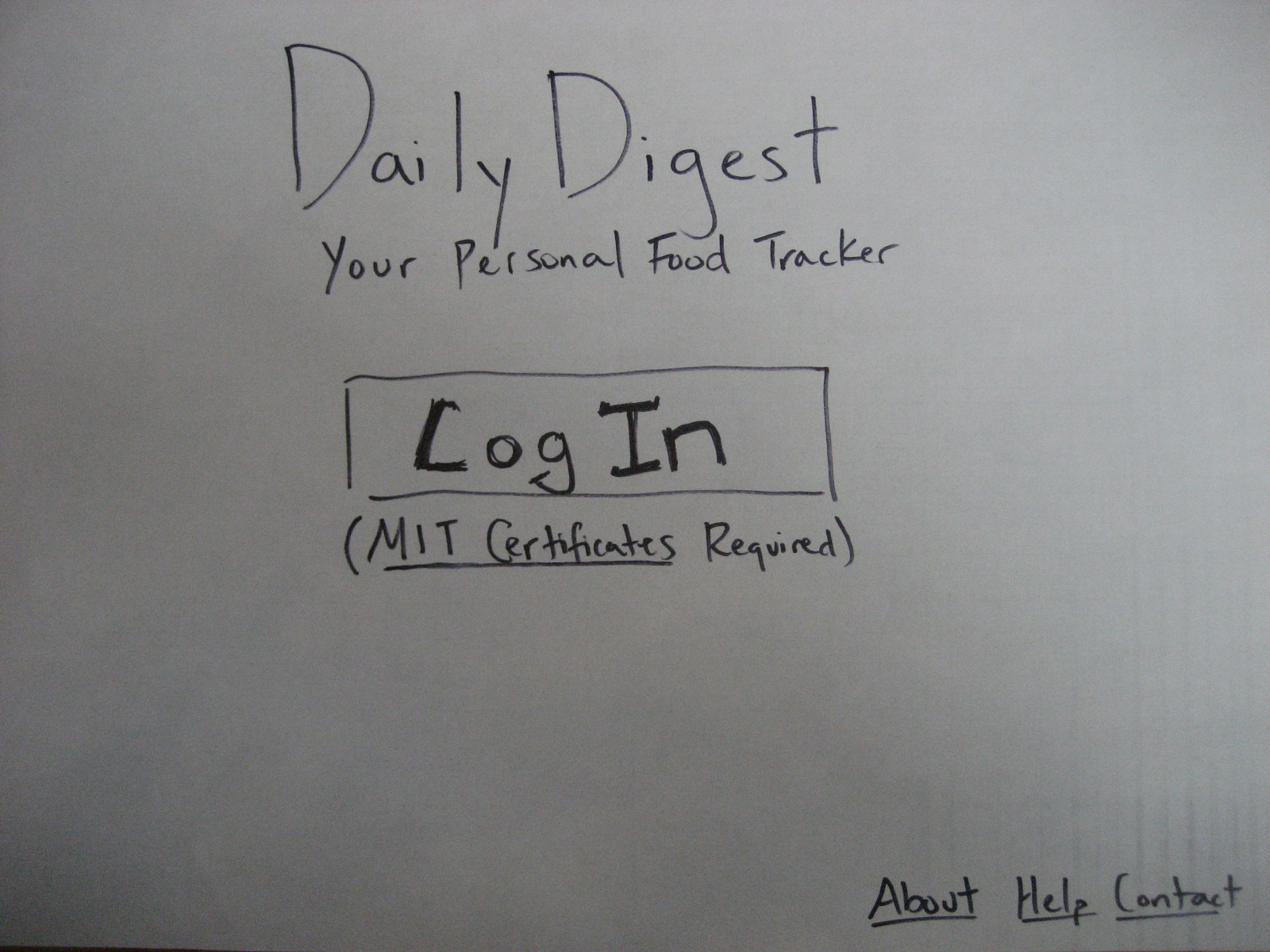
Fig 1. Log-In screen

Home Page
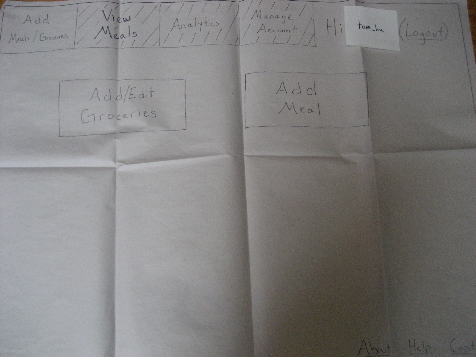
Fig 2. Home Page showing two options: "Add/Edit Groceries" or "Add Meal"
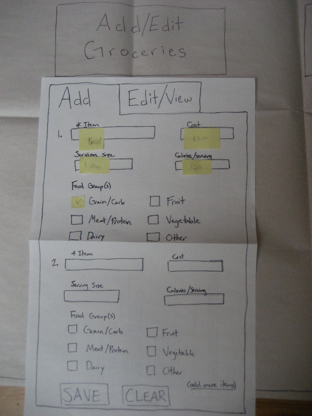
Fig 3. Clicking "Add/Edit Groceries" brings up this form.
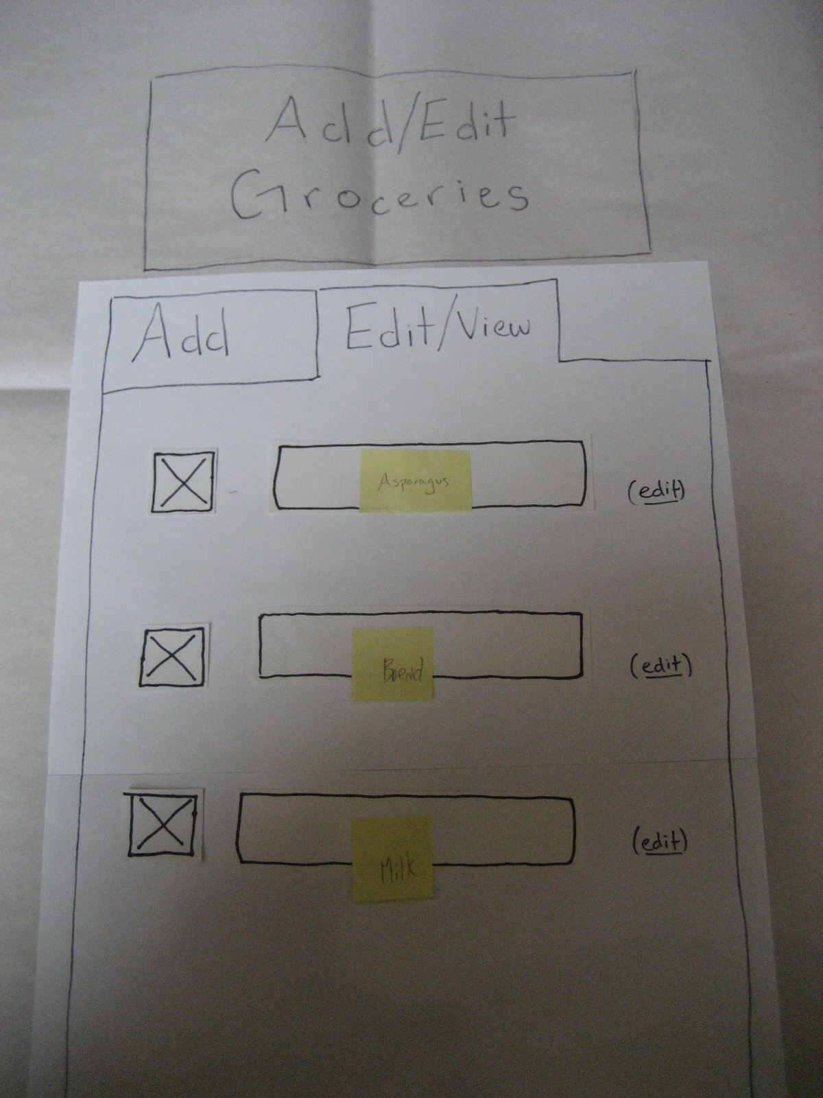
Fig 4. After saving new groceries, the groceries are displayed in the "Edit/View" tab.
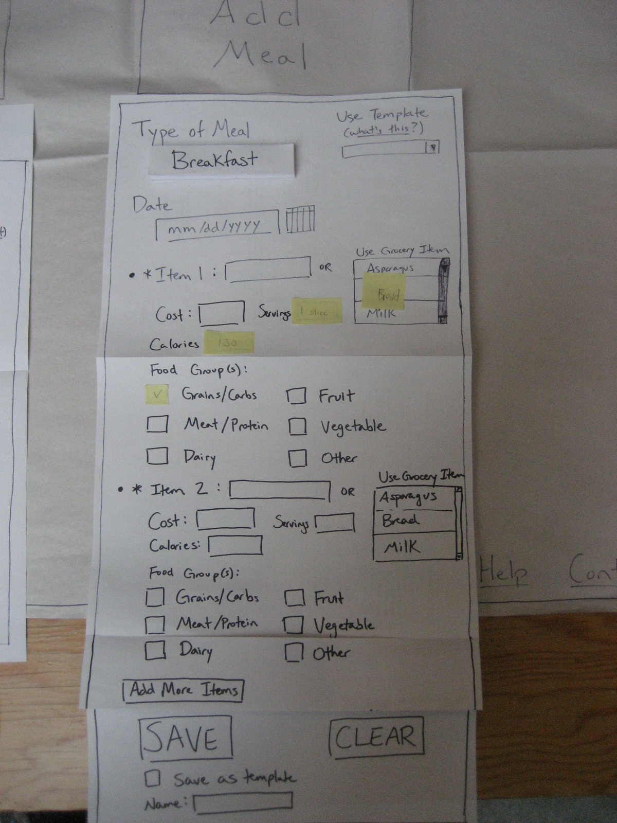
Fig 5. Clicking "Add Meal" brings up this form. For each food item, the user types it or chooses it from a select box containing all food on the food list. In the second case, the form auto-fills with the food's nutritional information.

View Meals
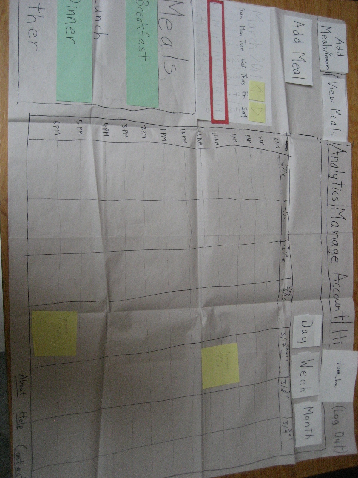
Fig 6. The default View Meals page shows meals for the current week in calendar form. Only breakfast and dinner are shown in this example, since the user has un-highlighted "Lunch" and "Other" in the lower left corner.
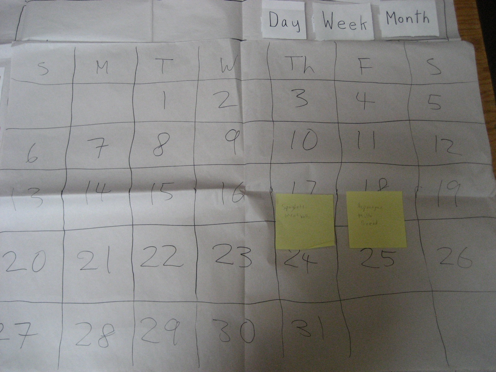
Fig 7. The user hits "Month" to see a month view of meals.

Analytics
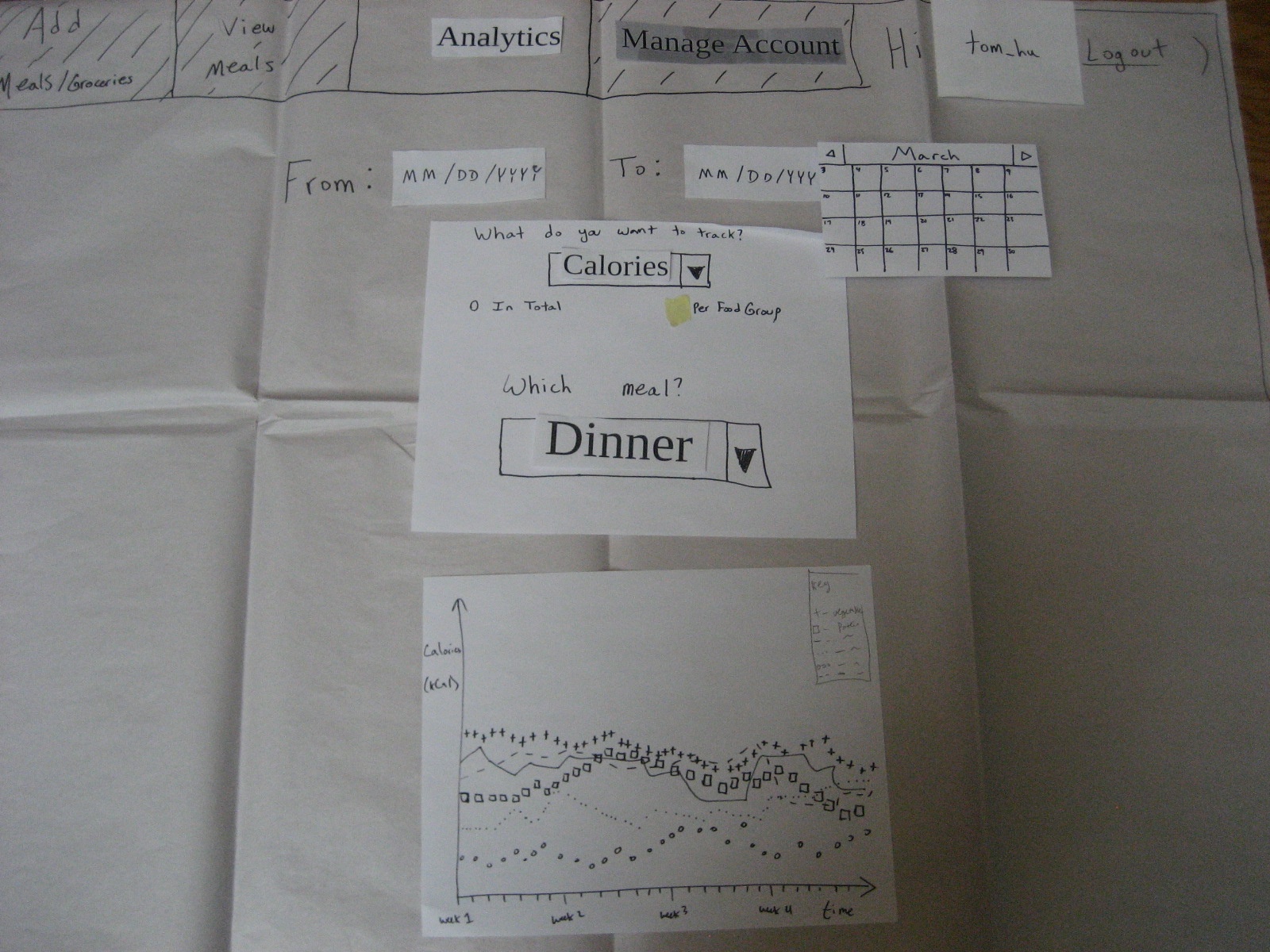
Fig 8. The Analytics page has one graph.
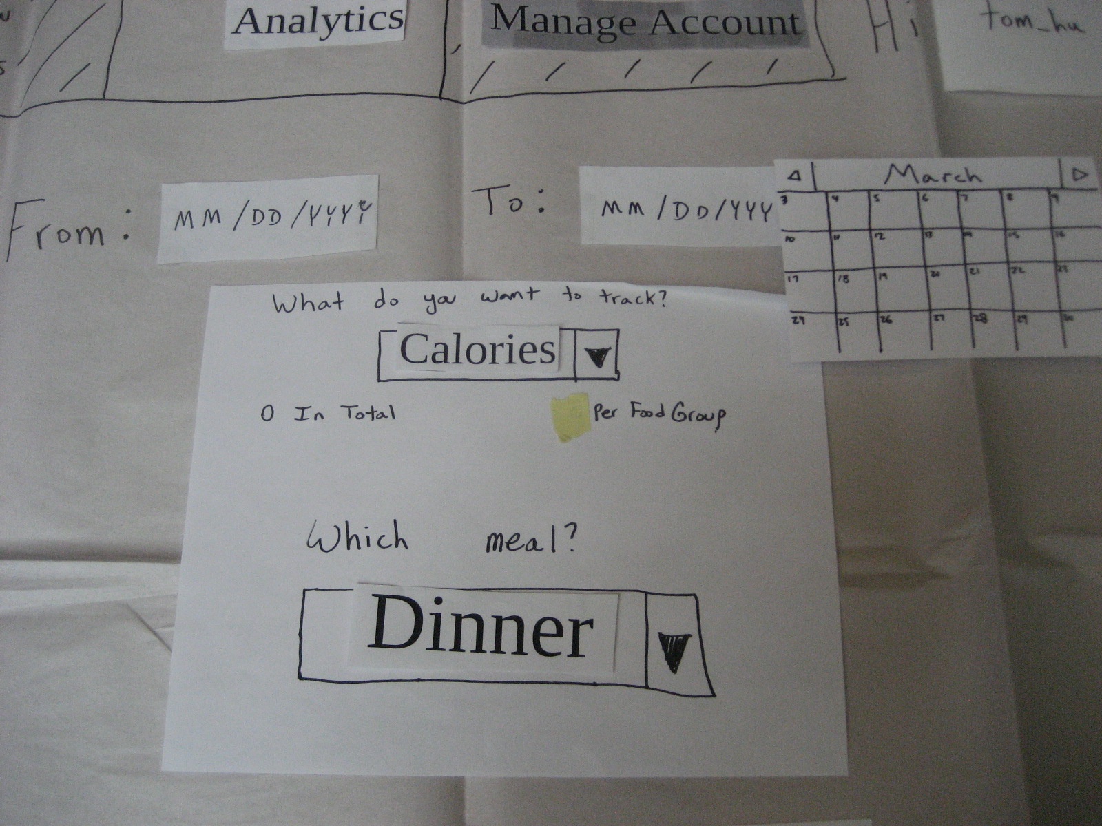
Fig 9. The graph options: Calories/Cost, In Total/Per Food Group, Breakfast/Lunch/Dinner/Snack/Other. The calendar in the top right is a date selector.

2. Briefing
DailyDigest is a web food journal. It lets you record the food you've eaten at each meal, along with its cost and nutrition. Besides that, you can also keep track of the groceries you've purchased, and can indicate when you've consumed some of your groceries. Finally, you can see analytics of your food cost and nutrition to illuminate trends in your eating habits.

3. Scenario Tasks

4. Observations

Iteration 1
Conclusions
- Home page is a bit overwhelming
- Trying to convey too much information. We tried to optimize for experienced users, but new users had a lot of trouble learning it.
- We may have given the users too much flexibility
- When given a choice, they're sometimes confused about how to make their decision
- (Are “Spaghetti and Meatballs” one or two items? How do I enter the cost if I split them? How do I enter food groups if I don't? Etc.)
- Also, the login screen is another example of this; users didn't know what all the pages were and weren't sure if they should jump to a specific page or not
- The labels on the meal log page were not very clear
- The analytics page needs work
- 3 graphs side-by-side are very confusing to a user
- It was unclear what options were actually changing
- The titles for the graphs were also unclear
User 1
- Upon being brought to the home page, the user was initially overwhelmed and confused.
- (He mentioned aloud that he wasn't sure which page to go to)
- After staring at the page for a bit, he regained his bearings
- When he actually attempted to use the Food List, he was able to use it quickly and efficiently
- He figured out how to use the meal log from the main menu without any problems
- At this point, he still found the home page confusing
- When attempting to enter a meal:
- He said “interesting” aloud and explained that he thought Spaghetti and Meatballs were two separate things, but didn't know how to enter the cost because he only has the cost for the meal in total.
- He put the total cost under the first item (“spaghetti”), and put “ – ” under the cost for “meatballs”
- When the confirmation came up, he said “This thing is still here... What do I do about it?”
- He said “I feel dumb” for not knowing what the food groups were for a particular item (wondering if there were multiple or not)
- (This was said light-heartedly in jest)
- He went to the meal log to view the meal history, but when he had to enter another meal, he initially thought he had to go back to the home page to enter a meal
- Then, when he found the “Add Meal” button on that page, he wondered why he could do it in two places
- He was able to enter this meal very quickly
- When he got to the analytics page, he found the “titles” underneath the graphs were confusing
- It took him a long time in the drop-down menu to find the “calories-vegetable” option
- He wondered aloud why there were 3 graphs
- After trying them out, he said aloud “I guess it would be for comparing and contrasting”
- He mentioned that the graphs could use “better headings” at the top
User 2
- The login screen confused him; he didn't know what the options meant or if he needed to do anything special here
- He was extremely confused by the home page
- “I'm not sure what this is for” (pointing to the Meal Log)
- He wanted to enter the food items from his shopping trip into the meal log because it was larger
- Then he was confused as to where to enter his meals
- “I'm not sure if Spaghetti and Meatballs are one item”
- He started putting them as one item, and then changed his mind
- Then he wasn't sure about the cost, and entered half of the total cost under each item
- He spent a significant amount of time deciding if it was one or two items
- He didn't know what food group to label each item as
- He left some of the optional “food groups” sections blank
- Found the meal log okay
- When he went to enter a meal on this page, his first instinct was to press the “breakfast” label on the left to enter breakfast, instead of the “Add Meal” page
- Found everything “a little complicated”
User 3
- Wondered what selection to make on the login screen.
- Observed that the home page was "busy." Spent a moment taking it in.
- Navigated the Food List all right, adding groceries to the list.
- When entering a meal, clicked on "what's this?" to see what the "template" was for. Thought this would be a useful feature.
- Though self couldn't accurately estimate the number of calories in food.
- On the Meal Log page, wondered how the time for a meal on the calendar was determined, since that was not an input when entering a meal on the Home Page.
- This shouldn't be the time of entry, because people may not enter a meal right after eating it.
- On the Analytics page, wondered how "week/month/year" buttons would reflect changes depending on the actual date selection, especially for date ranges that fall in the middle of those labels.
- On the Analytics page, thought there were too many drop-down options.

Iteration 2
Conclusions
- We need to figure out how to re-collapse the food list and the meal entry thing from the home page
- Also need to figure out how to unselect a template after one has been selected
- (Make a “None” option and have it default?)
- This home page was much more intuitive for users than the previous one however
- We still need to figure out how to make the labels for the meal log more obvious; might be easier with the actual visible representation because it is mimicking gCal.
- We need to make the optional fields more obviously optional
- A “Today” button would be very helpful for all of the date fields
- Look for an online database with nutrition info; maybe we can easily auto-complete nutrition info. Otherwise, probably not worth it
User 1
- Understood how to add the food item quickly and correctly
- Asked about templates through the “what is this?” hyperlink
- Was able to enter the meal quickly, and without confusion
- He had trouble checking the previous meals
- Was confused by the labels for the meal log
- Did not find the interface overwhelming
- Wondered aloud about the “add graph” button
- Tried it out and understood
- Suggested that we auto-complete the nutrition info for various foods
User 2
- On the food item entry screen, “There are a lot of boxes to push”
- After finishing entering the item, “How do I get out?”
- Commented that a “today” button would be very useful for date fields on the meal log (and elsewhere)
- Typed in the text “Don't know” for the cost of peanut butter
- Guessed something for all of the other fields he didn't know
- saved his breakfast as a template
- When asked to view the meals he's eaten recently, he said “Not sure whether to go to 'View Meals' or 'Analytics'.”
- After going to “View Meals”, he said “That makes sense now”
- He understood the labels/filters on the calendar for the meal log
- He had trouble finding the analytics tab at the top of the meal log from this page
- He suggested that we have greater parallels between pages. As it is, the user needs to learn a new interface for every tab (on the navigation bar)
- He commented that data entry was less straightforward than the rest of the site
- He mentioned that the fact that some fields weren't required wasn't obvious (he thought all fields were required)
User 3
- She didn't have any trouble with the meal log
- Wondered aloud “How do I close the grocery list?”
- Also, “What is the template?” and clicked on the hyperlink
- This user found the analytics page intuitive and was quickly able to get to everything
- She was a little confused by the graph that displayed information by food group
- Asked about aggregate statistics

5. Prototype Iteration
Our first design was primarily intended to maximize flexibility and efficiency. However, the tests showed that the users were overwhelmed and confused by the amount of information and possible actions they could take from any given page. This is reflected in the designs of the login page (i.e. the radio buttons that allowed users to jump to a specific tab when they login) and of the home page (i.e. the displays to view/add/edit the Food List and Meal Log). The challenge in redesigning these pages was to simplify them without significantly decreasing efficiency. For the login page, we found it was sufficient to completely eliminate the options to jump to a specific tab upon login since that feature did not seem to improve efficiency by a large enough of an amount to justify the confusion that it caused. Our solution for the home page was to collapse the Food List and Meal Log into two buttons, "Add/Edit Groceries" and "Add Meal." When the user clicks a button, the appropriate display expands. This presents a tradeoff between efficiency and learnability. This design is slightly less efficient than the first design (requires one extra click to complete a task), but it is much more learnable.
In the same vein, the analytics page was also intended to optimize efficiency by automatically displaying three graphs side-by-side in anticipation of expert users' desire to simultaneously look at and compare multiple graphs. However, the tests showed that users found this to be overwhelming especially given that most beginner users only want to see one graph at a time and do not want to compare multiple graphs yet. They also found the three graphs to be confusing since none of the graphs were labeled to indicate what the various buttons and menus were changing. Thus, we redesigned the page so that it would initially load only one graph, which the user could modify. To accommodate the expert users, we added a button that would allow them to display additional graphs next to the initial one. In this design, all options and graphs are clearly labeled.