Final Design
"Describe the final design of your interface. Illustrate with screenshots. Point out important design decisions and discuss the design alternatives that you considered. Particularly, discuss design decisions that were motivated by the three evaluations you did (paper prototyping, heuristic evaluation, and user testing)."
Screenshot |
Explanation |
 |
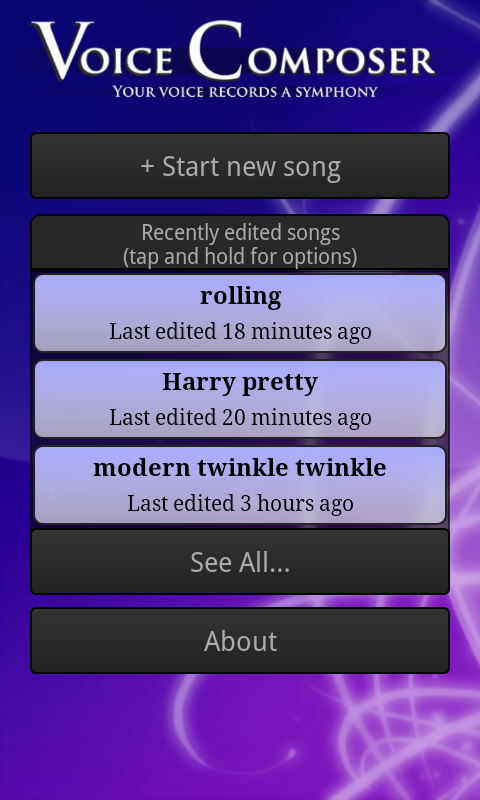
Originally, the main screen looked like the extended song list below. Our final design adopts a splash-screen-like design in order to highlight the name of the app and reassure users that they're in the right place, while remaining functional with a prominent "new song" button. The background is intended to be aesthetically pleasing but unobtrusive. |
 |
We limited the main screen to three saved songs to avoid overwhelming users. The buttons remain prominent. Tapping on a song launches the compose screen, shown below. Our original design included small "rename", "duplicate", "export", and "delete" buttons on each song, but our paper and heuristic evaluations noted that such nested buttons were confusing and difficult to use on a small screen. We therefore replaced them with a menu accessed by tapping and holding for a second or so; this method is nonobvious, so we also included an instructional note.
Renaming a song works by replacing the name in the song button with an editable text box; when the user submits (presses enter) the song is saved. Duplicating a song creates a new song named "Copy of NAME" and enters rename mode on that song. Exporting uses native Android sharing functionality, which displays a list of possible transfer methods, including Bluetooth, email, etc. for the user to pick from. Deleting a song asks for confirmation, then slides the song button right off the screen. (It would be preferable for all subsequent buttons to slide up until the deleted song was gone, but technical features of Android make implementing this animation difficult.) |
 |
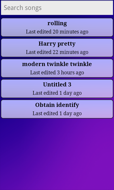
If the user clicks the "see all" button, this screen is shown. It lists all saved songs, allowing scrolling and searching (the list updates as a user types in the search box).
Here and above, each song button shows in approximate units the time since the last edit. Our original design used an absolute timestamp with second granularity, but testing convinced us that the extra precision wasn't useful. Currently the minimum interval shown is "<1 minute"; the display refreshes periodically in order to remain accurate. |
 |
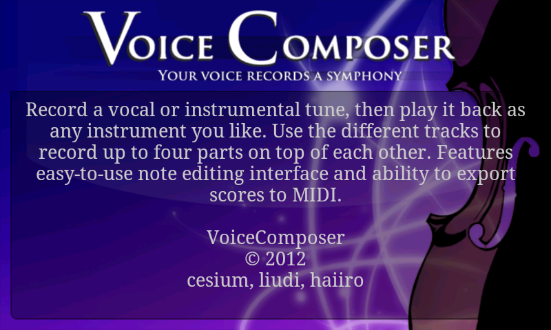
The "about" button takes users to this screen, which is just a static message. |
 |
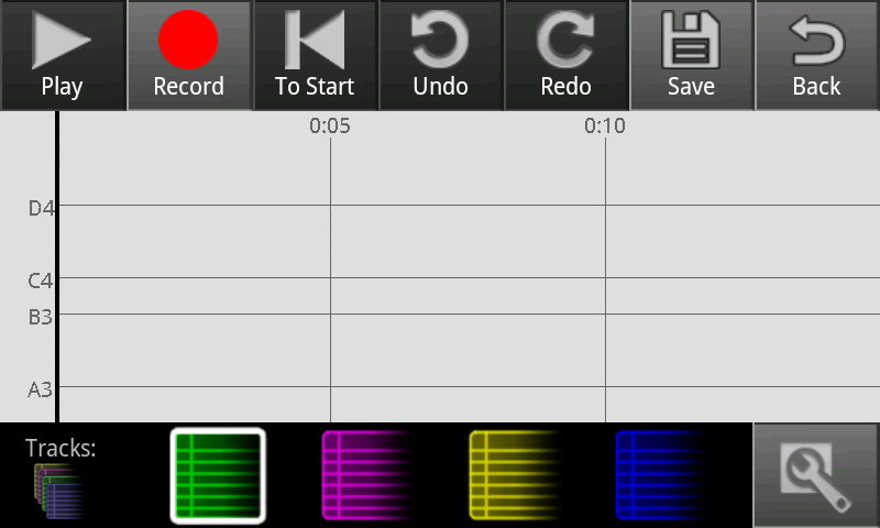
Clickthrough for start new song. |
 |
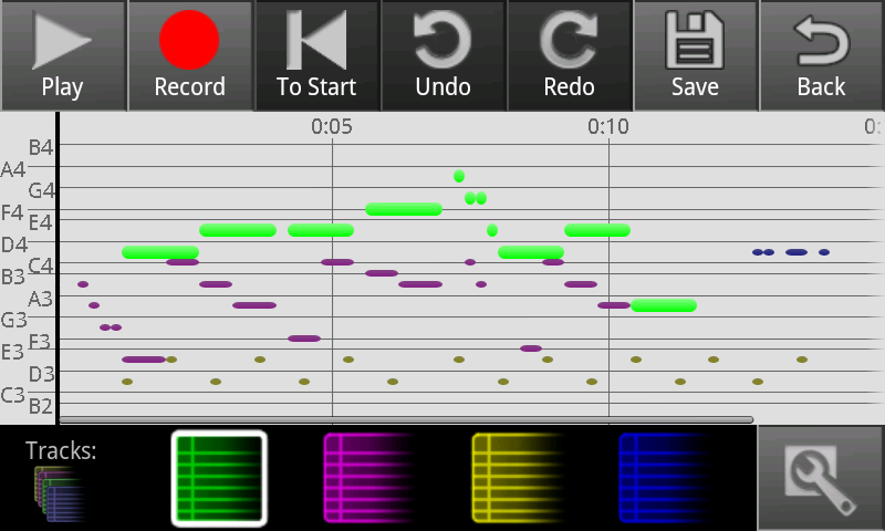
Record some notes. Here various tracks have been used to layer notes. |
 |
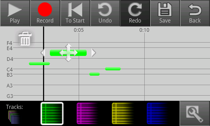
A screenshot of one of our editing interfaces. Tap a note to start editing mode on it. Tap another not to switch to it, or tap off to stop. Dragging the note moves it, pulling the ends changes its length. |
Implementation
"Describe the internals of your implementation, but keep the discussion on a high level. Discuss important design decisions you made in the implementation. Also discuss how implementation problems may have affected the usability of your interface."
Evaluation
Our users were friends from our living groups who had varying levels of interest in music. While they're all MIT students and so might not be generally representative, MIT students seem to have a pretty wide range of musical inclination and so weren't a particularly bad sampling of our user population, though most of them were programmers (don't think any of them had programmed on Android before, though). Our app aims to be usable by people with varying levels of music experience and who are probably somewhat younger, creative and tech-savvy enough to carry a smart phone.
We conducted user tasks by telling the user the purpose of the app (record songs without having to figure out the musical notation and when you're on the go) and the target audience (should be usable by people without a lot of musical experience).
We mentioned that they should think out loud, and that we were testing the app's usability, not their intelligence.
We had two editing interfaces that we can't decide between. We tested this by having different users test different editing interfaces first, give us their comments on it, then switch and give us their comments on the other one. I should've been careful to not tell users who made which interface, but I think I failed at this for the first two.
We tried to stay silent during observation, only giving tasks, then at the end asking questions about certain things the user did that they didn't explain, or things they may not have discovered.
Tasks
1. Record something
2. Edit
3. Add a harmony line
4. Export
Transcripts
These should be summarized for final submission, but they're here in full for you guys to look at.
User 1
Android User
A capella singer
Starting with old edit interface, then getting commentary on new
1. Record Something
- Records without looking at phone, trusting it to work
- "Is it gonna play back as voice or what?"
- He sings a fast song kind of quietly and the recording is um, is quite different from what he said
- Uses undo to try again.
- "twinkle twinkle..." Sings with the words
- It does better but gets some noise and merges many double notes
- "It has a problem with notes on the same pitch, but I would probably just articulate more if I wanted it to work. That might be hard to actually do."
2. Edit a note
- "How does one edit notes?"
- "Wah!
- Drags pitch
- "Wait, did that even move?" Arrows might be blocking note
- plays to confirm
- "Wait, stop!" Seems to have a bit of difficulty finding stop, but it's the first time he used play after all.
- "I wanted this note!" and moves it to the right place, but clicks back.
- "Oh check box! I didn't see that. I pressed the back button thinking it was okay."
- "Can I split notes?"
- Tries various buttons to see if he can find split
- Trying to use arrows that have x's over them, probably mostly looking at the note he wants to edit and stroking based on that
- Tries left/right stroking.
- "that made it shorter..."
- "Gah, not clear that that's possible"
- accidentally clicked a note trying to move cursor
- "I like the swipe up and down to get the right pitch, cuz you can hear what you want."
3. Record a harmony or something
- "Let's do it in a round."
- accidentally started recording at end rather than start
- accidentally pressed play to record, then surprised no notes show up
- gets right button
- this time looks at screen to record, sometimes. Maybe trying to line it up but gives up
- seems to figure out how tracks work just fine
- "at the beginning I was trying to track it... but it's completely off."
- "now it will sound completely weird"
- presses play
- it does
- "it's hard to record harmony without knowing the original tune."
- "Now that's modern music!"
- "I'd definitely want to hear what I'm recording against, but I don't know how easy that is"
- "you could definitely recommend using headphones, but it's really hard to record more than one track without that."
4. Export song
- "Okay I'm gonna save it as."
- "Uh, Modern twinkle twinkle. save."
- back
- "Tap and hold for options. Ok, let's export it to midi!"
- "whoah I can send it to (all these things)!"
- "Where does wifi go? Does it just go, randomly somewhere over the network? Oh, so it looks like wifi direct. Ok I don't know what wifi direct is."
- "I'll email it to myself! Look I'm in alan's contact list."
- "Now let's ask myself if I got a midi! Well, not yet."
- App crashed awhile after export.
Did you notice you can change instruments?
"No. Oh, I didn't try this \[settings button\]. Aha\! All of these guys look familiar" |
What did you think of note editing interface?
- swiping all directions
- "I like the up and down, that's for sure. The moving the note left to right seems sort of difficult. For one it seems to move in big chunks. The x's mean you can't move it any further, right? Obviously you can't move a note to zero. I guess you have a maximum note length? That doesn't seem so reasonable. Or it just doesn't, wait, I guess it's not clear to me whether that's a max note length or, oh, I see, it goes until it butts the next note in the same voice. That makes mores sense. Yeah. I guess it's hard to deal with, like say I wanted to move a note forward a little bit in time, that would be kinda difficult with this interface. At the same time it is also useful to stretch and shrink notes, I think it's hard to get all of that in there."
Try (DD's) interface. I tell him my phone takes longer to record things.
- Means to hit record
- "Oh that was play."
- "hellooooooo helllooooooooooo!"
- seems to record okay, gets random noise an octave above.
- "awo!"
- has a bit of a hard time pressing the note.
- "it doesn't have this whole save making changes to a note, or stop making changes to a note, you just click away. I see."
- "It's a liiiitle strange. You have to click directly on a note and then drag it to move it, whereas in alan's you can click anywhere to drag it. What's the most confusing about this up and down part is that I have to drag it, but it doesn't follow my finger exactly. Okay let's try left and right."
- "Okay so that moves it left and right, oh I like that."
- "and that makes it bigger, okay"
- "I like the left and right. I definitely like the left and right better. You can do that without changing the width of the note, and you can change the width. That's cool, sweet."
- "It does seem to be easier to do a lot of different notes."
- "I definitely noticed on Alan's you can just click undo if you don't want your change... But since you have undo up here, that's probably..."
Compare them.
- I think that.. hmm. (thinks for quite awhile)
(Playing with alan's) "is this actually centered on the note? hmm I think I would kind of like Alan's better except with left and right functionality more like yours. You know with move \[in all directions\] in the middle" (lots of gesticulation) |
- "it's true getting from note to note is much faster in this one (DD's)"
User 2
Using DD's interface first.
iPhone user
Casual composer, doesn't often finish songs
1. Record a song
- Clicks on a bunch a buttons
- Hit record
- "okay alright...."
- Sings "twinkle twinkle", except with doooooos, looking at it.
- Phone picks up pitches, kind of.
2. Edit
- taps a note. Trying different things on it.
- "So what I wanted to do was split a note in half. I guess that might be part of your phone thing but yeah."
- tries to tap end arrows with no effect
- deletes note
- "I was trying to click note between those notes (a row of 3 min length notes) and then I tried to tap away and then I clicked another note and it was hard to get away because all these things appeared and all I wanted was that note."
- "I tried to play, but I meant play from start." (uses to start)
- "I don't know if to start without a just play from start makes sense. I guess you could use it for record."
- plays back and stops to edit things. Uses dragging left to right a lot. Change pitch very carefully by tapping on note.
- "Is there like a go to next note button?"
- "It's hard to drag the pitch of small notes."
- Notices from red edge that she needs to shorten next note to lengthen this.
- "It's really hard to click small notes."
- "oops. Stoop!" Has hard time finding/hitting stop. Taps everywhere.
- "I was totally editing a note and I pressed play and it jumped to a nother place, what was up with that?" (cursor was in another place. Maybe cursor should follow editing)
- "wait the cursor isn't on my note?"
- doesn't notice you can stroke anywhere in the vertical
- "oh shoot I deleted. Undo. Yeaaah"
- "Darn I want another note. Oh look another note!" Take little extra note and drags it over
- "I really like how you can just drag a note around"
- "It turns out it's really easy to hit the trashcan cuz sometimes you have notes right over the trashcan you wanna hit. Esp if you have a descending line."
- "I think my song gets faster. (as in the lengths get shorter at end.) I really wish I could extend a note and have all notes move over, or have a mass move button, rather than moving them all one at a time."
- "I keep meaning to play from start but it just plays from whereever."
- finishes
- "Yeah! alright."
3. Record another track
- "...I don't know any harmonies to twinkle little star."
- (presses play rather than record again)
- (Singing) "pleeeeease record my song!"
- After several tries of clicking play, realizes it's not record.
- Realizes record doesn't do playback
- "Awh! I don't get to hear my song now? how am I supposed to harmonize with myself!"
- "Damn I can't click small notes!!"
- "Agh I just dragged my note to the side and it disappeared."
- bug. Various terrible things happen.
- she re-records
- Noise in the octave (she sings one note but it alternates between octaves.
- "I'm not sure how it got those ones"
- "wait can I no longer zoom in?" (she's at max zoom"
4. Export the song
- "Too bad, I'm naming it."
- "the star tried to twiiiiiiiiinkle. done. save. Yeah!"
- settings: "What's this? Oh cool!"
- "Wait how do I get outta here? ahhhh!" (not an android user)
- giggles while playing track in helicopter
- "wait what was I supposed to do now?" (re-instructed)
- "tap and hold for more options."
- chooses export.
- it crashes.
What do you think of this editing interface?
- "I really like how you can just move notes around. The trashcan kept getting in the way. I think it'd be nice to have a next/prev note function instead of playing the whole thing cuz I know where the pitches are sposed to be to hear what's wrong. And it's extremely hard to click small notes, holy shit."
Try Alan's interface
- Katfang tries to click play button to record again, despite already making this mistake and it being disabled.
- "Oh my god. it's different."
- "oops I pressed back instead of check"
- "Oh my god I have to click small notes again. Did I do it? I can't tell!" (arrows covering note, seems to be a problem with early notes)
- "I gave up trying to remember what the right note was while editing. I want to go one note at a time, cuz I don't actually know what note (pitch) I want, but I know the interval, but there's no next note and you have to go out every time."
- Still tries to tap arrows to change note even though she knows it's swipe
- About to use back
- "Oh shoot no. Check."
- "I want to cut out the beginning part, where there are no notes, cuz I'm like what the hell am I doing k I'll start now."
- "I'm still trying to tap these arrows even though I know they don't do anything unless I swipe over them." (shortening and lengthening)
- keeps trying to press back instead of confirm.
- "Stop stoooop!" tapping everywhere. "Oh stop."
- "Moving notes is bizarre and awkward." (messing with arrows to scoot notes over)
- "Nope": tries to play from wrong place agin.
- (trying to get note lengths right) "One thing that kind of bugs me is that I can't tell how long notes are relative to each other. Like a quarter note or something. Like if one is twice as long as another. I can only tell how long a note is within 5 seconds."
- "Also I have no music sense so I keep having to replay." (loses the note she wants while editing because it plays)
- "what is this note supposed to be??" (tries many times to get pitch)
- "Darn this was the actual note it recorded and that was just a messup note. Darn! Darn! I'm so angry!"
Impressions on this interface
- "My biggest thing was that I couldn't move notes. I just want to take this chunk of notes and be like you move that way! There's this big gap and I don't want it. I didn't randomly delete notes like the other one.
- I had a really hard time remembering the back button vs confirm, I kept clickng back note."
- "This interface especially could have a next and prev note. I dunno if that's good, if that's too many buttons. I kept having to click a note and pressing back and playing and clicking a note and pressing back and playing. You know cuz intervals. This would totally be fixed with a next/prev button."
- "turns out it's really hard to type potter. Oh well he'll just have to be pretty."
Compare interfaces.
- "I liked this (DD's) interface better, because I could move notes and I could move between notes more easily. LIke on the other one I'd have to click the back button, or the save button. But accidentally deleted a bunch of notes, but there's an undo button I guess."
- "I really wish I could add/split notes. On twinkle twinkle all the tones that there are two of them there was only one of them."
- phone crashes after export again.
Could you tell what's disabled?
- She was trying to press disabled buttons often, like play when she wanted record on an empty song.
- "I can't tell what's disabled." (alan's interface) "This one is... better." (DD's) "I can't tell if they're the ones I want to press or not press, but they're different."
- (Another person, watching): "My expectation is colored is enabled and non colored is disabled. Looks like Only record is enabled."
- "It might be more reasonable if record were white, itunes"
User 3
We're starting with Alan's interface.
Singing and playing instruments since he was 7
Doesn't own a smartphone, so I briefed him on Android usage. Function buttons, long tap, and zoom gesture.
Course 18 and 8, "I'm definitely not a computer person"
We are sitting next to the piano and I mention that piano records nicely.
Bit worried about this user test because he seemed unwilling to hurt our feelings or worried about not making mistakes.
1. Record a melody
- hit record
- sing a melody. "da da..." On each of his long notes it switches between neighbor tones, maybe he's between tones?
- plays it back
- "eeuh, maybe I shouldn't do so much vibrato"
- "Hmm what should I sing, let me try one of the choir songs."
- "how bright is the day..." singing with words
- Finds stop fine
- "is there a way to do it so it's just the part that I .. ooh, ahh!"
- he wanted to listen to only the new recording, since he recorded after his old recording. He was tapping and accidentally opened note editing.
2. Edit a note
- his piece has a lot of tiny notes.
- Surveying interface
- "Oh are these just tracks so, okay."
- Plays back to try to find wrong notes
- Opens editing
- "Umm swipe anywhere to edit ok...."
- "What is this..." tries note lengthening, seems to get it fine. "Ok."
- Tries to do vertical zoom in gesture on the 2 up arrows, but it doesn't work. Figures out pitch change and does so.
- Ends by hitting delete.
- "Actually can I play something on the piano, let's see.."
- Plays the tune on piano to tune himself. Then tunes editing to piano. presses confirm.
- Since the recording is pretty bad and he would have to edit almost all the notes, I suggest he can re-record the song if he'd like. "Ok"
- pressing track buttons
- Sees inactive notes on purple track. "Nope taken." Green track: "Also taken maybe?"
- "So I don't want to erase these accidentally. Are all these the same..."
- (I took off the other songs so he wouldn't have to worry about that. They were from our testing and he would've come into the app with nothing saved.)
- He's recording with piano now. It records all the pitches perfectly. He makes a couple mistakes
- "so I made some wrong notes yay we get to edit"
- it merges doubles and has noise on octave very occasionally
- He plays the song to find points to edit, then taps the note.
- However editing opens even though it's running (maybe editing/tapping should move and stop cursor?)
- trying to tap place he wants to stop to stop cursor, goes hits stop
- humming note he wants so he can tune wrong note
- this song has pretty large range, space between pitches pretty small.
- deletes a noise note. playing again from beginning to check accuracy.
- place where he misplayed and started over.
I suggest he tries to move a note over, since he didn't try it.
- He drags left edge of note over until he sees the red line
- "see what that does and maybe go back and fix it..."
- After playing for awhile: "ok, I found the section that needs the most work." guess he did't recognize it until it played
- He's using the note editing interface quite efficiently now
- tries to drag edge of actual note (near center of screen) and nothing happens. Then slides arrows--"there we go"
3. Record a harmony
- he goes back to piano
- since he's recorded a choir song he has a very convenient harmony ready
- practices it
- "ok let's see if we can play that in time."
- plays song to get time
- he records over his original tune

- "so ok so it... ok. Ah. I think I forgot to save. Oh well". Guess he doesn't see undo.
- "save and see if it makes a difference." saved ok.
- "now let's see..."
- opens settings
- "acoustic piano..yeah that's fine. ok... hmmmm. nope oops"
- "Now the point is get a harmony to it"
- clicks purple track.
- practices main line again.
- "..mrm ok. So my melody became my harmony ok."
- listens to it to get tempo
- watching it carefully to get them lined up. Makes a mistake and stops.
- "eugh oops. forgot what I did last time. now let's see how badly I messed it up."
- Plays it back. "Oops, my tempo changed a lot" (dunno, he has the harmonies lined up a lot better than the other user tests and it sounds pretty close to me. Guess we should really make it easier to line up harmonies though)
- has trouble tapping a small note.
- "ok now you extend..."
- app crashes... it didn't save but I tell him he can be done with task 3
4. Export the song
- Seems intimidated by instruction, "I've never done that before...."
- "Hmmmmmmmm" for a long time
- poking at things in song
- "ok let's go back..."
- goes back to main
- looks at about
- "hmmm hmmmm"
- "tap and hold for options"
- "Export ha!"
- "I don't know what to do now but uh I assume this is what you want"
- I tell him that's fine I guess
Opinions on this note editing interface?
- "sometimes it was hard to tell what note I was editing exactly, or what was happening exactly when I did it"
- "It was easy to use. Yeah I'd probably want a little more time to tinker with it so I could be more efficient."
- There was some trouble with tracks, what did you think tracks were?
- "I didn't really pay attention to it. I dunno, I feel sorta stupid because now I see tracks was written at there. I think I was just not noticing it." Awww it's not your fault man :(
What is x?
- "x's mean it can't extend. It would overlap another note."
- We added in the red bars since user test 1, so great, they did their job!
Try DD's interface.
- records the song again.
- finds trashcan fine
- zooms in to edit small notes
- pulling note lengths to get them right this time.
- very meticulous.
- figures out tapping out of edit fine
Opinions on this interface?
- "It was definitely easier to see what was going on while I was editing it. Uh. Yeah I think I prefer this one a little bit. It still serves the same function but it's easier to see."
Asked if he noticed moving left to right in this interface
- "Oh! that is quite nice. Yeah I didn't actually notice that. Yeah, felt like I couldn't see what was going on in the other one."
User 4
Starting with DD's interface
"I warn you, I do usability testing for my lab, so I will, like, give you user interface feedback."
singing for as long as can remember in a wide variety of genres
"I just finished singing, so I'm warmed up"
Course 6, so technically advanced
"I don't have any theory background, only performance."
1. Record a melody
- he reads the about page
- "I was not expecting instructions from the about page."
- "I'm right handed by the way"
- "There are a whole bunch of useful buttons on the top surface of the app, meaning I have to block the whole screen with my hand to use them."
- checks out settings
- thinking up a song
- Asks which end is the mike end
- "do do do" indiana jones. The phone picks up a handful of notes
- "Also the fact that the stop button was not red was confusing momentarily"
- "That was nothing like what I put into it! I'm going to try doing that again"
- Recording while looking at screen. It still fails
- "Ok I'm gonna radically simplify song."
- gets 2 notes.
- "Well the UI did what I expected"
- "I was very tempted to hold record rather than tap it. If I did that I'd expect it to record until I let go, then it would stop."
2. Edit a note
- "smaller ones are significantly harder to tap"
- "I would favor notes overlapping. UI stopped me from doing that. I wanted to pull notes over each other."
- plays again to confirm.
- "The default instrument does not sustain, gets soft so it doesn't parallel the interface."
3. Record a harmony
- goes straight to the right place--tracks
- records one note and it appears on the same line but uh as like 10 things
- deleting all notes one at a time
- "I wish the delete button were near the note like everything else"
- "I can't make a note longer than the screen because it centers the note and then I can't reach the arrow."
- "That's very frustrating. I don't want the screen to shift when I click on the note."
- There's a bug, the note on the second track only played on the second note of the first track
- I" don't have the ability to selectively mute tracks. LIke I would expect if I double tapped I could silence them or not."
4. Export the song
- "I saved"
- ?? looks confused
- taps the android menu button, gets nothing
- Exits apps and looks in my files
- it's not there.
- "Yeah I don't know what I'm doing."
- I suggest he try renaming the song
- "I have no clue how to do that"
- goes into song
- clicking save again doesn't have me name it; only the first time
- Figures it out and finds export
- Naturally it crashes
Try other interface
- I tell him this phone is more reasonable at recording
- He records a more reasonable song
- touches editing
- "I can't scroll on the timeline (canvas length is less
- stroking and touching arrows "It's not doing it! Nothings doing anything, did I break it?" I think the note somehow disappeared. He was trying to lengthen
- slides pitch and it works.
- "I wanna be able to tap outside the note and have it revert back."
- "confused why sometimes when I hit play it starts at beginning, sometimes where it is."
- getting confused by trashcan location but probably because he started with the other interface
- "clicking to start while playing didn't do anything. want it to go to start, still playing. But I'm biased though because I'm used to editing music in finale, which will always plays starting at beginning unless you tap cursor, in which case it starts where you tapped it."
- "Whoah it went back. Oh I see that button undid as opposed to approve. Okay."
- "So I wanna move this note. I don't know how to move a note in this interface. I feel like I'd have to do two end adjustments."
- "Also I want when I hummed that everything should be the same length, it isn't, you're using seconds instead of a standard beat measurement. I want it to standardize and stack the notes I think I sang next to each other and eliminates gaps between them, because when I'm singing it takes awhile to catch on and produces a gap. The way it is if I wanted it to be precise I'd have to touch every single note."
Compare interfaces
- "So I think this (DD) interface behaved a lot more like what I was expecting"
- "This (Alan) one it was much more clear how to edit specific attributes, but most of the time I just wanted to grab note and move it around, didn't care for precision"
- "I think the first one was better purely because of the movement. In the second one I would enable movement so that if I yanked the middle of the note it would preserve length and move."
Is there anything in (alan) interface you would want in (dd)?
- "(alan) was clearer to me, because each icon is related to a specific action, so I felt more comfortable modifying a specific attribute."
Unprompted
- "The fidelity of note registration compared to what I performed is low enough that I'd favor it as composing rather than recording device. It enabled me to play around with things easily. It would've been distinctly useful for it to do an actual audio recording and then play it back and play what's here. So if I had an idea I would record voice and then play with the staff until it matched up with what I sang."
- (in Alan's) "I think actions when you select notes on the bottom right of the screen are better than on the left hand side of the screen because your hand gets in the way. It'd be better if you put all icons on the right."
Disabled buttons
- (dd) "Buttons are dark, don't afford button actions"
- "But grayed out don't afford pressing even more so the other ones must work"
Discovered usability issues
Reflection
"Discuss what you learned over the course of the iterative design process. If you did it again, what would you do differently? Focus in this part not on the specific design decisions of your project (which you already discussed in the Design section), but instead on the meta-level decisions about your design process: your risk assessments, your decisions about what features to prototype and which prototype techniques to use, and how you evaluated the results of your observations."
