GR3 - Paper Prototyping
Pictures
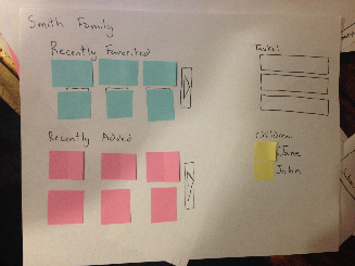
Landing Page |
Mosaic View |
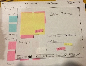
Modal View - Single Picture |
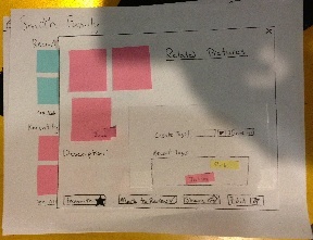
Modal View - Multiple PIctures |
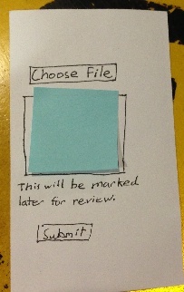
Mobile View |

Recent changes are showcased to catch the user up on changes since they last logged in. Tasks are shown here as well. Clicking on pictures leads to the modal view. Clicking the arrows or the children leads to the mosaic view. |
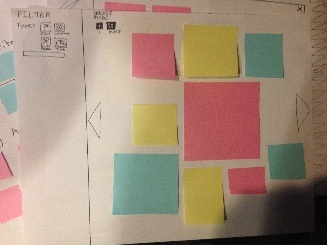
The user views pictures here (which can be filtered via the menu on the left). Selecting an image or images brings up the modal view. |

A user can view/edit attributes of a single picture as well as view related pictures. |

A user can view/edit attributes of all selected pictures (and also tag individual ones).
|

This mobile website allows users to quickly upload media from their phone. |
Briefing
Purpose of application: To help parents manage co-owning digital content of their children and family.
- You are a parent of two children, John and Jane, and you have a spouse.
- You and your spouse have already created accounts on CoShare and CoShare recognizes you both as each other's spouses.
- You have a smartphone with a web browser.
Tasks
1. Bulk uploading content from a desktop
- Background: You have ~100 new pictures from the past week. You want to upload the 3 best pictures John and Jane each as well as 3 with both of them in it.
- Johns pictures were at the park, while he was playing soccer
- Jane’s pictures were from a play at school
- You were also at a family party where you were able get a few pictures of both of your children together.
- Part a: Upload these specific photos and tag the them according to
- which kid
- where they occurred
- what they were doing
- Part b: You didn’t know enough about one of the pictures you uploaded and you want your spouse to tag it accordingly.
Present site on landing screen.
2. Retrieve content added by spouse
You were unfortunately unable to attend John’s soccer game, but your spouse was there and has uploaded pictures and videos to CoShare. You want to browse this content and
- mark three pictures as “favorited”
- watch the video of John scoring a goal.
Present site on landing screen.
3. Mobile upload and desktop refinement
Part 1
You just snapped a cool picture of Jane at her gymnastics meet and want to upload it to CoShare, but with so much going on, you don’t have the time to be on your phone for too long. You would also like to fully tag this picture later when you are on your desktop.
Task: Upload picture from the smart phone.
Present mobile site.
Part 2
Later in the evening you are back at home and have logged into CoShare.
Present site on landing screen. See if they notice the new TASK to fully tag their recently uploaded picture from mobile. If not, prompt them to choose the Task and tag the picture appropriately.
Observations
Round 1 Observations
We found these usability problems in the first iteration of our prototype, while testing on Users 1, 2 and 3.
Bad Affordances on Landing Page
The titles for “Recently Added” and “Recently Favorited” were meant to be links themselves, but we did not make that clear enough, as all three users were unaware that you could click them to bring up the mosaic view for those pictures.
Unclear Result of Mobile Upload
Users 2 and 3 both expressed that they were unclear if the picture had been uploaded on the mobile site because hitting “submit” merely removed the picture from the screen. This was due to a complete lack of a message confirming the upload had indeed happened.
Bad Learnability to Close Popup
When the View/Edit popup window for specific pictures came into view, Users 1 and 2 were not aware that this was in fact a popup window and it could be closed as such with the X in the top right. Perhaps the affordances for making it seem like a popup window were not apparent enough in our prototype or the X was not large enough and too far the from the locus of attention of the user.
Tasks Were Noticed!
One great success we had was that all three users noticed the new Task to refine the tagging on their pictures they have previously uploaded from the mobile site.
Prototype Iteration
Bad Affordances on Landing Page
-Headers will remain hyperlinks despite providing poor affordances
-A “See All” button was included at the bottom of each section
Bad Affordances for Browsing:
-Mode selection for aggregating photos was not used as hoped.
-Increased the size of mode selection buttons
-Provided clear affordance of which mode is selected by highlighting the mode the user is currently in.
-Added a view content button when multiple pictures are selected allowing the user to access the content module
-Unclear how to access the module
-Increase the size of the exit button
-Computer Prototype will use a red button increasing affordances
Mobile Unclear Result of Mobile Upload:
-Removed text indicating the upload will be marked for later
-Update the notification message after successful upload to include the content has been submitted successfully and will be marked for review
Bad Learnability in Applying Tags:
-Removed text form for creating tags
-Instituted a dragging tag system
-New tags are generated with one text field
-Once created these tags populate the Recent Tags box where the user can drag it onto the picture they want to tag
-When dragging a tag, a region will pop up indicating allowing the user to tag all the pictures shown
-Tags can be color coded depending on the type of tag being created
-Default is a general tag
-Different types are selected from a drop down menu similar to Google calendar and iCal
-Tags will include a delete region
-Improved efficiency with a Recent Tags box contains recently used tags and allows user to bypass creating redundant tags
Round 2 Observations
Modes for selecting pictures were unclear
User 4 assumed you can only select one photo at a time- multiple selection mode was not visible or clear enough. User 6 tried to click multiple pictures in the mosaic view but clicking the first one would just brings up that individual picture
Learnability with associating tags with pictures
All 3 users, upon creating a tag, believed the tag was automatically associated with the visible images, and no further action was needed. User 5 tried to drag to recently added tags into the “Create Tag” box. This was also a function of this being unclear on a paper prototype that it was a text input box.
Visual Affordances for Uploading Content
Users 5 and 6 both took a lot of time on the landing page to realize what they needed to do to upload content. This had to do with the menu bar not being prominent, as well as the unclear text of “add content”. They also seemed to immediately look in the other sections of the page first, focusing in the wrong place for what they needed to do.
Lack Of Description/Information Scent
Users had various problems with understanding what buttons, labels, etc meant- something that could be made much clearer with just a few words of descriptive text. The selection mode in the mosaic, actions required for tagging, and the mark for review button all created some confusion.
