Design
Design overview
Our design was a combination of all three designs we came up with during the design phase, and a simplified version of our paper prototype model. The design is based on the input of two users; caregiver and child. The caregiver has to be able to quickly and easily choose a meal to cook for their kids, and the kids have to be able to give feedback on the meal they just ate. We didn’t want the application to interfere or be a burden to the caregivers/children, so we worked to make it as simple as possible. Our design has four main pages: the home page, results page, and recipe page (for caregivers), and the feedback page (for children).
Home page (for caregivers)
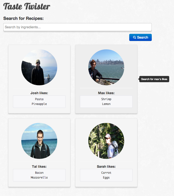
The home page is where caregivers can search for meals by ingredient or by what a certain child likes.

The search bar accepts ingredients from a list (based on the limited number of recipes in our database), or from clicking on one of the children tiles. Hovering over the Max tile prompts the user to “Search for max’s likes”, something we added after doing heuristic evaluations, because not all users found it intuitive that the tiles could be clicked on. We felt adding the tool tip was an elegant way to signal this capability to the users without having to add an extra button.

Additionally, we learned from the heuristic evaluations that users were confused by the ingredients listed in the tiles, and thought they were buttons that could be clicked. To alleviate this, we made them less prominent and made them look more like a list of likes instead of a button.
Unlike the paper prototype, we had no general “recommended ingredients” listed below the tiles. We found that users either did not notice these ingredients were even there, or thought they were the only ingredients they had to choose from.

Learnability
- Typing in an ingredient and selecting it from the list populates the search bar with an icon.
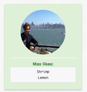
- Hovering over a tile changes the color of the tile (feedback), and clicking on a tile populates the search bar and colors the tile green (more feedback).
- There is internal consistency for search items: every time something populates the search bar it is put in a little tile, so the user can assume it’s a valid search parameter.
- The tiles are meant to have the affordances of large buttons, shown by rounded corners and shading.
- The search and clear buttons have the affordances of buttons, and are also colored based on their function (i.e. “clear” is red). However, they have multiple visual to indicate their function-- both color, text, and icons.
Efficiency
- Instead of trying to remember what their kid likes, a user can click on the tile and the program will search based on all of the ingredients that the kid has voted on already.
- The “clear” button lets the user clear the search field in one sweep, without having to remove ingredients individually.
Safety
- Users can remove out of ingredients/clear the search bar if they don’t actually want to search for something.
- Users can easily return to this page if they want to modify their search.
Design decisions
- What should we include on the home page?
- We ultimately decided to include just the search bar and the children tiles as the main components. Based on user tests we found that including too much on the page confused the users and took away from the purpose of the search bar. The user feedback and the heuristic evaluations also caused us to de-emphasize the listed ingredients in child tiles.
- Should the users be able to search for anything or just prescribed words?
- In order to make our implementation easier, and because we had a relatively limited database of recipes, we decided to limit the possible search words. When the user types anything (or just clicks) in the search bar, the list of allowed words appears.
Results page (for caregivers)
The user arrives at the results page after searching for something on the home page.

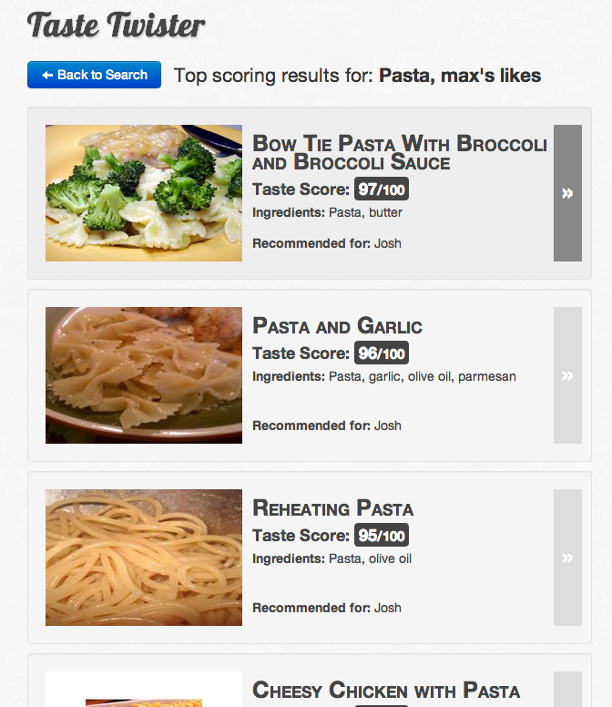
This page allows the user to easily return to the search page by clicking on the “Back to Search” button, and lets the user know what they had just searched for. Additionally, it displays an ordered list of results. Each result includes a picture of the dish, the title of the dish, a taste score, the significant ingredients, and which child (if any) it is recommended for. The taste score and recommendations comes from the childrens’ feedback.

This page is intended to give a helpful overview of the different recipes that match the search criteria, such that the caregiver won’t need any additional information to decide on a recipe.
When the user hovers over one of the tiles, it changes color, and clicking on any part of the tile brings the user to the recipe page.
Learnability
- The tiles change color when the user hovers over them (feedback).
- The search parameters are listed at the top of the page so the user knows that what they searched for has been taken into account (feedback).
- The taste score is made very prominent to allow the user an easy metric for choosing recipes.
- The image also stands out, which is intended to make it even easier for the user to choose between recipes.
- The boxes around the tiles and the arrow button is intended to provide button affordances for selecting the recipe.
Efficiency
- The taste score lets the user choose a recipe quickly -- it only takes one click to choose a recipe, and the caregiver can assume that it fits their criteria
Safety
- The user can quickly return to the search page by clicking on the “Back to Search” button. When they do so, their search parameters still populate the search box, so they can make incremental changes to their query.
- If the user manipulates the URL, they are either directed back to the search page or sent to a “no results found” page. This also lets the user know that the queries that return actual results are based on their input.

Design decisions
- What should we include in the recipe tiles?
- We decided to include a bit of information in the results tiles so that the user would be able to make a decision without having to make any more clicks. However, we wanted to make the information within the tile easy to read, which is why we made the title large and highlighted the taste score. This lets the caregiver make a quick decision based on taste score.
- Do we need an explicit button to return back to the search page?
- We decided that we needed the button to allow users to return to the search page and have their previous query still present in the search bar.
Recipe page (for caregivers)
The recipe page allows the caregivers to do a few key things.

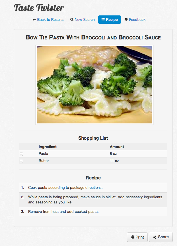
First, this page allows caregivers to navigate back to the results page and begin a new search with a single click. Additionally, it lets them go to the feedback page, where their children can give feedback. The recipe page also displays the title and picture of the dish, as well as a shopping list and list of steps in the recipe. The page also lets the user print out the recipe/ingredients or share the information with someone, such as a partner that is going to the grocery store for them.
Based on heuristic evaluations and user tests, we felt that it was best to combine the shopping list and recipe into a single page.Additionally, our user test made it seem like people appreciated being able to check off the ingredients they already had. Checking the box next to an ingredient crosses out the ingredient and indicates to the user that they already have the ingredient.
Learnability
- The navigation bar highlights the current page in blue to show active state and make it clear the page the user is on.
- The recipe and shopping list are presented together to make it easier for a user to see the ingredients while they are making the recipe.
Efficiency
- Navigation bar allows users to easily navigate back to complete a new search or see the results again.
- User doesn’t have to go to multiple pages to see the recipe and shopping list.
Safety
- Previous query still populates the search bar/results page when the user returns to them from the navigation bar.
- Users can easily return to search results after selecting a recipe.
- Ingredients can be checked and unchecked (so the user doesn’t get stuck in one state)
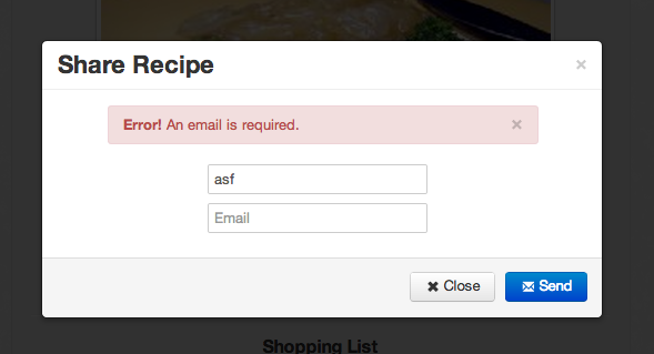
- There is error checking in the “share” modal, to ensure that the recipe will be sent.

Design decisions
- Should the recipe and shopping list be on the same page?
- We ultimately decided to put the recipe and shopping list on the same page, as they are in classic recipe books (natural mapping). During our user tests, we found that people had forgotten the ingredient amounts when they went to the recipe page, and we felt it was safer to include them together. This also made it easier for users to share/print the two sets of information.
- Should checking the checkbox indicate that the user already has the ingredient?
- Users viewed the shopping list like one they would have on paper, so when they had bought an ingredient, they wanted to cross it out. Therefore, we felt having the checkbox function as a crossing out mechanism made the most sense.
- What should we put in the navigation bar?
- Although we wanted to make the navigation bar simple, we found that users thought it was valuable to have a button for returning to search and results.
Feedback page (for children)
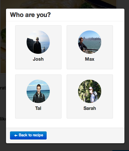
The feedback page is meant for the children to rate what they thought of the meal, and help caregivers make meals in the future. First, they are presented with a modal window where the child or caregiver can click on the current child giving feedback.

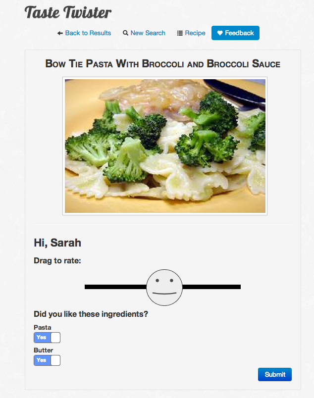
After choosing the correct child, the child is presented with a page that reminds them of the meal they just ate and allows them to rate what they thought of the meal as a whole and each separate ingredient.

The smiley face changes based on where it is on the sliding bar, and moves the ingredient yes/no choice based on if the smiley face is on the “happy” side or the “sad” side. If the smiley is dragged toward the left, the ingredient preferences toggle to ‘no.’

However, once the toggles are changed manually, they are no longer tied to the slider. After the child has moved the slider accordingly and toggled the ingredients based on their preferences, they click submit and are prompted with another modal window. The idea is that once one kid finishes, they will pass the app off to another kid, who will complete their feedback – continuing until all kids have given feedback.

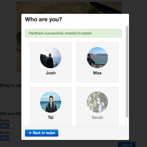
The modal window that appears after one kid has given feedback has grayed out the picture of any child who previously submitted, and provides an alert saying that the feedback has been sent to the caregivers.
Learnability
- This page maintains the same navigation bar as before, so the user can easily go back to any of the other pages, especially if the child is not yet ready to give feedback (internal consistency).
- The smiley face gives visual feedback as it is moved around (turns brighter green/becomes more smiley if moved to the right).
- Picture stays the same from the recipe page to give the child a visual cue as to the meal they just ate (useful, especially if they can’t read).
- The page greets the child by name, which also provides visual feedback.
- There is a diameter around the slider bar, so the user doesn’t have to be exactly on the line to drag the smiley (steering law).
- After submitting, the modal window has a grayed out picture of the kid who just submitted and an alert to provide feedback.
Efficiency
- The yes/no button underneath the ingredients moves to all yes or all no based on where the smiley is (as long as they haven’t been changed manually).
- Clicking submit prompts the user for another child right away, so they can easily/quickly give feedback.
- The user can click on the line to move the smiley there, instead of having to drag it the whole way.
Safety
- Although there is no way to change feedback once it is submitted, if the caregiver returns to the recipe, the child can go back and alter their feedback.
- If feedback is not submitted, the user can still choose that child in the modal window to give feedback.
- Once the user changes the ingredient yes/no choices manually, they remain the same despite where the smiley is (so moving the smiley doesn’t change their choices)
- In the modal window, there is a button to return to the recipe so the user is not stuck there if they don’t actually want to give feedback at that time.
- After submitting, the modal grays out the kid who just submitted so you can’t easily give feedback multiple times for the same kid.
Design decisions
- How much should we ask from the children?
- We had a few designs early on where kids could drag and drop ingredients into preference buckets. However, based on user tests, we decided to make the feedback page as simple as possible since people were worried about what their kids could handle. We ended up with a slider which was fun for kids to move around, and simple toggles underneath the significant ingredients.
- How can we cycle through all of the kids efficiently?
- We decided to use a modal window to select the kid, and cycle through these immediately after submitting one. This way, the kids are not on an entirely separate interface. This could have been confusing, especially to caregivers trying to teach their kids how to use the interface. In addition caregivers can can easily pass the app around after dinner allowing children to rate the meal.
Summary of design changes
Paper prototyping
- Led to our initial design from a component standpoint.
- Caused us to get rid of “recommended ingredients” because no one was using it.
- Had to make sure to add obvious button affordances to the child tiles on the home page.
Heuristic evaluation
- Caused us to de-emphasize the individual likes under the kid tiles.
- Caused us to emphasize the taste score.
- Caused us to make the hover color more pronounced on the results/recipe pages.
- Caused us to put the recipe and shopping list on the same page and fix the navigation bar.
User testing
- Caused us to rethink the affordances and information sensing we have on the different pages.
- Caused us to rethink the order of operations on the recipe page.
- Caused us to rethink the taste score presentation.
Implementation
Taste Twister is built using Django, a Python web framework and is hosted on Heroku. Our project depends heavily on the templating and url routing features of feature of the framework. Our backend generates all the HTML for our pages. On the frontend, Taste Twister replies on the jQuery library and canvas element for user interactions. We used Twitter Bootstrap for scaffolding and plugins like modals. While Bootstrap was an important tool for us, we tried to avoid using to many visual elements from it and opted to style things with custom CSS.
Data was collected through web scraping. Currently, all of our data is in local text files that we write and read to. This made it quick to develop and modify data, but causes a few usability problems. For example, there is a slight delay when searching for several ingredients. Because of the lack of a database our search functionality does no perform as well as it could.
Evaluation
How it was conducted
We conducted our user tests in person. For the first caregiver and two child tests, we went to their residence, which was the same environment they would be in if they were actually going to use the application. The second two caregiver user tests were conducted in 34-101, which was done out of necessity, and could simulate what it would be like to use the application on the go.
We had the caregivers perform tasks related to the first three pages, the home page, results page, recipe page. The children performed tasks related to the feedback page. One of our group members helped the children go through the tasks on the feedback page, to simulate what it would be like if a caregiver was there teaching them how to use the application. We would have the kids first pick a dish that they had heard of, so they could imagine having just eaten it.
Our users
We had three caregivers and two children test out our application. The caregivers had children in our target demographic (5-10 years old), and the children themselves were also between the ages of 5 and 10. One was a 5 years old boy and the other was an 8 year old girl, so they represent both ends of the spectrum. We tested two fathers and one mother.
Briefing and tasks
The caregivers were given the briefing and tasks in the form of an online document, which they read before beginning the tasks.
The children were given their briefing in an informal manner before completing their task. We did not expect them to remember everything we read to them, and made sure to ask if they had any questions before proceeding.
Briefings For caregivers
Hello, you are testing Taste Twister, a web application designed to help caregivers plan meals for their kids.
As kids, we know we made our caregivers suffer as they tried to plan meals for us and our siblings. Kids can be picky eaters, and siblings often don’t agree on foods. caregivers have a difficult time remembering what their kids like, and end up cooking the same dishes over and over. We want to make it easier for caregivers to find new meals to cook that their kids will actually like. Taste Twister makes the entire process of choosing meals based on what kids like fun and interactive for caregivers and kids.
You’ll greatly help us if you talk through your thought process as you complete the tasks and let us know if you have any additional feedback.
Your role:
Imagine you are a caregiver of four kids: Max, Josh, Tal, and Sarah. Your kids have very different food preferences, which you have trouble keeping track of. You’ve been cycling through the same meals for the past few weeks, and really want to try something new. After hearing about Taste Twister from one of your friends, you visit the mobile site and put in all of your kids’ information. You are about to head out of work and want to pick a dish for tonight before you head to the grocery store.
Task 1:
Find the ingredients you need to cook a meal with pasta that you think your kids will like.
Task 2:
Cook a meal that Max and Sarah are sure to like.
Briefing for kids
Your role:
You are a Tal, a 6-year-old child. You’re a pretty picky eater, and generally don’t like things that are green. You are interested in trying new foods, but only within reason. Your mom just made pesto pasta, and since pesto is green, you were skeptical about eating it. After dinner, your mom hands you her phone and asks you to rate the dinner.
Task 1:
Provide feedback on the meal you just ate.
Usability problems
Catastrophic
-
- The younger child could not read very well, and the only visual cue for the ingredients was the name of the ingredient. This would cause the caregivers to also have to be present when the children were giving feedback.
- Solution: Include pictures with the icon as well as the name of the icon, and change the “yes/no” to happy face/sad face icons.
Major
-
- The older child found the toggle buttons difficult to use -- they thought they could be dragged.
- Solution: Make the toggle buttons look more like toggles and less like draggable buttons. Also, make them larger as the children seemed to have trouble guiding the mouse around.
- caregivers didn’t always realize that the search bar was not universal
- Solution: Either make the search bar universal or don’t display the search button until they type in a valid ingredient.
- Some caregivers did not realize that the kid tiles were buttons at first
- Solution: Make the tiles have more affordances to make them look like buttons or include a textual cue.
Minor
-
- Users could figure out what the checkboxes meant, but a few found them counterintuitive. They felt that checking the box should mean that they need to buy something, instead of meaning they already had the ingredient.
- Solution: Create separate sections for the ingredients-- when a user checks on off, it moves it to the “have” list, instead of the “need” list.
- caregivers didn’t always understand what the taste score was exactly, and it took some prompting to get them to notice/use it.
- Solution: Make the taste score more prominent (change the color/make it the largest element of the results tile).
- Some caregivers did not realize that they could search for multiple ingredients
- Solution: Make the searched ingredients look more like discrete tiles, or include an example set of tiles in the search bar when they arrive at the site so they have an idea of what to search for.
Cosmetic
-
- Pressing enter on an ingredient in the search bar list only puts the ingredient in the search bar, and many users expected it to also search for that item
- Solution: Make the search button more prominent.
- Taste score doesn’t have to be from 100 to 0, because caregivers only really care about whether their kids will love it, won’t eat it, or don’t really care.
- Solution: Use faces instead of numbers to communicate the taste score
Reflection
Over the course of the iterative design process, we learned that our initial conceptions on what users will find easy/difficult is often very different from the reality. Before doing the paper prototype, we thought we had a good design, and then after doing the computer prototype, we thought we had a great design. However, there were still multiple usability problems. In fact, even after our final iteration we still have a long way to go.
The iterative design process also taught us that it’s much better to make mistakes early on in the process. We learned a lot from our paper prototype and consequently made our design much simpler. If we hadn’t done that initial step, we would have spent a lot of unnecessary time implementing features that turned out to be useless to the users.
We also learned that it is crucial to test with users who are of the target demographic. In our final round of testing, many things emerged because it was easier for the users to imagine using the product. Additionally, testing with children was crucial because it is very difficult for adults to act, especially with fine motor skills, like they are children.
If we were to do it again, we would like to do more testing early on of users in our ideal demographic. Additionally, it would have been nice to test multiple designs, as there were many elements that we left out of our paper prototypes that may have been useful later on. We played it a bit safe with our design, and we’re proud of our final product. However, it would have been a good exercise to perhaps try more things at the paper prototype phase.
