Design #2
Index
Log In (top)
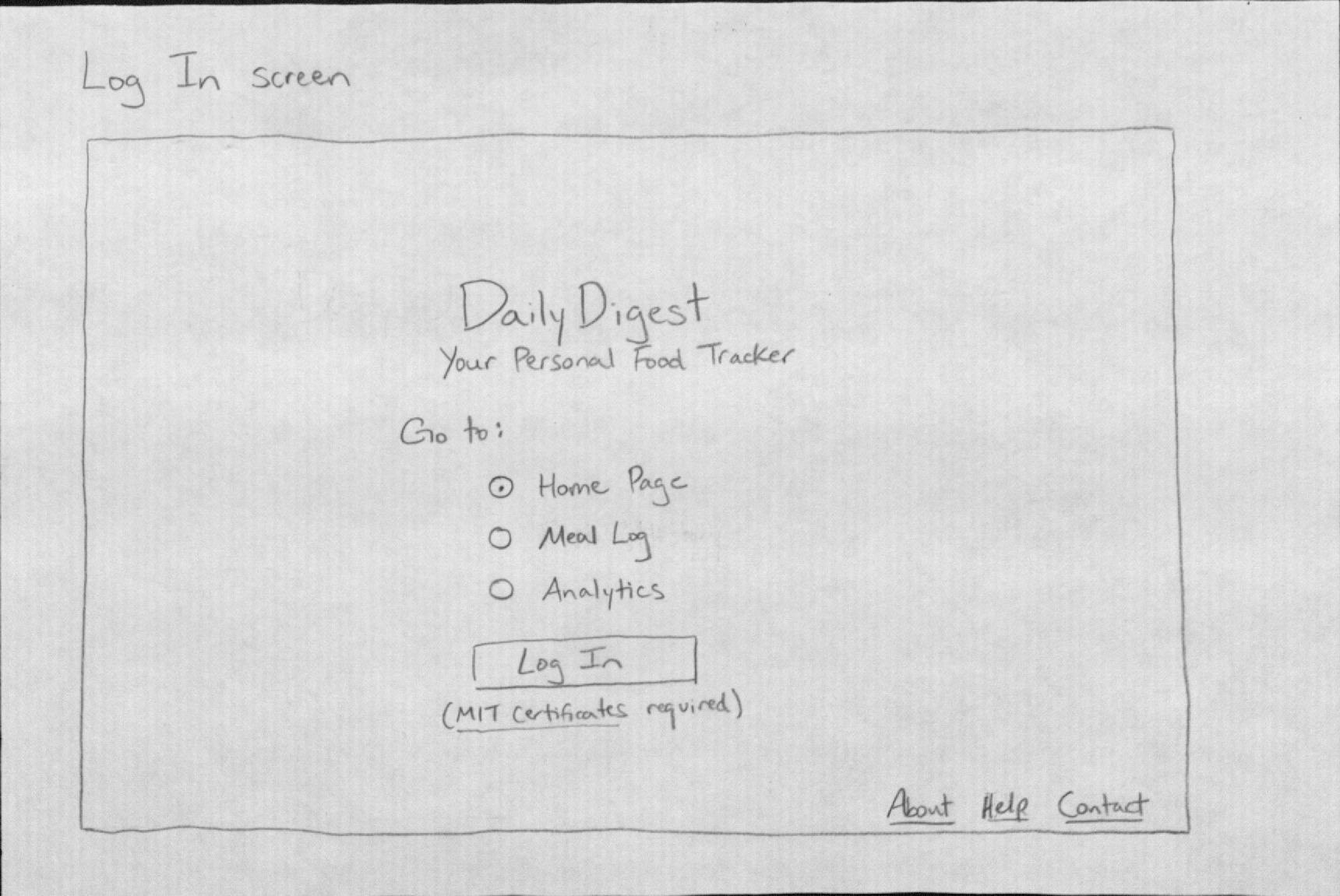
In our scenario, Fred would arrive at the DailyDigest home page and simply click to log in.
On this page, a user logs in to his personal account. He can optionally select a landing page under “Go to”; the default is to land on “Home Page.”
Learnability:
- Pro: It’s easy to figure out what to do here. There is only one button, clearly labeled.
- Con: First-time users might not know what DailyDigest does: they may have to visit the “About” page. They may not understand the choices for the landing page, but a default is selected for them.
Visibility:
- Pro: The options on this page are visible.
Efficiency:
- Pro: Allowing experienced users to choose to override the landing page increases efficiency. Assuming an experienced user wanted to go directly to the Analytics page, for example, this design saves the user a click (from the Home Page) and some upload time for the desired page.
Error Prevention:
- Con: The main error here would be if someone tried to log in without certificates.
- Pro: Text right under the “Log In” button states this requirement, and also links to MIT IS&T’s Certificates website.
Home Page (top)
Fred would arrive on the Home Page after logging in. (Perhaps the Home Page would be more aptly renamed to reflect its contents, but that’s for later consideration.) Here, he would be able to accomplish both of his main goals: recording his newly-purchased groceries from Trader Joe’s into his Food List - which is a record of all the food he owns - as well as updating his Meal Log with dinner, breakfast, and lunch. Fred would also be able to see a summary of Analytics, which consists of some charts with data pulled from past Meal Log entries. So, he might actually be able to satisfy his later, sudden curiosity for Analytics on this Home Page too.
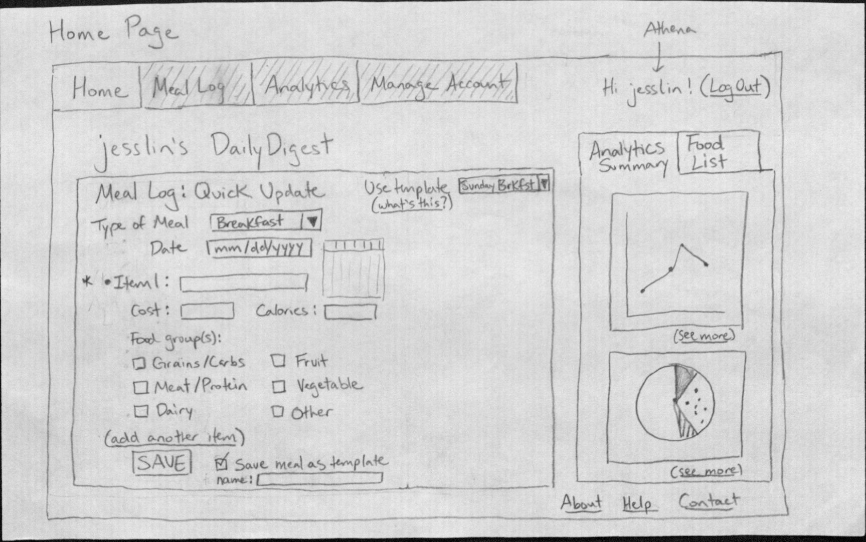
The Home Page offers has two elements: a tabbed box that holds Fred’s Food List and a summary of his Analytics, and a form to allow him to quickly add an entry to his Meal Log.
--> 1. Tabbed Box (top)
The tabbed box has a tab for the user’s Food List and a summary of the user’s Analytics. By default, the Food List tab will appear selected.
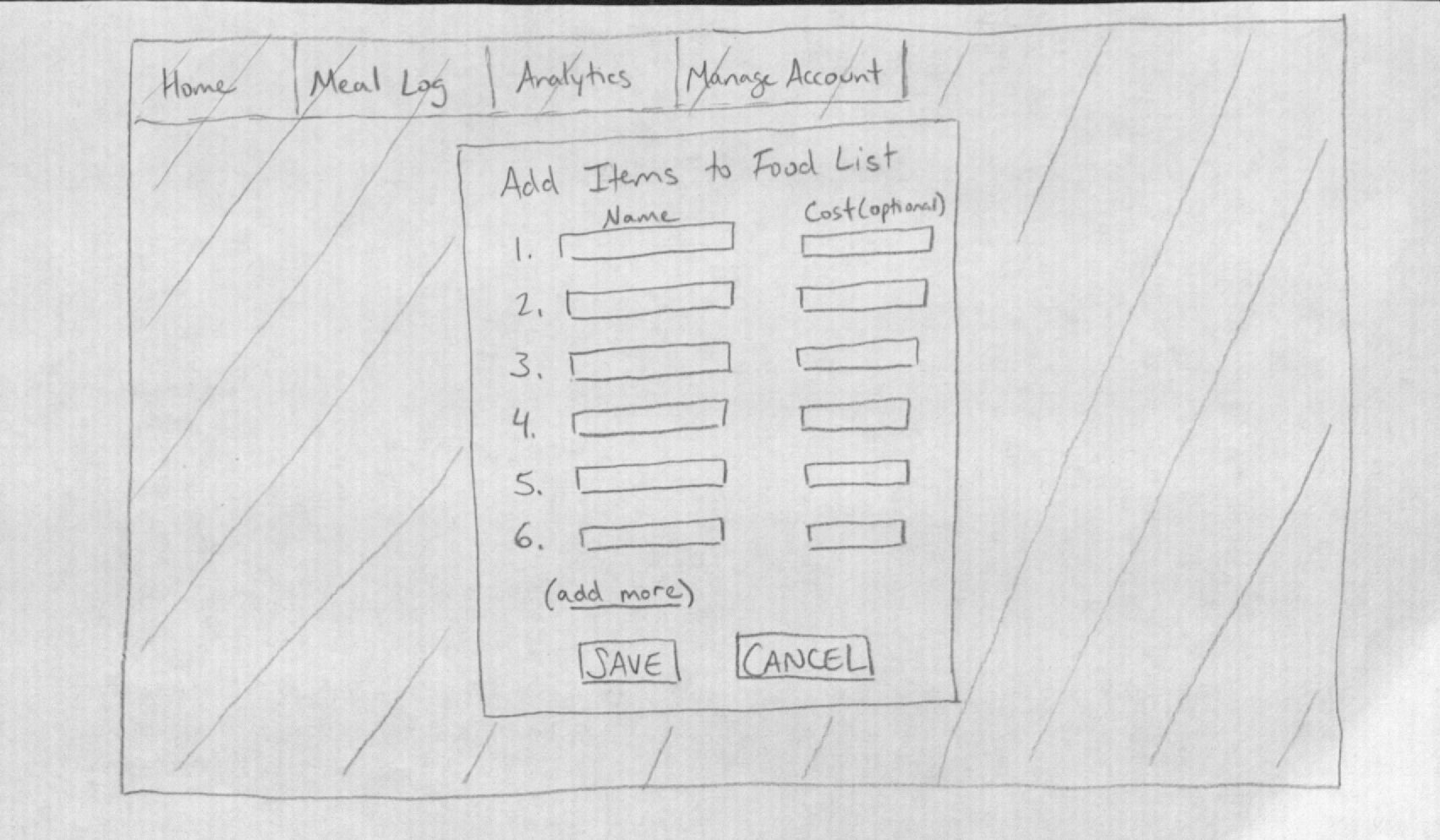
In our scenario, Fred would click on the “Add Items” button on the Food List in order to record items from his Trader Joe’s shopping trip. This pops up a box that allows him to quickly enter in the items from his receipt and their cost in separate text boxes. If he has more items than the default number of entries in this pop-up box, he can click “add more,” which will reveal more text box entries (without altering the previously entered entries). Then he hits SAVE.
Displaying tabbed box opened to Food List
Pop-up for adding an item to the Food List
When Fred wants to fix the misspelled word “aspargus,” he can click on the word directly in the Food List and edit it. When he mouses over the text of the items in the Food List, the cursor will change to an “I” shape, which indicates an affordance for editing. If he keeps his cursor over an item for a second, the cost of that item will appear as mouseover text.
Learnability:
- Pro: It is easy to learn the basic operation of Adding Items to the Food List: there is a button that brings users to a simple form. The Analytics Summary provides charts that are self-explanatory.
- Con: It is not immediately obvious how to edit the text of entries in the Food List, unless you mouse over the text and see the cursor change. Users can edit another, slower way: deleting an entry with the “x” next to an item, then adding that item again through “Add Items.”
Visibility:
- Pro: The Food List tab will appear as the front tab by default. This is important for visibility, because “Analytics” can be seen elsewhere on the website, but the Food List is only located on this Home Page.
- Pro: Having a Food List right next to the Meal Log: Quick Update is a good thing for visibility, since it allows users to see the food they own as they fill out the update form. This may help jog the user’s memory about what he ate.
- Con :The cost of each item is not visible unless you mouse over it, for simplicity’s sake.
Efficiency:
- Pro: Having an Analytics Summary on the Home Page can save users the time of going to the actual Analytics Page on a daily basis, since it shows a few statistics that might satisfy most people.
- Pro: When the user inputs items into the Food List, he is not required to tag the item with its Food Group. It makes this operation more efficient (but there is a trade off, explained in the “Meal Log: Quick Update--Efficiency” section).
Error Prevention:
- Pro: Users can reverse their actions one step. For example, if a user clicks the “x” next to an item in the Food List without meaning to, thus deleting it, he can undo that delete.
- Pro: The ability to easily click and edit the text of each item in the Food List allows for easy correction of spelling mistakes.
--> 2. Meal Log: Quick Update (top)
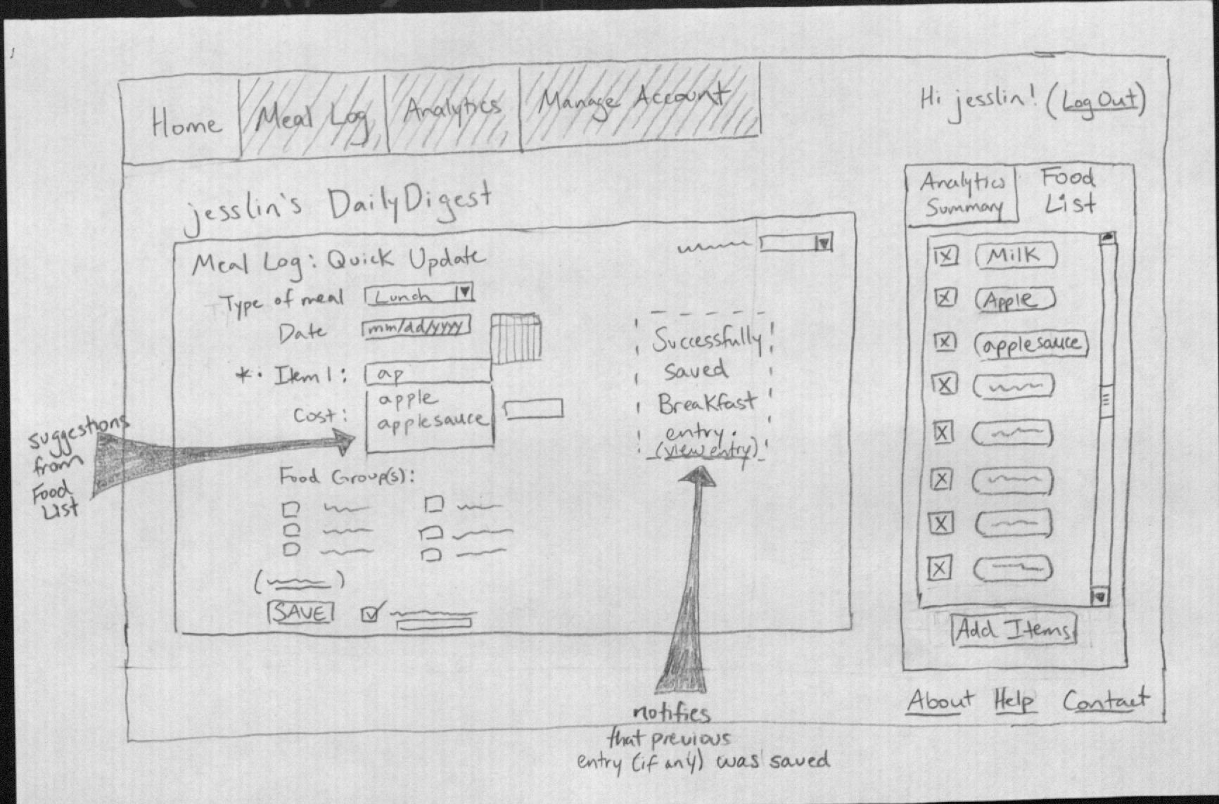
This is a straightforward form that prompts a user for information about a past meal. There are two special things here. First is the ability to fill out the form with a “Template”, seen in the upper right corner of this box. Users can save certain Meal Log entries as Templates, which will auto-fill the form with the food items from that meal. This would be useful if the user often eats the same dish or the same meal. Users can still edit the form after a Template auto-fills it. Second, when a user types into an “Item” text box, items from the user’s Food List that match the entered text will be suggested to the user via a drop-down list (see “apple” and “applesauce” in the diagram).
Displaying basic Quick Update
Displaying auto-complete suggestions for food items in Quick Update, and notification from a previously saved Meal Log entry.
In our scenario, Fred would input spaghetti and meatballs for dinner (as one item or two, as desired), and save that entry. The Food List suggestions would help him enter his breakfast items. He may even have saved breakfast as a Template. Since this interface categorizes food by common nutritional attributes (e.g. protein, carbohydrates) as well as food groups, Fred will be able to categorize “peanut butter” in the “protein” and “fat” categories. Since all options besides the name of the food are optional, Fred is free to guess the number of calories for his multicultural lunch, and to not include the food groups. In between the breakfast and lunch entries, Fred can quickly update the Food List with the item he forgot to enter the first time around, since the Food List is on the same page.
Learnability:
- Pro: The format of the Meal Log is a form, which is easy to learn. Notably, the Date is selected either by typing in text, or by clicking on the date from a calendar that appears (but is not a pop-out) when the user clicks on the Date text box. This is a common mechanism for date selection, so it is externally consistent. The concept of Templates may be less obvious, and new readers may need to read about their function.
Visibility:
- Con: The automatic suggestion of items from the Food List is only visible if the user has items in his Food List. Otherwise, the user may never learn of this functionality. We can expect users to add items into their Food List, though.
- Pro: once a user saves a Meal Log entry, he will see a message confirming that the entry was saved.
Efficiency:
- Pro: The date of a new entry defaults to the current date.
- Pro: Templates allow users to save themselves time from entering commonly-eaten, routine meals or food items. Since Templates can be edited after they auto-fill the form, a Template can save the user time even when it doesn’t exactly match what the user ate.
- Pro: Once a user saves a Meal Log entry, the Quick Update box will clear again (albeit with a message confirming the previous entry was saved), ready to be used to enter another food entry.
- Con: The user cannot enter multiple meals all at once, before clicking SAVE.
- Con: Because food items in the Food List are not tagged with the different food groups, the user will have to label an item’s food group each time it is used.** This may be an acceptable inefficiency, since it gives users a chance to consciously review the types of food they have eaten each time they record a meal.** There was an efficiency trade off made; it is easier to update the Food List because there is no need to tag items in it.
Error Prevention
- Con: The “Save meal as template” checkbox is by default un-checked, since the majority of any user’s meals will not be saved as a template (so, good for efficiency). However, there’s a risk that users will forget to check that box when they do want to.
- Pro: once a user saves an entire new entry, a message appears that allows users to directly view the previous entry, in order to correct any possible mistakes. This stays up until it is replaced by a newer entry’s message.** Con: user may not recognize that there’s an error with an entry, if he does not go to view the actual entry.
- Pro: To prevent confusion from two entries of “milk”, this interface forces users to write distinguishable entries if they have two kinds of the same item. Users will not be allowed to have two identical food items on their Food List.
Meal Log (top):
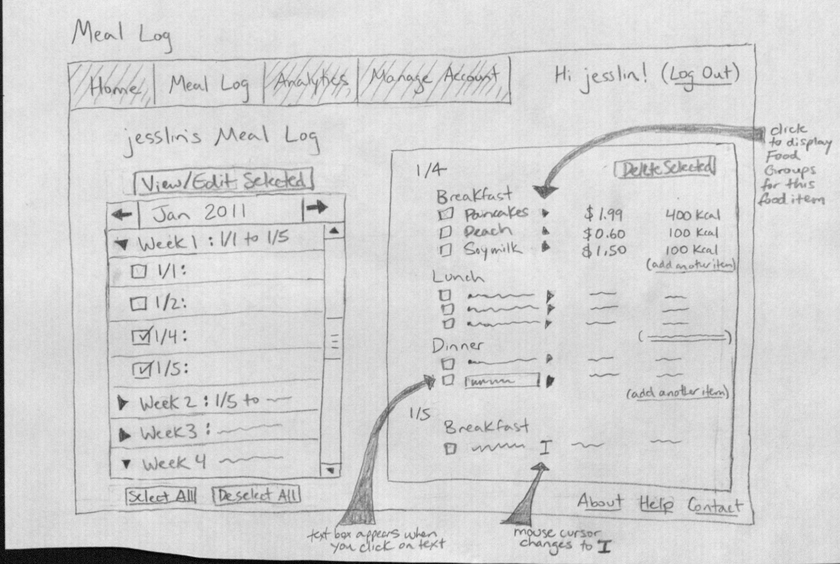
The Meal Log displays records of past meals. There is an entry selection box, where the user selects records to view, via a mix of a calendar and collapsible table form. First, the user selects a month, and then sees the entries organized by week. He checks off the dates he wants to view, then clicks “View/Edit Selected.”
The area on the right side of the screen will update to show the meal entries. Each food item is a collapsible table: a small arrow to the right of each food item allows you to pull down the list of Food Groups that the food item is tagged with. Each piece of displayed information (e.g. Name of food, cost, calories) can be edited by clicking on it, which will turn it into a text box that can be edited. The cursor will change to an “I” shape to indicate an affordance for editing when the mouse hovers over a piece of displayed information. Clicking away from the text box after editing saves the text. A user can add more items to an entry by clicking “add another item,” which slides out an additional blank row to fill out; or he can delete items by checking off items and clicking “Delete Selected.”
In our scenario, Fred would arrive at the Meal Log to look over the actual entries he made throughout the week, just to glance over everything he ate. When he notices he made a mistake with the date of yesterday’s dinner entry, he can select and view both today and yesterday’s entries, and then use a combination of adding and deleting items to transfer the dinner from one day to another.
Learnability
- Pro: It’s easy to figure out how the entries are organized-by month-and the selection for month is consistent with other electronic calendars, such as Google Calendar. The organization by weeks is clear too.
- Con: It’s less obvious how to edit the text of entries, and new users may not recognize that the changing of the mouse cursor indicates an affordance for editing the text once you click on it.** Pro: This design is, however, consistent with other applications, such as Google Tasks. It is also internally consistent with the editing of the Food List.
Visibility
- Pro & Con: Not all meal entries are shown at once in the selection box. However, the division of the entries into weeks can help users visually break down all the entries into manageable and more meaningful chunks.
- Pro & Con: The Food Groups for individual food items in a meal aren’t shown by default--the user has to click the little arrows to see them. However, this makes it easier to parse the rest of the information, since the screen is less cluttered.
- Pro: It’s possible to view two entries from very different time periods, side-by-side.
Efficiency
- Pro: It’s efficient to edit the text of each entry. Rather than having to mark text (via a checkbox, for example) and click an “Edit” button and then a “Save” button, users can click directly on text to turn it into a text box to edit it, then click anywhere outside the text box to save. (By Fitt’s Law, there is essentially an infinite button to save the text.)
- Con: See Error Prevention below.
Error Prevention
- Pro: Before every “Delete Selected” operation to remove food items from meals, a pop-up box will ask for confirmation.** Con: This is less efficient, but these deletions are not recoverable. Plus, unlike accidentally deleting items from the Food List, it will be hard for the user to figure out what food he accidentally deleted in the Meal Log, since this is information from the past.
- Con: It will be confusing what “Select All” or “Deselect All” means in the entry selection box. Does it apply to only the month being displayed, or is it global? Perhaps there should be a “Deselect All on this Page” and a separate, global “Deselect All.”
Analytics (top):
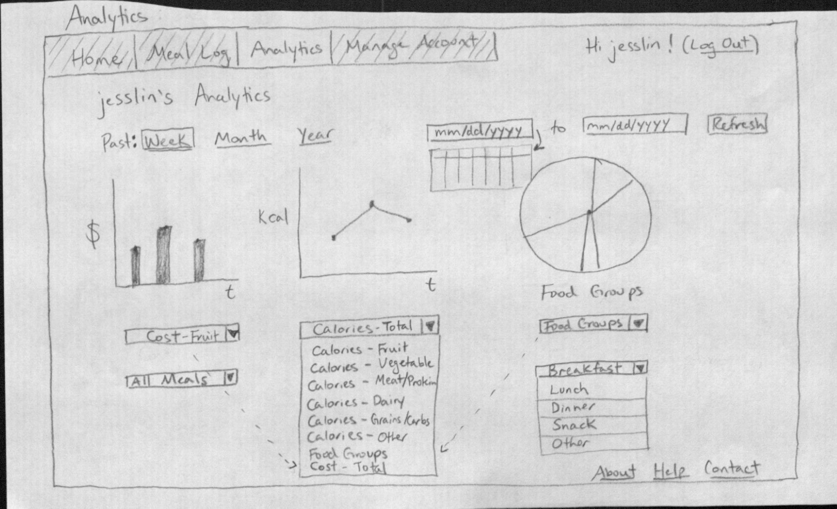
The Analytics page displays three charts by default, all for the past week: cost, total calories consumed, and the proportion of different food groups consumed. Users can change the date range for the data by selecting between Week, Month, or Year (the corresponding date will be automatically displayed in the boxes in the upper right), or by selecting specific dates. The user can change what each chart displays.
In our scenario, Fred would go to the Analytics section to see if he had indeed eaten more vegetables this week and spent less money on snack food. This is accomplished by selecting “Calories - Vegetables” and “All Meals” on one graph, and “Cost” and “Snack” on another, and choosing the “Month” time frame.
Learnability
- Pro: The interface is easy to learn. It is a form.
- Con: An exception to the internal consistency of the labels in the dropdown boxes is “Food Groups.” New users may not know what it means.
- Pro: However, this is intended to be one of the default graphs displayed, so new users can see what it is on their first visit.
- Con: New users may be confused by the date selection, since there are two ways of accomplishing the same thing.
Visibility
- Pro: Three graphs allow for the main points of interest of the user’s data to be shown.
- Con: Three graphs side-by-side may be too cluttered.
- Con: Users can’t see all the options for the graphs at once--they need to use the dropdown boxes.
Efficiency
- Pro: The choices for past week, month, or year provide shortcuts for selecting a time range. It is more efficient than selecting by date.
- Con: The upper dropdown box provides many options to comb through. This may slow users down. This problem may be mitigated by finding a good ordering for the many options, possibly with most-often-used categories near the top.
Error Prevention
- Pro: Errors selecting date or type of analytics to show are easy to fix; the controls are all on the same page, and users can “Refresh” the view to get the desired graphs.
General Comments (top):
Learnability & Efficiency:
- Con: This interface is geared to experienced users, allowing for things like landing page selection and Templates to help efficiency. These features may make the interface seem more complex for new users.** Pro: However, since DailyDigest is intended to be used regularly-once a day to several times a day-new users will soon become experienced users, and efficiency becomes much more important to them. In fact, if the interface is not efficient, users will find making daily updates of their food intake to be too annoying or slow, and will stop using DailyDigest.
Visibility:
- Pro: The same top navigation bar (“Home”->“Manage Account”) and footer bar (“About”->“Contact”) are visible from every page of DailyDigest. The navigation bar is shaded to indicate which page the user is viewing, and there is a title on each page too.
