Note: We created two separate designs for user testing, one which took a more user-friendly approach and another which focused exclusively on efficiency. After the first round of testing (which consisted of three music directors and an "elf" from the radio station) we dropped the design which focused on efficiency and merged the best design concepts from both into a single design. Because we ran each user in the first round on both designs (we counterbalanced so that an equal number of users started with either design) there was a significant learning and preference bias (the tasks remained the same across the two designs, therefore users were more comfortable by the time they tried the second design). This may have been an influence on the users' unanimous preference for the second design they were presented with. Nonetheless, we found it a useful exercise to use multiple designs in our first round of testing, since many details from both made it into the final design.
Quick Links |
|---|
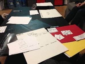
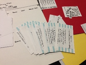
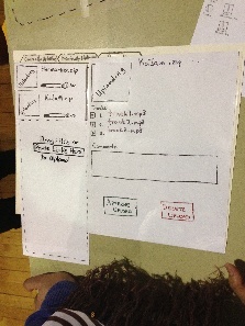
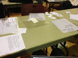
Prototype Photos
|
v1.0 of user-friendly implementation |
|
v1.0 of user-friendly implementation |
|
v1.0 of high-efficiency implementation |
|
v1.0 of high-efficiency implementation |
|
v1.0 of reporting interface (both aforementioned v1.0 implementations use the same reporting interface) |
|
One of the user testing sessions at the WMBR studio. |
|
Some of the interface widgets and task cards used. |
|
v2.0 of our merged implementation |
|
A view of the testing session on Monday March 18th. |
|
v2.0 of reporting interface |

Briefing
What follows is the briefing presenting to participants in the paper prototype tests:
Thank you for taking the time to help us test the prototype of our system.
You will be acting as the “user”, our goal is not to test you, but to test our system and find flaws or inconsistencies that will improve the final implementation.
One person from our group will act as a “computer” who will control the experiment and provide tasks that we would like you to perform using the interface.
The other group members will act as “observers”, and will be taking notes on the experiment.
We will be asking you to perform tasks that relate to your current music director duties, but using our interface instead of what you are normally used to. At a high level these tasks will include importing digital music, previewing music and getting CMJ reporting data. We ask that you do not ask interface related questions during the test itself (as this will better help us find faults in our interface) but we can answer anything after the test is complete.
Thanks and have fun!
Scenario Tasks
Scenario |
Task |
|---|---|
Imagine you are a music director, Lana, and you wish to upload some albums to the digital library via the KaJaM! interface |
Open KaJaM! and log into the system |
You have downloaded 2 albums onto your computer: Starmarker.zip and KaJaM.zip and wish to import them to the library |
Import Starmarker.zip and KaJaM.zip into the digital library |
While KaJaM.zip is importing, you wish to preview one of the tracks |
Preview (play) a track in the KaJaM album |
The track from the KaJaM album sounds familiar, and you quickly realize you have already imported the album and don't need it again |
Delete the currently importing KaJaM album |
The Starmarker.zip file finishes importing, and you wish to make sure all the track details are correct |
Inspect track details* |
You find incorrect and incomplete track details you want to fix |
Edit track details to reflect the correct information** |
You wish to approve the album to officially file it in the digital library |
Approve the album |
Before you leave, you wish to complete College Media Journal reporting for the month |
Take a look at the reporting data in the digital library |
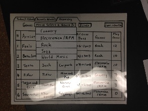
You notice the reporting data is displaying _the Blue Dot _genre, but you want to look at "Electronica/RPM" |
Filter the reporting data to show only "Electronica/RPM" |
Now all reporting data is on "Electronica/RPM" only, but it is not sorted by play count in the last month |
Sort the reporting data by play count in the last month, in descending order |
Everything looks good, but you still want to make adjustments to the reports based on physical CD play count before submitting them |
Export the reporting data to Excel file format for further editing |
Now that you are all done, you wish to go home |
Done! |
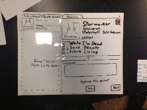
*The album contains tracks with pre-tagged information, but some are incorrect or incomplete:
Track # |
Track Name |
Artist |
Album |
Label |
Release Date |
Genre |
|---|---|---|---|---|---|---|
1 |
While I'm Dead |
Starmarker |
Unknown |
Polyvinyl |
|
|
2 |
Sand Beauty |
Starmarker |
Unknown |
Polyvinyl |
|
|
3 |
Silvre Lining |
Starmarker |
Unknown |
Polyvinyl |
|
|
**The facilitator assumes Lana Googles the album information, so facilitator provides all the correct information to the user on a separate sheet of paper:
Track # |
Track Name |
Artist |
Album |
Label |
Release Date |
Genre |
|---|---|---|---|---|---|---|
1 |
While I'm Dead |
Starmarker |
Killer Kilometer |
Polyvinyl |
20/02/2013 |
Electronica/RPM |
2 |
Sand Beauty |
Starmarker |
Killer Kilometer |
Polyvinyl |
20/02/2013 |
Electronica/RPM |
3 |
Silver Lining |
Starmarker |
Killer Kilometer |
Polyvinyl |
20/02/2013 |
Electronica/RPM |
Observations
Importing tasks
Legend (relevant for prototype iteration 1 only, note that reporting interfaces were identical in both designs for this iteration):
(U) - This point specifically references the user-friendly design
(E) - This point specifically references the high-efficiency design
Prototype Iteration 1
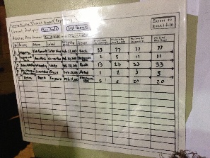
User Import Files into the Library Preview Song Tracks Delete Importing Album Inspect and Edit Album/Track Details Approve Album Music Director #1 User Import Files into the Library Preview Song Tracks Delete Importing Album Inspect and Edit Album/Track Details Approve Album Music Director #2 User Import Files into the Library Preview Song Tracks Delete Importing Album Inspect and Edit Album/Track Details Approve Album Music Director #3 User Import Files into the Library Preview Song Tracks Delete Importing Album Inspect and Edit Album/Track Details Approve Album "Elf" User Import Files into the Library Preview Song Tracks Delete Importing Album Inspect and Edit Album/Track Details Approve Album Student User #1 Student User #2 Student User #3
Prototype Iteration 2
The drag and drop interface was intuitive and easy (learnability,efficiency).
Confused about how to pull up album details once the albums are uploading, lacks visual affordance for clicking on the uploading albums (learnability).
The now modified delete upload button was extremely obvious and easy to find (learnability).
Confused about where different fields go in the album information panel (e.g. she thought the "Unknown" was producer name and not album name, and she thought "Date Unknown" was today's date instead of album release date) and require more visual affordances for what each field denotes (learnability).
Consistently looking for a help button on the interface ("Is there help available for that?") (learnability).
Intuitive and easy for this user (learnability).
Readily dragged and dropped files to the interface (learnability,efficiency), but dragged the second file to the smaller space (once the right-pane came in). User remarked that it was not clear whether he was to drag and drop the zip files or the contents, or whether both zip files could be dragged together.
User may not have known how to get into track details to view the song tracks. User remarked about the lack of affordances on the upload rows. (learnability)
User had no issues deleting the file, but paused the upload before deleting the upload. User remarked that it wasn't obvious that the .zip file corresponded to an album. (learnability,safety) User inquired about whether it was possible to delete on a per-track level, although it wasn't a task. (efficiency)
User remarked that they didn’t know if one of the items was the band or album name (but knew that “Unknown” was the other name), but acknowledged the affordance of the highlight (learnability). The user also remarked about the intuitive nature of the date picker. (learnability)
CRITICAL INCIDENT: User was slightly confused about upload vs. approve and wasn’t sure if leaving would approve (learnability,safety), user also remarked that it may not be the case that users want the approved album to disappear. (efficiency)
No significant issues.
Double-clicked on the row and paused a moment to search for the play icons.
No significant issues.
No significant issues.
No significant issues.
Reporting Tasks
Prototype Iteration 1
User |
Switch to Reporting Mode |
Filter View by Genre |
Sort View by Play Count |
Export Reporting Data to Excel File |
|---|---|---|---|---|
Music Director #1 |
|
|
|
|
Music Director #2 |
|
|
|
|
Music Director #3 |
|
|
|
|
"Elf" |
|
|
|
|
Prototype Iteration 2
User |
Switch to Reporting Mode |
Filter View by Genre |
Sort View by Play Count |
Export Reporting Data to Excel File |
|---|---|---|---|---|
Student User #1 |
|
|
|
|
Student User #2 |
|
|
|
|
Student User #3 |
|
|
|
|
Prototype Iterations
Design |
First Iteration |
Second Iteration |
|---|---|---|
Importing |
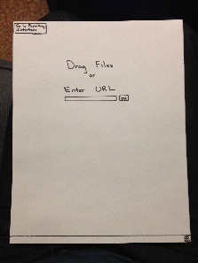
The efficient design featured a text box and button, while the "friendly" design featured neither. |
A text box added to the "friendly" design to provide affordances for pasting or typing URLs |
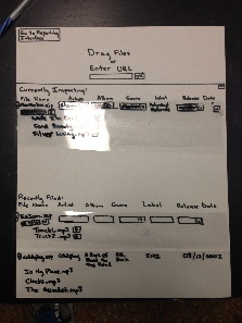
Managing Imports |
The efficient design had a more visible "stop" button, next to the progress bar, while the "friendly" design placed its "delete" button far from the user's focus |
The "friendly" design added a 'pause upload' button near the progress bar and changed the "No (do not approve)" button to a visible, red "Delete Upload" button |
Organization |
The efficient design used a button to switch between upload and reporting modes and featured recent uploads on the same "upload" page, while the "friendly" design separated current from recent uploads, and used tabs for navigation |
The "friendly" design reworded its tabs to be more clear as to their purpose |
Navigation |
The efficient design assumed that scroll-bars would be used normally to scroll through recent uploads, while the "friendly" design used a button to scroll through the details while keeping the approve buttons static. |
A scroll-bar replaced the "scroll-button" for scrolling through details in the "friendly" design. |
Reporting |
The interface featured a single-genre drop-down box which required clicking on a "filter" button to filter. The release dates included and date ranges of playback counting were unclear. |
Genre was converted to a Piazza-like tagging design much like that of the "friendly" design and removed the requirement to click on a "filter" button; release date ranges were made explicit and columns were added to clarify over which date ranges counts were collected |
Miscellaneous Features |
N/A |
Added a hover-based mechanism to view per-track artists for compilation albums; tooltips were added to clarify what each text field represented in the editor pane |
1 Comment
Sarah E Lehmann
Prototype: You definitely put a good amount of time/thought into prototype creation--well done!
User testing observations: I like that you clearly tested on people in your intended user class.
Overall: Great job!