Note: We created two separate designs for user testing, one which took a more user-friendly approach and another which focused exclusively on efficiency. After the first round of testing (which consisted of three music directors and an "elf" from the radio station) we dropped the design which focused on efficiency and merged the best design concepts from both into a single design. Because we ran each user in the first round on both designs (we counterbalanced so that an equal number of users started with either design) there was a significant learning and preference bias (the tasks remained the same across the two designs, therefore users were more comfortable by the time they tried the second design). This may have been an influence on the users' unanimous preference for the second design they were presented with. Nonetheless, we found it a useful exercise to use multiple designs in our first round of testing, since many details from both made it into the final design.
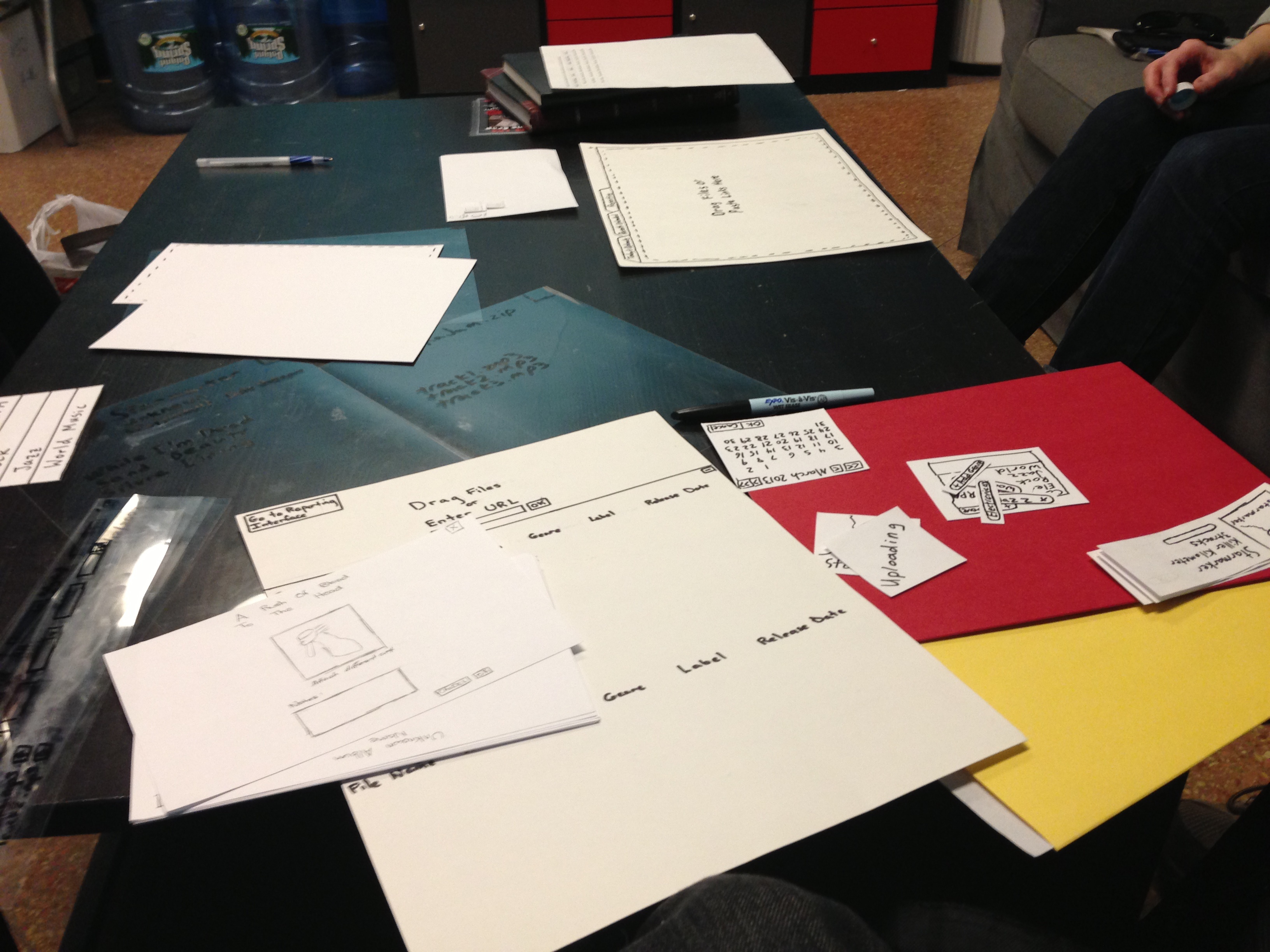
Prototype Photos

|
v1.0 of user-friendly implementation
The user has drag/dropped two files from the desktop onto the interface and the files have begun uploading to the system.
|
|
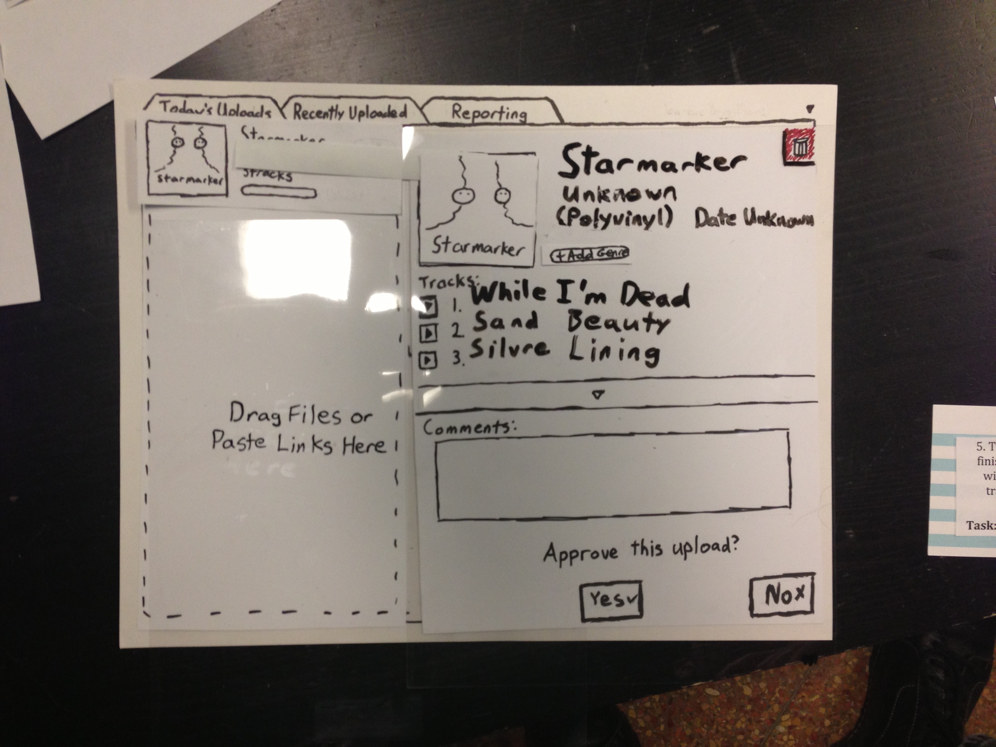
v1.0 of user-friendly implementation
The user has clicked on one of the uploading albums and sees the detailed album view with cover-art. Each field on this page is editable (the field highlights on a mouse hover and turns into a text-box on click).
|
|
v1.0 of high-efficiency implementation
The main screen that shows up on loading. The "+" button at the bottom manually brings up the list of uploading albums and previously uploaded.
|
|
v1.0 of high-efficiency implementation
An album (starmarker.zip) has completed uploading and is ready to be approved (and filed) into the playback system.
|
|
v1.0 of reporting interface (both aforementioned v1.0 implementations use the same reporting interface)
Currently with no filtering selected, all albums are being shown.
|
|
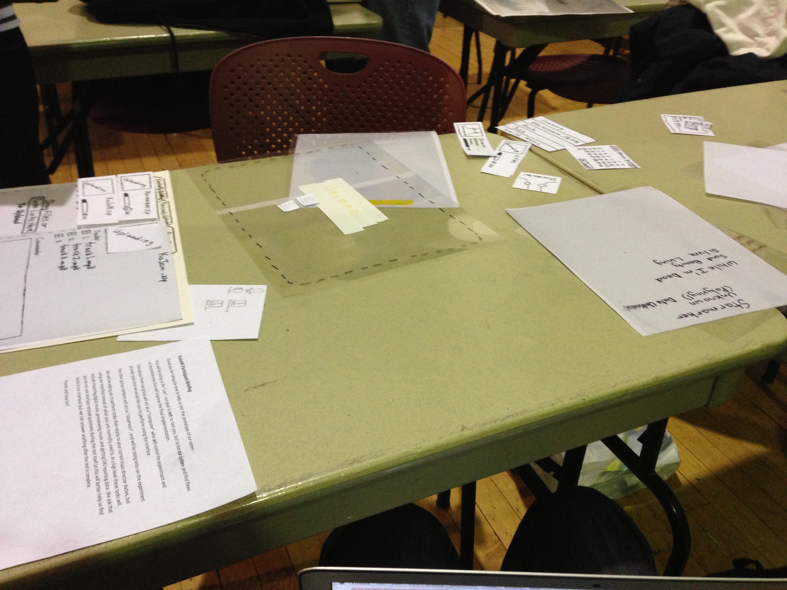
One of the user testing sessions at the WMBR studio.
|
|
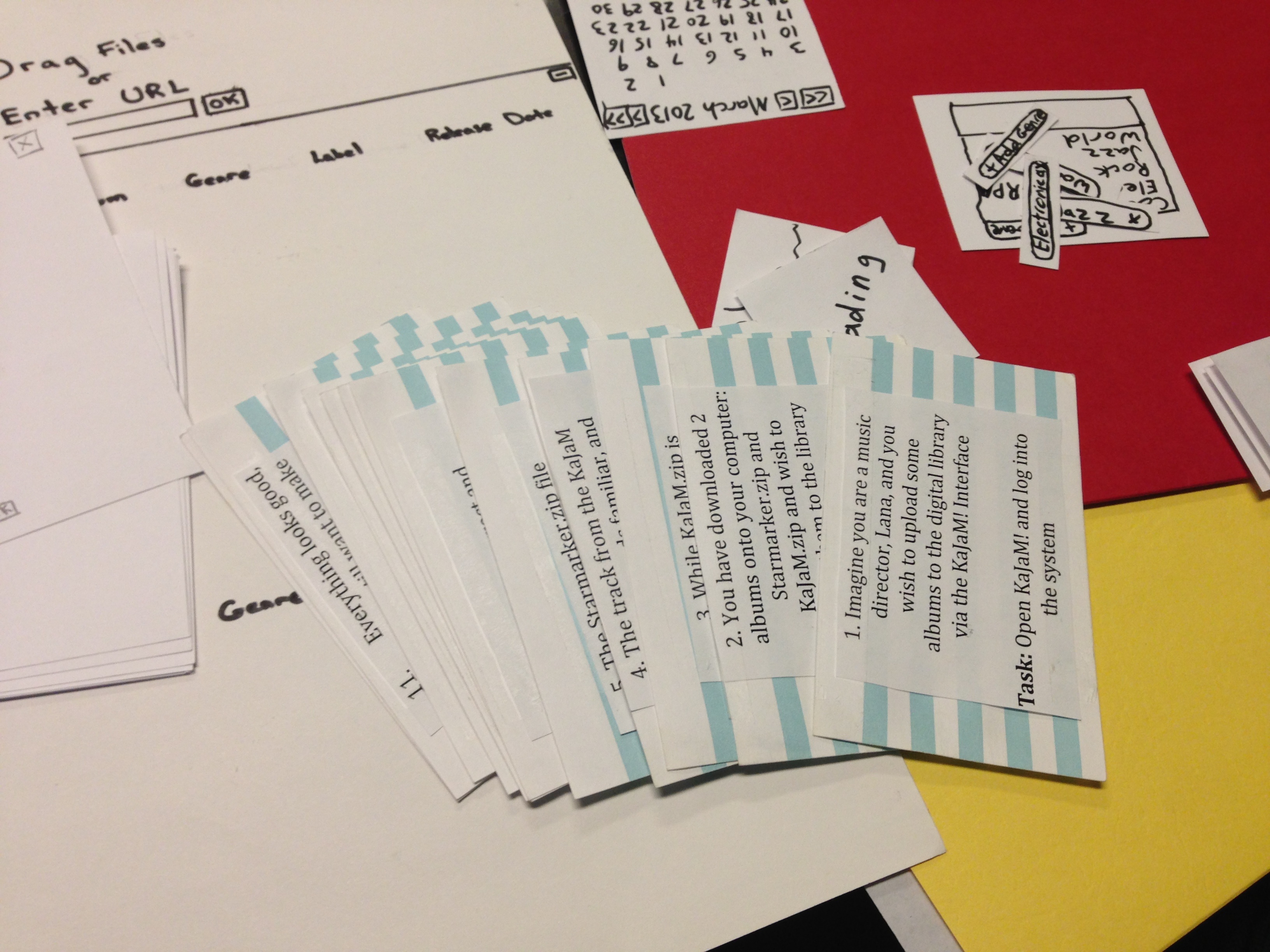
Some of the interface widgets and task cards used.
|
|
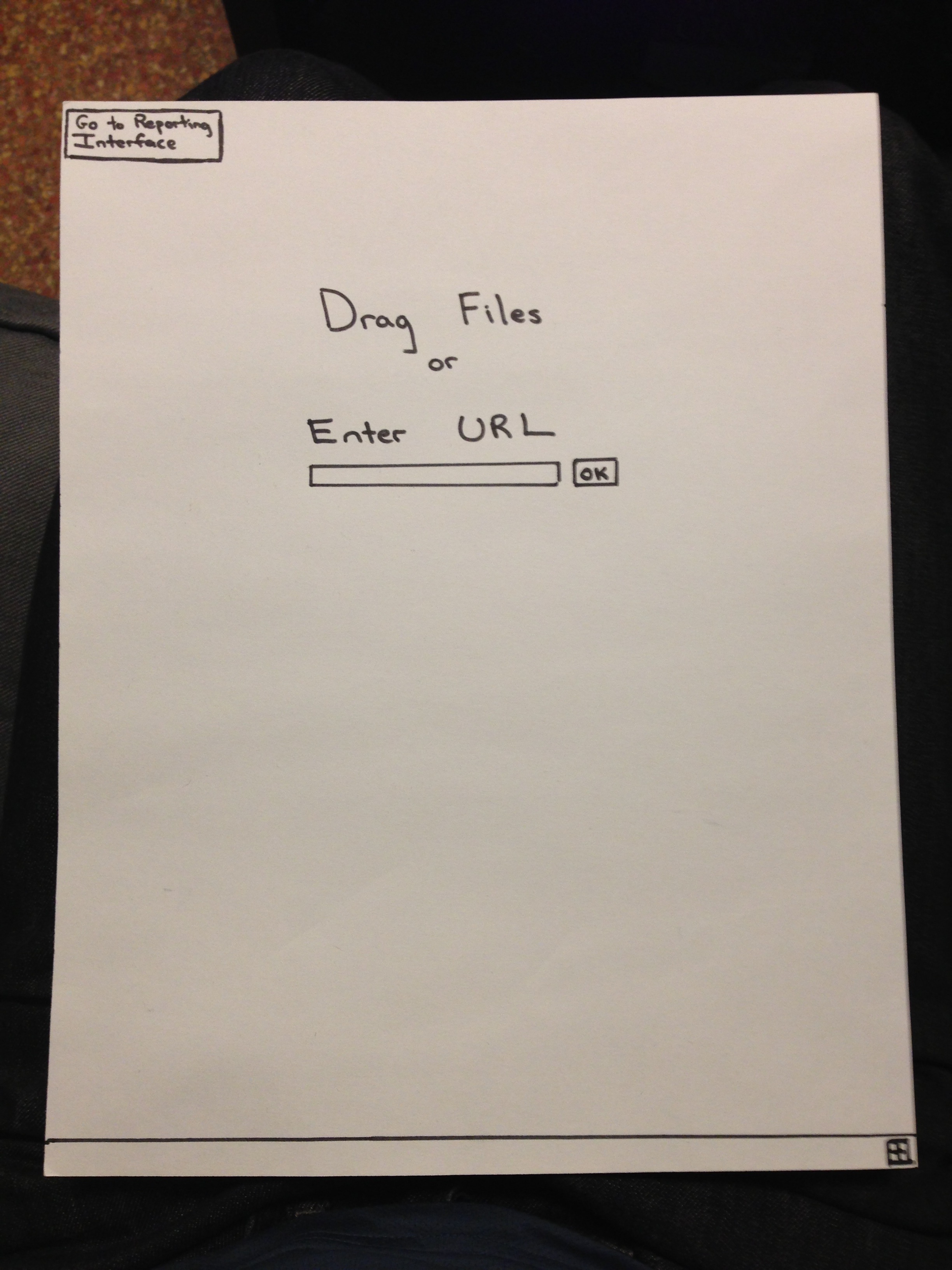
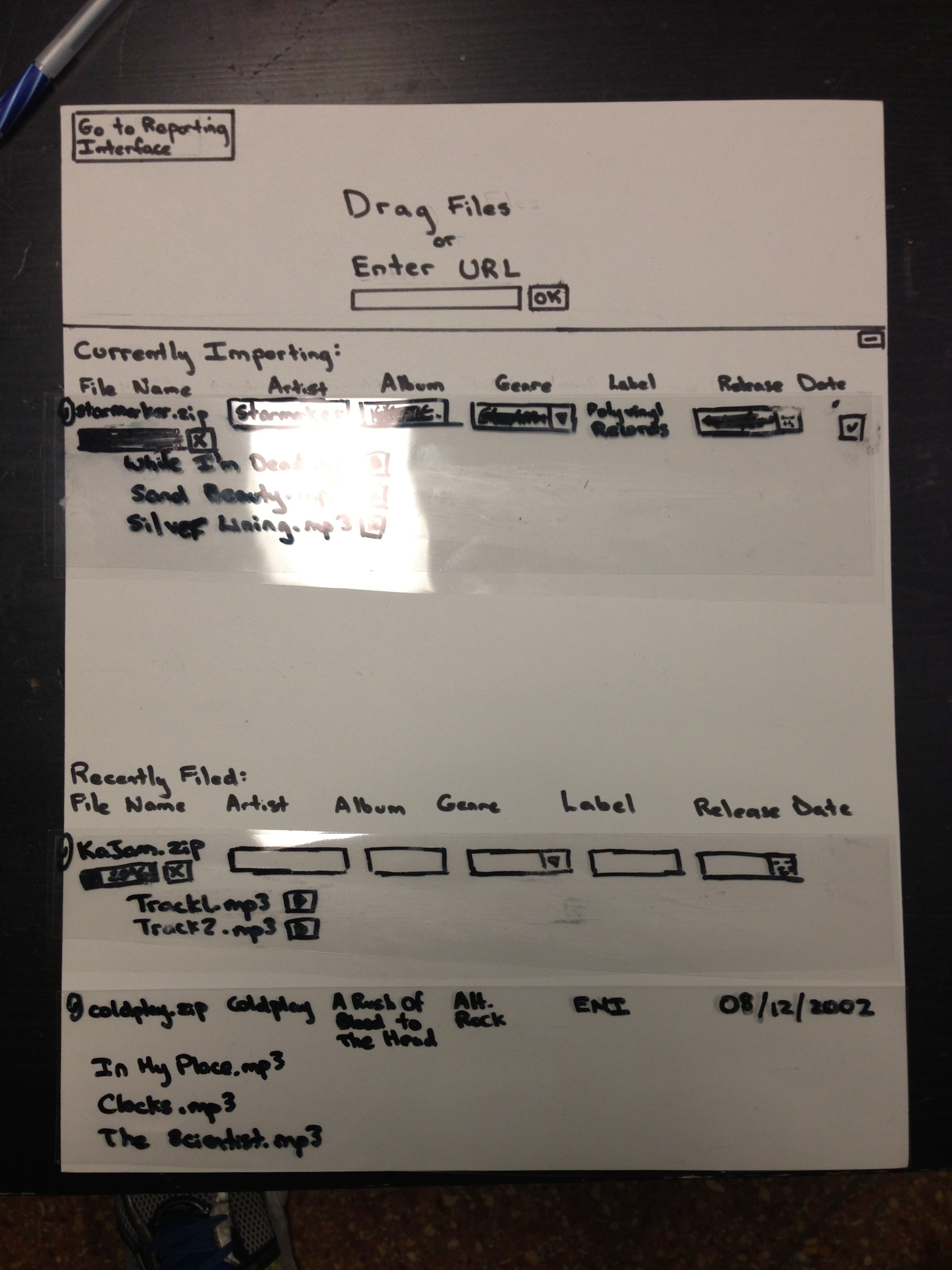
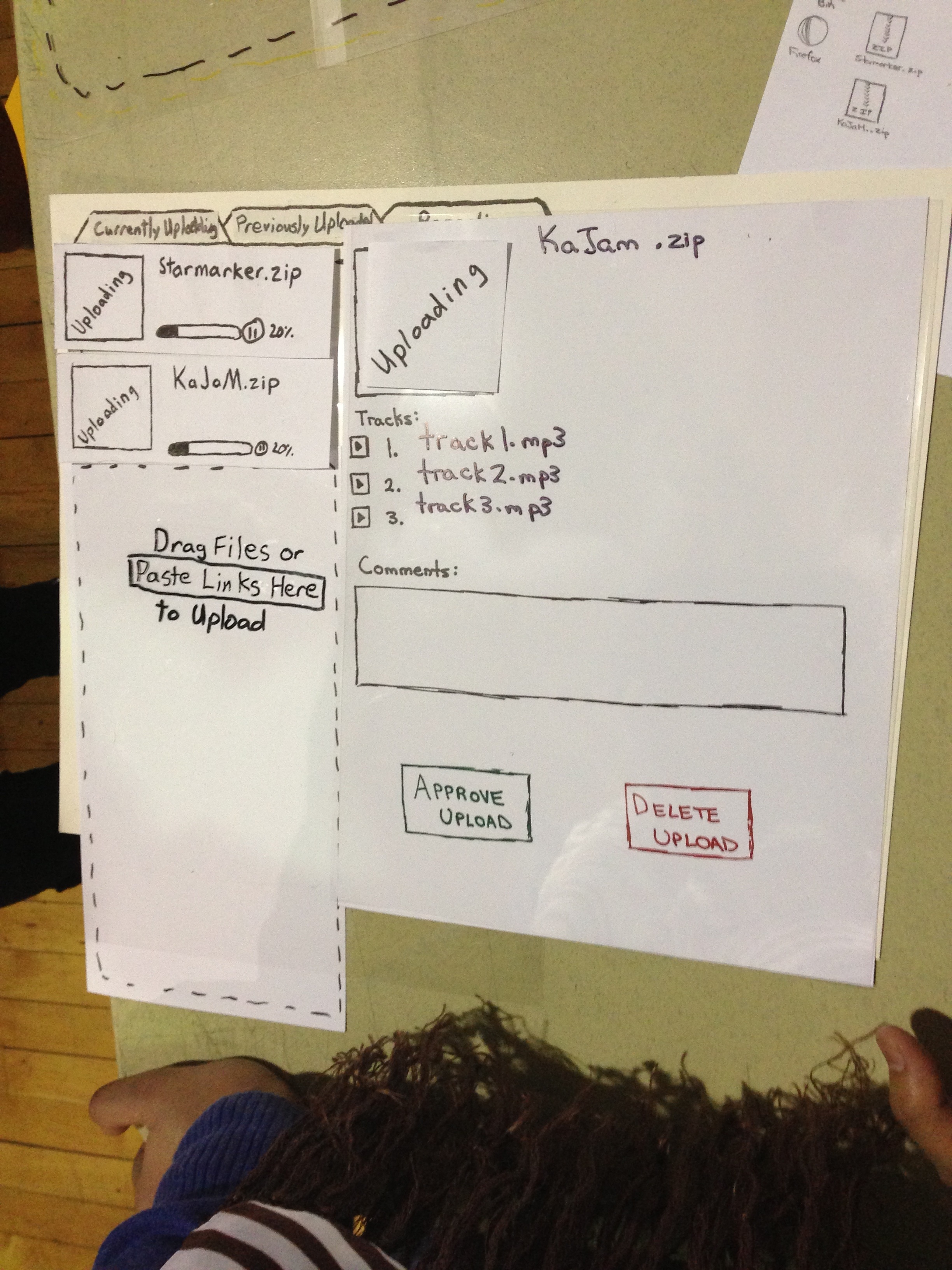
v2.0 of our merged implementation
Notice the pause button by each upload progress bar, the clear approve/delete buttons for the album (and the removal of the trash bin icon previously in the top right corner), and the re-wording on the upper left tabs for clarity. Changes not seen include a screen hover on dragging files over the interface (an entire gray-out screen blankets the screen and says "upload"), a highlight on hovering over any editable fields (including the tracks, which then allow editing of artists on individual tracks), and other minor changes. Other forthcoming changes include being able to delete single tracks (also using a hover over track affordance) and a clear visual cue that uploading albums can be clicked on to see specific album information.
|
|
A view of the testing session on Monday March 18th.
|
|
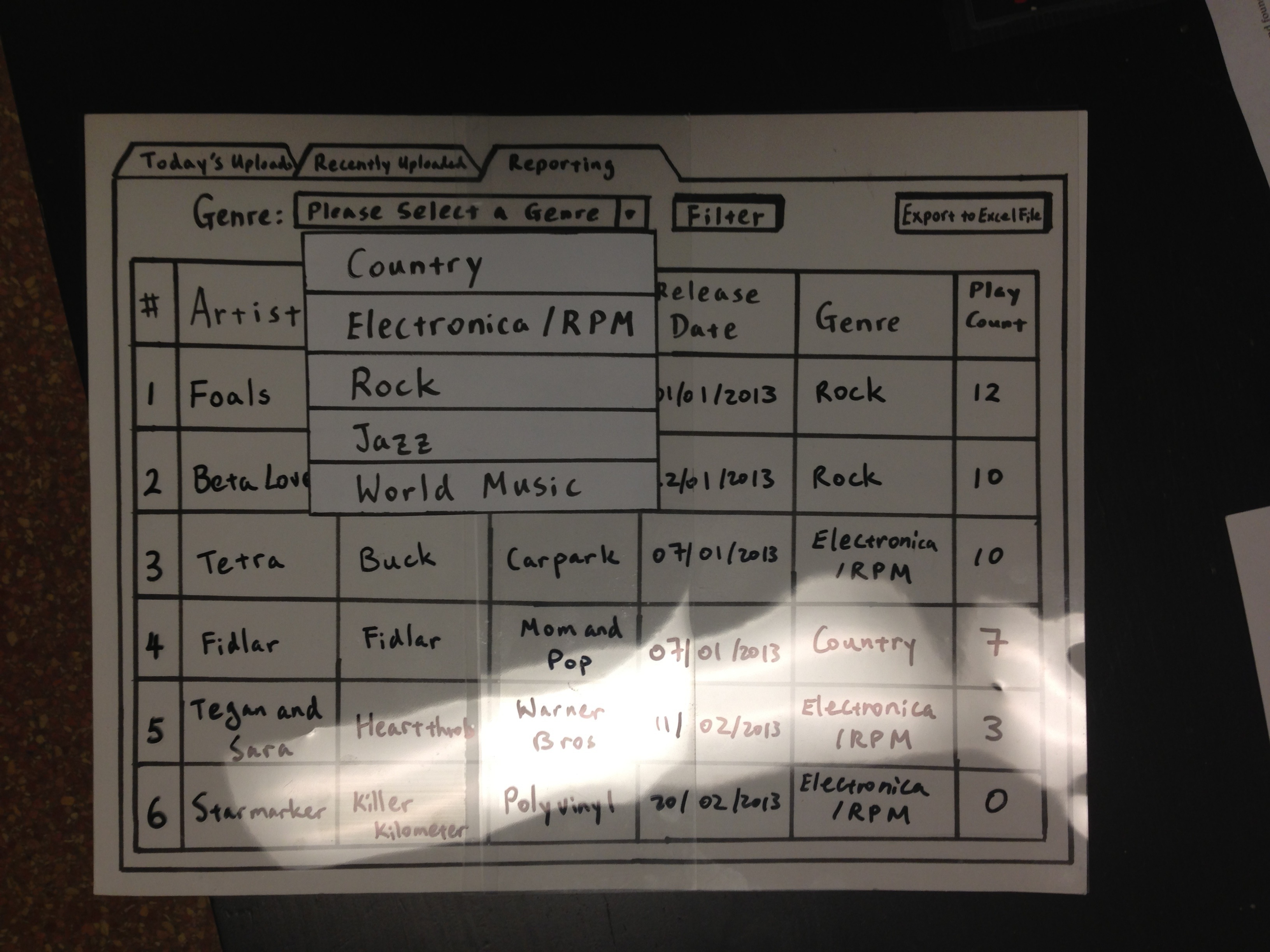
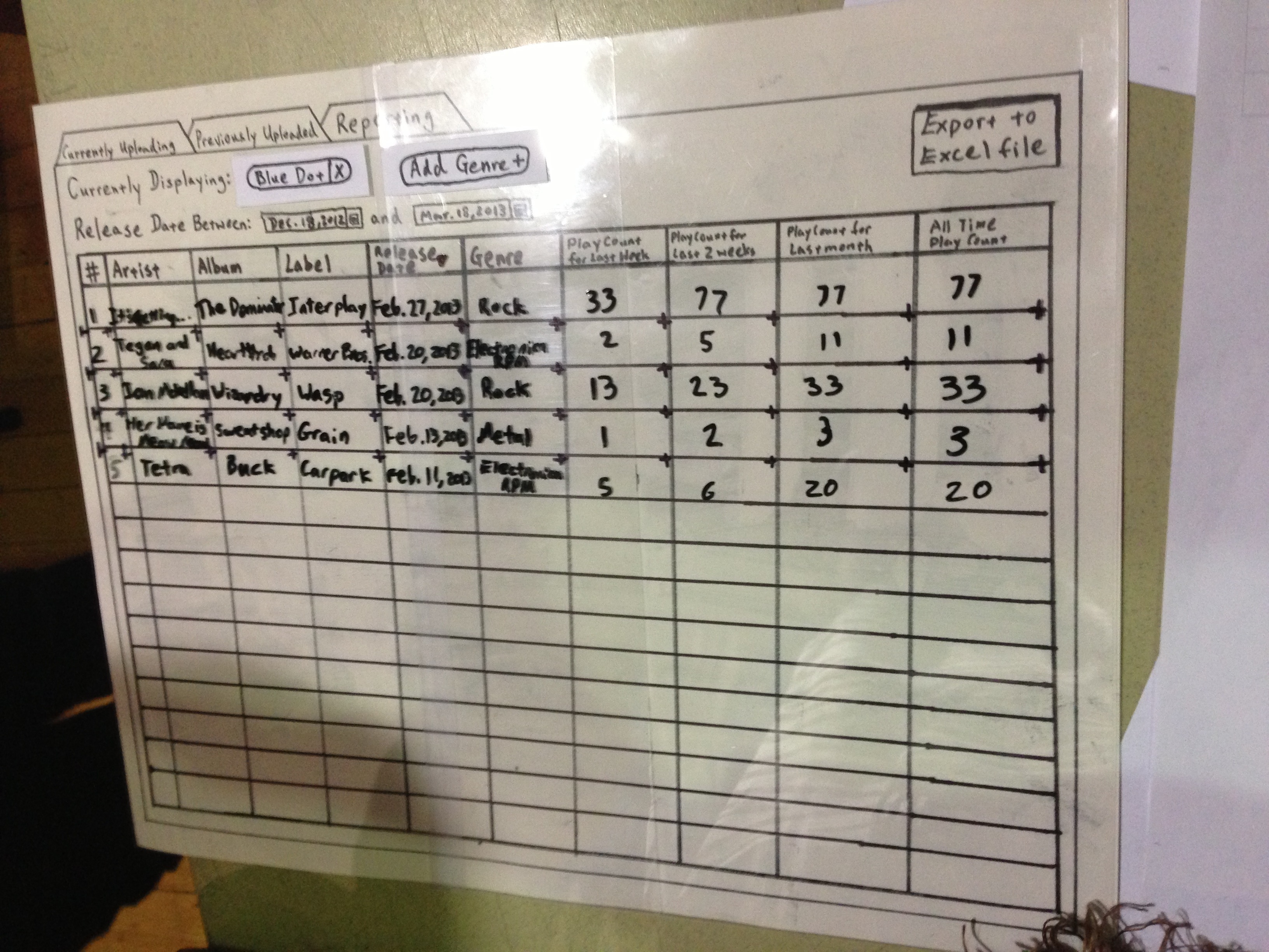
v2.0 of reporting interface
Notice the Piazza-like tagging for genre filtering (allowing flexible genre additions as well as multi-selection filtering), release date range filter, and additional playback count columns (for easy sorting between commonly used date ranges). Note that there were several transparencies made for both versions of the reporting interface to reflect changes in filtering and when clicking on one of the playback count headers (which sorts by play count in descending order).
|
Briefing
KaJaMi Participant Briefing
Thank you for taking the time to help us test the prototype of our system.
You will be acting as the “user”, our goal is not to test you, but to test our system and find flaws or inconsistencies that will improve the final implementation.
One person from our group will act as a “computer” who will control the experiment and provide tasks that we would like you to perform using the interface.
The other group members will act as “observers”, and will be taking notes on the experiment.
We will be asking you to perform tasks that relate to your current music director duties, but using our interface instead of what you are normally used to. At a high level these tasks will include importing digital music, previewing music and getting CMJ reporting data. We ask that you do not ask interface related questions during the test itself (as this will better help us find faults in our interface) but we can answer anything after the test is complete.
Thanks and have fun!
Scenario Tasks
Scenario |
Task |
Imagine you are a music director, Lana, and you wish to upload some albums to the digital library via the KaJaM! interface |
Open KaJaM! and log into the system |
You have downloaded 2 albums onto your computer: Starmarker.zip and KaJaM.zip and wish to import them to the library
|
Import Starmarker.zip and KaJaM.zip into the digital library |
While KaJaM.zip is importing, you wish to preview one of the tracks |
Preview (play) a track in the KaJaM album |
The track from the KaJaM album sounds familiar, and you quickly realize you have already imported the album and don't need it again |
Delete the currently importing KaJaM album |
The Starmarker.zip file finishes importing, and you wish to make sure all the track details are correct |
Inspect track details* |
You find incorrect and incomplete track details you want to fix |
Edit track details to reflect the correct information** |
You wish to approve the album to officially file it in the digital library |
Approve the album |
Before you leave, you wish to complete College Media Journal reporting for the month |
Take a look at the reporting data in the digital library |
You notice the reporting data is displaying _the Blue Dot _genre, but you want to look at "Electronica/RPM" |
Filter the reporting data to show only "Electronica/RPM" |
Now all reporting data is on "Electronica/RPM" only, but it is not sorted by play count in the last month |
Sort the reporting data by play count in the last month, in descending order |
Everything looks good, but you still want to make adjustments to the reports based on physical CD play count before submitting them |
Export the reporting data to Excel file format for further editing |
Now that you are all done, you wish to go home |
Done! |
*The album contains tracks with pre-tagged information, but some are incorrect or incomplete:
Track # |
Track Name |
Artist |
Album |
Label |
Release Date |
Genre |
1 |
While I'm Dead |
Starmarker |
Unknown |
Polyvinyl |
|
|
2 |
Sand Beauty |
Starmarker |
Unknown
|
Polyvinyl
|
|
|
3 |
Silvre Lining |
Starmarker |
Unknown
|
Polyvinyl
|
|
|
**The facilitator assumes Lana Googles the album information, so facilitator provides all the correct information to the user on a separate sheet of paper:
Track # |
Track Name |
Artist |
Album |
Label |
Release Date |
Genre |
1 |
While I'm Dead |
Starmarker |
Killer Kilometer |
Polyvinyl |
20/02/2013 |
Electronica/RPM |
2 |
Sand Beauty |
Starmarker |
Killer Kilometer |
Polyvinyl
|
20/02/2013
|
Electronica/RPM
|
3 |
Silver Lining |
Starmarker |
Killer Kilometer
|
Polyvinyl
|
20/02/2013
|
Electronica/RPM
|
Observations (Importing Tasks)
Legend (relevant for prototype iteration 1 only, note that reporting interfaces were identical in both designs for this iteration):
(U) - This point specifically references the user-friendly design
(E) - This point specifically references the high-efficiency design
Prototype Iteration 1 |
User |
Import Files into the Library |
Preview Song Tracks |
Delete Importing Album |
Inspect and Edit Album/Track Details |
Approve Album |
Music Director #1 |
- User found the drag and drop interface to be intuitive and easily learnable, but isn't familiar with the fact that file start importing as soon as the mouse button is released. Instead, user searched for an "OK" button to start importing officially. This is a tradeoff we made to achieve more efficiency, but sacrifices some safety because the user may inadvertently drop the wrong file on the interface.
|
- Learnability
- User recognized the play button beside the track right away
- Efficiency
- User's single click on the play button starts playing the track right away
- Safety
- If user clicked on play accidentally, a pause button appears in place of the play button to stop track
|
- Learnability
- On the user-friendly interface, the user had some trouble locating the trash can because it was placed far away from the user's line of vision
- On the high-efficiency interface, User quickly found the "X" delete button beside the uploading album
- Efficiency:
- High-efficiency interface requires very little mouse movement to reach the "X" button, whereas the user has to move the cursor all the way across the screen in the user-friendly version of the interface.
- Safety:
- User prefers that the user-friendly interface gave a confirmation warning before deleting album
|
- Learnability
- User found the both interfaces to be easy to understand in terms of what information is being displayed
- Both interfaces lack affordances in terms of what is editable and what isn't, user had to experiment by single clicking on the fields
- Efficiency
- User liked how both interfaces showed all the album and track information on one screen
- User noted the directly editable fields are very convenient
- (E) User liked the comments text box in the album approval screen for adding notes for DJ (e.g. "This is the first album by this artist")
- Safety
- User noted a mistake in adding the genre can be easily fixed by clicking the "x" beside the genre tag
|
- Learnability
- User was confused about how to "approve" the album on both interfaces because he did not associate approval with the "checkmark" button
- Efficiency
- Again, a tradeoff was made between efficiency and safety: single click on the "checkmark" button will approve the album immediately
- Safety
- User prefers a confirmation message
|
Music Director #2 |
- Learnability
- Drag and drop was very straightforward, no problem
- Efficiency
- User really likes being able to type in the URL instead of downloading then dropping the file
- Safety
|
- Learnability
- (U) Had a hard time finding how to open the album information, tried to click on "Recently Uploaded" tab** Found the play button rather fast, but double clicked instead of single click, figured out it pauses it by double clicking
- No trouble with efficiency or safety
|
- Learnability
- For a long time, user had trouble finding the trash can
- Eventually discovers the delete function when she hovers over the icon and the text changes to "delete"
- Safety
- Tried clicking on it but surprised to find it deletes without asking her to confirm
|
- Learnability
- User figured out how to edit fields rather fast, but not sure how to "save" the entry (tried clicking inside the textbox when she really just wanted to exit the textbox - safety issue)
- Tried clicking on "checkmark" icon, which could cause further problems as that will approve the entire album and make the edit screen disappear altogether
- Efficiency
- Prefers when all the information is in front of her and not hidden behind some buttons (need to be activated)
|
- User used the comments section before approving, found it to be a really good idea
- No other issues
|
Music Director #3 |
- Learnability
- Did not understand the "drag and drop" instructions
- User had trouble uploading the files due to lack of clarity in instructions and also did not understand the “Today’s Upload” tab, tried clicking on other tabs
- User struggled with learnability insomuch that efficiency and safety were not concerns
|
- User found the play button very quickly and had no other issues
- (E) User liked having all the information in one place (play button, album information etc.) for all albums
|
- Learnability
- (U) User saw the trashcan and assumed that it works the same way as the Windows Recycle Bin
- Tried to look for a way to drag the album into the trashcan
- Looked for a delete button by hovering over the currently importing album on the left pane
- Eventually the user hovered over the trashcan and saw the delete but did not click on it and tried to drag albums over to it
- Tried clicking on everything in the end to delete the album (e.g. tried to click on "don't approve" button, which did nothing but close the album view)
- User notes usually the trash can is for dropping files on it, you don’t open the trash can ever
- Efficiency
- User can drop multiple files into a trash can, is there a way to quickly delete multiple albums?
- Safety
- User likes a place where you can open the trash can to look at deleted albums
|
- No problem with interpreting the track detail view and editing the fields
- User looked for a save button to confirm edits to the field (safety)
- Date pop up is unnecessary, people usually only care about the year of release, not exact date
- User likes the add genre feature to allow for sub-genres and easy deletion of wrongly labeled genres (safety)
|
|
"Elf" |
- Learnability
- User tried to unzip all files first then drag and drop the content directly onto the KaJaM interface
- Our interface did not make it explicit that users are to drop zip files directly
- Efficiency
- User noted that he will want to drop multiple files at a time
- Safety
- User also noted that there doesn't seem to be a way to cancel a file dropped accidentally
|
- Learnability
- User was confused that the right side of the screen was completely blank, and instead clicked on "recently uploaded" tab to look for the tracks within currently uploading album
- The tabs are not labelled clearly to communicate what it is really for
- Efficiency
- Quickly found the play button to preview each track
|
- Learnability
- Found the trash icon quickly due to its red color
- Trying to kill the progress bar (to stop it from uploading)
- User wants a feature that allows for stopping the import but not delete it (pause it for now)
- Want to drag and drop the tracks onto the trash can to delete instead of clicking
- Efficiency
- Had trouble deleting all 3 separate tracks quickly, just deleting one at a time
- Repetitively delete everything is a concern: no expedient way to delete everything
- Safety
- Don't need confirmation message, especially if it acts like a recycle bin like on Windows
|
- Learnability:
- Quickly decided to double click on the song track name, then figured out the single click is better
- User suggested offering more affordances for single click because he is a "double-click" guy (learnability and efficiency)
- He got that "Unknown" is the album name rather quickly
- Don’t know what unknown date is (import date or release date?). Also English styled date is not good
- Efficiency
- What if there are different artists in each album (compilations are very frequent), want the ability to change the artist name for each track versus for the album (efficiency versus customizability)
- Various artists for the entire album, but separate artist name for each song
- User wants to potentially change the genre for each track
- User does not value visual album art as much and prefer to have everything displayed as he considers himself to be a database guy
- Safety
|
- No issues with learnability, efficiency or safety but want to see what he has approved during the current session (want to see what other people have uploaded recently)
|
Prototype Iteration 2 |
User |
Import Files into the Library |
Preview Song Tracks |
Delete Importing Album |
Inspect and Edit Album/Track Details |
Approve Album
|
Student User #1 |
The drag and drop interface was intuitive and easy (learnability) |
Confused about how to pull up album details once the albums are uploading, lacks visual affordance for clicking on the uploading albums (learnability)
|
The now modified delete upload button was extremely obvious and easy to find (learnability).
|
Confused about where different fields go in the album information panel (e.g. she thought the "Unknown" was producer name and not album name, and she thought "Date Unknown" was today's date instead of album release date) and require more visual affordances for what each field denotes (learnability).
Consistently looking for a help button on the interface ("Is there help available for that?") (learnability)
|
Intuitive and easy for this user. (learnability)
|
Student User #2 |
Learnability:
Efficiency:
Safety: |
Learnability:
Efficiency:
Safety: |
Learnability:
Efficiency:
Safety: |
Learnability:
Efficiency:
Safety: |
Learnability:
Efficiency:
Safety: |
Student User #3 |
Learnability:
Efficiency:
Safety: |
Learnability:
Efficiency:
Safety: |
Learnability:
Efficiency:
Safety: |
Learnability:
Efficiency:
Safety: |
Learnability:
Efficiency:
Safety: |
Observations (Reporting Tasks)
Prototype Iteration 1 |
User |
Switch to Reporting Mode |
Filter View by Genre |
Sort View by Play Count |
Export Reporting Data to Excel File |
Music Director #1 |
- User found switching modes via the tabbed interface to be easy and intuitive (learnability)
- Single click on another tab switched the mode immediately (efficiency), and user noted he can easily switch back if he accidentally clicked on another tab (safety)
|
- Learnability
- User struggled with understanding the "filter" button and what it means - he thought it brings up another "filter" window 
- Efficiency
- User did not like how selecting a genre from the drop down menu did not filter the genres right away
- Not efficient to require 2 user clicks every time a genre needs to be filtered
- Safety
- Requires user to confirm genre choice by explicitly clicking on "Filter", but user did not like this
|
- Learnability
- User did not know how to sort the rows (no affordances offered to suggest that clicking on the header row sorts it)
- User noted that having an arrow displayed beside the header would really help to indicate the sort function
- Efficiency:
- Single click on the head column sorts the table in descending order, second click sorts the table in ascending order. User thought this was convenient
- Safety:
- User did not know how to "clear" the sort, but eventually just noted that he could just click on another head row to sort by another row instead
|
- User found the export button very quickly and no troubles with this task (learnability)
- User liked that the file started downloading right away without prompting him to confirm (efficiency versus safety)
|
Music Director #2 |
- No issues with switching to reporting mode
|
- User did not struggle with the filtering steps at all
- Interface is a bit too busy and overwhelming (learnability and safety, but may help efficiency)
- User noted that the reporting data does not filter by date range (e.g. everything in the last 6 months)
|
- User finished sorting rather quickly as she knows to click on the header row from knowledge in the head
|
- No issues with exporting to excel file
|
Music Director #3 |
- No issues finding the reporting mode
|
- User had no trouble with filtering the genre
- Struggled in understanding what date range the reporting data covered (learnability and safety)
|
- User had trouble sorting by play count, did not realize that the header row can allow sorting (learnability)
Eventually tried to export to Excel for further manipulation
|
|
"Elf" |
- No problem finding the "Reporting" tab
|
- Made a comment implying the filter button was redundant ("You have to click filter now?")
- No issues with filtering but user wants to report multiple genres (e.g. not jazz or world, but only want electronica and rock)
|
- No issues with sort because the user is knowledgeable with Excel
- However, user does not see what the play counts are for? Is this one week or two weeks?
- Want to filter play count in each column by date
|
- No issues with export, user thought the button was very clear
|
Prototype Iteration 2 |
User |
Switch to Reporting Mode |
Filter View by Genre |
Sort View by Play Count |
Export Reporting Data to Excel File |
Student User #1 |
Learnability:
Efficiency:
Safety:
|
Learnability:
Efficiency:
Safety:
|
Learnability:
Efficiency:
Safety:
|
Learnability:
Efficiency:
Safety:
|
Student User #2 |
Learnability:
Efficiency:
Safety:
|
Learnability:
Efficiency:
Safety:
|
Learnability:
Efficiency:
Safety:
|
Learnability:
Efficiency:
Safety:
|
Student User #3 |
Learnability:
Efficiency:
Safety:
|
Learnability:
Efficiency:
Safety:
|
Learnability:
Efficiency:
Safety:
|
Learnability:
Efficiency:
Safety:
|
Prototype Iterations
Design |
First Iteration |
Second Iteration |
|
|
|
|
|
|
|
|
|