Testing Information
Briefing
The briefing we presented to users consisted of a description of the problem our application is intended to solve, along with the characteristics of the users it is intended to be used by. Essentially, it was a brief description of the information determined in GR1, when we ourselves gathered information about the problem. In our briefing, we then attempted to emphasize the following points:
- The application is to be used to facilitate moving people in and out of dorms.
- People can either move in or out; both are done frequently.
- People move from and to a wide variety of places.
- Dorms typically have a set list of subtasks to be completed when a student is moving in or out.
- When moving, people have individual requirements which need to be taken care of.
- The application is to be used by dorm management staff.
- Dorm managers are very busy.
- Dorm managers are comfortable with the typical affordances of web interfaces and applications.
- Dorm managers like visual tools.
- Dorm managers are required to document move-ins and move-outs extensively
- Multiple people often simultaneously work together on moving students, dividing labor.
In essence, the spoken briefing we gave when having users test our prototype was then very similar to the following example:
"Our application, DormMate, is intended to facilitate the moving of people in and out of dorms and similar residential areas for students by the managing staff of these buildings. People move often, and to and from a large variety of places, making dorm management staff, who despite being very capable of using modern organizational tools, very busy, and giving them an enormous amount of information to keep track of. This information is difficult to manage since current tools are all text-based, and simultaneously needs to be reflected on separate paper forms when documented - it particularly affects communication between different staff members when dividing labor for moving students. The information is even more confounded because despite having protocols for moving students, students often have individual needs when moving which cannot be addressed by a rigid protocol."
Scenario Tasks
Based on the Task Analysis we did in GR1, we came up with four main tasks for potential users to accomplish during testing of our prototype. These four tasks were chosen since it was felt that they were representative of the tasks that management staff would need to accomplish, with other possible tasks only being minutely different, and following very similar steps to be accomplished. In addition, the four tasks had subtasks which covered many of the smaller tasks dorm management staff may need to accomplish in respect to the encompassing tasks of moving students in and out of a dorm. The tasks are as follows:
Task 1: Document and Indicate Subtask Completion
- Background : Jack Sparrow is in the process of moving out of the dorm; he has just returned his key.
- Task Detail : Mark that Jack Sparrow has returned his key in the system to document and inform other management staff.
Task 2: Determine Room Information
- Background : The house manager needs to know some statistics about the rooms on each floor for the incoming school year. They are currently using DormMate for their dorm.
- Task Detail : Determine the number of vacant rooms on the 2nd floor of the current dorm (tell the facilitator).
Task 3: Start Moving a Student In
- Background : John Hex has requested to move into Next House on March 30. He wants to live somewhere on the 2nd floor. He has no special move-in requirements.
- Task Detail : Begin the process for moving John into Next House using the application.
Task 4: Start a Room Swap
- Background : Lydia Slovaki wants to move into the same room that Ben Frog is moving out of. She would like to move on April 10th, and wants to be called when her move date is confirmed.
- Task Detail : Begin the process for moving Lydia in and Ben out in the system.
Prototype Design & Analysis
Prototype 1
Prototype Photos
Prototype Image |
Description |
|
|
|
|
|
|
|
|


Observations
During our prototype testing, we observed users in detail and found multiple instances where usability as reflected by the testing participant did not match expectations exactly; these observations were recorded as critical incidents, and used to determine required changes for the next iteration of our interface's design. The full list of observations is just below.
The observations are organized by user, then task.
User 1
Task 1
- Does not use News Feed to find task (does not seem to realize it is clickable); however, task is already on screen.
Task 2
- Scans floor plan manually instead of noticing information box with desired information.
Task 3
- Pauses for around 10s before realizing that return to main screen will allow initialization of a moving task.
- Spends 5 - 10s searching for "new move task" button.
- Used embedded floor plan to fill user information, rather than people directory as expected.
Task 4
- Did not use room swap option; instead did separate move-in and move-out.
- Again, filled out information using the embedded floor plan instead of the people directory.
User 2
Task 1
- Does not use News Feed to find task (does not seem to realize it is clickable); however, task is already on screen.
Task 2
- Pauses for ten seconds before deciding to use floor plan.
- Sees summary statistics (as desired), but opts to verify by scanning the floor plan manually.
- Doesn't realize floor plan is pannable.
Task 3
- Took 5-10 seconds to decide to go back to main page to start move-in task.
- Uses floor plan to populate move information, rather than people look-up / calendar as expected.
- (Typo) Couldn't find "move-in date" because it was written as "move-out date".
Task 4
- Stalls while trying to use embedded floor plan to fill out relevant move-in information.
- Gives up on using embedded floor plan and finds people directory for use.
User 3
Task 1
- Does not use News Feed to find task (does not seem to realize it is clickable); however, task is already on screen.
- Updates both desired information as well as extra information (incomplete subtask...).
Task 2
- Finds floor statistics and uses them. Does not use floor plan for verification at all.
Task 3
- Uses the calendar to help fill in date information.
- Thinks a random box made by the layout is clickable when it isn't.
- Forgets to put name in once, and is then corrected.
Task 4
- Doesn't use room swap option; instead opts to do separate move-in and move-out.
- Uses embedded floor plan to fill information instead of people directory.
- Doesn't fill out current residence of individual moving in (optional field)
Prototype Iteration
In response to the usability issues we saw in the testing of the first iteration of our design, we made multiple changes to our prototype. These changes are detailed below.
These changes are from the first iteration. The second iteration has not been revised yet.
Change 1
- Change : Much of the first prototype's text was written in cursive. This was all changed to print.
- Reason : Users are more familiar with print on computer screens. In the prototype testing, they often took a while to find buttons, we think possibly because their text was in cursive.
Change 2
- Change : Added search bar in floor plan mode for quick navigation.
- Reason : Users had some difficulty with panning around large floor maps, and accessing tasks from there, as evidenced by the large time spent panning and delay in starting a new task from the floor plan.
Change 3
- Change : Replaced the floor stats box with a dialog-spawning "Floor Stats" button, with large font.
- Reason : People did not seem to notice the floor stats box on the floor plan during testing, possibly because the text was small and they deemed it as containing minute details.
Change 4
- Change : Changed text of new move task button on home page from "Start New Move" to "Start New Task".
- Reason : People were a little confused as to whether "Start New Move" was the right button for all kinds of moves; many suggestions for the change.
Change 5
- Change : Relevant information drop downs are initially collapsed, rather than have the floor plan showing.
- Reason : Users did not notice the rest of the items in the menu such as the people lookup directory or the calendar, which should be more optimal for certain tasks.
Change 6
- Change : "Floor plan" drop down in relevant information part of form was replaced by a listing of vacant and occupied rooms.
- Reason : Floor plan drop down took users a while to pan around, while the information they were looking for was just occupancy of rooms.
Change 7
- Change : Removed "room swap" option.
- Reason : Users cited this as a confusing point and typically used move-ins and move-outs together to produce the same functionality.
Change 8
- Change : Fixed the "move-out" typo on the move-in form.
- Reason : Obvious source of confusion.
Prototype 2
Prototype Photos
Prototype Image |
Description |
|
This is the picture of the main page from our second prototype. The page is nearly unchanged |
|
This page too (the new move task form) is almost entirely unchanged; the difference |
|
This picture shows the "Show Available Rooms" dropdown enabled, with it looking and |
|
This image shows the part of the paper prototype dedicated to our floor plan page, and |
|
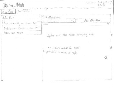
This shows the pop up resulting from clicking on the "Floor Stats" button; we embellished it |


Observations
Again, we observed users in detail and found multiple instances where usability as reflected by the testing participant did not match expectations exactly; these observations were recorded as critical incidents, and used to determine required changes for the next iteration of our interface's design. The full list of observations is just below.
The observations are organized by user, then task.
User 1
Task 1
- Does not use News Feed to find task (does not seem to realize it is clickable); however, task is already on screen.
Task 2
- Stalls for a few moments before noticing the floor stats button, but then uses it.
- Tries to check by scanning floor plan, but there is an inconsistency, and this confuses him.
Task 3
- Pauses for around 10s before realizing that return to main screen will allow initialization of a moving task.
- Tries clicking pop-up calendar for auto-filling date (not "useful information calendar"), but it's just a reference tool, and is not clickable.
Task 4
- The user has trouble and stalls before deciding to use the people directory for looking up the old address of the student moving in.
User 2
Task 1
- The user is confused when he doesn't see the referred to task on screen (facilitators forgot to put it there...), but figures it out afterwards.
Task 2
- The user does not notice the "Floor Stats" button, and instead tries counting vacant rooms by scanning the floor plan.
Task 3
- Immediately starts a new task using the floor plan, contrary to previous users.
Task 4
- Could not find the "Start New Task" button on the main page.
- Confused by the "Start New Task" functionality on the floor plan; thinks that it will start both a "move in" and "move out" task.
User 3
Task 1
- Does not use News Feed to find task (does not seem to realize it is clickable); however, task is already on screen.
Task 2
- Manually scans floor plan for number of vacant rooms rather than looking at "floor stats".
- Tried to click the static color key (maybe was looking for information?).
Task 3
- Used the main page "Start New Task" button rather than floor plan.
- Used the "Useful Information" "Show Available Rooms" dropdown for looking up rooms - but did not use it to autofill.
Task 4
- Used autofill capabilities of "Show Available Rooms" dropdown this time.
- Used the MIT people directory to look up information about Lydia.
- Took a significant amount of time to figure out how to "add a new subtask".
Prototype Iteration
Since the testing for this prototype was very recent, decisions on the changes which should be made to the interface have not been decided upon yet.