PosterBoard - GR6 - User Testing
Manasi Vartak, Tristan Naumann, Chidube Ezeozue
Design
Final Design
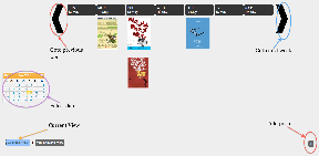
Device: We decided to use a SmartBoard for our implementation instead of a web or mobile interface because user studies indicated that users would not go out of their way to get information about events through a website or mobile app. In fact, the events.mit.edu website which is a central repository for events is hardly used. We envision SmartBoards (or a similar devices) being placed at the current locations of poster boards in Stata. We also chose to allow adding of posters through the smart board as opposed to having a separate web interface for simplicity.
In our final design, we implemented for two views to organize posters on the PosterBoard, one view to add a poster and a detailed view to interact with the selected poster. We decided against the "Random view" because it did not aid in finding more relevant information.
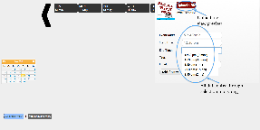
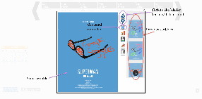
- Calendar View: Posters are displayed by week and users can either scroll to a week or select it off a calendar.
- Calendar View:
- Calendar View:
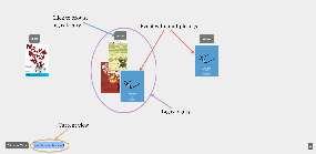
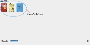
- Similar Events View: Posters are grouped by tags event organizers assign to them (e.g. talk, social etc). Posters with multiple tags are placed in multiple categories. Clicking on a tag allows users to browse events in that category. This functionality circumvents the need to need to have an explicit search button which would require typing and our studies show that typing on a vertical surface is very tedious.
- Similar View :
- Browse Tag Category:
- Similar View :
- Add poster view: We implemented a slide-in panel for adding posters where the user can select a poster file, event date and time, and tags. These selections require no typing, they are accomplished through calendar widgets and drop downs. Similarly for entering email, we prompt the user to swipe their id at the RFID reader and auto-populate the email field.
- Add View:
- Add View:
- Detailed view: When a poster is clicked on (in the calendar or similar events view), the poster is focused and the user is able to scribble on it, change scribbling color, view previous scribbles, continue a previous scribble, like/dislike a poster, get a reminder for the event by swiping an RFID card and delete the poster, also by swiping a card.
- Detailed View Example 1:
Detailed View Example 2: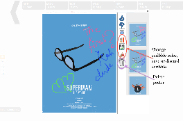
Send email reminder functionality: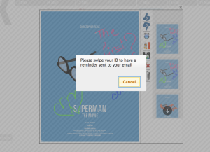
- Detailed View Example 1:
Motivations
In the course of our design, we made changes driven by comments in our paper prototype and heuristic evaluation. Our user testing also threw some insight on possible future improvements.
Paper Prototype
We changed the label "Clustered view" to "Similar Events View"
We forwent using QR codes for adding an event to a user's calendar settling instead for sending an email reminder to the user on swiping their RFID card. *** event organizers didn't want to create them either ***
One of the users could not find the button to select the poster file so we made sure that the button was clearly set apart with a sufficient color contrast
To exit from a focused poster, we allowed the user either click a close 'x' sign or click outside the focused poster.
Heuristic evaluation
Before the heuristic evaluation, we put in some animation that slid in the new week when scrolling weeks but it made posters disappear briefly before showing up the poster of the new week. An evaluator thought the behavior was jarring and we removed it.
Some evaluators pointed out that there was no way to remove a poster added in error, for instance, so we implemented this critical authentication-based delete functionality
Some evaluators pointed out that since there were only two views (and hence, two buttons for switching between them), it wasn't obvious which view was selected despite our visual separation of the two. So, we added a border that made the selected view more obvious.
We added visual feedback to the like/dislike buttons so users could know how many likes/dislikes a poster has acquired
In response to an evaluator's point, we used alternating column colors in the calendar view to set the days apart but this was not visually appealing so we discarded the idea.
We contemplated moving the calendar to the bottom alongside the buttons for switching between view modes but the calendar would have made that panel occupy too much vertical screen estate. We also contemplated moving the view-switching buttons to the left with the calendar but the similar view does not need a calendar and such a grouping would have been inconsistent between views. Finally, we considered doing away with the calendar entirely since most users would be looking for events around the current date but we decided not to because it would make event management very inefficient for people who put up events weeks or months in advance and wish to take them down or view them.
We removed the randomness in the ordering of the posters in the Similar Events View so that every time that view is brought up, posters remain in the same place they previously did.
We made the event category labels clickable to solve the problem of visibility when there are a lot of events in a category and the posters begin to overlap.
We changed the reminder icon from a calendar icon to an alarm clock icon because the calendar icon was confusing given other uses of a calendar (primarily in the Calendar View)
Evaluators thought the scribbling feature was interesting but was concerned by the lack of a way to save, erase and change the pen color of a scribble. We implemented all those features.
Some evaluators thought the 'x' used for closing the Add Poster dialog was not externally consistent or noticeable enough and that the dialog could not be dismissed by clicking outside it. We changed the 'x' to a much larger 'Cancel' button within the dialog but retained the strictly modal functionality for safety reasons. We wanted to prevent users from dismissing the add dialog in the middle of adding a poster and having to start all over again.
Hovering over a poster caused jerky behavior and we fixed it.
User Testing. If we were going to make further changes, we would make the following changes based on user testing feedback ***NEED TO ADD SEVERITY*** and possible solutions.
We would increase the information scent because some users pointed out and we also observed that users did not understand the capabilities of the board and various modes of interaction possible. Interestingly, a user pointed this out during the paper prototype and we decided then to show a demo video whenever the board is idle and in standby mode. However, on further consideration we dropped the idea because having a standby mode would be a trade off between giving the posters maximum visibility time and the previous aim of educating new users. We now think that a more appropriate approach would be to display tooltip like messages that would point out interesting features of the board. That idea too has to be carefully implemented because it has a high propensity to become a nuisance for experienced users and unlike system possessing authentication, we cannot selectively turn it off or on per user. If we implemented a personalized board as initially envisioned, we could reduce the nuisance-capacity somewhat.
A user pointed out that an efficient way to add items to the calendar would also be to drag the thumbnails of the posters of interest into a virtual calendar at the bottom of the screen.
Despite the fact that a focused poster can be dismissed by clicking outside the poster, most of our users consistently dismissed it with the 'x' at the top right corner. This 'x' was small and hence poster dismissal proved to be somewhat difficult. It would be necessary to increase the size of this element.
When selecting a poster from the file system, a user first changed the view mode (of Window Explorer) away from 'Detail View' to 'Tile View' so he could preview the images before selecting them. This was a gentle reminder that a mode that allows previewing in the file explorer should be set by default.
For some reason, most users when trying to scribble clicked on the color picker first regardless of whether they needed to select a new color. This indicates that the users were not aware that scribbling could be done immediately after focusing and some means to increase the visibility of the mode may be needed here.
The idea of swiping a card for identity seemed confusing to some users. In particular, a non-native English speaker mostly ignored all written instructions (including those for swiping cards) indicating that in a diverse environment such as MIT's we may need to cut down on textual information.
One of the users was confused about which view was currently selected indicating that our efforts to distinguish the selected view (in response to our heuristic evaluations) may not have been sufficient.
A user had difficulty finding an added poster because she temporarily forgot the date she added it to and this is a scenario that we will probably need to deal with in practice. First of all, there needs to be some feedback indicating that the add operation was successful (in response to another user's comments) and this feedback should provide a way to optionally let the user view the added poster in its right place in the application.
One user assumed at first that the color picker was for changing the background color of a poster we therefore need to make its purpose (changing the scribble color) more obvious.
One user did not save after scribbling (although, another user did so without thought). For safety reasons, we may want to remind users to save their scribbling or continuously save it in the background.
Implementation
We implemented the project using a SmartBoard optical touchscreen that plugged into any computer's serial/USB ports for input and VGA port for output. The backend was implemented using Python using the Django web application framework and SQLite database. We also wrote a standalone websockets server for feeding the inputs from the RFID card reader to the frontend. The frontend was implemented using HTML, CSS and Javascript with a heavy reliance on the JQuery and JQuery UI libraries as well as a few other libraries.
The dialog for adding posters was implemented using JQuery UI Dialog; using Calendrical and Chosen javascript libraries for selecting dates/times and tags respectively.
The Calendar View was implemented using a grid built out of HTML tables and the Similar View was implemented using absolutely positioned image elements.
Focusing of the posters was implemented using Colorbox javascript library and the scribbling was implemented by using SVGs with the Raphael javascript library. Additional libraries were used for displaying the color picker and old sketches.
When storing the sketches, we opted to store the coordinates as fractions of the height and width as sketch time as opposed to absolute coordinates to permit scaling at display time.
We also contemplated displaying old sketches as stacks underneath the main poster but the colorbox javascript library was not flexible enough to accommodate this. Retrospectively, our approach gives more visibility to the old posters that a stacked arrangement would have.
We also contemplated saving the sketches as the user sketched instead of waiting till the user was done sketching but that approach was more bug-prone and given the time limitations, we opted for the less bug-prone approach of saving when the user clicked the Save button.
*** Need to talk about how we used RFID reader to remove need for typing ***
- the actual board was not functional until the week before GR5 was due. It was missing a crucial connecting cable to allow the smart board to communicate with the computer. After several tens of hours of conversations with Customer Service and three sets of incorrect cables, we finally got the board working. So resolution, fit to big screen cow;don't happen very well.
It is also important to point out that the board's touchscreen was not as responsive as we hoped and this impacted the usability of the system somewhat. Another board-specific implementation detail is that the board does not support multi-touch so we abandoned the idea of supporting multiple users working with the board simultaneously.
- rfid. we had to explore several ways to get rfid working with javascript and enable it to talk to the django server. we had to make three prototypes, two of which failed before getting a viable one. the working prototype came together the week before GR5, limiting our ability to take further advantage of it.
Evaluation
The ideal user test would have been conducted by moving the board to a part of the building with high human traffic and the test conducted with people who were attracted to the board in the first place. We however did not have that luxury because the board was fixed in place at the group space of a research group. We however managed to conduct a test that was very revealing and helpful.
Choice of users
We were looking for users that were representative a the bulk of the population in MIT: students and we had 3 users: 1 female postdoc who recently completed her PhD in New York, 1 male PhD student working in CSAIL and **Tristan fill in here**. In order not to focus solely on students, we performed a demo of the project for a professor as well and got some helpful comments from him as well.
User preparation
We utilized our briefings and tasks (outlined below) from the paper prototyping exercise with one slight modification.
Briefing
PosterBoard is a project that aims to increase visibility of event posters by encouraging interaction with the posters.
What you are looking at is an electronic poster board that will be installed up in a public place like the ground floor of the Stata center.
Scenario Tasks
Task 1*: *You have come across this poster board in Stata Center. Describe 5 things you can do with it. Interact with it for two minutes. (We utilized this open ended task to get a sense for which features of the poster board were discoverable as well as those that might be expected).
Task 2*: *You have a USB drive in your possession. Add a poster from the USB onto the poster board.
Task 3*: *Find a poster you like, add it to your calendar and scribble on it.
Reflection
The project turned out to be much more hardware focused than we expected since our application was heavily dependent and limited by the SmartBoard and RFID equipment. As mentioned above, the SmartBoard was not fully functional until the last week of classes.
*** talk about personalization: possibilities, why we didn't do it. How would we do it ***