GR 2 - Designs
* Notes: this is just a reference,p[; the sections order in Spring 2009 class. Please follow the sections in your handout for this year.
Scenario
We felt that the scale of our project was too big. So we decided to focus on the kids user group and more specifically the main interface (the most original and key part of our website) that displays all the projects/ profiles. We created three scenarios where kids interact with the main interface. We had two designs for the main interface. And we created two story boards to illustrate one scenario.
Scenario 1
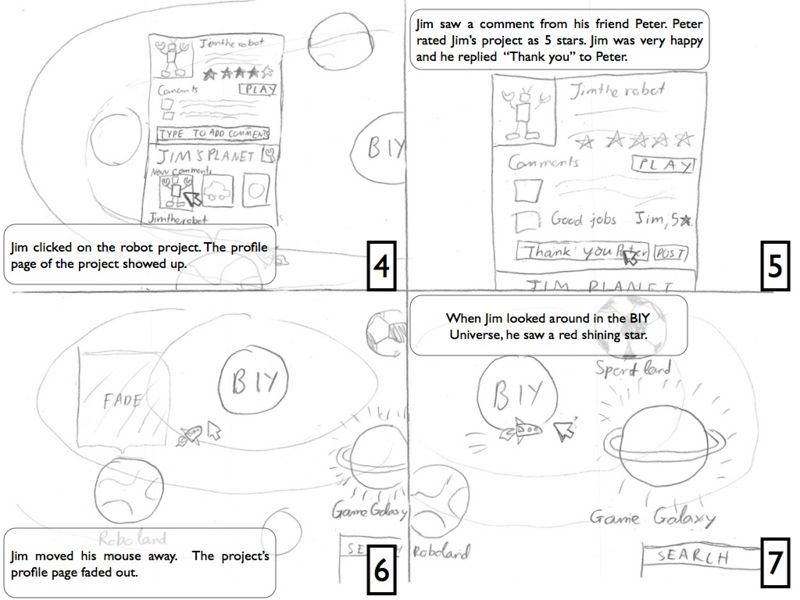
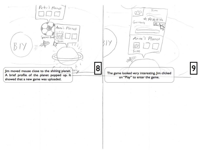
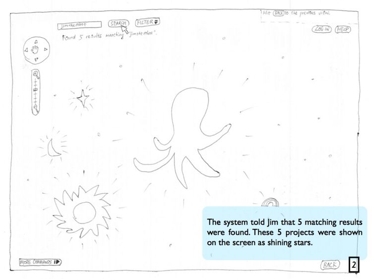
Jim is a 12-year-old boy living in Cambridge. He is a big fan of robots so he is taking a robot building class this semester. One day when he went back home from school, he opened the BIY website. After login with his username and password, the website took him to the BIY Universe. He was very eager to see people's response to a robot project he uploaded a week ago. He typed his username into the search box and clicked on Search. After one second, all his projects were shown in the Universe. He opened the robot project and saw three new comments there. One of the comments was from his teacher Peter. Peter thought it was a great work and he gave the project a rating of 5. Jim was very happy to see that and he replied "thank you" to Peter. Then he closed this project and started to looked around in the universe. Suddenly a bright red star got his attention, it's a new project just got uploaded to the Game Galaxy. Jim clicked on the red star and started to play that game. Jim found it a really interesting game and he thought maybe he would take a game design class next semester in BIY.
Scenario 2
Nick, 10, is a happy boy with lots of fun stuff in his room. But now he is in the mood of play some “virtual” games on his computer. He heard from friends that BIY is a great resource of kids-created games, so he goes to the website and browses in the “universe”. Wow soon he is dizzied from all the fancy shining stars in the universe and doesn't know which one to choose . He then sees the “filter” button, and clicks it. It turns out that it is a drop down menu, with different filter criterion, such as “Game”, “Ten most popular”, etc... He uses the “Ten most popular” and plays the most popular games for a while. He discovers that the user “zigzag” seems to make several popular games, and he is interested in checking out zigzag's other works, if any. So he uses the search function, types in “zigzag”. Viola! In front him are all the projects by this zigzag guy. He likes all of them, and he admires zigzag. He checks out zigzag's profile, and wants to contact him. So he uses the “send a message” option and send zigzag an email:”good job man!”
Scenario 3
Anna just came back from her programming class with BIY today. After playing around with her project in Scratch for a while, she was quite satisfied with the project and was ready to put it on display! She logged into BIY website and uploaded her project. Besides the project itself, she also used a wizard to add some easy descriptions to her project, accompanied with several pictures. She also named the project “Dora Dreams”. Now she turned to her profile page. She hoped to change her personal interest and other stuff in her profile, because she recently became interested in TaeKwonDou and wanted to announce it. Later on, she also thought “Dora Dreams” was too girly a name to use. Thus she went ahead and modified her project description as well.
Design
Design One
This interface allows children to browse, share, and play games and projects created by themselves. The user will be able to manage his projects, keep track of his friends' projects, and also explore other people's projects. The interface is represented by the metaphor of an universe. Each user has his own planet. He can upload and show his projects there. He can also decorate, upgrade, and personalize the planet according to his taste and show it off to his friends.
To make the users' experience more thrilling and adventurous, we have the mouse cursor control a space ship. When the user moves his mouse, the spaceship will follow, just as the user being an astronaut who maneuvers his spaceship to explore novel planets. Also, what worth mentioning is that the pop-up windows showing project thumbnails will appear over the planets that are in the neighborhood of the spaceship, which will save the user from clicking every single planet to see what projects are there on the planets.
This interface also supports social features like chatting and communicating with friends. Since each online user is controlling a spaceship, one will also be able to see other people's spaceships. He can type into a chat box and a speech bubble will appear above his spaceship so that anyone around him can see. This is very similar to some of the online multi-player games. This feature suits our target goals since our users are young children who are always appealed to games and always want to make new friends. In addition to that, though not essential to the interface's main purpose of browsing and viewing projects, this feature will encourage young children to learn how to type as well!
Design Two
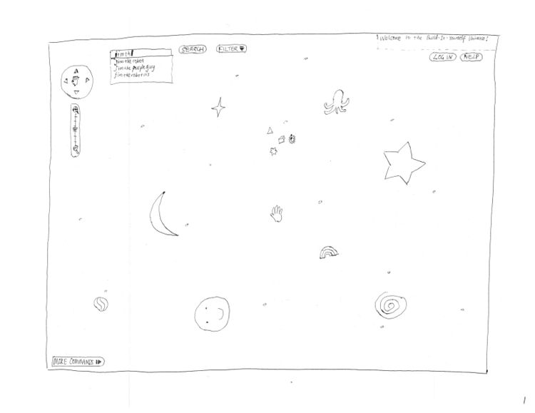
In this design, we have projects as stars in the universe. Projects can be accessed via
- exploring the universe: dragging the space scene around, zooming in and out
- searching keywords: searching by project name, author, tag
- and using filters: searching by category
Google Map style browsing
Google Map is intuitive and fun to use. It encourages users to explore, which fits our goal perfectly.
Our innovative "flying star under spot light" eye candy
When a searching or filtering action is performed, the matching results will fly to the center of the screen and rearrange themselves in an aesthetic way (we will figure out the algorithm soon). The goal is to encourage kids to explore more projects. http://courses.csail.mit.edu/6.831/wiki/index.php?title=Image:Liuhuan-design-search-result.JPG
Hide functionalities for simplicity
We keep the interface simple as much as we can while leaving some hints for users to explore themselves.
Youtube style project page
A project page will have a similar layout to a Youtube video page. We are not going to spend much time here since this proved to be a decent pattern.
http://courses.csail.mit.edu/6.831/wiki/index.php?title=Image:Liuhuan-design-project-page.JPG
Pop-up blocking window
The user posts a comment in a pop-up blocking window. Same design pattern will be used in tasks like user log in, adding a tag, etc. http://courses.csail.mit.edu/6.831/wiki/index.php?title=Image:Liuhuan-design-post-comment.JPG
Form vs. Wizard
The user uploads a new project by filling a form (advanced users) or following a wizard. We are not going to spend much of our development time here because this has been done by many websites and we don't want to reinvent the wheel. Nevertheless we show a sketch for it here for the reason that same design pattern will be used in user profile creation.
Story Board
We created two storyboards for scenario 1.
Storyboard One
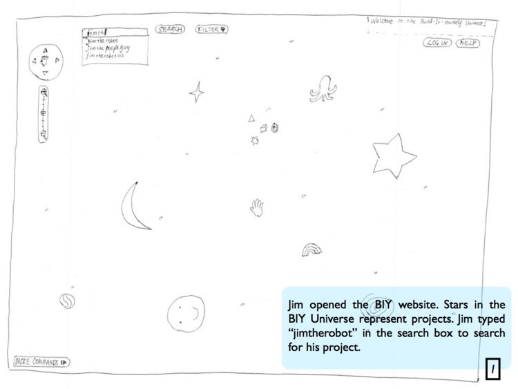
Storyboard Two
This story board illustrates part of the functionalities mentioned in scenario one using the second design. http://courses.csail.mit.edu/6.831/wiki/index.php?title=Image:Storyboard.001.jpg
The rest of the story is the same as using the filter functionality described in the design section. When user selects a filter, the UI will have the same effects as searching: only matching stars show up in the universe.

